15 Trendy Hallway Paint Colors Ideas You’ll Absolutely Love
- Hallway Decorating
 Ben
Ben- 0
- 36 minutes read

You know that moment when you walk through your hallway and think, “This space needs something… but what?” Yeah, I’ve been there too.
After repainting my hallway three times in two years (don’t judge), I’ve learned that hallways deserve way more credit than we give them. They’re not just passages from room to room – they set the entire mood for your home.
Think about it: your hallway greets every guest, connects your living spaces, and probably gets more foot traffic than any other area. So why do we always leave it for last when planning our paint colors?
Today, I’m sharing 15 hallway paint color ideas that transformed my perspective on these overlooked spaces. Trust me, once you nail your hallway color, your whole house feels more pulled together.
Cozy Neutral Hallway Colors
Let’s start with the crowd-pleasers – neutral colors that wrap your hallway in warmth. I painted my first apartment’s hallway in Benjamin Moore’s “Accessible Beige,” and honestly, it changed everything. The space went from feeling like a tunnel to becoming this inviting pathway that actually made sense.
Here’s what makes neutrals work so brilliantly in hallways:
- They reflect light beautifully (crucial for those windowless corridors)
- They complement literally any decor you throw at them
- They create flow between different room colors
- They’re timeless – you won’t hate them in six months
My go-to neutral picks include warm grays, soft taupes, and creamy whites with undertones. Sherwin Williams’ “Agreeable Gray” hits different in a hallway – it picks up light throughout the day and creates this chameleon effect that keeps things interesting. Want something warmer? Try “Balanced Beige” or go for a mushroom tone like “Natural Linen.”
The trick with neutrals? Don’t go too light if your hallway gets heavy traffic. I learned this the hard way when my pristine cream walls showed every scuff mark within weeks. Now I stick to mid-tone neutrals that hide the inevitable wear and tear.
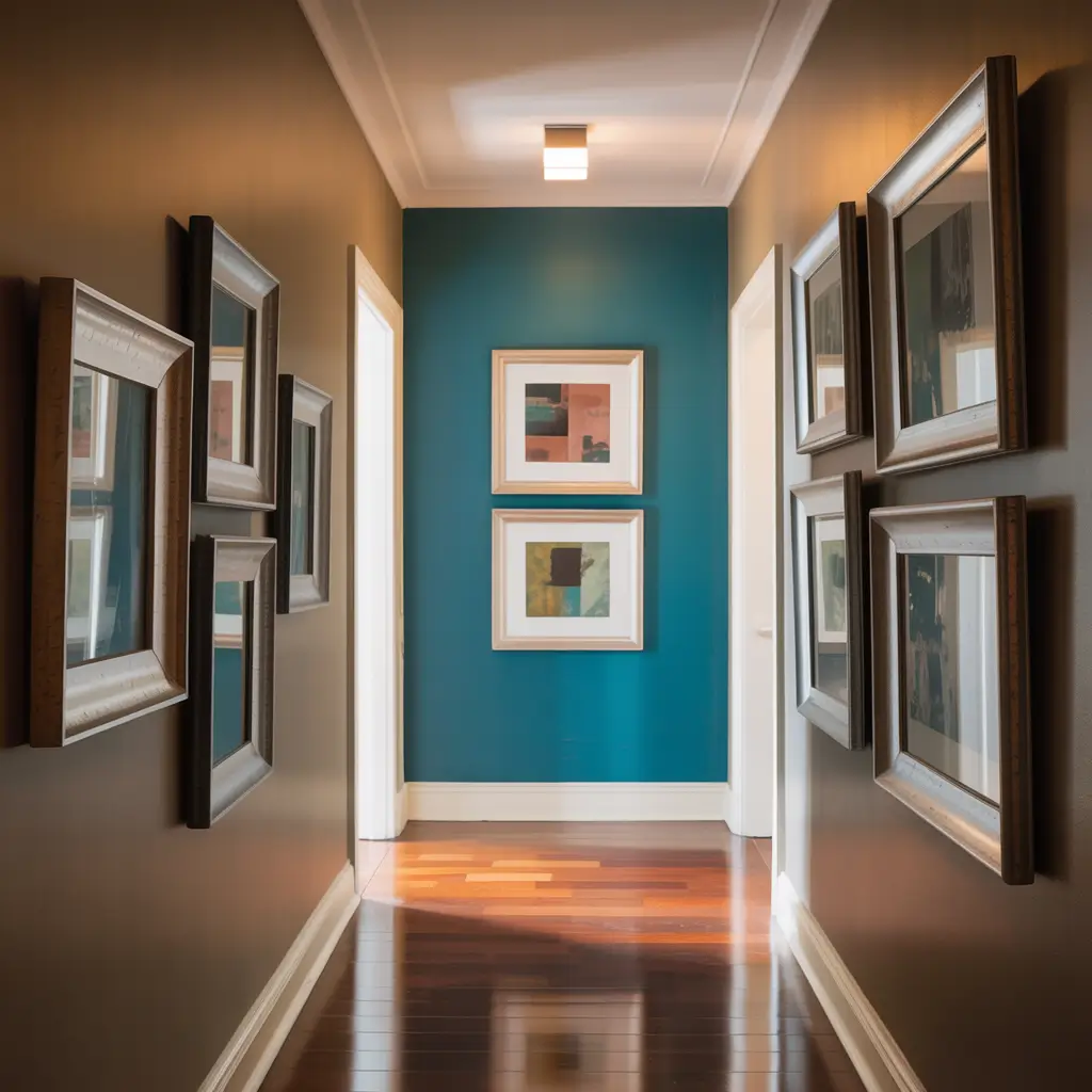
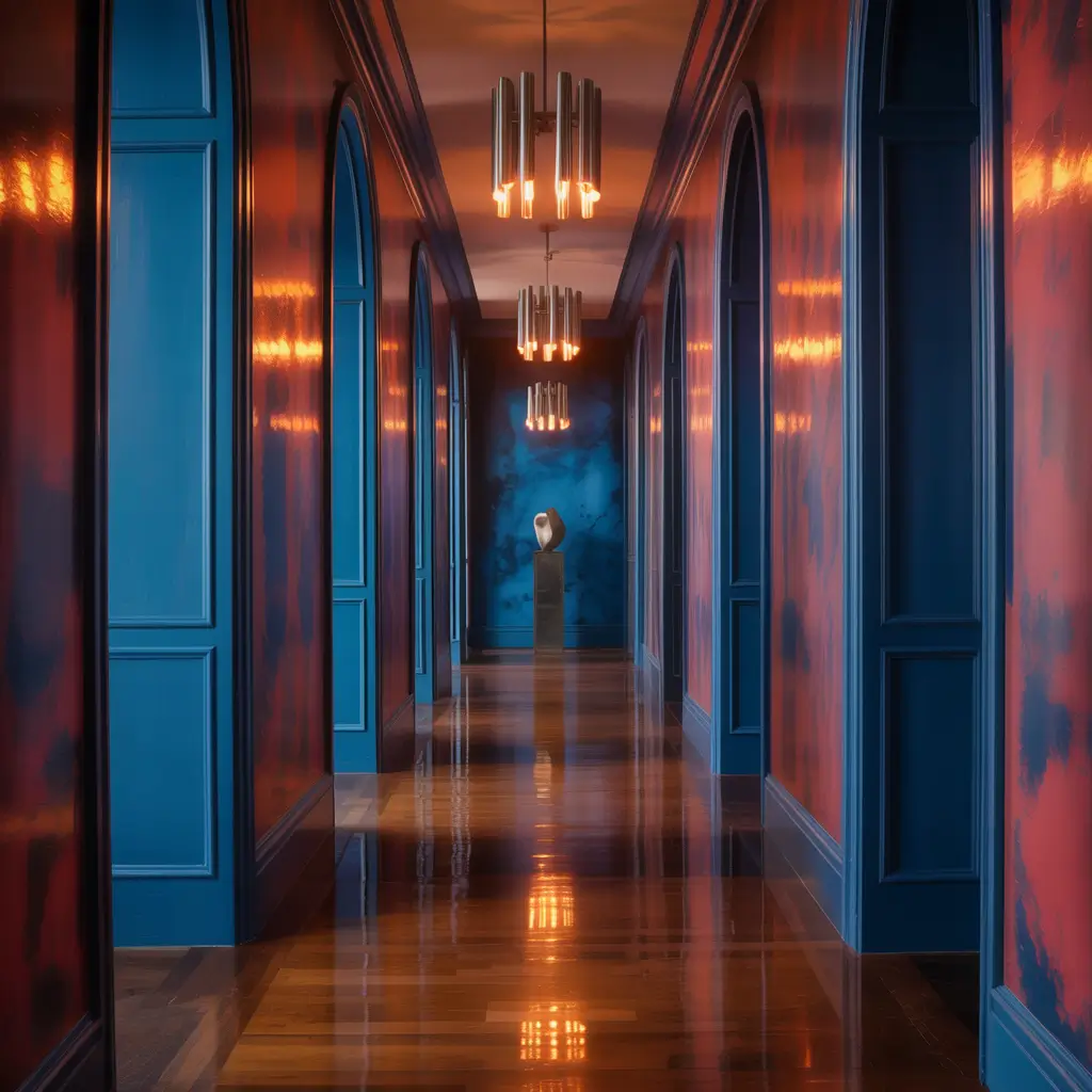
Bold Statement Hallway Hues
Ready to make people stop in their tracks? Bold hallway colors turn boring passages into gallery-worthy spaces. My neighbor painted her hallway in this gorgeous deep emerald green, and now everyone who visits asks for the paint code (it’s Benjamin Moore’s “Hunter Green,” FYI).
Bold doesn’t mean garish though. Think sophisticated drama:
- Deep navy blues that make white trim pop
- Rich burgundies that feel luxurious
- Charcoal blacks for ultimate sophistication
- Vibrant teals that energize the space
Here’s the thing about bold colors in hallways – they actually make narrow spaces feel more intentional. Instead of trying to hide a cramped hallway, you’re celebrating it. I painted my current hallway in Farrow & Ball’s “Hague Blue,” and suddenly this forgotten space became the star of my home tours.
Pro tip: If you’re nervous about going full bold, start with the end wall. Create a focal point that draws the eye through the space. You get the drama without the commitment of painting every surface.
Soft Pastel Hallway Inspiration
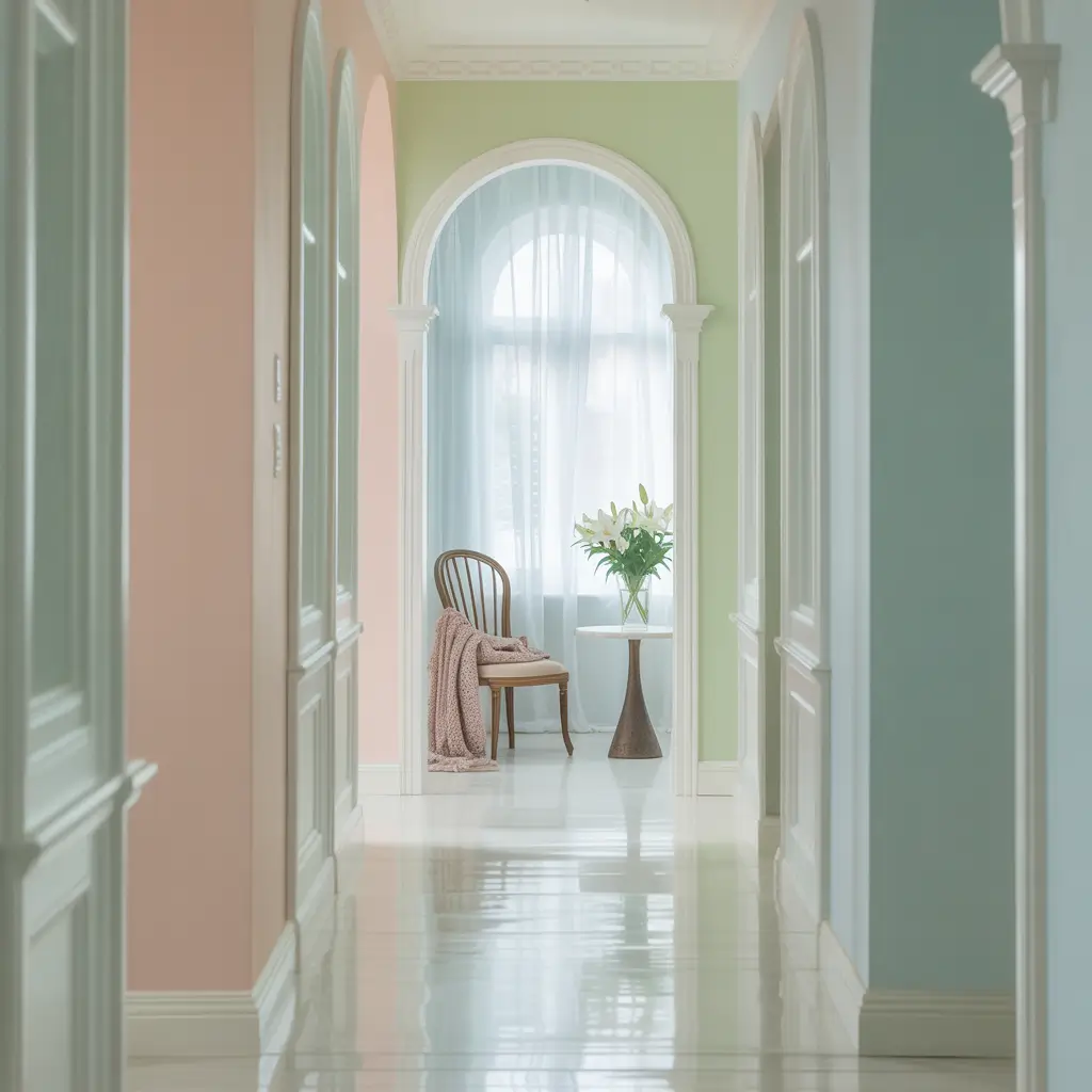
Who says pastels are just for nurseries? Soft, muted pastels bring unexpected sophistication to hallways. They’re having a major moment right now, and I’m here for it.
I recently helped my sister choose a dusty rose for her hallway (Benjamin Moore’s “First Light”), and the transformation blew us away. The color shifts from pink to peach depending on the lighting – it’s like having multiple paint colors in one.
Best pastel picks for hallways:
- Sage greens that feel fresh but grounded
- Powder blues for that airy, spacious vibe
- Soft lavenders that add whimsy without going juvenile
- Blush pinks that warm up north-facing hallways
The secret to adult pastels? Choose colors with gray undertones. They prevent that Easter egg effect and keep things sophisticated. Also, pastels work incredibly well with both modern and traditional decor – they’re surprisingly versatile.
Also Read: 15 Creative Hallway Light Fixtures Ideas You’ll Love Trying
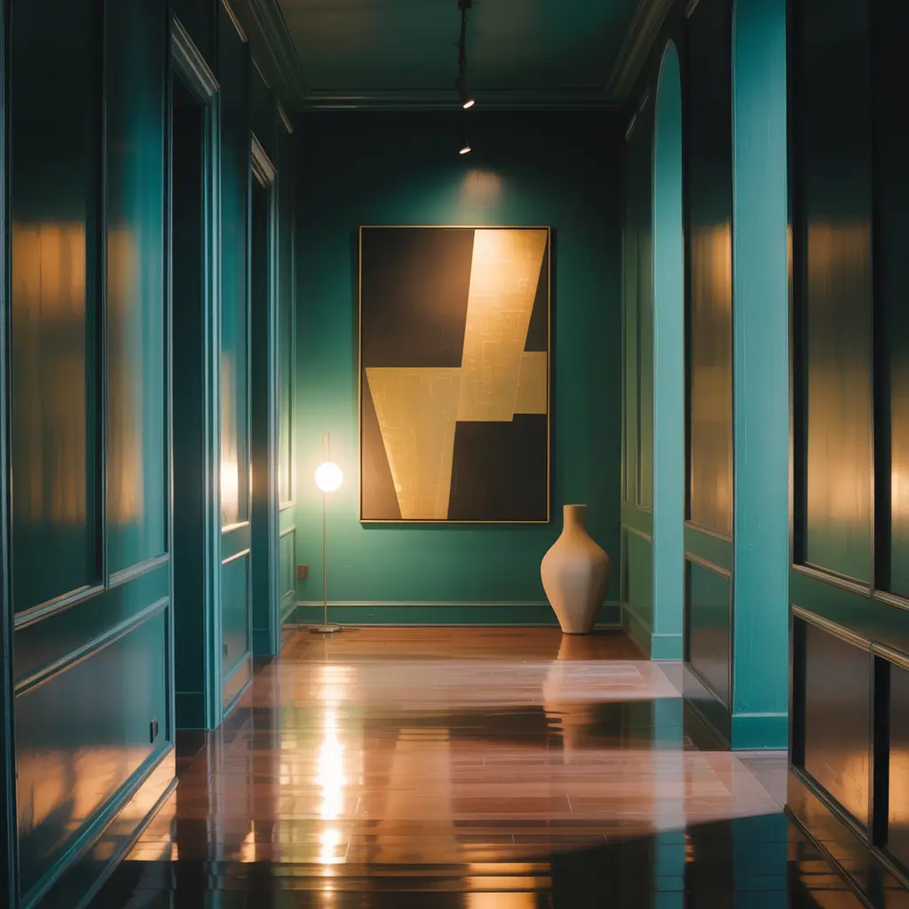
Dark and Moody Hallway Paint
Okay, hear me out on this one. Dark hallways create drama and intimacy that light colors just can’t match. Yes, conventional wisdom says dark colors make spaces feel smaller. But you know what? Sometimes that’s exactly what you want.
My friend painted her hallway in Clare’s “Current Mood” (basically black with blue undertones), and it transformed a boring corridor into this moody, magazine-worthy space. She added picture lights for artwork, and boom – instant gallery vibes.
Dark colors that work beautifully:
- Deep forest greens for organic richness
- Midnight blues that feel cosmic
- Chocolate browns for warmth without brightness
- Plum purples for unexpected luxury
Here’s when dark colors really shine in hallways: when you have high ceilings, when you want to showcase art or lighting, or when your hallway connects to bright, light-filled rooms. The contrast creates visual interest that keeps your home feeling dynamic.
Bright and Airy Hallway Shades
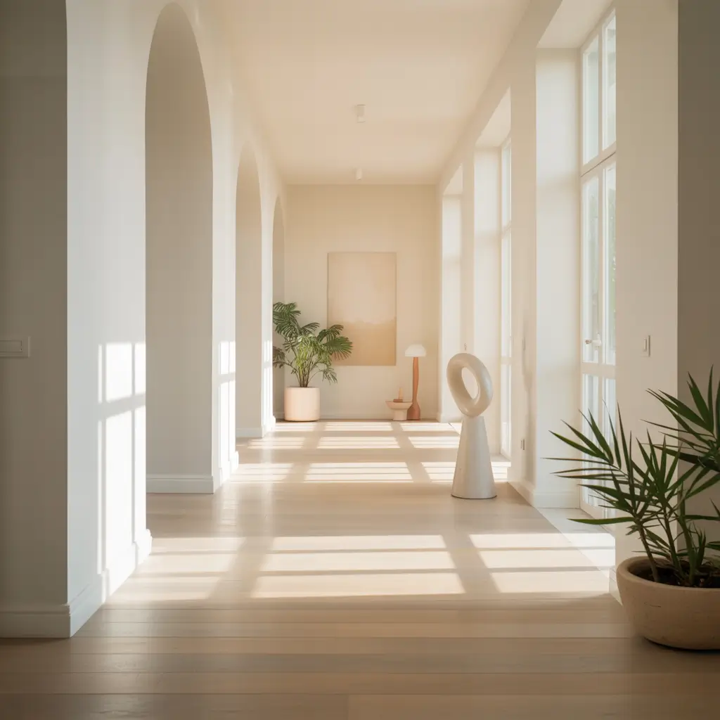
Need to maximize every bit of light in your hallway? Bright, airy shades make even the darkest corridors feel spacious. I’m talking about colors that basically act like mirrors for natural light.
My top picks for maximum brightness:
- Pure whites with cool undertones
- Soft ivories that warm without darkening
- Palest grays that add depth without shadow
- Whisper-light blues that suggest sky and space
Benjamin Moore’s “Cloud White” transformed my friend’s windowless hallway from cave-like to surprisingly bright. The key? She paired it with glossy white trim and added a large mirror at the end. The light bounces around like crazy.
Want to know a secret? Semi-gloss or satin finishes in light colors reflect even more light than flat paints. Sure, they show imperfections more, but in a hallway where you’re not staring at walls up close, the trade-off is worth it.
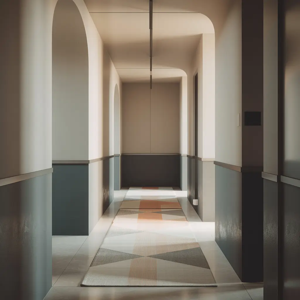
Two-Tone Hallway Color Ideas
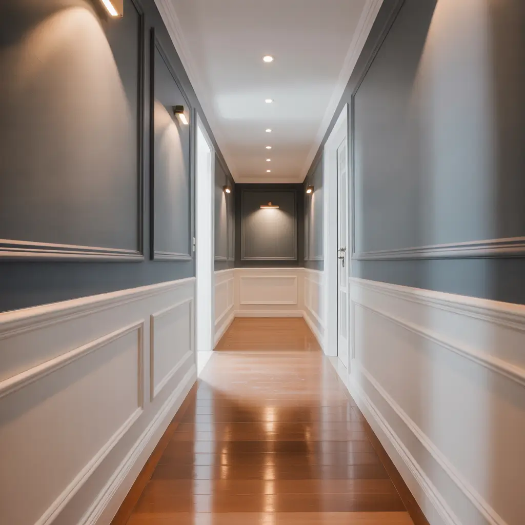
Why choose one color when you can have two? Two-tone hallways add architectural interest without actual renovation. This trend has exploded lately, and I totally get why.
I recently painted my hallway with “Railings” by Farrow & Ball on the bottom half and “Cornforth White” on top. The darker bottom grounds the space while the lighter top keeps things airy. Plus, the dark lower half hides scuffs from bags, shoes, and life in general 🙂
Popular two-tone combinations:
- Navy bottom, white top (classic nautical vibes)
- Gray bottom, cream top (sophisticated and timeless)
- Green bottom, sage top (organic and calming)
- Black bottom, any color top (bold and modern)
The standard split happens at chair rail height (about 32-36 inches), but you can go higher for drama or lower for subtlety. I’ve seen people do 2/3 dark bottom for maximum impact – it looks incredible in tall hallways.
Also Read: 15 Charming Upstairs Hallway Ideas for Small Spaces
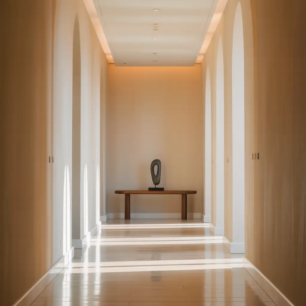
Modern Minimalist Hallway Palettes
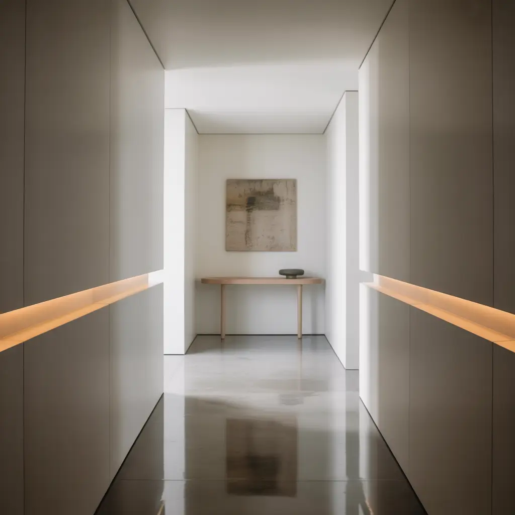
Sometimes less really is more. Modern minimalist palettes strip away the excess and focus on pure, clean color. Think Scandinavian simplicity meets Japanese zen.
My minimalist color obsessions:
- Pure white (obviously)
- Soft gray with zero undertones
- Palest pink (barely there blush)
- Greige that bridges gray and beige
The trick with minimalist colors? Quality matters more than ever. When you’re working with such simple palettes, every imperfection shows. I splurged on Benjamin Moore’s “Chantilly Lace” for my minimalist phase, and the coverage and finish made all the difference.
Minimalist doesn’t mean boring though. Play with textures – maybe add a subtle lime wash effect or choose different sheens for trim versus walls. The variation creates interest without adding color chaos.
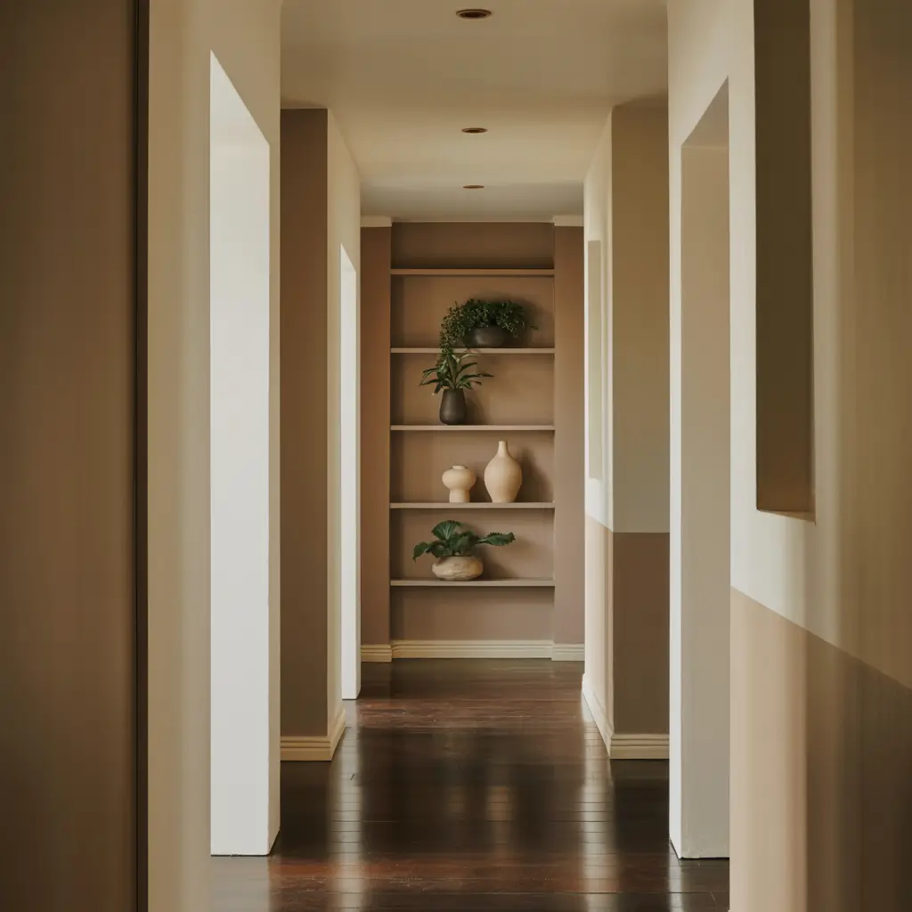
Warm Earthy Hallway Colors
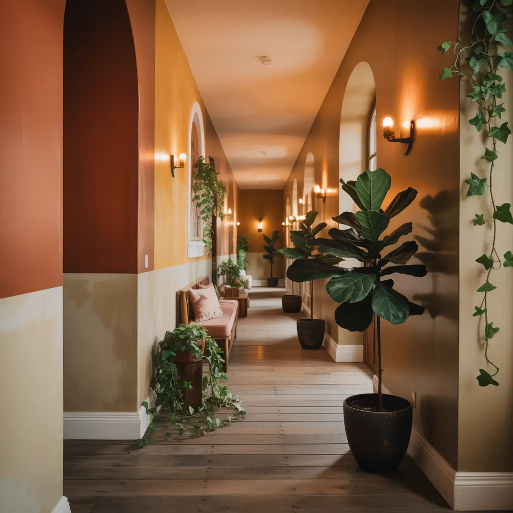
Earthy tones bring the outside in and create seriously cozy vibes. After years of cool grays dominating, warm earth tones are having their moment, and hallways are the perfect place to experiment.
I painted my mom’s hallway in this gorgeous terracotta shade (Clare’s “Current Mood”), and now it feels like a warm hug every time you walk through. The color changes throughout the day – peachy in morning light, rich clay at sunset.
Earth tones that nail it:
- Warm terracottas for Mediterranean vibes
- Soft sands that feel beachy but sophisticated
- Muted olives for that trendy organic look
- Caramel browns that feel luxe, not dated
These colors work especially well if your hallway connects to rooms with natural materials like wood floors or stone accents. They create this cohesive flow that makes your whole home feel intentional.
Cool Calm Hallway Tones
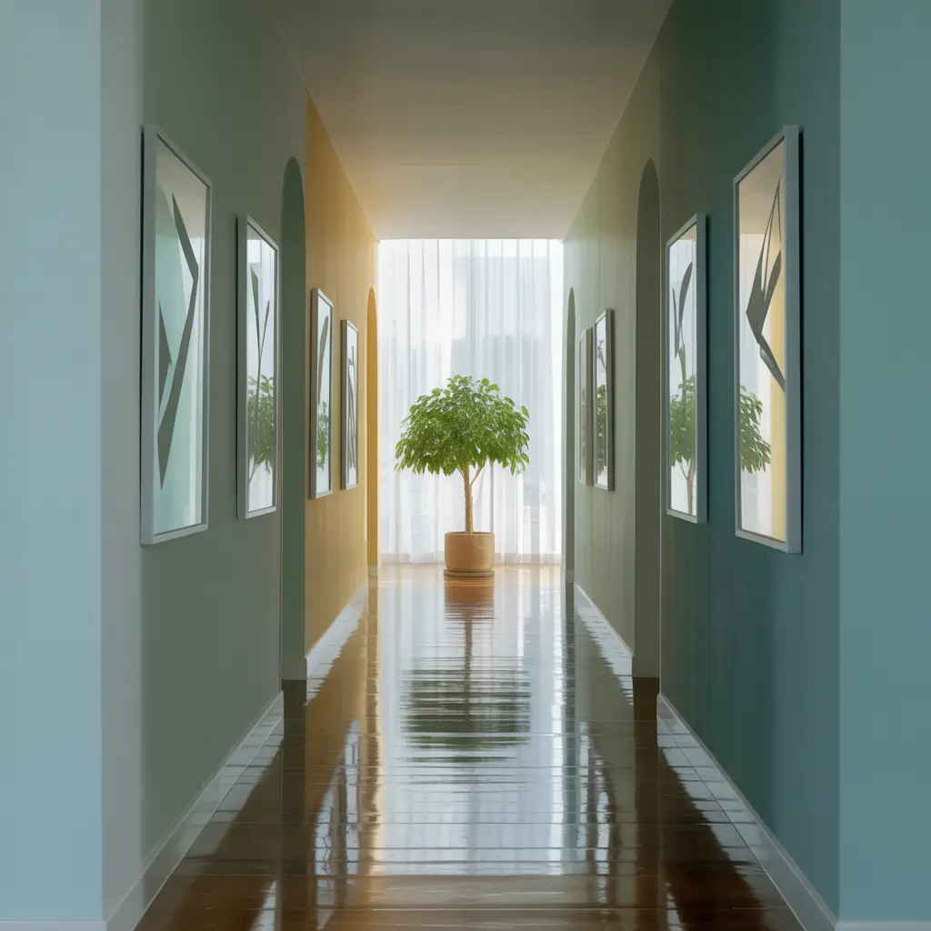
Need your hallway to be a zen zone? Cool, calming tones turn chaotic corridors into peaceful passages. These colors literally lower your blood pressure (okay, maybe not literally, but they definitely help).
My favorite calming colors:
- Soft blue-grays that whisper serenity
- Pale seafoams for spa vibes
- Lavender-grays that soothe without being sweet
- Icy blues that feel fresh and clean
I used Benjamin Moore’s “Healing Aloe” in my upstairs hallway, and walking through feels like taking a deep breath. The color has this barely-there green undertone that’s incredibly soothing without being obvious.
Cool tones work magic in south-facing hallways that get lots of warm light. They balance the yellow tones from sun exposure and keep things feeling fresh all day long.
Also Read: 15 Fun School Hallway Ideas and Colorful Wall Projects
Vibrant Accent Wall Hallways
Can’t commit to a full hallway of color? An accent wall delivers maximum impact with minimum commitment. Plus, it’s perfect for renters who might have painting restrictions.
I painted just the end wall of my hallway in this punchy coral (Sherwin Williams’ “Animated Coral”), and suddenly the whole space had personality. The white side walls keep things from feeling overwhelming while the pop of color adds energy.
Accent wall strategies that work:
- End walls create focal points
- Niche walls highlight architectural features
- Behind artwork for gallery effects
- Stairway walls for vertical drama
Choose your accent color based on what you see from other rooms. That coral wall? You can glimpse it from my living room, kitchen, and bedroom. It ties everything together without being in your face.
Classic White Hallway Elegance
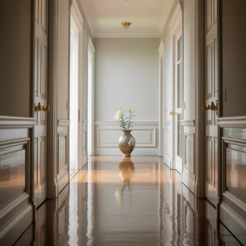
Never underestimate the power of white done right. A well-chosen white creates timeless elegance that never goes out of style. But here’s the thing – not all whites are created equal.
After testing literally 12 different whites (my husband thought I’d lost it), I learned that undertones make or break white paint. Cool whites can feel stark, warm whites can look dingy, and the wrong white makes everything else look off.
My white hallway winners:
- Benjamin Moore “White Dove” (warm but not yellow)
- Farrow & Ball “All White” (despite the name, has warmth)
- Sherwin Williams “Pure White” (truly neutral)
- Benjamin Moore “Simply White” (fresh with subtle warmth)
White hallways showcase everything else – your art, your flooring, your trim color. They’re like the perfect white t-shirt of paint colors. Simple, classic, and they make everything else look better.
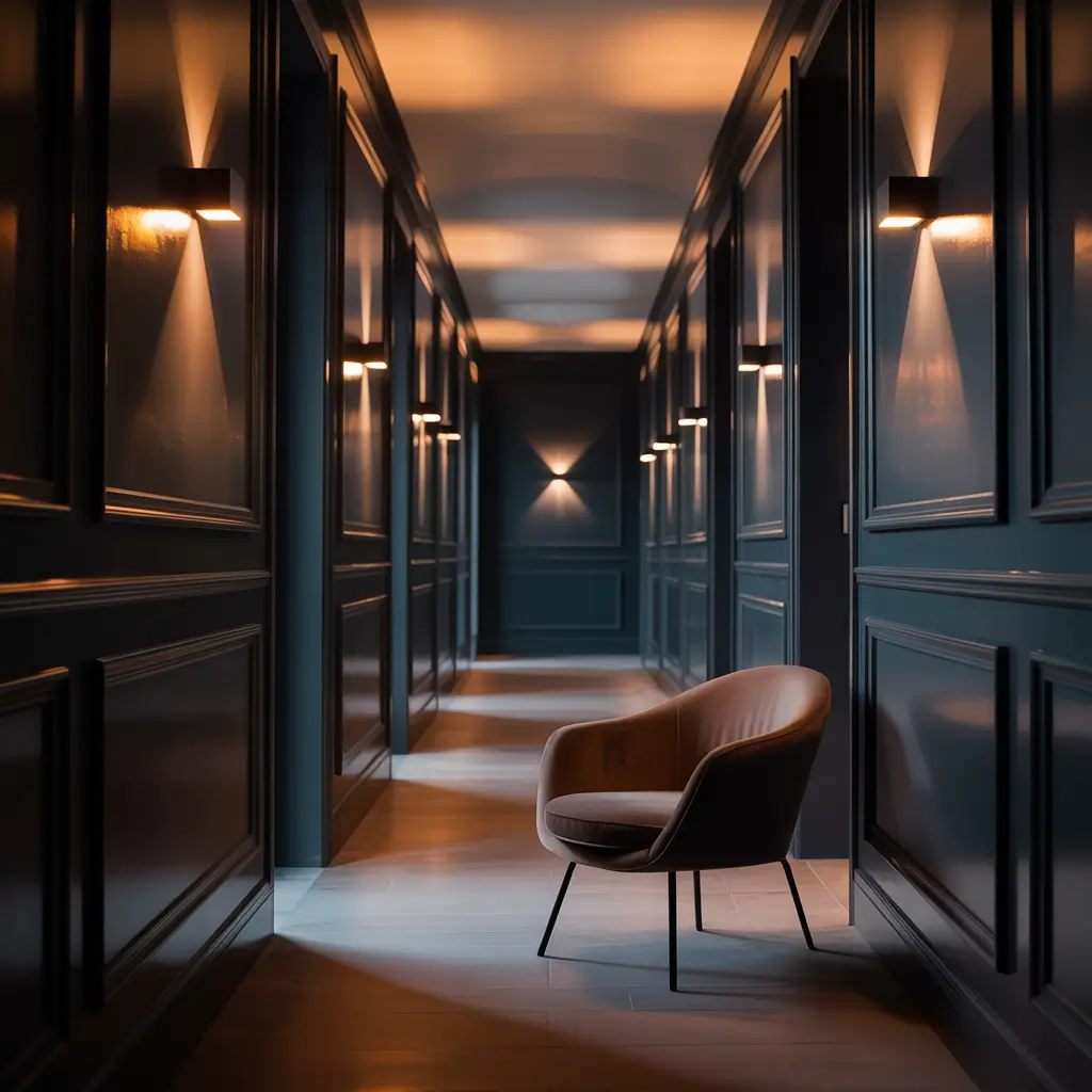
Trendy Gray Hallway Combinations
Gray might not be the “it” color anymore, but the right gray still creates sophisticated hallways that feel current, not dated. The key? Choose complex grays with interesting undertones.
Forget flat, boring builder gray. I’m talking about:
- Warm grays with taupe undertones
- Blue-grays that shift in different lights
- Green-grays for that trendy sage-adjacent look
- Purple-grays that feel mysterious
My current obsession is Benjamin Moore’s “Stonington Gray” – it reads blue in some lights, true gray in others. Paired with crisp white trim and black accents, it feels fresh and modern without trying too hard.
Gray also plays incredibly well with other colors. Use it as a base for colorful artwork, or pair it with a bold accent wall. It’s basically the Switzerland of paint colors – neutral but interesting.
Subtle Ombre Hallway Effects
Want something unique without going crazy? Ombre effects create subtle drama that feels artistic but approachable. This technique gradually transitions from one color to another (or from dark to light in the same color).
I attempted this in my sister’s hallway using three shades of blue, gradually lightening from floor to ceiling. Did it take forever? Yes. Was it worth it? Absolutely. The effect makes her low ceilings feel miles high.
Ombre techniques that work:
- Horizontal gradients for length illusion
- Vertical gradients for height effect
- Color-to-white for subtle impact
- Tonal variations in the same color family
IMO, the secret to nailing ombre is using colors from the same paint strip. They’re designed to work together, so the transition feels natural. Also, invest in a good blending brush – trust me on this one.
Jewel-Toned Hallway Inspiration
Jewel tones bring luxury and depth that makes hallways feel expensive, even on a budget. These rich, saturated colors create instant sophistication.
I painted a client’s hallway in Benjamin Moore’s “Gentleman’s Gray” (a deep blue with purple undertones), and everyone assumes she hired a designer. The color looks different at every time of day – sometimes navy, sometimes eggplant, always gorgeous.
Jewel tones that steal the show:
- Emerald greens for richness
- Sapphire blues for depth
- Amethyst purples for drama
- Ruby reds for warmth and energy
These colors love good lighting. Add picture lights, sconces, or even fairy lights to make them really sing. The way light plays off jewel tones creates this almost velvet effect that photographs beautifully.
Coastal-Inspired Hallway Colors
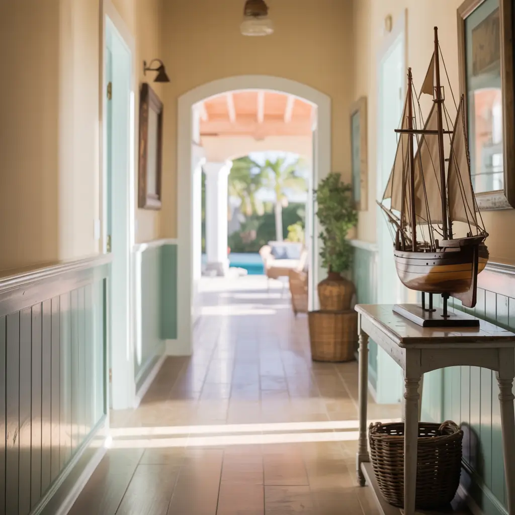
Bring beach vibes home with coastal colors that make every day feel like vacation. And no, I’m not talking about predictable nautical stripes (though if that’s your thing, go for it).
Modern coastal colors include:
- Soft aquas that suggest sea glass
- Sandy beiges with pink undertones
- Weathered grays like driftwood
- Seafoam greens that feel fresh
I used Sherwin Williams’ “Sea Salt” in my beach house hallway, and it’s perfect – green in some lights, blue in others, always calming. Paired with white shiplap and natural wood accents, it nails that relaxed coastal feel without screaming “beach theme.”
The best part about coastal colors? They work everywhere, not just beach houses. They bring light and calm to any space, making them perfect for busy hallways that need a chill vibe.
Conclusion
Your hallway deserves better than builder beige or whatever was there when you moved in. These 15 color ideas prove that hallways can be showstoppers, not afterthoughts.
Whether you go bold with jewel tones, keep it calm with coastal blues, or make a statement with two-tone walls, the right color transforms your hallway from a passage to a destination.
My advice? Start with samples. Paint large swatches and live with them for a few days. See how they look in morning light, afternoon sun, and evening darkness.
Your perfect hallway color is out there – sometimes you just need to be brave enough to try it. And hey, if you hate it? That’s what second coats are for.