15 Vibrant Modern Colorful Bedroom Ideas with Fresh Vibes
- Bedroom Design
 Ben
Ben- 0
- 42 minutes read
Remember that moment when you walked into a friend’s colorful bedroom and felt instantly energized? That happened to me last spring at my cousin’s housewarming.
Her bedroom walls were this gorgeous deep emerald green with coral accents, and I literally stood there thinking, “Why is my bedroom still beige?”
That night sparked my colorful bedroom obsession, and let me tell you, embracing color in the bedroom changed my entire morning mood – no more waking up to boring walls!
Here’s what I’ve discovered after helping redesign eight bedrooms (including three complete color disasters that we don’t talk about): modern colorful bedrooms aren’t about throwing rainbow paint everywhere and hoping for the best.
The secret lies in strategic color placement, understanding color psychology, and knowing when to stop before your bedroom looks like a bag of Skittles exploded. After plenty of trial and error, I’ve learned what makes colorful bedrooms feel sophisticated rather than chaotic.
Ready to kiss those neutral walls goodbye? Let’s explore 15 modern colorful bedroom ideas that prove bold choices lead to beautiful spaces.
Whether you’re a color newbie or ready to go full kaleidoscope, there’s an approach here that’ll transform your snooze zone into a vibrant sanctuary!
Bold Color-Blocked Bedroom
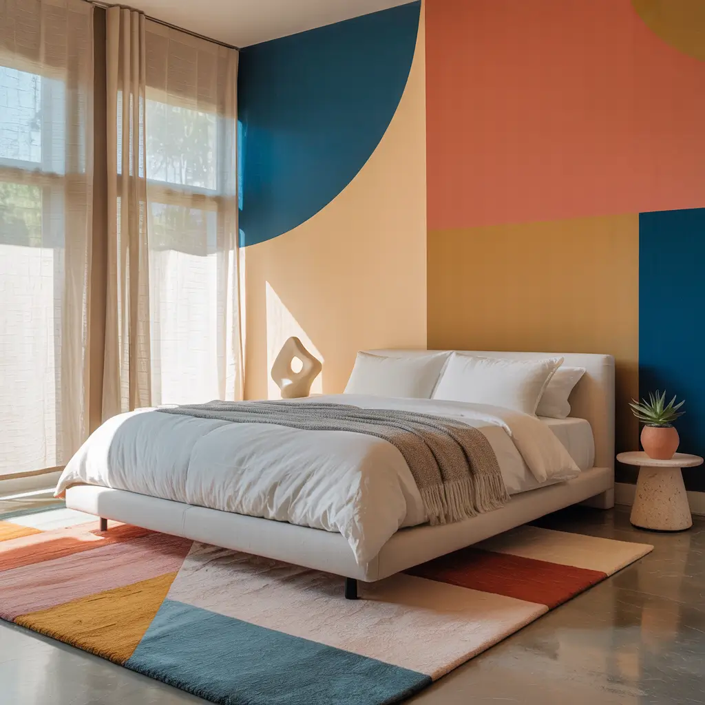
Color blocking transforms bedrooms into modern art installations you can sleep in. When my best friend showed me her color-blocked bedroom design on Pinterest, I thought she’d lost her mind. Three months later, her bedroom looked like it belonged in a design magazine, and I ate my words (they tasted like humble pie).
The technique involves using large blocks of solid colors on different walls or sections. We painted one wall cobalt blue, another coral, kept two walls white, and added a yellow closet door. Sounds crazy? The key is choosing colors from the same saturation level – all bold or all muted, never mixed. This creates harmony despite the variety.
Strategic furniture placement makes color blocking work. Position neutral furniture against colored walls and colorful pieces against white walls. This balance prevents visual overload while maximizing impact. Her white bed against the blue wall looks stunning, while the coral wall showcases her minimalist white desk. It’s controlled chaos at its finest!
Color Blocking Success Tips
- Choose colors from the same color wheel family or complementary opposites
- Keep 40% of walls neutral for breathing room
- Use painter’s tape for crisp lines (trust me on this)
- Test color combinations with large paper samples first
- Consider natural light when selecting colors
Pastel Paradise Retreat
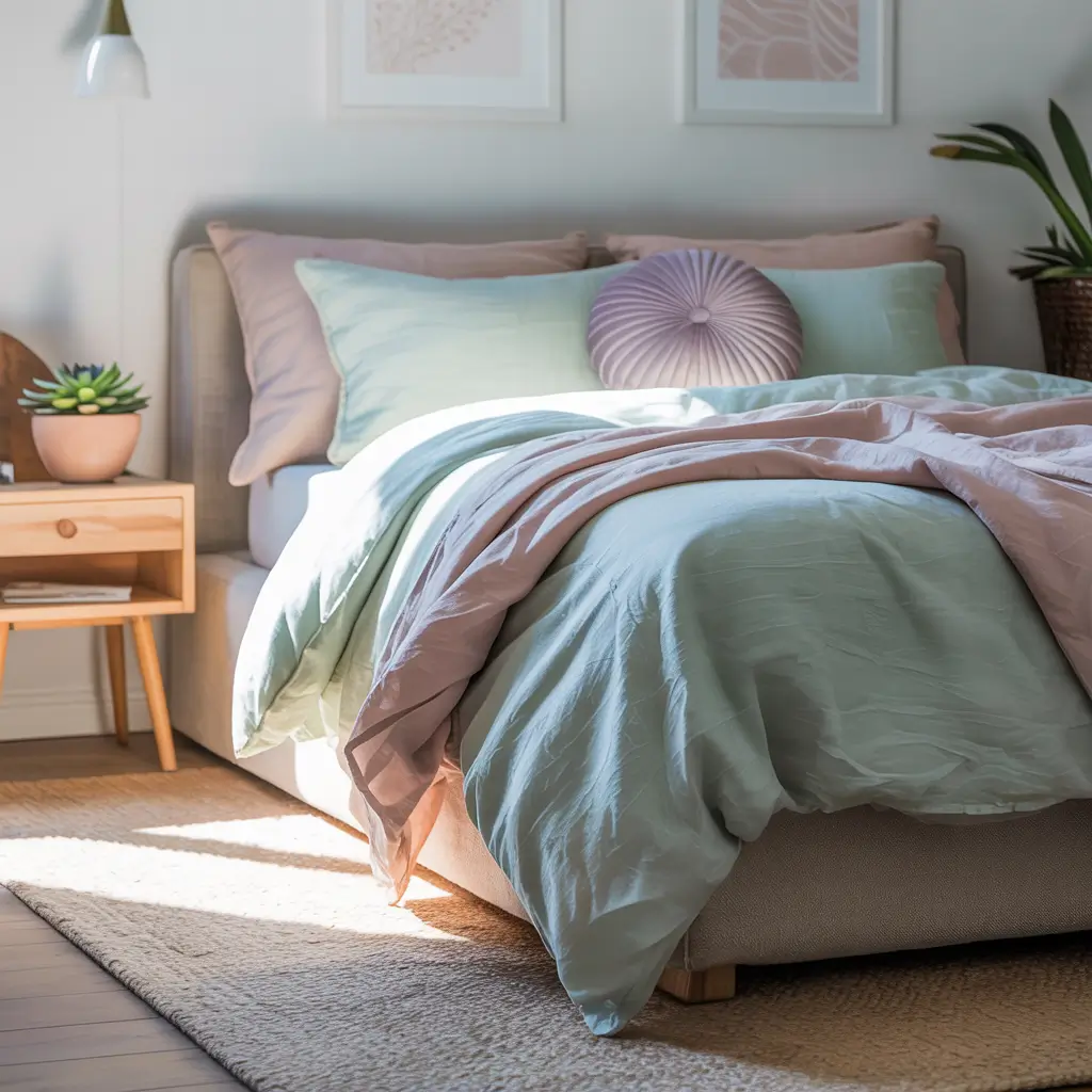
Pastels prove that colorful doesn’t have to mean loud. I designed a pastel bedroom for my teenage niece who wanted color but also needed a calming study space. We created this dreamy cloud of soft pinks, lavenders, mint greens, and butter yellows that feels like living inside a macaron box – in the best way possible.
The secret to sophisticated pastels lies in layering. We painted walls the palest pink (barely there, really) then added deeper pastel tones through bedding, artwork, and accessories. A mint green throw here, lavender pillows there, pale yellow curtains filtering sunlight. Each color whispers rather than shouts.
Grounding elements prevent pastel overload from feeling juvenile. White furniture, natural wood accents, and metallic hardware add structure to all that softness. We chose brushed brass fixtures that warm up the cool pastels beautifully. The result feels fresh and modern, not like a nursery. IMO, pastels are seriously underrated for adult spaces 🙂
Pastel Perfection Guidelines
- Layer different pastel shades for depth
- Include plenty of white to prevent sweetness overload
- Add natural textures like linen and wood
- Use metallics to sophisticate the palette
- Vary the saturation of your pastels
Vibrant Boho Modern Space
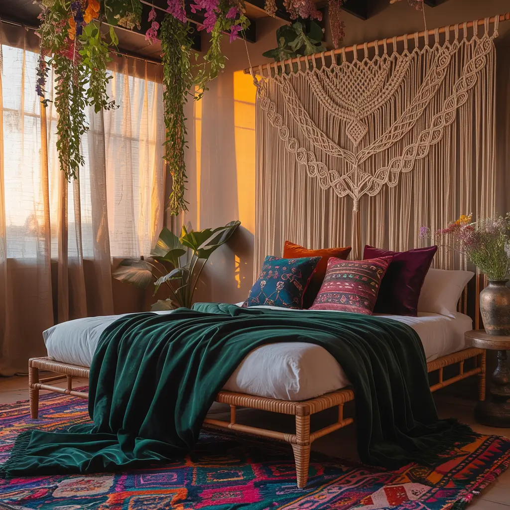
Modern boho brings controlled colorful chaos that feels intentional rather than accidental. My sister wanted a boho bedroom but worried about it looking too “college dorm.” We created a vibrant space using jewel tones, global textiles, and modern furniture that feels worldly and sophisticated.
The color palette draws from Moroccan souks and Indian textiles – deep teals, burnt oranges, fuchsias, and golds. But here’s the trick: we grounded everything with a neutral base. White walls let colorful textiles and artwork pop without competing. Her navy bed frame anchors the space while rainbow-hued pillows and throws add the boho spirit.
Mixing patterns within the same color story creates cohesion. Geometric Moroccan prints, paisley Indian textiles, and striped Mexican blankets all work together because they share color threads. We found a rug incorporating all her accent colors, which ties everything together brilliantly. Organized chaos never looked so good!
Boho Color Harmony
- Start with a neutral base (walls and large furniture)
- Choose a unifying color palette before shopping
- Mix patterns in the same color family
- Layer textiles for that collected-over-time feel
- Include plants for natural color pops
Also Read: 15 Beautiful Modern Boys Bedroom Ideas with Timeless Style
Jewel-Toned Elegance
Jewel tones create instant luxury without the luxury price tag. When my cousin wanted her bedroom to feel expensive on a teacher’s budget, we turned to rich emerald greens, sapphire blues, and amethyst purples. The depth of these colors adds sophistication that pale shades can’t match.
The key to jewel tones lies in balance and lighting. We painted one accent wall in deep emerald, used sapphire blue bedding, and added amethyst throw pillows. Too many dark colors can feel heavy, so we balanced with crisp white sheets and gold accents. The metals make jewel tones sparkle – literally and figuratively.
Lighting becomes crucial with deep colors. Layer your light sources – overhead, bedside lamps, and even some LED strips behind the headboard. We installed dimmers everywhere because jewel tones transform throughout the day. Morning light makes them vibrant; evening light turns them moody and romantic. Same room, different personalities!
Jewel Tone Mastery
- Choose 2-3 jewel tones maximum
- Balance with white or cream elements
- Add metallic accents (gold or brass work best)
- Invest in good lighting with dimmer options
- Use jewel tones in textiles if paint feels too bold
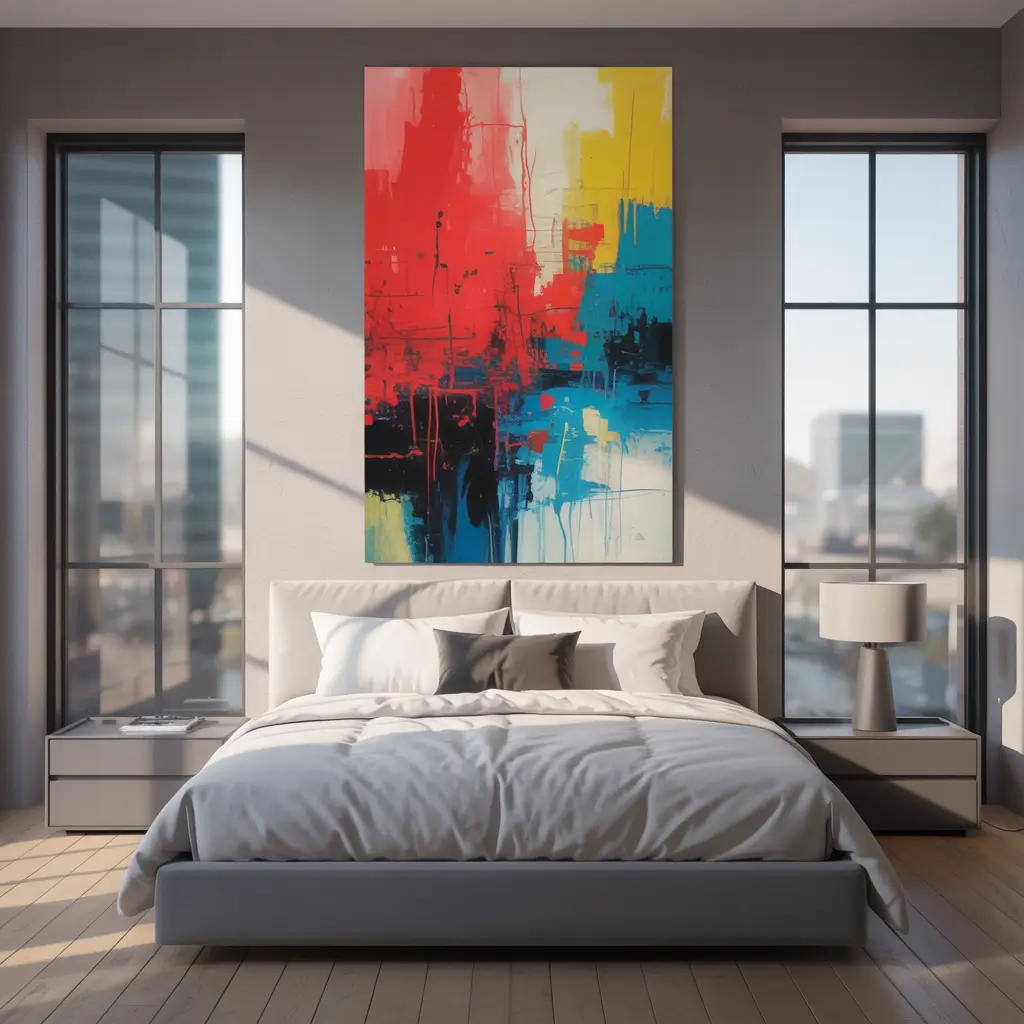
Color Pop Minimalist Room
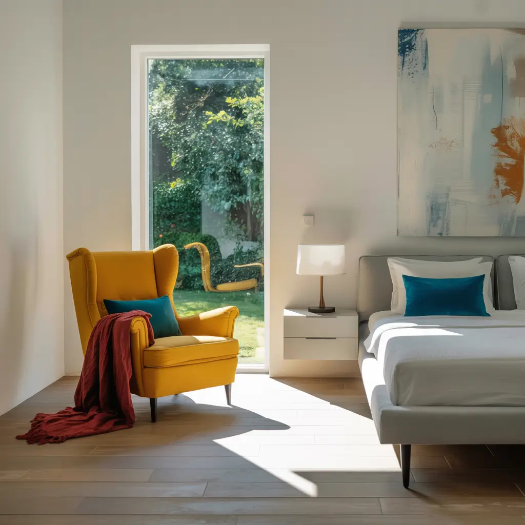
Minimalism doesn’t mean colorless – strategic pops of color can define a space. I helped my minimalist friend add color to her all-white bedroom without compromising her aesthetic. One vibrant element against a neutral backdrop creates more impact than a rainbow wall ever could.
We kept her white walls, white furniture, and white bedding but added one stunning coral pink chair. That single piece transformed the entire room’s energy. Later, she added a large abstract painting with coral, yellow, and teal – still minimalist but now with personality. The restraint makes each colorful element feel intentional.
The beauty of this approach lies in its flexibility. Swap out your color pop seasonally without repainting or major expense. Summer might bring a turquoise throw; winter could feature a mustard yellow bench. We even found colorful cord covers for her lamp – tiny details that make big differences in minimalist spaces.
Minimalist Color Strategy
- Choose one dominant pop color to start
- Keep 90% of the room neutral for balance
- Make color pops functional (chair, lamp, artwork)
- Quality over quantity always
- Consider seasonal swaps for variety
Tropical Modern Oasis

Tropical bedrooms transport you to vacation mode without the airfare. Modern tropical skips the kitsch for sophisticated island vibes. I created one for my beach-obsessed friend using coral, turquoise, lime green, and sunset orange – but strategically, not everywhere at once.
The approach starts with choosing your tropical inspiration. We picked Miami Art Deco meets Tulum minimalism, using clean lines with tropical colors. White walls got one coral accent wall, turquoise appeared in artwork and pillows, lime green came through plants (real ones!), and orange showed up in sunset-inspired curtains.
Natural elements ground tropical colors beautifully. Rattan furniture, jute rugs, and tons of plants prevent the space from feeling theme-parky. We added a rattan headboard that adds texture without competing with colors. The key is suggesting tropical paradise rather than recreating a tiki bar. Subtlety wins!
Tropical Without Tacky
- Limit tropical colors to 3-4 maximum
- Include natural materials throughout
- Real plants over palm print everything
- Modern furniture with tropical colors
- White space between colorful elements
Also Read: 15 Cozy Modern Girls Bedroom Ideas for Every Style
Sunset-Inspired Bedroom
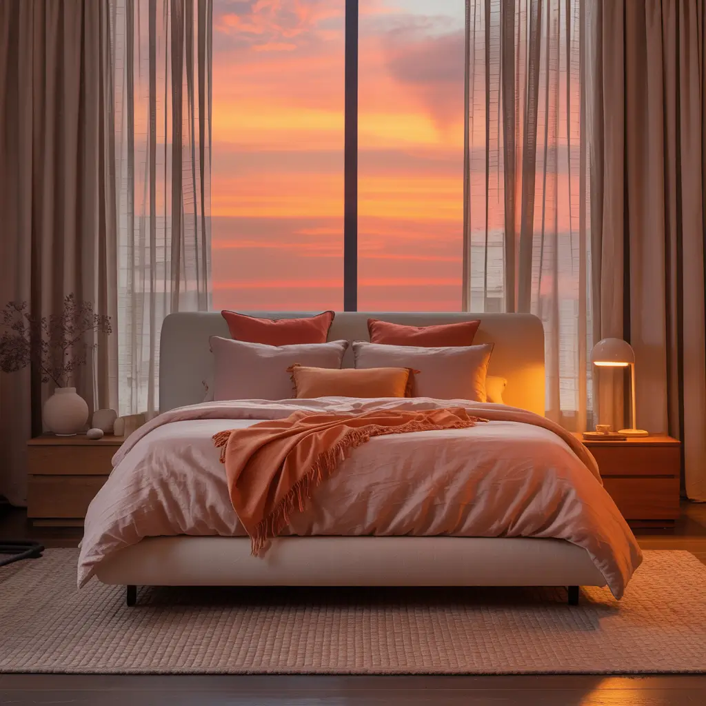
Sunset palettes create naturally harmonious colorful bedrooms. Nature already figured out which colors work together – we just need to copy! My own bedroom transformation started with a photo I took in Santorini. Those orange, pink, purple, and gold tones became my color roadmap.
We implemented the sunset gradient on one wall using a blended painting technique. Starting with deep purple at the bottom, blending through pink and orange, ending with pale yellow at the ceiling. Sounds complicated? It took practice, but YouTube University taught me well. The other walls stayed white to let the sunset wall star.
The rest of the room pulls individual colors from the gradient. Orange throw pillows, pink curtains, purple artwork, gold hardware – each element references the sunset without repeating it. Natural light changes the wall throughout the day, creating an ever-shifting art piece. Morning light emphasizes yellows; evening brings out purples.
Sunset Color Magic
- Study actual sunset photos for color inspiration
- Blend colors gradually for authentic effect
- Pull accent colors from your gradient
- Keep other walls neutral for balance
- Consider the room’s natural light direction
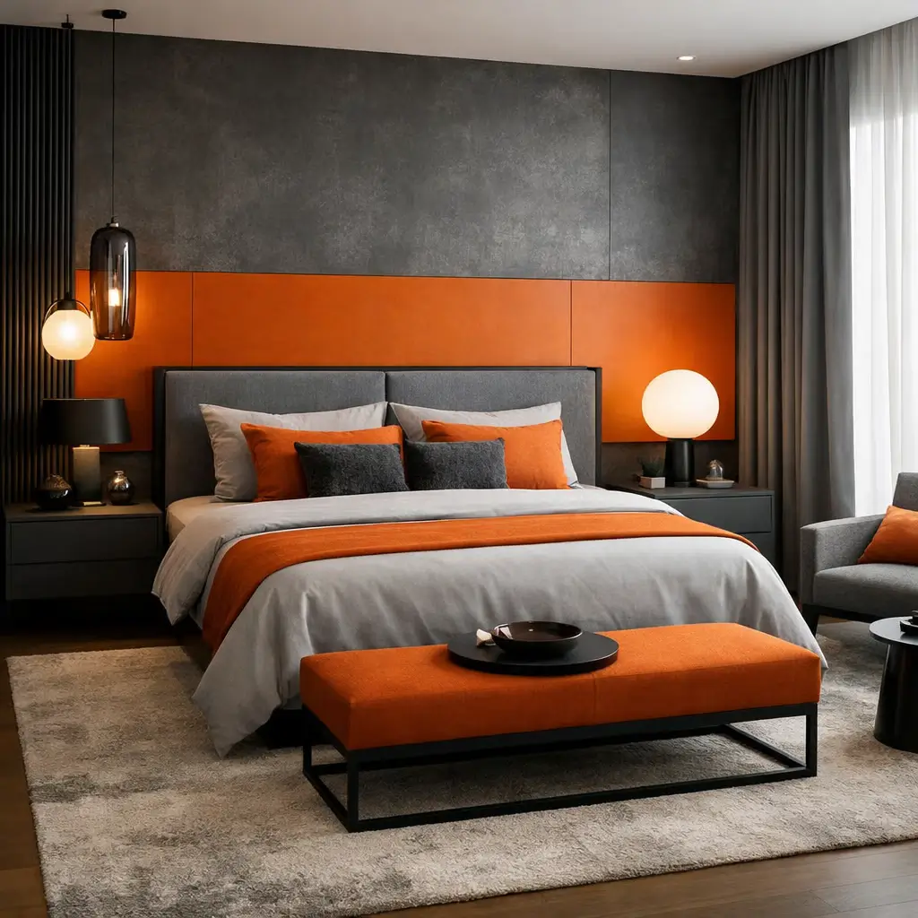
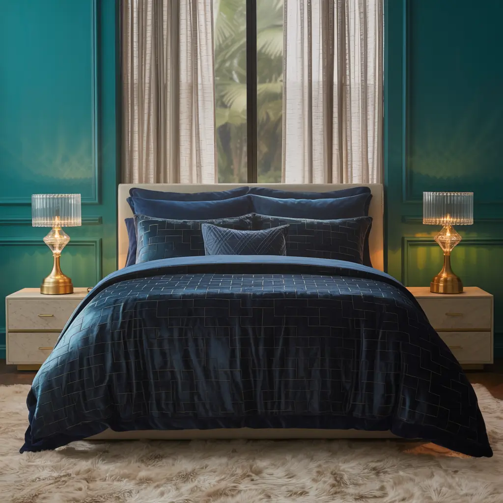
Moody Teal and Gold Haven
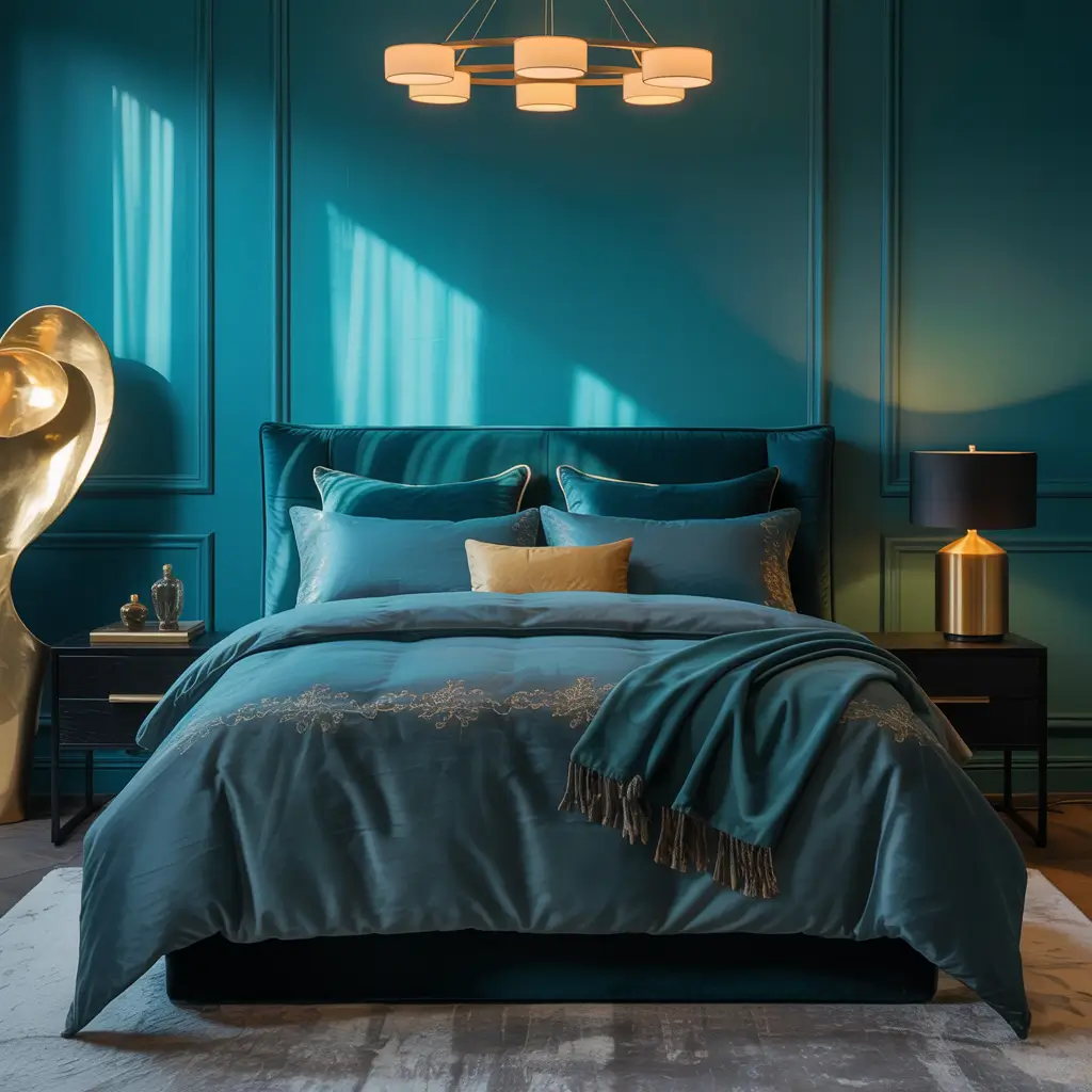
Teal and gold creates sophisticated drama perfect for modern bedrooms. This combo walked into my life when I helped redesign my brother’s guest room. He wanted something memorable but not overwhelming – teal and gold delivered exactly that boutique hotel vibe.
The proportion matters enormously. We used teal as the dominant color (walls and bedding) with gold as the accent (hardware, lighting, artwork frames). Too much gold feels gaudy; too little gets lost. The 80/20 rule worked perfectly – 80% teal elements, 20% gold touches throughout.
Texture variety keeps this color combo interesting. Velvet teal pillows, silk gold curtains, matte wall paint – each surface interacts with light differently. We found this amazing teal grasscloth wallpaper for one wall that adds subtle texture. Gold appears in mirror frames, lamp bases, and drawer pulls. Cohesive yet complex!
Teal and Gold Balance
- Deep teal over bright turquoise for sophistication
- Warm gold over cool silver accents
- Mix textures in both colors
- Layer different teal shades for depth
- Strategic gold placement for maximum impact
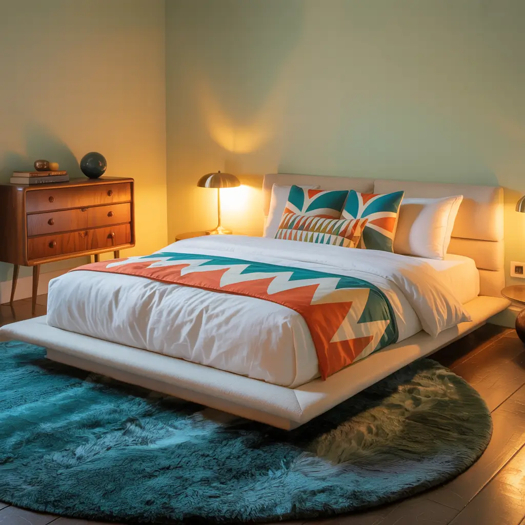
Rainbow Accent Wall Design

Rainbow walls don’t have to look like kindergarten classrooms. Modern rainbow designs use sophisticated color gradients or geometric patterns. My friend’s daughter wanted rainbows; her parents wanted style. We compromised with an abstract rainbow wall that satisfied everyone.
Instead of traditional arch shapes, we created vertical stripes in rainbow order but muted tones. Think dusty rose, burnt orange, mustard yellow, sage green, steel blue, and lavender – rainbow sequence but sophisticated shades. Each stripe varies in width for visual interest. It reads as artistic rather than childish.
The rest of the room stays neutral to let the rainbow wall shine. White furniture, gray bedding, and minimal accessories prevent color competition. We added a few pillows pulling colors from the wall, but restraint keeps it modern. The wall provides all the color excitement needed. FYI, this also photographs amazingly for social media :/
Rainbow Done Right
- Choose muted rainbow shades over primaries
- Vary stripe widths for interest
- Keep everything else neutral absolutely
- Consider geometric patterns over traditional arches
- Test with removable strips first
Also Read: 15 Bold Modern Masculine Bedroom Ideas for Confident Style
Artistic Abstract Bedroom
Abstract art inspires bedrooms that feel like sleeping in galleries. My artist friend wanted her bedroom to reflect her creative spirit without hanging actual paintings everywhere. We turned her walls into abstract art using bold color combinations and organic shapes.
The design started with choosing a color story – coral, teal, mustard, and white. Using painter’s tape and patience, we created large abstract shapes across two walls. Think Matisse cutouts meet modern design. Each shape flows into the next, creating movement and energy throughout the space.
Furniture placement works with the abstract design. Position pieces to complement, not compete with wall shapes. Her bed sits partially within a coral curve, making it feel integrated rather than just placed. The abstract theme continues in bedding with abstract printed pillows and throws. Living art at its finest!
Abstract Art Approach
- Plan your design on paper first
- Use 3-4 colors maximum
- Create flow between shapes
- Consider furniture placement in design
- Embrace imperfection – it’s art!
Modern Retro Color Mix
Modern retro brings ’70s color energy with contemporary sophistication. When my neighbor wanted to channel retro vibes without the full shag carpet commitment, we created a modern interpretation using burnt orange, olive green, and chocolate brown – but make it fresh.
The update comes through proportion and application. Instead of overwhelming orange walls, we chose one burnt orange accent wall. Olive green appears in a gorgeous velvet headboard. Chocolate brown grounds everything through wooden furniture. Add cream elements to lighten the palette, and suddenly the ’70s feel current
Modern shapes keep retro colors contemporary. Clean-lined furniture, geometric patterns, and minimal accessories prevent time-warp syndrome. We found this amazing abstract rug incorporating all three colors in a modern pattern. It bridges retro inspiration with current design perfectly. Groovy meets grown-up!
Retro Modern Rules
- Update retro colors with modern proportions
- Mix with contemporary furniture shapes
- Include plenty of white or cream
- Avoid period-specific patterns
- One retro element per surface maximum
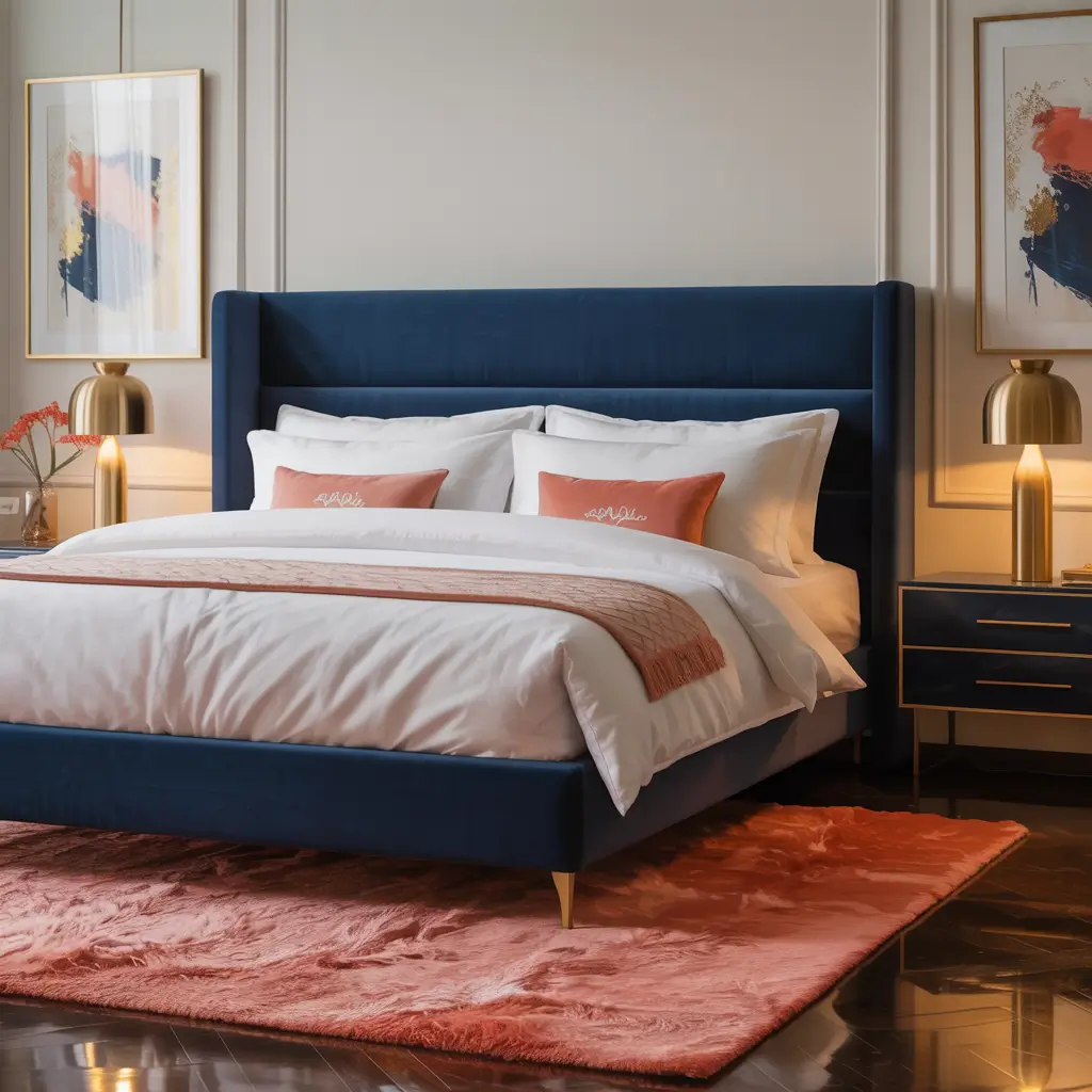
Chic Coral and Navy Palette
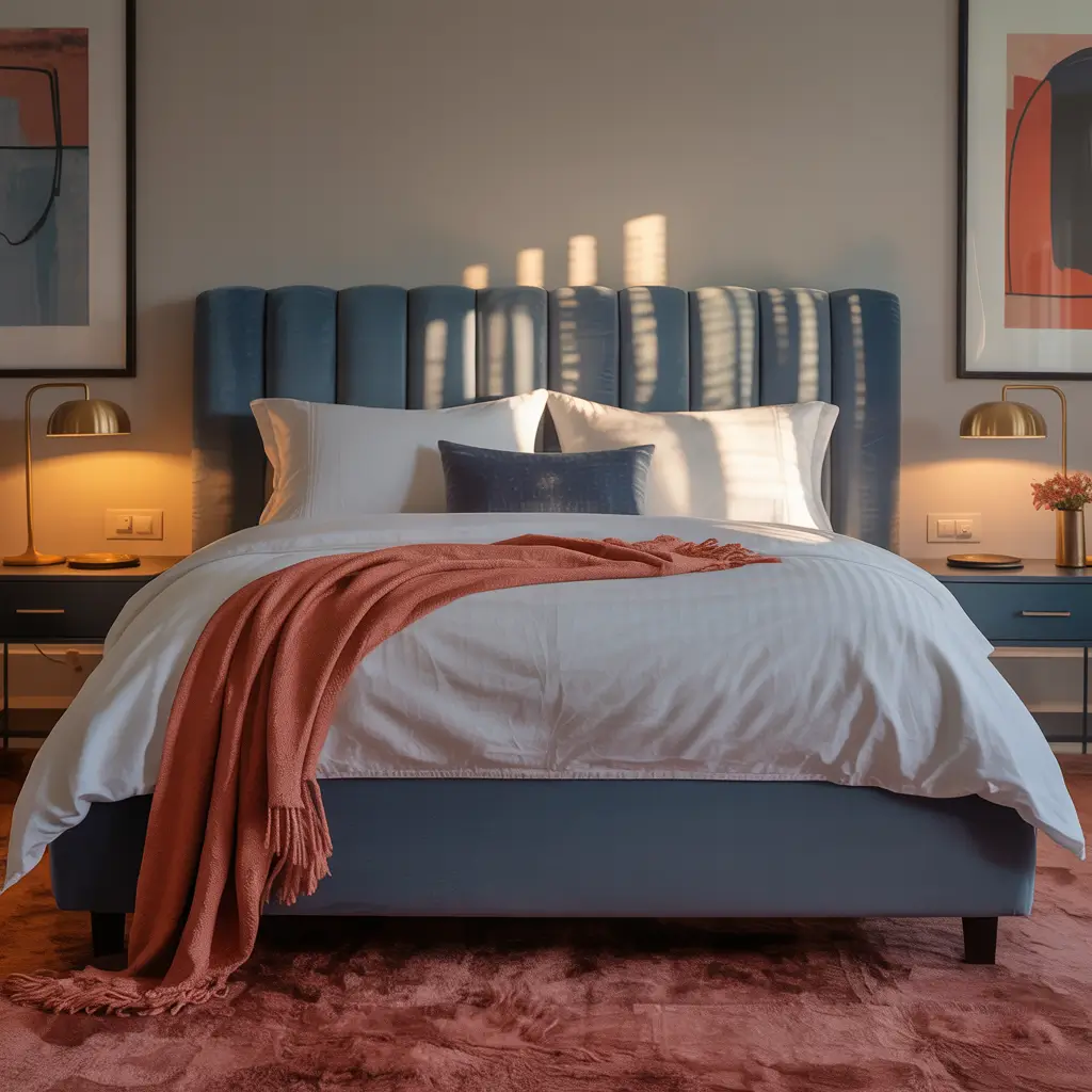
Coral and navy creates preppy sophistication with a twist. This unexpected combo landed in my radar when redesigning my cousin’s bedroom. She wanted something unique but timeless – coral and navy delivered both without feeling trendy or temporary.
The balance between warm coral and cool navy needs careful consideration. We used navy as the grounding color (bedding, curtains, and one accent wall) with coral providing energy (artwork, pillows, and a stunning coral dresser). White walls and furniture pieces mediate between the two contrasting temperatures.
Patterns help marry these opposing colors. Stripes, geometrics, or florals incorporating both colors create visual bridges. We found perfect curtains with a modern geometric pattern using coral, navy, and white. They tie everything together while adding graphic interest. Sometimes the right pattern solves everything!
Coral Navy Harmony
- Navy as the base coral as accent
- White elements for balance
- Mixed patterns incorporating both colors
- Vary the shades of each color
- Natural textures soften the contrast
Botanical Green Modern Room
Green bedrooms connect us to nature while creating incredibly versatile colorful spaces. My plant-obsessed friend wanted a botanical bedroom that went beyond just adding plants. We created a modern jungle using various green shades that feels fresh, never overwhelming.
The green palette ranges from sage to forest, mint to olive. We painted walls sage green – calming but not boring. Darker green appears in bedding and curtains, while lighter greens show up in artwork and accessories. The variety creates depth while maintaining the botanical theme throughout.
Actual plants amplify the botanical vibe. Mix real plants with green decor for layers of natural color. We installed floating shelves specifically for her plant collection, creating a living wall effect. Natural wood furniture and white accents prevent green overload. It’s urban jungle meets modern design!
Green Scene Guidelines
- Layer multiple green shades for interest
- Include natural wood elements
- Add actual plants to enhance theme
- White accents prevent overwhelm
- Consider green’s undertones (blue vs. yellow)
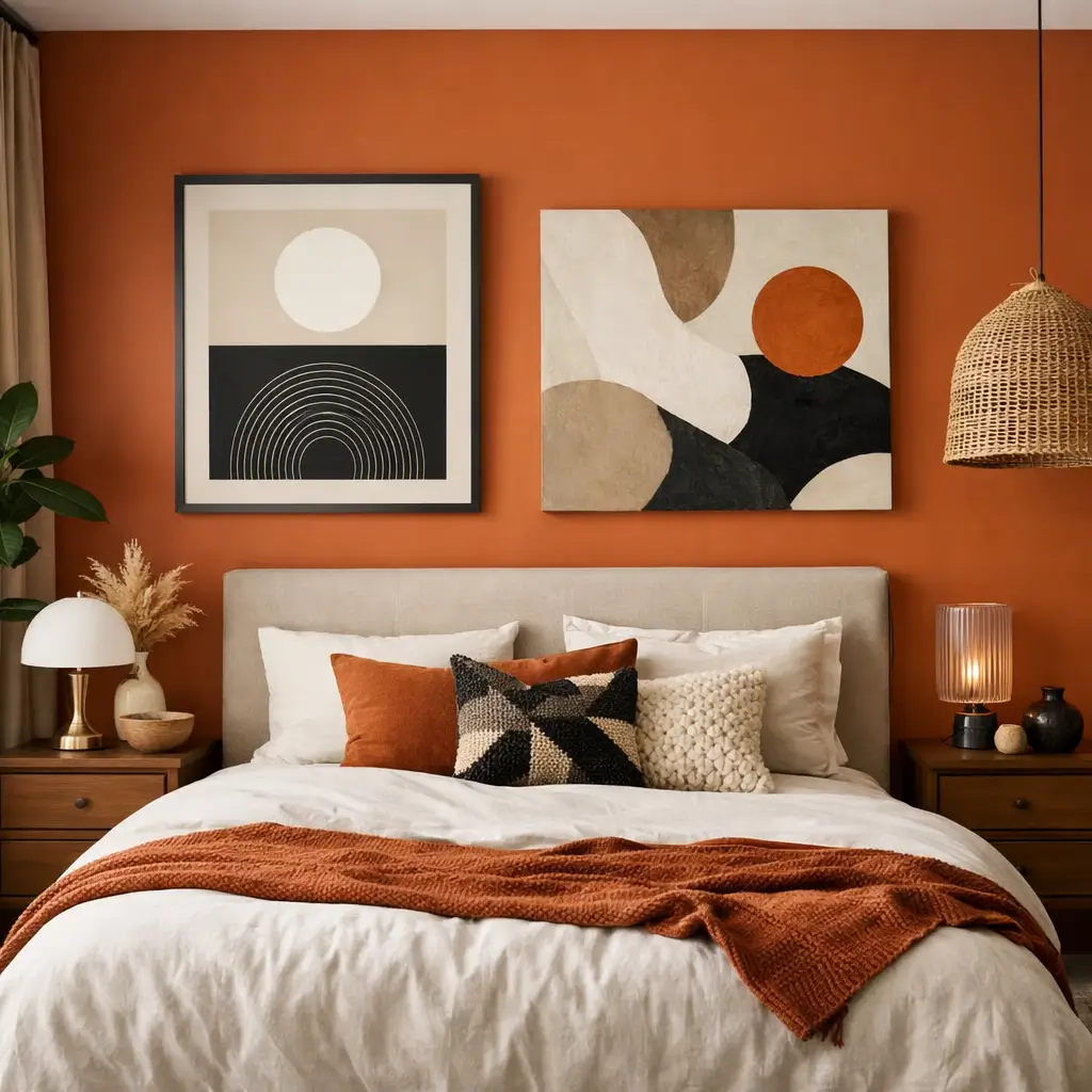
Terracotta Warmth Bedroom
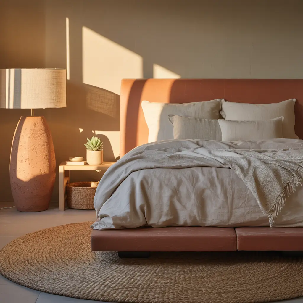
Terracotta brings earthy warmth that makes bedrooms feel like Mediterranean retreats. This trending color walked into my life through Instagram, but implementing it required more thought than double-tapping. My latest project proved terracotta works brilliantly in modern bedrooms when balanced properly.
The shade selection matters enormously. True terracotta can feel heavy; we chose a lighter clay tone with pink undertones. One terracotta wall anchors the space while terracotta textiles (pillows, throws, artwork) spread the warmth throughout. Cream and white elements keep things bright and modern.
Complementary colors enhance terracotta beautifully. Deep blues, sage greens, and warm creams all play nicely with terracotta’s earthy vibe. We added navy blue curtains and sage green plants, creating a sophisticated color story. The warmth of terracotta makes every other color feel cozier!
Terracotta Triumph
- Choose the right shade for your light
- Balance with cool colors for contrast
- Include natural textures throughout
- Layer different terracotta tones
- White space prevents heaviness
Modern Multi-Color Gallery Wall
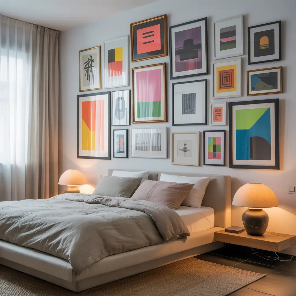
Gallery walls offer controlled ways to introduce multiple colors without painting commitment. My indecisive friend couldn’t choose just one color scheme – the gallery wall solution let her have them all while maintaining sophistication. Strategic curation makes the difference between art collection and chaos.
The key lies in finding common threads. We chose artwork sharing similar color intensities – all bold or all muted, never mixed. Her collection includes abstract prints, photographs, and illustrations in coral, teal, yellow, and green. The consistent saturation level creates harmony despite color variety.
Frame selection unifies diverse artwork. All white frames create cohesion regardless of art style or color. We arranged pieces considering color distribution – no clustering of similar colors. The wall reads as one cohesive installation rather than random hanging. Planned spontaneity at its finest!
Gallery Wall Greatness
- Unify through frame color or style
- Plan layout on floor first
- Distribute colors evenly throughout
- Include some neutral pieces for breathing room
- Consider the wall color as background
Creating Your Colorful Sanctuary
There you have it – 15 modern colorful bedroom ideas that prove beige isn’t the only option for sophisticated spaces.
Whether you start with one coral chair or go full rainbow wall, remember that color should energize and inspire you daily. Your bedroom sets the tone for your entire day, so why not make it colorful?
My biggest advice? Start with colors that genuinely make you happy, not just what’s trending on Instagram. Test paint samples in your actual lighting conditions, live with them for a few days, and trust your instincts.
The best colorful bedrooms reflect their inhabitants’ personalities while creating spaces that function beautifully.
Remember, you can always start small. Maybe it’s colorful bedding against neutral walls or one vibrant piece of art.
Once you experience waking up to color, you’ll wonder why you waited so long. Now stop pinning inspiration and start painting – your colorful transformation awaits!