10 Elegant Statement Powder Room Ideas for Modern Homes
- Bathroom Design
 Ben
Ben- 0
- 51 minutes read
Your powder room is beige, boring, and basically invisible. Mine was too, until I realized something crucial: statement powder rooms are where you get to be fearless with design.
I painted my first powder room walls black three years ago (against everyone’s advice), and suddenly people started asking for house tours. For a bathroom. Let that sink in.
Here’s the thing about statement powder rooms – they’re your permission slip to go absolutely wild with design choices you’d never attempt elsewhere. Bold wallpaper that costs $200 a roll? Totally doable when you only need two rolls.
That dramatic paint color you’ve been fantasizing about? Way less scary in 25 square feet. I’ve transformed six powder rooms now (yes, I have a problem), and each one taught me that the boldest choices create the most memorable spaces.
The best part? Statement powder rooms require minimal square footage and minimal budget to create maximum impact.
Ready to turn that forgettable bathroom into the room everyone talks about at dinner parties? Let’s explore the statement powder room ideas that actually deliver.
Bold Wallpaper & Gold Accents
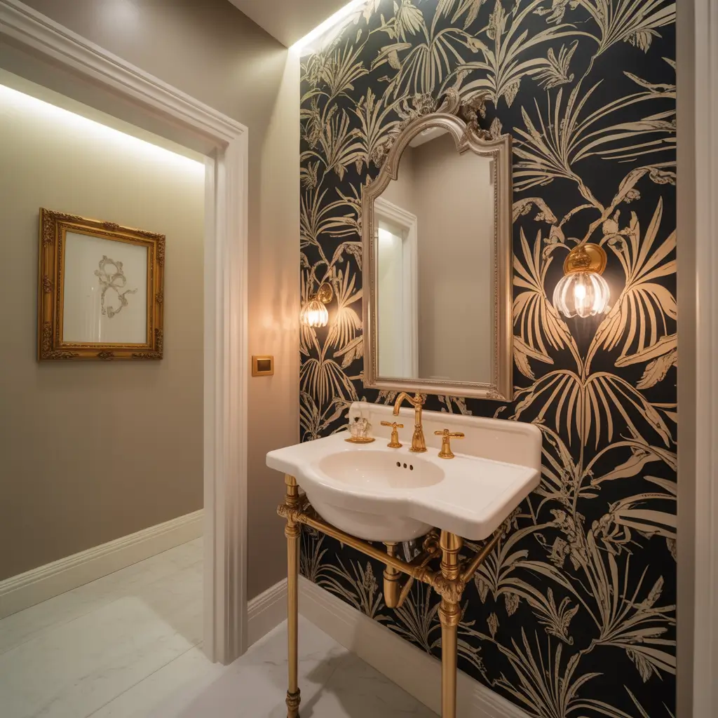
Bold wallpaper paired with gold fixtures creates instant luxury that makes guests do double-takes. I installed a dramatic black floral wallpaper with oversized peonies in my powder room last year, added brushed gold faucets, and now every single visitor asks to take photos in there. Every. Single. One.
The combination works because wallpaper provides the drama while gold adds warmth and prevents the boldness from feeling harsh. My wallpaper cost $180 for two rolls, the gold faucet was $120, and together they transformed my basic builder-grade powder room into something that looks like it belongs in a design magazine.
Choosing Bold Wallpaper
What makes wallpaper truly statement-worthy:
- Large-scale patterns create drama without chaos
- Metallic elements catch light beautifully
- Dark backgrounds make small spaces feel intimate
- Unexpected color combinations stop people in their tracks
- Textured wallpaper adds another dimension
I tested three different wallpapers before committing (thank goodness for samples!). What looked amazing online sometimes felt overwhelming in person. Always order samples and live with them for a few days.
Gold Accent Execution
Strategic gold placement maximizes impact:
- Faucets and fixtures as primary gold elements
- Mirror frames for secondary sparkle
- Light fixtures for overhead glamour
- Cabinet hardware for subtle consistency
- One unexpected gold element for personality
The biggest mistake I see? Going halfway with gold. If you choose gold faucets, commit to gold throughout. Mixing gold and chrome looks indecisive, not eclectic.
Making the Combination Work
Here’s my formula for wallpaper and gold success:
- Keep 70% of the room in your bold wallpaper
- Use gold for 20% of visual weight
- Leave 10% as neutral breathing room
- Install proper lighting to showcase both elements
- Keep accessories minimal so wallpaper and gold shine
I learned this ratio the hard way after my first attempt included way too many gold accessories. The space felt cluttered rather than luxurious. Now I’m ruthless about editing.
Black & White Contrast Design
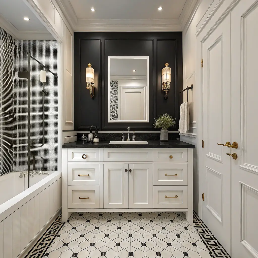
Black and white powder rooms create timeless graphic impact that never goes out of style. My sister’s powder room features black hexagon tiles, white grout, and matte black fixtures, and it’s looked fresh and current for four years straight. No trendy colors to regret here.
The stark contrast between black and white eliminates the need for additional decoration. The pattern IS the decoration. Plus, this combination photographs incredibly well, which matters if you’re even slightly into sharing your home on social media.
Creating Maximum Contrast
Ways to amplify black and white drama:
- Contrasting grout color makes tile patterns pop
- Mix matte and glossy finishes for depth
- Add geometric patterns through tile layout
- Include both colors in every sightline
- Use lighting to emphasize contrast
My sister chose white subway tiles with black grout, and the grid effect creates this stunning graphic punch. With white grout, the whole thing would have blended into boring.
Balancing the Stark Look
Prevent black and white from feeling cold:
- Add one warm wood element (mirror frame, shelf)
- Choose warm white over stark bright white
- Include brass or gold as a third accent
- Use warm lighting (never cool LED)
- Add one organic element like a plant
The warmth element is crucial. I’ve seen pure black and white powder rooms that feel like hospital bathrooms. Adding a walnut mirror frame or brass faucet makes all the difference.
Pattern Possibilities
Black and white pattern options:
- Classic checkerboard for retro vibes
- Hexagon tiles for modern geometry
- Striped walls for drama
- Moroccan-inspired tiles for global flair
- Marble with heavy black veining
Jewel-Toned Powder Room Elegance
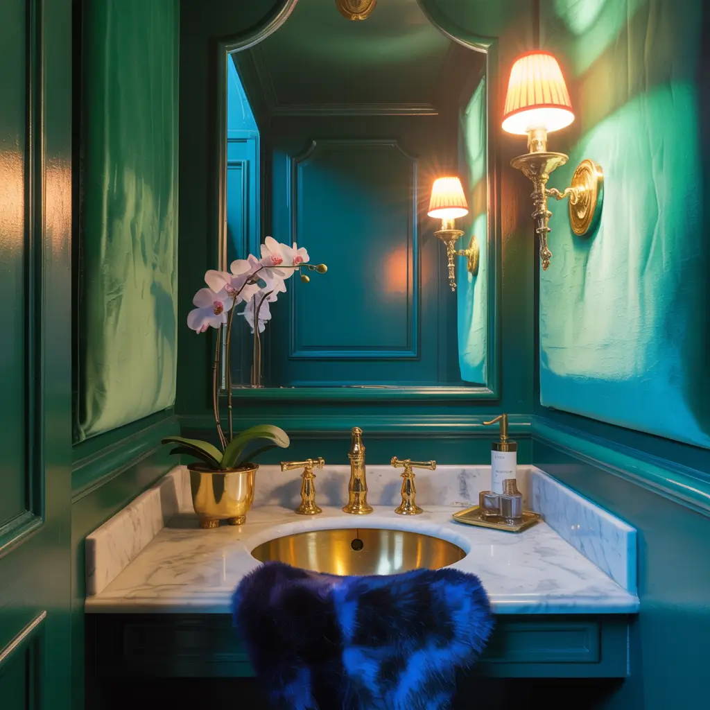
Jewel tones transform powder rooms into luxurious little treasure boxes. I painted my current powder room deep sapphire blue, and visitors literally gasp when they open the door. The richness of jewel tones creates instant sophistication without trying too hard.
The psychology behind jewel tones is fascinating – our brains associate these colors with actual gemstones, which automatically registers as valuable and special. My $40 can of sapphire paint makes my powder room feel more expensive than my living room that cost thousands to furnish.
Selecting Your Jewel Tone
Perfect jewel tone options:
- Emerald green for natural elegance
- Sapphire blue for regal sophistication
- Ruby red for bold drama
- Amethyst purple for unexpected luxury
- Topaz orange for warm richness
I tested five different jewel tones before choosing sapphire. The undertones matter enormously – some blues lean purple, others green, some gray. Test in your actual lighting before committing to gallons.
Enhancing Jewel-Tone Richness
Make jewel tones sing:
- Use semi-gloss or high-gloss paint for depth
- Add metallic accents (gold or brass, never chrome)
- Include one mirror to reflect the color
- Layer multiple shades of your chosen tone
- Install layered lighting to showcase richness
The gloss level makes or breaks jewel tones. I initially used matte sapphire, and it looked flat and dull. Semi-gloss transformed it into something that actually looks like a gem.
Preventing Overwhelming Darkness
Keep jewel tones sophisticated, not oppressive:
- Paint just one or two walls in the jewel tone
- Keep ceiling white or cream
- Add plenty of light sources
- Include white fixtures for contrast
- Use large mirrors strategically
Also Read: 12 Elegant Powder Room Inspiration Ideas and Luxe Touches
Artistic Wall Murals
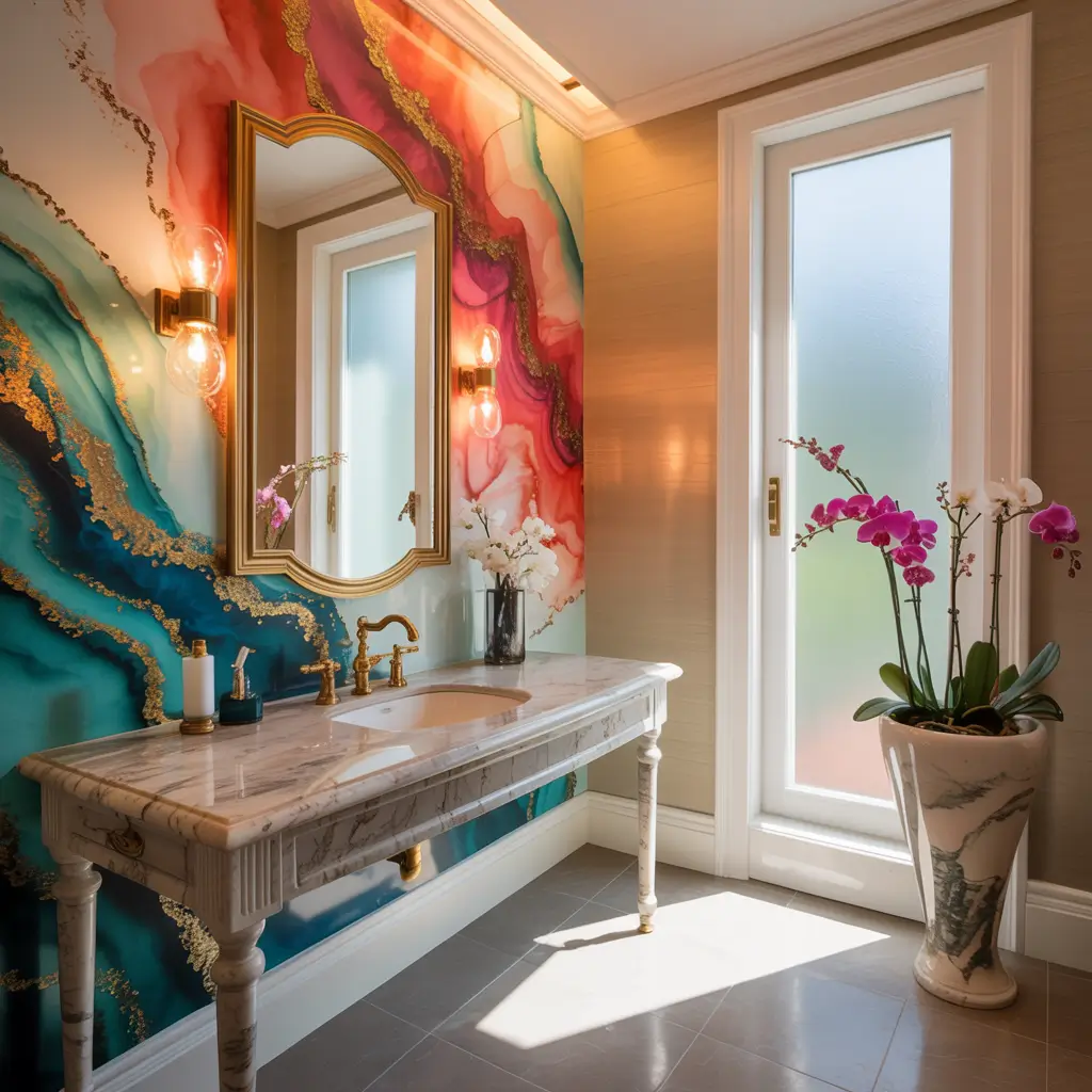
Wall murals turn powder rooms into immersive art experiences. My friend commissioned a custom mural of a tropical forest for her powder room, and now guests spend way too long in there admiring it. She’s genuinely had to knock on the door to check if people are okay 🙂
The beauty of murals in powder rooms is the freedom to go completely artistic without worrying about practicality. You’re not cooking next to it or sleeping under it. It’s pure visual impact for two-minute visits, which is exactly what murals excel at.
Mural Options and Sources
Where to find statement-worthy murals:
- Custom artists for one-of-a-kind pieces
- Removable mural wallpaper for commitment-phobes
- Hand-painted murals for authentic artistry
- Digital print murals for photographic realism
- Stenciled murals for DIY budget options
I helped another friend install removable mural wallpaper, and it went up in three hours. The technology has gotten insanely good – nobody can tell it’s not hand-painted unless they touch it.
Choosing Mural Subjects
Subjects that work in powder rooms:
- Nature scenes (forests, gardens, oceans)
- Abstract art for modern spaces
- Geometric patterns for contemporary
- Vintage botanical illustrations
- Cityscapes for urban sophistication
The scale matters tremendously. Small, detailed murals get lost in powder rooms. Go bold and oversized for maximum statement impact.
Installation and Styling
Making murals work:
- Keep all other walls neutral
- Choose fixtures that complement mural colors
- Add lighting to showcase the artwork
- Keep accessories absolutely minimal
- Let the mural be the only focal point
My friend’s tropical mural is paired with simple white fixtures and zero accessories. The restraint lets the mural shine completely.
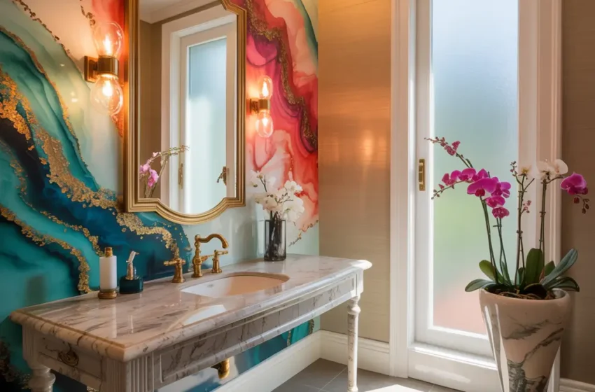
Luxe Marble & Metallic Fixtures
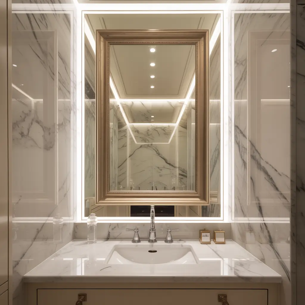
Marble and metallic fixtures together scream luxury without saying a word. I splurged on Calacatta marble for my powder room walls (yes, walls, not just counters), paired it with unlacquered brass fixtures, and created a space that looks like it cost five times what I actually spent.
The combination works because cool marble balances warm metallics perfectly. The natural veining in marble provides organic pattern while metallic fixtures add that human-made refinement. Together, they create this perfect marriage of nature and craftsmanship.
Marble Selection Strategy
Choosing the right marble:
- Calacatta offers dramatic veining for maximum impact
- Carrara provides subtle gray veining for softer look
- Emperador adds warm brown tones
- Nero Marquina brings black marble drama
- Green marble for unexpected color
I almost chose Carrara for budget reasons, but splurging on Calacatta made the difference between nice and absolutely stunning. In a small powder room, the extra cost is manageable.
Metallic Finish Options
Choosing your metallic:
- Unlacquered brass develops beautiful patina
- Brushed brass stays consistent and modern
- Polished brass brings traditional glamour
- Copper adds warm, unique character
- Mixed metals work if intentional
FYI, I chose unlacquered brass specifically because I wanted the living finish. Watching it develop patina over the past year has been unexpectedly satisfying. Each powder room develops its own unique character.
Balancing Luxury Elements
Prevent luxury from becoming overwhelming:
- Keep proportions reasonable (not all marble)
- Mix marble with simpler materials
- Choose one metallic finish and commit
- Add simple white elements for breathing room
- Include natural wood for warmth
Geometric Tile Statement Walls
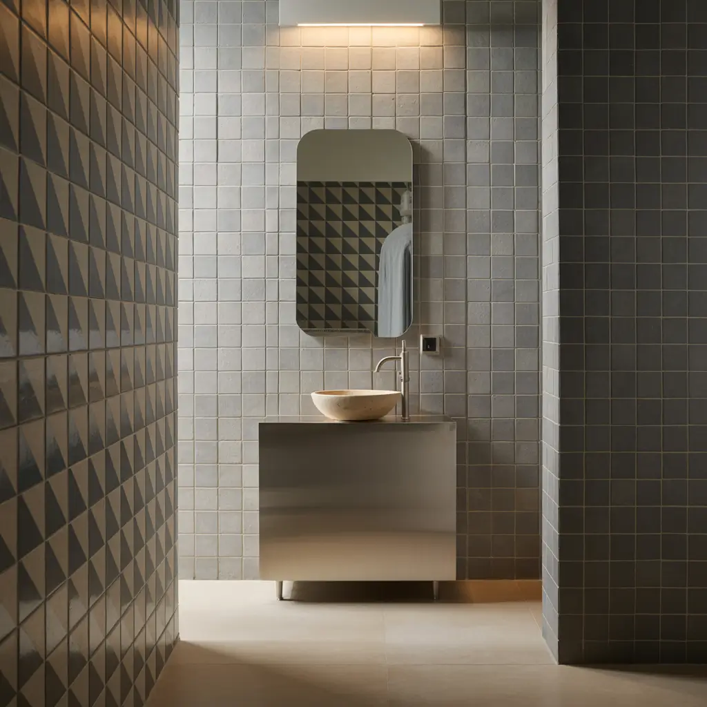
Geometric tiles create instant visual interest that turns boring walls into conversation pieces. I installed large hexagon tiles on my powder room’s back wall in a mix of navy and white, and it’s literally the first thing everyone notices and photographs.
The repetitive geometric pattern creates movement and energy without needing any additional decoration. The tiles ARE the artwork. Plus, tile provides practical water resistance while looking absolutely gorgeous.
Pattern and Shape Selection
Geometric tile options that wow:
- Hexagons for modern honeycomb effect
- Moroccan shapes for exotic flair
- Chevron patterns for dynamic energy
- Triangles for edgy contemporary
- Mixed geometric for maximum complexity
I chose large hexagons (8 inches) over small ones, and the scale makes a huge difference. Small geometric tiles can feel busy in tiny spaces, while larger ones create bold impact.
Color and Material Choices
Making geometric tiles pop:
- High contrast colors for maximum drama
- Metallic tiles for light play
- Matte and glossy tiles mixed together
- Monochrome for sophisticated restraint
- Bold color combinations for fearless statements
The grout color matters as much as tile color. I used dark gray grout, which emphasizes the geometric pattern without harsh black-and-white contrast.
Installation Considerations
Getting geometric tile right:
- Hire a professional (seriously, geometric patterns are unforgiving)
- Start with a level centerline
- Plan your layout to avoid awkward cuts
- Use spacers religiously
- Seal everything properly
I tried DIY geometric tile installation once. Once. Never again. The precision required is no joke, and crooked patterns ruin the entire effect.
Also Read: 10 Trendy Green Powder Room Ideas and Modern Accents
Dark Moody Vibes with Lighting Focus
Dark moody powder rooms with strategic lighting create dramatic intimacy that feels incredibly special. My basement powder room features charcoal gray walls, black ceiling, and five different light sources. It’s basically a cave, but a really sexy, sophisticated cave.
The key to dark powder rooms is understanding that darkness isn’t the problem – insufficient lighting is. Add enough light sources, and dark spaces become dramatic rather than depressing. My powder room is darker than my bedroom, but way better lit.
Going Dark Successfully
Essential elements for dark powder rooms:
- Minimum three light sources (overhead, sconces, accent)
- Semi-gloss or high-gloss paint for reflection
- Metallic accents to bounce light
- Large mirrors to amplify brightness
- White or light fixtures for contrast
I learned about the three-light minimum the hard way. My first dark powder room had one overhead light, and it felt like a dungeon. Now I layer lighting like my life depends on it.
Lighting Layer Strategy
Creating the perfect lighting balance:
- Overhead for general illumination
- Sconces beside or above mirror for task lighting
- LED strips under vanity for ambiance
- Picture lights for artwork highlights
- Dimmer switches for mood control
The dimmer switches were a game-changer. Bright for actual bathroom tasks, dimmed for evening ambiance when guests are over. Flexibility makes dark powder rooms work for every situation.
Dark Color Options
Beyond basic black:
- Charcoal gray for softer drama
- Deep navy for sophisticated moodiness
- Forest green for natural darkness
- Eggplant purple for unexpected richness
- Deep teal for colorful depth
IMO, navy blue is the most forgiving dark color. It has all the drama of black but feels slightly less intense, which works better for powder rooms with zero natural light.
Nature-Inspired Green Powder Room
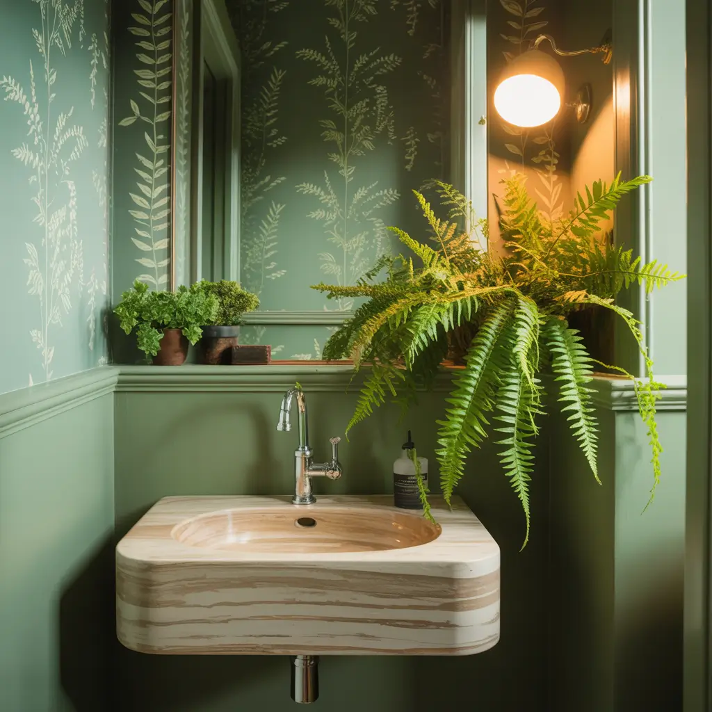
Green powder rooms bring organic calm to small spaces. My mom’s powder room features soft sage walls with botanical wallpaper on one accent wall, and visitors literally comment that they feel more relaxed after using it. The connection to nature that green provides is genuinely therapeutic.
Whether you choose deep emerald, soft sage, or vibrant lime, green has this unique ability to make spaces feel both sophisticated and calming. It’s basically the only color that works equally well for modern, traditional, or eclectic styles.
Green Shade Selection
Perfect greens for statement powder rooms:
- Emerald for jewel-tone luxury
- Sage for spa-like serenity
- Forest green for dramatic sophistication
- Mint for fresh, clean energy
- Olive for earthy elegance
I helped my mom test eight greens before choosing her sage. The undertones vary wildly – some greens read yellow, others blue, some gray. The wrong undertone can make your powder room feel sickly instead of sophisticated.
Enhancing the Nature Connection
Complete the organic look:
- Add real plants (or realistic faux ones)
- Include natural wood elements
- Choose stone or stone-look surfaces
- Use organic shapes in accessories
- Install warm, natural-toned lighting
My mom’s powder room has four plants (two real, two fake), a wooden mirror frame, and river rock-inspired tile. The layered natural elements create this immersive forest-like experience.
Pairing Green with Metallics
Metallics that work with green:
- Brass for warm traditional elegance
- Gold for luxury glamour
- Copper for earthy richness
- Black metal for modern edge
- Chrome for cool contemporary
Vintage Glam with Crystal Chandeliers
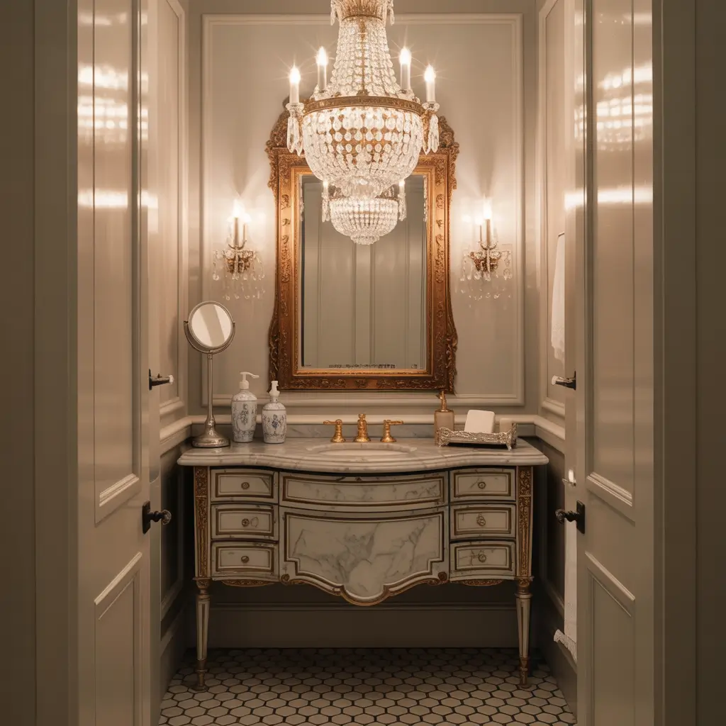
Crystal chandeliers in powder rooms create old Hollywood glamour that never goes out of style. My friend installed a vintage crystal chandelier in her tiny powder room, and it completely transformed the space from basic to breathtaking. The sparkle factor alone makes every visit feel special.
The key to vintage glam is balancing ornate elements with modern restraint. Too much vintage becomes costume; the right amount becomes sophisticated elegance. My friend keeps her vanity sleek and modern, letting the chandelier be the vintage star.
Finding the Perfect Chandelier
Chandelier selection tips:
- Estate sales for authentic vintage pieces
- Online retailers for reproduction options
- Size should be proportional but generous
- Crystal quality matters (avoid plastic)
- Consider dimmer compatibility
My friend found her chandelier at an estate sale for $90, had it rewired for $75, and now it looks like a thousand-dollar piece. Vintage hunting pays off spectacularly for lighting.
Vintage Glam Elements
Beyond the chandelier:
- Ornate vintage mirrors (real or reproduction)
- Marble or marble-look surfaces
- Velvet or silk textiles
- Soft pink or cream color palettes
- Gilded accents and frames
The color palette matters for vintage glam. My friend chose blush pink walls, and combined with the crystal chandelier, it creates this perfect vintage elegance.
Modern Meets Vintage
Keeping vintage glam current:
- Mix vintage accessories with modern fixtures
- Choose contemporary plumbing fixtures
- Add one unexpected modern element
- Keep the overall design edited
- Avoid going full costume
The worst vintage glam happens when every element screams “vintage!” One or two statement vintage pieces mixed with modern elements creates sophistication instead of time warp.
Also Read: 12 Fabulous Modern Powder Room Ideas and Luxe Design Features
Minimalist Chic with Bold Artwork
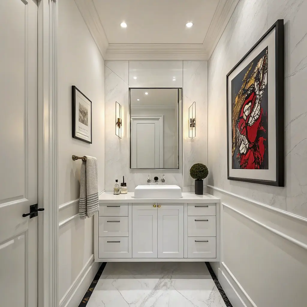
Minimalist powder rooms with one piece of bold artwork prove that less really can be more. My current powder room features completely white walls, a floating white vanity, and one enormous abstract painting. That’s it. The restraint makes the artwork sing, and the simplicity feels incredibly expensive.
The key is choosing artwork that’s genuinely bold enough to carry the entire space. Timid art in a minimalist room just looks like you forgot to decorate. You need something with serious presence to pull off this look.
Artwork Selection Strategy
Choosing statement-worthy art:
- Go bigger than feels comfortable (seriously)
- Choose abstract over literal imagery
- Pick colors that complement your fixtures
- Consider texture and dimension
- Invest in proper framing or canvas
I made the mistake of choosing too-small art initially. It looked lost on the big white wall. Now my painting is 4 feet by 5 feet in a powder room that’s only 6 feet wide. The scale makes it work.
Maintaining Minimalist Discipline
Essential minimalist principles:
- Keep surfaces completely clear
- Choose integrated sinks over vessel bowls
- Hide all storage completely
- Limit accessories to absolute zero
- Use simple, clean-lined fixtures
The discipline required for true minimalism is real. I constantly want to add “just one more thing,” but restraint is what makes minimalist powder rooms powerful.
Strategic Minimalist Choices
What to include in minimalist powder rooms:
- One statement artwork
- Simple floating vanity
- Minimal hardware (push-to-open preferred)
- Recessed or simple lighting
- One live plant maximum
Everything else is visual noise that dilutes the impact. My minimalist powder room has exactly six elements total, and that’s it.
Creating Your Statement Powder Room
After designing ten different statement powder rooms, here’s what I know for certain: bold choices create memorable spaces.
The powder rooms people remember and talk about aren’t the safe beige ones. They’re the ones where someone took a risk and committed fully.
The beauty of statement powder rooms is that small square footage means small risk. That bold wallpaper? It’s two rolls, not twenty.
That dramatic paint color? It’s one gallon, not five. You can afford to be fearless in powder rooms in ways you’d never attempt in larger spaces.
Pick the idea that genuinely excites you – whether it’s jewel-toned walls, geometric tiles, or vintage crystal chandeliers – and execute it confidently. Half-hearted statements aren’t statements at all.
Your powder room deserves more than boring beige walls and standard fixtures. Give your guests something genuinely worth talking about. Time to make that statement and transform your forgotten powder room into your home’s showpiece!