12 Chic Blue Paint Colors for Bedroom Ideas and Stylish Decor
- Bedroom Design
 Ben
Ben- 0
- 34 minutes read
Blue bedrooms used to terrify me. Something about waking up surrounded by blue felt like drowning in reverse.
Then I painted my bedroom “Palladian Blue” on a dare, and suddenly understood why everyone’s obsessed with blue paint colors for bedrooms.
Turns out, blue isn’t just one boring color that reminds you of corporate logos. We’re talking about dozens of shades that can transform your bedroom from “meh” to “never leaving this sanctuary.”
After testing what feels like every blue paint sample in existence (my walls looked like a Smurf crime scene for weeks), I’ve found the blues that actually work.
These aren’t random blues I pulled from a color wheel. These are the ones that survived my brutal testing process of living with them, hating them, repainting them, and finally finding the winners.
Let’s talk about the blue bedroom colors that’ll make you excited to go to sleep.
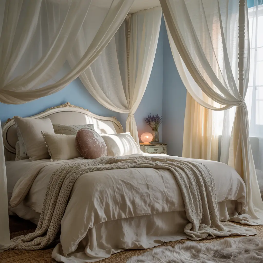
1. Soft Sky Blue Serenity
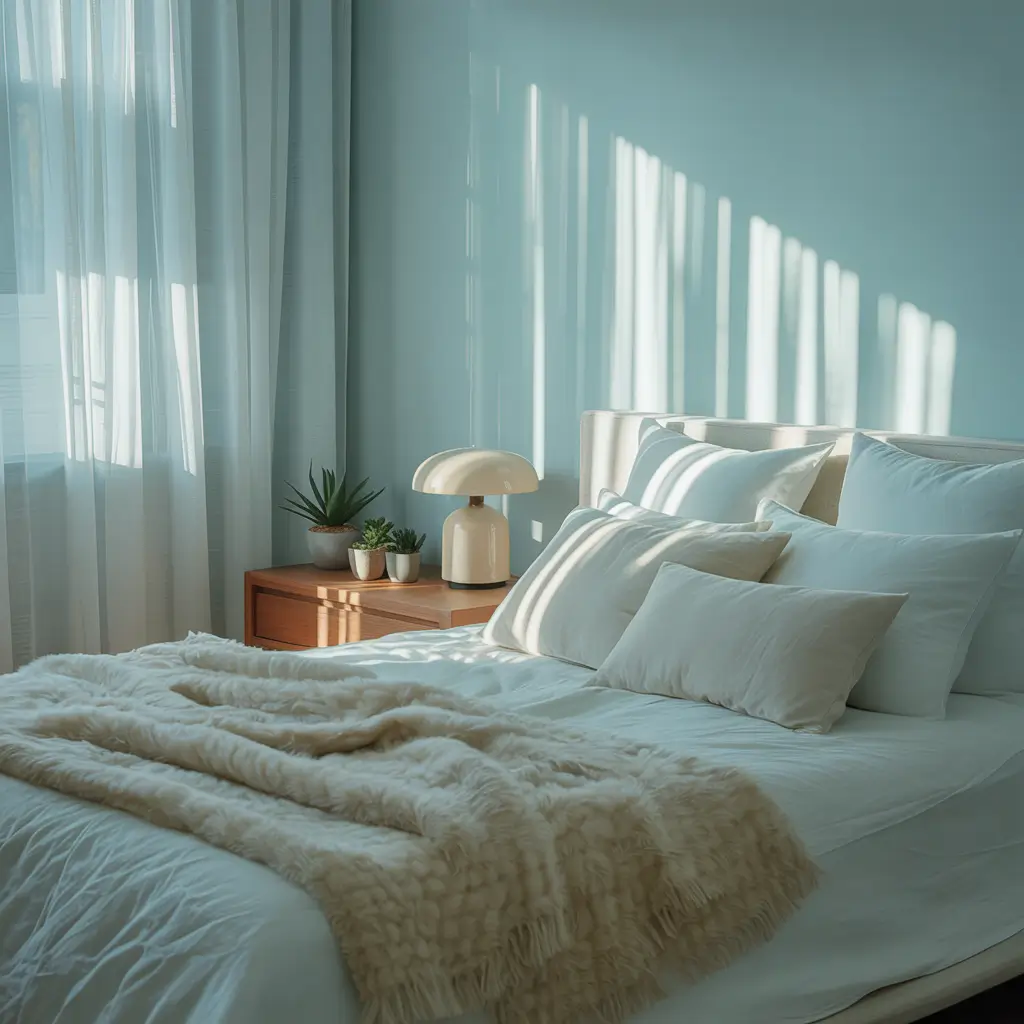
Soft sky blue creates the kind of calm that meditation apps charge $14.99 a month for. It’s gentle enough not to overwhelm but interesting enough to avoid that “did you forget to paint?” look.
I discovered this shade after my therapist suggested I needed more “serenity” in my life. Cheaper than twice-weekly sessions, I figured. Painted my bedroom Benjamin Moore’s “Breath of Fresh Air,” and honestly? Game changer. The color makes mornings feel less aggressive and evenings more peaceful.
Making Sky Blue Work
The soft sky blue success formula:
- Choose blues with gray undertones to avoid nursery vibes
- Keep furniture light or medium-toned
- Add white linens for cloud-like effect
- Include warm wood accents for balance
- Layer different blue textiles for depth
My favorite soft sky blues that actually deliver? Benjamin Moore “Healing Aloe” (despite the name, it’s blue), Sherwin-Williams “Rainwashed,” and Clare “Headspace.” Each creates that perfect morning sky feeling without the 6 AM wake-up call.
The biggest mistake with sky blue? Going too light. What looks perfect on the chip becomes invisible on walls. Go two shades darker than your gut says. Trust me, I repainted three times before learning this lesson.
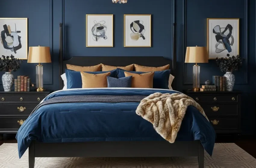
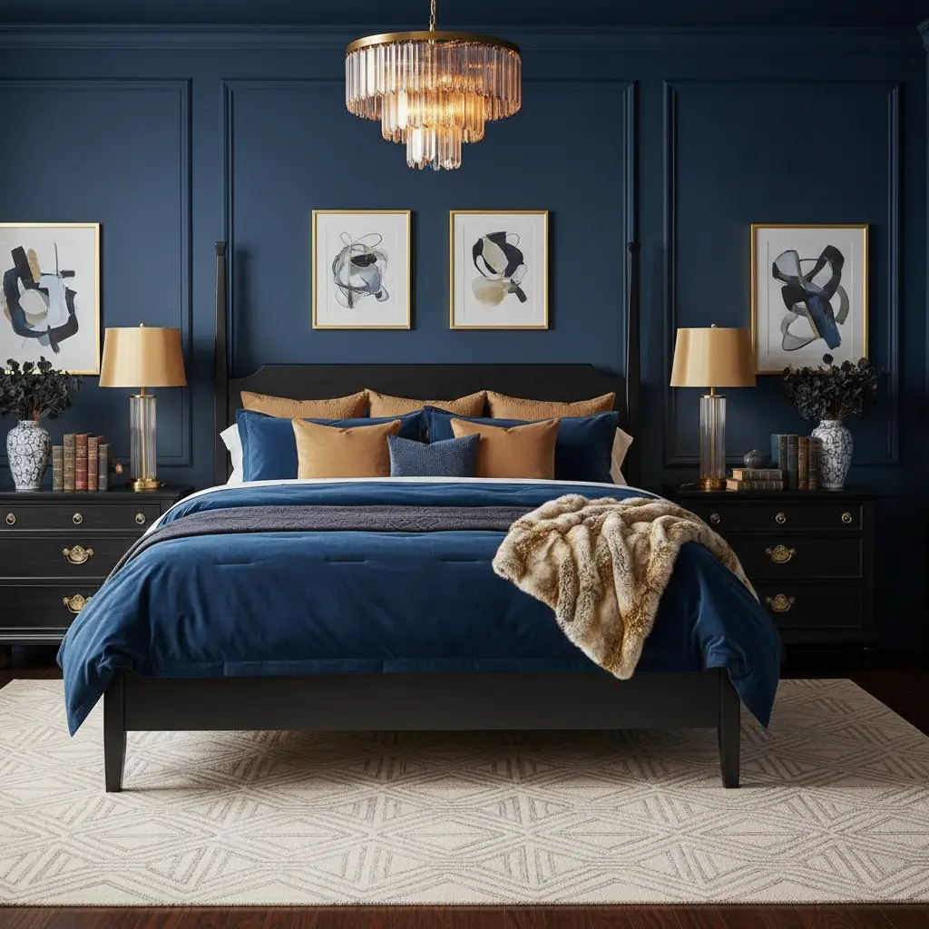
2. Deep Navy Cozy Retreat
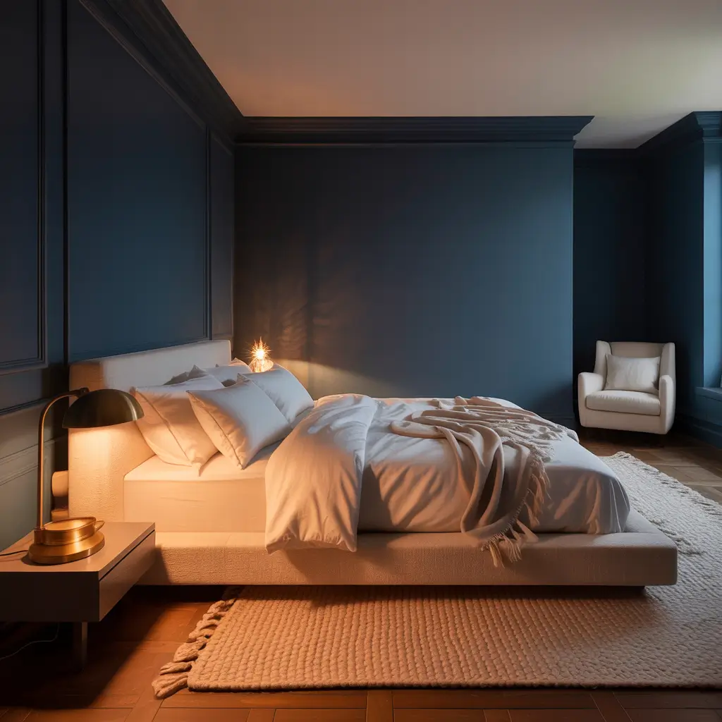
Deep navy transforms bedrooms into sophisticated cocoons that make you actually want to go to bed. It’s dramatic without the commitment issues of black.
My master bedroom went navy after staying in a boutique hotel that ruined me for basic bedroom colors. Came home to my beige walls feeling personally attacked. One gallon of Benjamin Moore “Hale Navy” later, and my bedroom looked like it belonged in Architectural Digest (if you squint and ignore the laundry pile).
Navy Excellence Strategy
Creating the perfect navy retreat:
- Commit fully – one navy wall looks hesitant
- Add brass or gold hardware for warmth
- Use crisp white bedding for contrast
- Include multiple light sources
- Consider the ceiling (white or matching?)
The navy blues worth your money? Benjamin Moore “Hale Navy” (the gold standard), Farrow & Ball “Stiffkey Blue” (if you’re fancy), and Clare “Goodnight Moon” (perfect name, perfect color). Each creates depth without making your bedroom feel like a submarine.
Don’t cheap out on navy paint. Bad quality navy looks like denim, not sophistication. Spring for the good stuff – your walls spend more time with you than most people do.
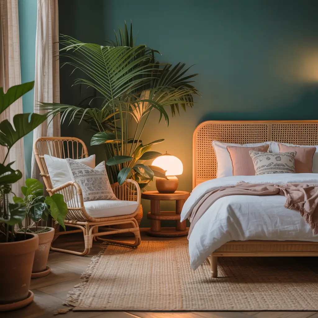
3. Aqua Dream Oasis
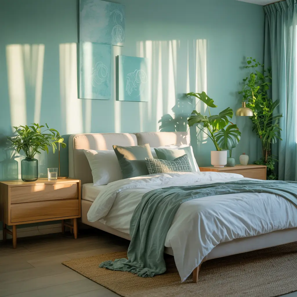
Aqua brings that vacation vibe home without the sunburn and credit card debt. It’s cheerful without being aggressive, calming without boring you to tears.
I painted my guest bedroom aqua after returning from a Caribbean trip with serious post-vacation depression. Couldn’t afford to move to Turks and Caicos, but I could definitely recreate that water color on my walls. Now guests never want to leave. Success or problem? Still deciding.
Aqua Paradise Creation
The aqua bedroom blueprint:
- Choose aqua with green undertones for sophistication
- Mix with white and natural textures
- Add coral or peach accents sparingly
- Keep metals warm (gold or brass)
- Include plants for tropical vibes
My tested aqua winners? Benjamin Moore “Spectra Blue,” Sherwin-Williams “Spa,” and Behr “Tidewater.” Each captures that perfect blue-green balance without looking like a public pool.
The undertone situation with aqua determines everything. Too blue becomes baby room. Too green becomes hospital. You want that sweet spot that makes people ask, “Is that blue or green?” The answer? Yes.
Also Read: 10 Inspiring Best Bedroom Paint Colors Ideas and Color Combos
4. Powder Blue Minimalist Haven
Powder blue proves that minimal doesn’t mean colorless. It’s the perfect amount of color for people who think they hate color.
My minimalist phase coincided with discovering powder blue, and honestly, it saved my bedroom from looking like an empty storage unit. The color adds interest without disrupting the calm minimalist vibe. Marie Kondo would approve (probably).
Minimalist Blue Mastery
Powder blue minimalism essentials:
- Keep everything else neutral
- Choose matte or flat finish
- Limit decorative elements
- Use natural materials
- Let the color breathe
The powder blues that work in minimal spaces? Benjamin Moore “Windmill Wings,” Clare “Imagine,” and Farrow & Ball “Parma Gray” (it reads blue, trust me). Each adds subtle color without overwhelming simplicity.
Temperature matters more with powder blue than darker shades. Cool powder blue feels fresh but potentially cold. Warm powder blue feels cozy but can read purple. Test in your actual lighting before committing.
5. Teal Tranquil Escape
Teal delivers drama and calm simultaneously – a paradox that somehow works perfectly in bedrooms. It’s the color equivalent of being exciting and reliable.
I fought against teal for years, thinking it was too trendy. Then painted an accent wall in Benjamin Moore “Aegean Teal” and immediately painted the other three walls to match. Sometimes you need to admit when you’re wrong. Teal was right all along.
Teal Transformation Tactics
Making teal work its magic:
- Choose blue-leaning teal over green-leaning
- Balance with warm neutrals
- Add metallic accents for glamour
- Layer different teal shades
- Include plenty of texture
My teal champions? Benjamin Moore “Aegean Teal,” Sherwin-Williams “Oceanside,” and Clare “Current Mood.” Each creates that perfect jewel-tone richness without overwhelming the space.
The saturation level changes everything with teal. Full saturation feels energetic. Muted teal feels sophisticated. Dusty teal feels vintage. Pick based on your bedroom’s personality, not just the color chip.
6. Steel Blue Modern Chic
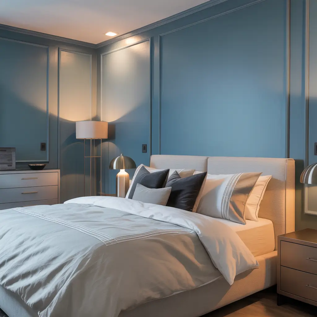
Steel blue brings industrial sophistication that makes bedrooms feel current without trying too hard. It’s the perfect blue for people who think blue is too soft.
My bedroom went steel blue after I got tired of explaining that my gray walls “had blue undertones.” Just went full blue-gray and stopped explaining. The color reads as neutral from a distance but has personality up close. Best of both worlds.
Steel Blue Sophistication
The steel blue formula:
- Pair with crisp whites and blacks
- Use modern furniture shapes
- Keep patterns geometric
- Add chrome or nickel finishes
- Layer textures, not colors
The steel blues that deliver? Benjamin Moore “Nimbus Gray” (more blue than gray), Sherwin-Williams “Storm Cloud,” and Behr “Atmospheric.” Each creates that perfect modern edge without feeling cold.
Finish matters enormously with steel blue. Flat looks industrial (good). Eggshell looks sophisticated (better). Semi-gloss looks like a gym (bad). Choose wisely based on your aesthetic goals.
Also Read: 12 Gorgeous Moody Bedroom Paint Colors and Luxe Design Tips
7. Cornflower Blue Vintage Charm
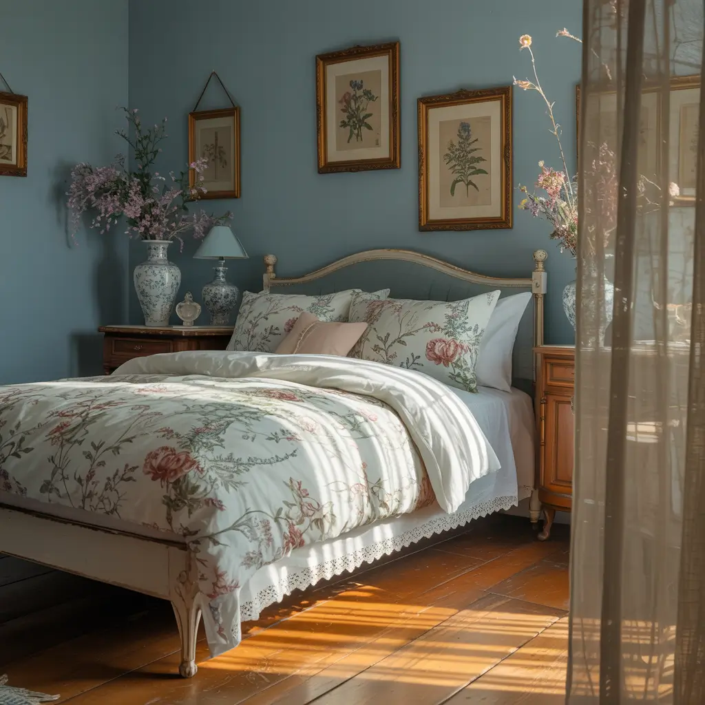
Cornflower blue brings vintage sweetness without the saccharine overload. It’s nostalgic but not dated, sweet but not silly.
I inherited my grandmother’s bedroom furniture and needed a color that honored the vintage vibe without making my bedroom feel like a time capsule. Cornflower blue bridged that gap perfectly. The furniture looks intentional, not inherited.
Vintage Blue Excellence
Creating cornflower charm:
- Mix with cream, not stark white
- Include floral patterns sparingly
- Add antique brass fixtures
- Layer different blue shades
- Keep modern elements for balance
My cornflower favorites? Benjamin Moore “November Skies,” Farrow & Ball “Cook’s Blue,” and Sherwin-Williams “Porch Ceiling Blue.” Each captures that vintage feeling while staying fresh.
The key with cornflower? Don’t overdo the vintage elements. One or two antique pieces, not an entire estate sale. The color carries enough nostalgia on its own.
8. Ocean Wave Coastal Vibes
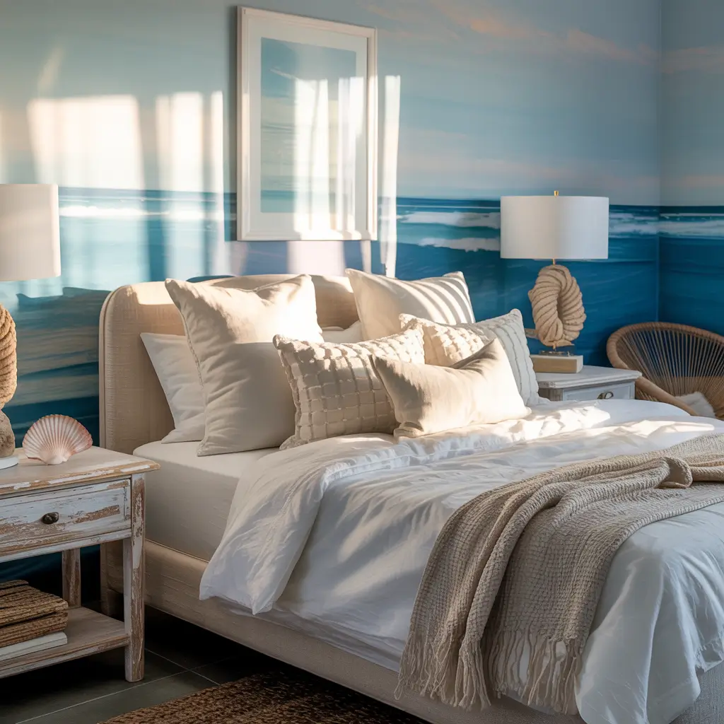
Ocean blue brings the beach indoors without the sand in your sheets. It’s the perfect blue for people who consider “beach” a personality trait.
Living 500 miles from the nearest ocean didn’t stop me from creating coastal vibes. Painted my bedroom Benjamin Moore “Beach Glass” and suddenly felt like I lived in a beach house. Delusion? Maybe. But a happy delusion.
Coastal Blue Perfection
The ocean wave blueprint:
- Choose blues with green-gray undertones
- Add natural textures (jute, rattan)
- Include white and sand colors
- Keep decor minimal and natural
- Layer different ocean-inspired blues
The ocean blues worth trying? Benjamin Moore “Beach Glass,” Sherwin-Williams “Watery,” and Behr “Ocean Boulevard.” Each captures different ocean moods from calm to stormy.
Avoid the theme park trap. You want coastal inspiration, not “Pirates of the Caribbean” set design. Let the color do the work; skip the anchors and seashells.
9. Baby Blue Romantic Nest
Baby blue gets unfairly dismissed as childish, but done right, it creates the most romantic, dreamy bedrooms imaginable.
I accidentally discovered adult baby blue when the “French Blue” I ordered online arrived looking like a nursery color. Almost returned it, then tried it anyway. That happy accident became my favorite bedroom color ever. Sometimes mistakes lead to magic.
Sophisticated Baby Blue
Making baby blue grown-up:
- Add black accents for sophistication
- Use luxe textures (velvet, silk)
- Include metallic elements
- Keep patterns mature
- Balance with deeper blues
The baby blues that work for adults? Benjamin Moore “Windmill Wings,” Clare “Goodnight Moon,” and Farrow & Ball “Borrowed Light.” Each reads as sophisticated, not saccharine.
The finish trick with baby blue? Go matte or flat to avoid that plastic toy look. Shiny baby blue screams nursery. Matte baby blue whispers elegance.
Also Read: 10 Trendy Bedroom Paint Colors Ideas and Stylish Palettes
10. Indigo Moody Elegance
Indigo creates the moodiest, most elegant bedrooms without going full goth. It’s dramatic, sophisticated, and surprisingly versatile.
My indigo bedroom phase started after seeing Japanese indigo textiles in a museum. Came home, painted my bedroom Benjamin Moore “Polo Blue,” and suddenly felt like I lived in an art gallery. The color makes everything else in the room look expensive, even my Target nightstand.
Indigo Drama Done Right
Creating indigo elegance:
- Go all in – four walls or none
- Add warm woods for balance
- Include cream or camel accents
- Layer lighting extensively
- Mix patterns within the blue family
My indigo picks? Benjamin Moore “Polo Blue,” Sherwin-Williams “Naval,” and Clare “Goodnight Moon.” Each creates that perfect mysterious depth without feeling oppressive.
Quality matters most with indigo. Cheap indigo paint looks purple or black depending on light. Good indigo maintains its blue integrity always. Worth the investment, IMO.
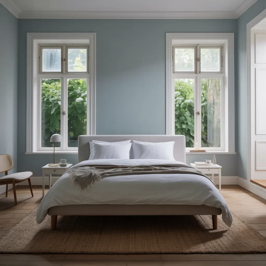
11. Blue-Gray Scandinavian Calm
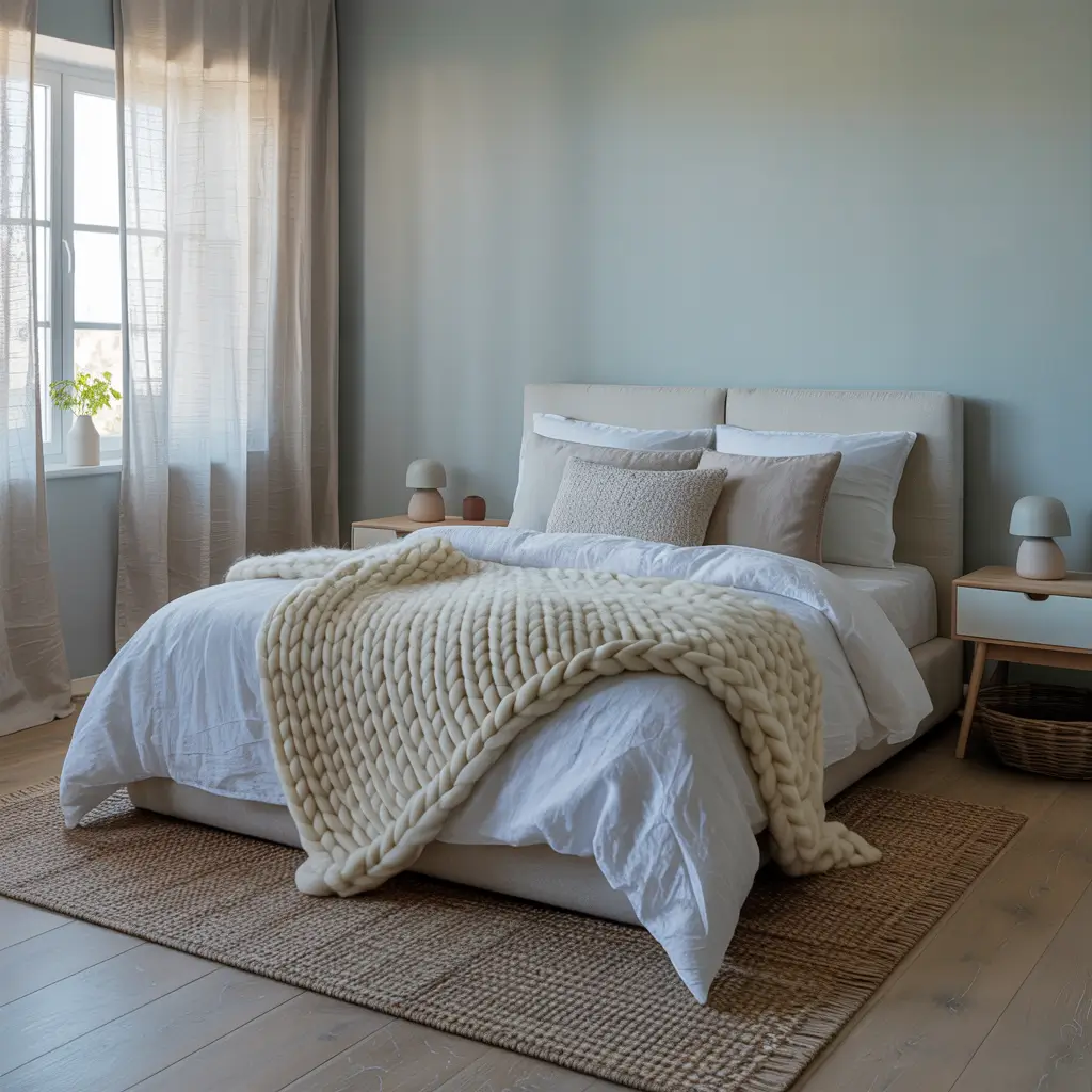
Blue-gray delivers Scandinavian serenity without requiring you to pronounce “hygge” correctly. It’s the perfect compromise between color and neutral.
After my fifth trip to IKEA (don’t judge), I realized their display bedrooms always featured blue-gray walls. Copied the exact color, and suddenly my bedroom looked like it belonged in Stockholm. Sometimes the best design comes from shameless copying.
Scandi Blue Success
The blue-gray Scandinavian formula:
- Choose blue-gray with cool undertones
- Add natural wood everything
- Keep bedding white and natural
- Include cozy textures
- Maintain minimal decoration
The blue-grays worth copying? Benjamin Moore “Healing Aloe,” Sherwin-Williams “Misty,” and Farrow & Ball “Oval Room Blue.” Each creates that perfect Nordic calm without the Nordic prices.
The balance between blue and gray determines everything. Too gray feels corporate. Too blue loses that Scandinavian restraint. You want that perfect middle ground that makes people pause and wonder.
12. Turquoise Tropical Paradise
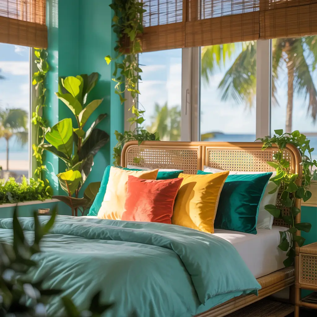
Turquoise transforms bedrooms into tropical escapes faster than you can say “piña colada.” It’s bold, cheerful, and guaranteed to improve your mood.
I painted my bedroom turquoise during the darkest winter in memory. Couldn’t afford a tropical vacation but could afford a gallon of paint. That turquoise bedroom got me through seasonal depression better than any light therapy lamp. Sometimes color is medicine 🙂
Tropical Turquoise Magic
Creating paradise with turquoise:
- Choose turquoise with depth (not flat)
- Add white and natural elements
- Include tropical plants
- Keep furniture light-colored
- Layer different turquoise shades
My turquoise winners? Benjamin Moore “Mexicali Turquoise,” Sherwin-Williams “Cloudburst,” and Behr “Fiji.” Each brings vacation vibes without looking like a resort gift shop.
The intensity question matters with turquoise. Full strength for one accent wall. Diluted for all four walls. Unless you’re brave. Then full turquoise everything. Own your choices.
Your Blue Bedroom Journey
Here’s what I’ve learned from my blue bedroom adventures: blue paint colors work because they actually affect your mood.
Science says blue lowers blood pressure and heart rate. My experience says blue makes bedrooms feel like sanctuaries.
The best blue for your bedroom? The one that makes you happy when you wake up and peaceful when you sleep. Test everything.
Live with samples. Trust your gut over color trends.
Remember, you’re not painting the Sistine Chapel. If you hate it, repaint it. I’ve repainted the same bedroom four times in one year. Excessive? Yes. Worth it for the perfect blue? Absolutely.
Now excuse me while I order more blue paint samples. Just discovered three new shades I haven’t tried yet, and my walls are looking suspiciously ready for change.
My partner says I have a problem. I say I’m conducting important color research. For science. Happy painting, and may your blues never disappoint!