10 Creative Green Kitchen Tiles Backsplash Ideas to Try Today
- Kitchen Tiles Ideas
 Ben
Ben- 0
- 48 minutes read
Your kitchen backsplash takes up prime visual real estate. And let’s face it—staring at boring white or beige tiles while waiting for pasta water to boil gets old fast.
Green backsplashes have exploded in popularity, and honestly? It’s about time. This color brings life, freshness, and connection to nature that neutral tiles simply cannot deliver.
Whether you prefer subtle sage whispers or dramatic emerald statements, green backsplash tiles offer something for every aesthetic preference.
I resisted colorful backsplashes for years. Safe neutrals felt responsible. Then I installed a sage green herringbone backsplash in my own kitchen, and everything changed.
That single design choice transformed a functional cooking space into somewhere I genuinely enjoy spending time.
Ready to explore green kitchen tile backsplash ideas that deliver serious design impact? These ten options cover the entire green spectrum—from soft pastels to moody forest tones—helping you find your perfect shade.
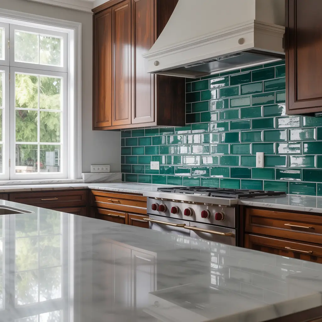
1. Emerald Green Subway Tile Backsplash
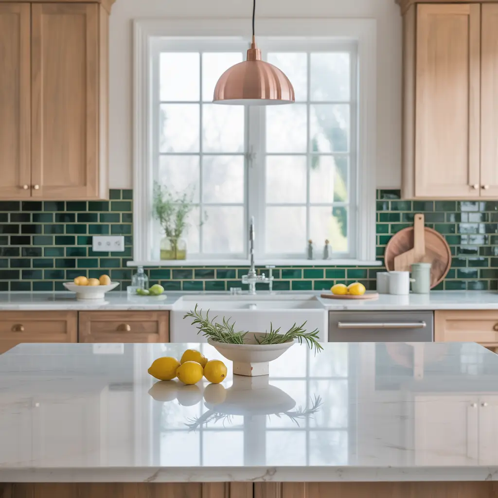
When you want green that commands attention without overwhelming, emerald subway tiles deliver perfectly. This combination marries classic format with luxurious jewel-tone coloring.
Why Emerald Subway Tiles Work
Emerald green occupies the sweet spot of the green spectrum. Not too yellow, not too blue—this balanced hue reads as sophisticated and intentional rather than trendy or dated.
Subway tiles in emerald create striking backsplash focal points while maintaining the familiar, approachable format that works in virtually any kitchen style. The rectangular shape keeps things grounded even when the color makes bold statements.
The appeal of emerald green subway tile backsplashes includes:
- Versatile pairing options: Works beautifully with white, cream, black, brass, and wood tones
- Timeless format: Subway shape ensures the design won’t date quickly
- Rich visual depth: Emerald provides color weight without feeling heavy
- Light interaction: This shade reflects light beautifully, especially in glossy finishes
- Mood enhancement: Creates calm, grounded atmospheres perfect for kitchens
Styling Your Emerald Backsplash
Pair emerald subway tiles with white cabinets and countertops for maximum impact. The contrast allows the green to shine as your kitchen’s undisputed star.
For moodier aesthetics, combine emerald tiles with dark wood cabinets and brass hardware. This combination creates sophisticated, almost Art Deco-inspired spaces that feel both luxurious and welcoming.
Consider extending emerald subway tiles from countertop to ceiling. This full-height approach maximizes impact and prevents that awkward stopping point where budget renovations often cut corners. Commit fully to the color, and the results genuinely impress.
Grout selection matters significantly. White grout emphasizes each individual tile distinctly. Matching dark grout creates more seamless, unified surfaces. I personally prefer subtle contrast—emerald tiles with charcoal grout adds definition without overwhelming.
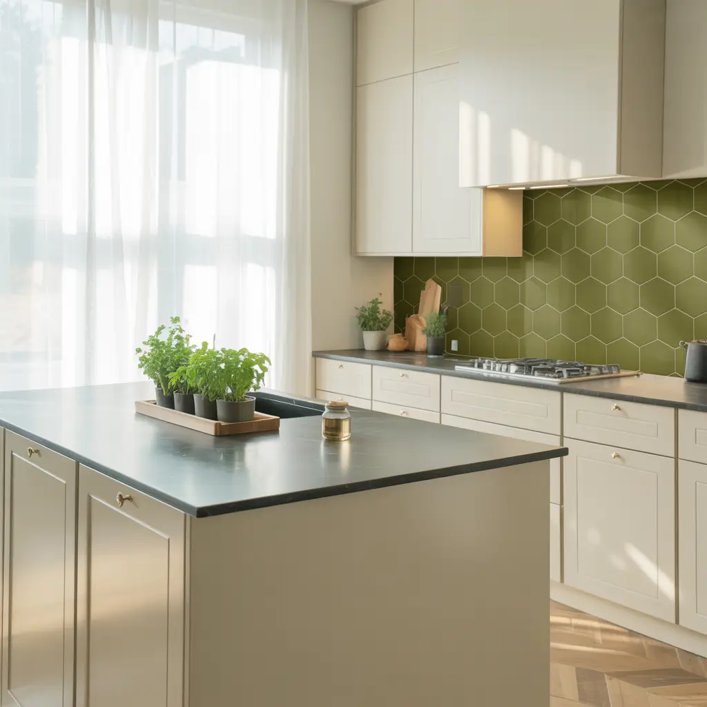
2. Matte Olive Hexagon Tile Backsplash
Olive green sometimes carries 1970s baggage (thanks, avocado appliances), but modern applications prove this earthy shade deserves serious reconsideration.
Reconsidering Olive Green
Matte olive hexagon backsplashes combine warm, earthy coloring with contemporary geometric shape. This pairing updates olive’s reputation while honoring its natural warmth.
Why olive hexagon tiles work in modern kitchens:
- Earthy sophistication: More grounded than cooler green shades
- Natural inspiration: References Mediterranean landscapes and olive groves
- Warm undertones: More welcoming than blue-leaning greens
- Geometric interest: Hexagons add visual texture through shape alone
- Matte softness: Absorbs light gently without harsh reflections
- Unexpected choice: Stands apart from predictable sage or emerald options
Making Olive Feel Contemporary
The key to successful olive backsplashes involves modern context and quality materials. Pair olive tiles with contemporary fixtures, updated lighting, and current design elements to prevent dated appearances.
Consider these styling approaches:
- White oak cabinets: Natural wood tones complement olive beautifully
- Matte black hardware: Contemporary edge balances olive’s warmth
- White marble countertops: Luxury elements elevate the earthy shade
- Brass accents: Warm metallics enhance olive’s golden undertones
- Minimalist lines: Clean contemporary surroundings prevent retro associations
The matte finish particularly suits olive green. Glossy olive can veer too close to vintage aesthetics. Matte surfaces feel current and sophisticated while maintaining the color’s inherent warmth.
Hexagon shapes add necessary visual interest. The geometric pattern provides complexity that olive’s muted tone benefits from—creating backsplashes that feel designed rather than dated.
3. Forest Green Mosaic Pattern Backsplash
Sometimes you want backsplashes that feel like artwork. Forest green mosaic patterns deliver that artistic quality with undeniable drama.
The Mosaic Advantage
Forest green mosaic backsplashes combine deep, moody coloring with intricate small-tile patterns. These installations create visual texture and sophistication that larger tiles simply cannot achieve.
The appeal of forest green mosaics:
- Artistic quality: Transform functional surfaces into design features
- Color depth: Deep forest tones create dramatic focal points
- Textural complexity: Multiple small tiles engage the eye differently than single surfaces
- Light interaction: Various tile angles catch illumination uniquely
- Pattern options: Geometric, random, or gradient arrangements available
- Statement impact: Guests inevitably notice and comment on mosaic installations
Mosaic Pattern Options
Forest green mosaics come in diverse arrangements:
Geometric patterns use forest green tiles in structured, repeating designs. These arrangements suit contemporary kitchens wanting organized visual interest.
Random mosaics scatter forest green tiles in organic, unstructured patterns. These installations feel more artistic and handcrafted.
Mixed material mosaics combine forest green glass with stone, metal, or ceramic elements. These combinations add textural variety within single installations.
Gradient mosaics transition from lighter greens into deep forest tones. These arrangements create movement and visual flow across backsplash surfaces.
IMO, forest green mosaics work best in kitchens with sufficient natural light. The deep coloring absorbs illumination—adequate lighting prevents cave-like atmospheres while letting the rich color shine appropriately.
Also Read: 12 Amazing White Kitchen Tiles Ideas and Sleek Designs
4. Sage Green Herringbone Tile Backsplash
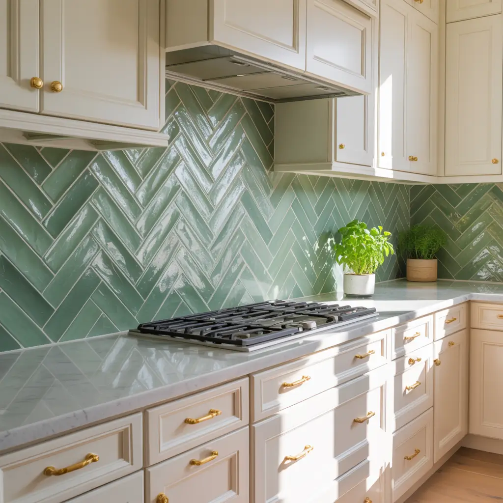
Sage green might be the most universally appealing green shade for kitchens. Combined with herringbone patterns, it creates sophisticated backsplashes with serious design credentials.
Why Everyone Loves Sage
Sage green bridges colorful statements and safe neutrals perfectly. This dusty, gray-tinged green feels colorful enough to add personality yet subdued enough to serve as near-neutral background.
The psychology behind sage’s appeal:
- Calming properties: Reduces stress and promotes relaxation
- Natural connection: Evokes herbs, plants, and organic materials
- Warm undertones: More welcoming than cooler green shades
- Broad compatibility: Works with warm and cool palettes equally
- Timeless quality: Sage has appeared in design throughout history
The Herringbone Factor
Adding herringbone patterns to sage green tiles creates double design impact. The color provides gentle visual interest while the pattern adds architectural sophistication.
Herringbone characteristics:
- Visual movement: Pattern creates flow and directional energy
- Vertical emphasis: Can make ceilings appear higher
- Classic credentials: Historical pattern with proven appeal
- Sophistication boost: Elevates simple tiles into statement features
- Installation precision: Requires careful alignment for best results
I installed sage green herringbone tiles in my own kitchen backsplash. Three years later, I still love this combination. The color feels calming during busy morning routines, and the pattern adds enough interest to keep the space feeling designed rather than default.
Consider extending sage herringbone from countertop to ceiling behind your range. This full-height approach creates stunning focal points that anchor entire kitchen designs.
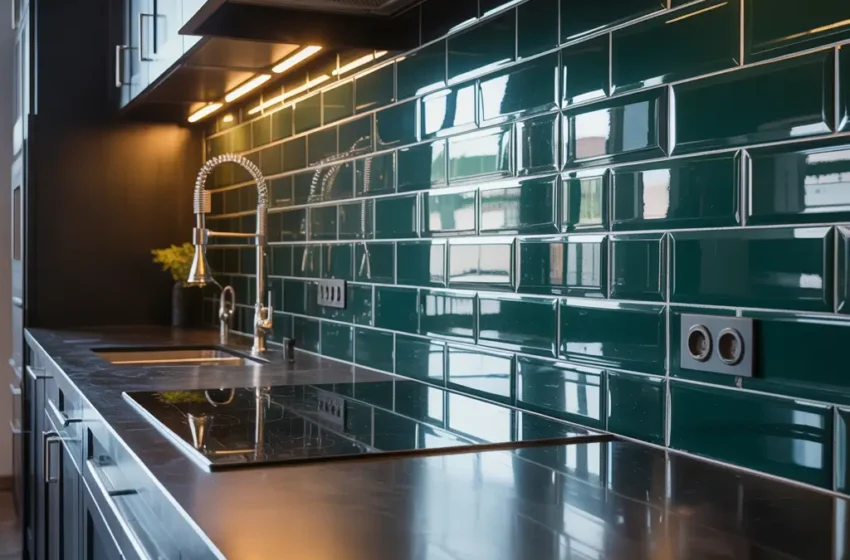
5. Dark Green Glossy Brick-Style Backsplash
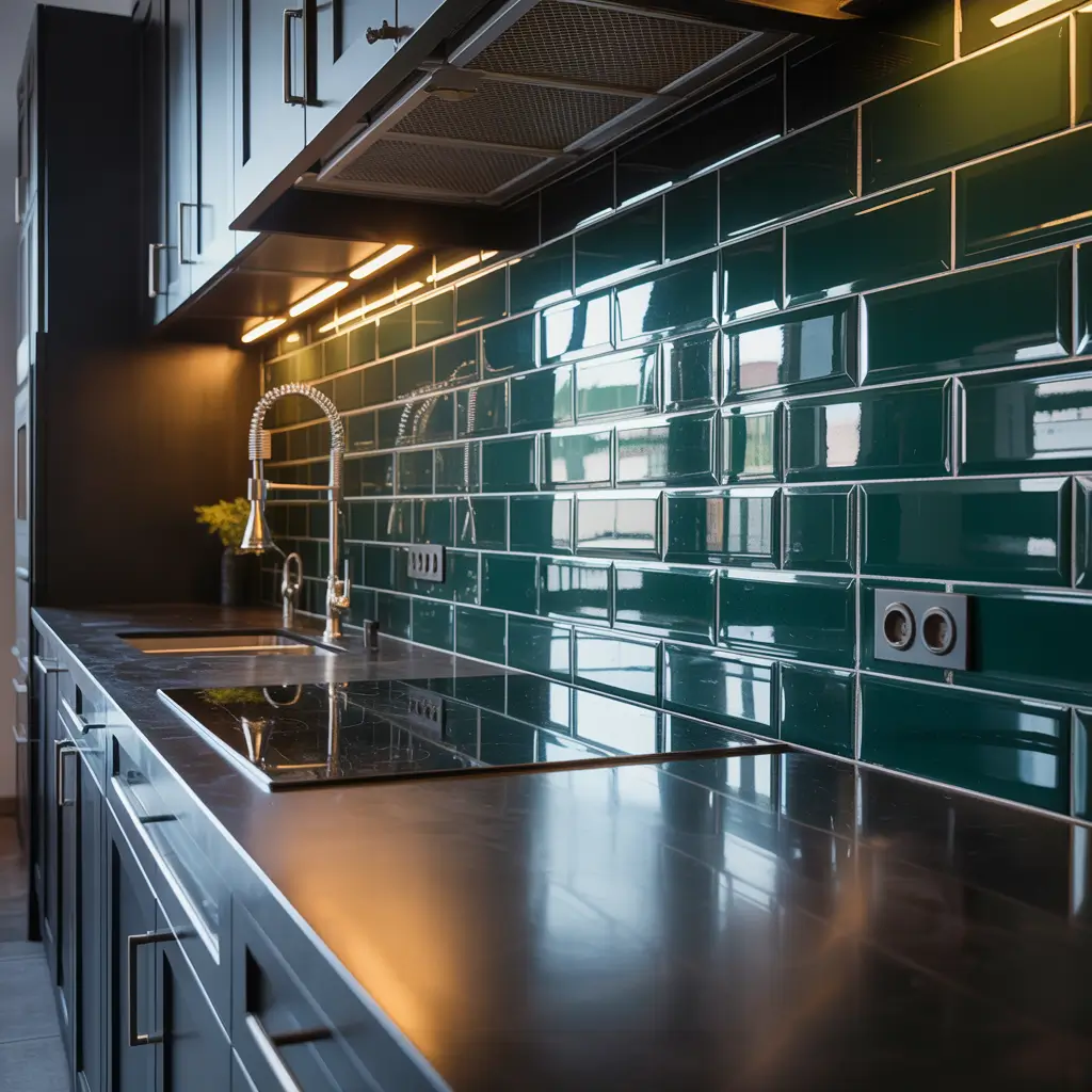
Brick-style tiles bring warmth and texture that smooth tiles cannot replicate. In dark glossy green, they create unexpected contemporary statements.
Brick Style Meets Bold Color
Dark green glossy brick-style backsplashes combine traditional tile format with contemporary color and finish. This pairing creates unique aesthetics that feel both familiar and fresh.
Why dark green brick-style tiles captivate:
- Textural warmth: Brick formats add tactile dimension
- Dramatic color: Deep green creates moody sophistication
- Light reflection: Glossy surfaces bounce illumination beautifully
- Contemporary twist: Unexpected color updates traditional format
- Industrial references: Brick shapes nod to warehouse aesthetics
- Statement quality: Impossible to ignore—in the best way
Creating Successful Dark Green Backsplashes
Dark green glossy tiles require thoughtful lighting and placement to avoid overwhelming kitchens. The deep color absorbs light—compensate with adequate illumination.
Consider these strategies:
- Under-cabinet lighting: Essential for illuminating dark backsplashes properly
- White or light cabinets: Contrast prevents overall darkness
- Reflective countertops: Light surfaces balance dark tile absorption
- Strategic placement: Consider dark green behind ranges only, lighter tiles elsewhere
- Brass hardware: Warm metallics complement deep green beautifully
The glossy finish becomes crucial with dark tiles. Matte dark green can feel oppressive. Glossy surfaces catch and reflect light, preventing the cave-like atmosphere that matte dark tiles risk creating.
Kitchens with generous natural light handle dark green glossy backsplashes most successfully. Windowless kitchens require more creative lighting solutions to make this dramatic choice work effectively.
6. Mint Green Geometric Tile Backsplash
Want something fresh, playful, and undeniably charming? Mint green geometric tiles bring cheerful personality to kitchen backsplashes.
The Mint Green Appeal
Mint green occupies the lighter, cooler end of the green spectrum. This shade evokes ice cream parlors, vintage diners, and spring gardens—all pleasant associations for cooking spaces.
Why mint geometric backsplashes work:
- Fresh aesthetic: Mint suggests cleanliness and renewal
- Playful personality: Less serious than deeper green alternatives
- Light enhancement: Pale tones brighten spaces naturally
- Retro references: Nods to mid-century design while feeling current
- Versatile styling: Works in traditional, modern, and eclectic kitchens
- Geometric interest: Shapes add visual complexity without color intensity
Geometric Pattern Options
Mint green geometric tiles come in various shapes:
Hexagons create honeycomb patterns with gentle color impact. The organic shape softens mint’s coolness.
Fish scales (scallops) bring Art Deco elegance in refreshing tones. These curved shapes feel romantic and sophisticated.
Triangles add sharp, modern energy balanced by soft coloring. The contrast creates interesting visual tension.
Arabesques deliver Mediterranean-inspired flowing shapes in cool mint tones. These patterns suit eclectic and bohemian kitchens.
FYI, mint green tiles particularly suit kitchens with abundant natural light. The pale color needs illumination to appear fresh rather than washed out. Dim spaces can make mint look flat or clinical.
Pair mint geometric tiles with warm wood tones to prevent excessive coolness. Natural wood cabinets or countertops balance mint’s fresh quality with necessary warmth.
Also Read: 10 Creative Modern Kitchen Tiles Ideas for Dream Kitchens
7. Deep Green Marble Effect Tile Backsplash

Verde marble has graced luxury spaces for centuries. Modern porcelain tiles capture this prestigious appearance at accessible price points.
Understanding Green Marble Effects
Deep green marble effect tiles replicate natural verde marble’s distinctive veining, depth, and luminosity. These tiles deliver luxury aesthetics without natural stone maintenance requirements.
Why choose green marble-effect for backsplashes:
- Luxury appearance: References expensive natural stone
- Dramatic veining: White or gold veins create visual movement
- Practical performance: Porcelain resists staining and etching
- Consistent quality: No surprise variations between tiles
- Lower maintenance: Standard cleaning products work perfectly
- Cost effectiveness: Fraction of natural marble pricing
Selecting Realistic Green Marble Tiles
Not all marble-effect tiles convince equally. For believable green marble appearances, prioritize:
- Varied veining patterns: Multiple tile designs prevent obvious repetition
- Appropriate scale: Veining proportions should match natural stone
- Depth in printing: Multiple layers create dimensional effects
- Surface texture: Polished or honed finishes matching natural stone
- Color accuracy: Rich, deep greens rather than artificial-looking shades
Large format tiles work best for marble effects. Bigger tiles mean fewer grout lines, enhancing the seamless slab appearance that natural marble provides.
For backsplash applications, consider book-matching veining where patterns flow continuously across adjacent tiles. This technique mimics how natural marble slabs appear, maximizing the luxury illusion.
Green marble-effect backsplashes create instant focal points. The dramatic veining and rich coloring naturally draw attention, making these tiles perfect behind ranges or in prominent cooking zones.
8. Vintage Green Patterned Ceramic Backsplash
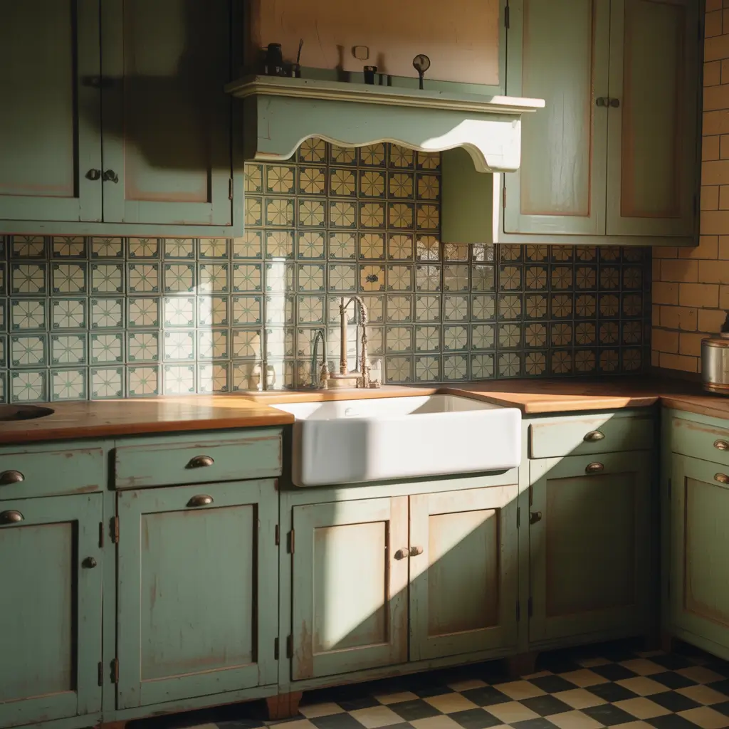
Everything old becomes new again. Vintage-inspired green patterned tiles bring nostalgic charm while meeting modern performance standards.
Capturing Retro Elegance
Vintage green patterned ceramic backsplashes reference design eras from Victorian times through mid-century modern. These tiles add character, warmth, and storytelling to contemporary kitchens.
Popular vintage green tile styles include:
- Victorian encaustic-inspired: Intricate geometric patterns in earthy green tones
- Art Deco influences: Bold geometry with green and gold combinations
- 1950s motifs: Retro patterns in sage or mint green variations
- Mediterranean heritage: Hand-painted looks with aged patina effects
- Botanical references: Vintage floral designs in various green shades
Balancing Vintage with Contemporary
The challenge with vintage tiles? They can tip kitchens from “charming” to “grandma’s house” quickly. Balance matters tremendously.
Pair vintage green patterned tiles with modern fixtures and clean lines to keep overall aesthetics current. Consider these strategies:
- Contemporary cabinets: Flat-panel doors balance ornate tile patterns
- Modern hardware: Current fixture styles ground vintage tile references
- Strategic placement: Use vintage tiles as accent areas within simpler surroundings
- Updated lighting: Contemporary fixtures prevent dated atmospheres
- Neutral companions: Simple surrounding surfaces let patterns shine
I’ve seen gorgeous kitchens featuring vintage green patterned tiles only behind ranges, bordered by solid tiles elsewhere. This approach delivers vintage character without overwhelming commitment to full retro aesthetics.
9. Gradient Green Ombre Tile Backsplash
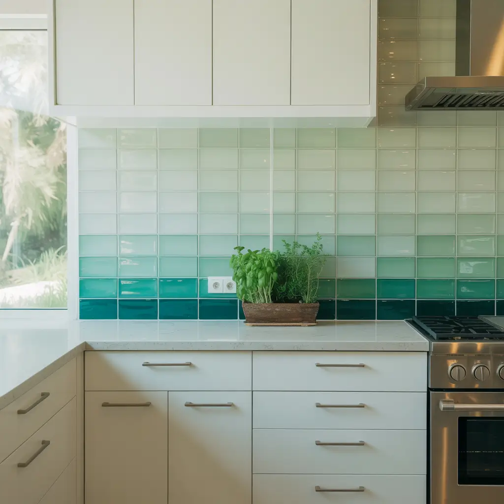
For truly unique kitchen statements, gradient ombre backsplashes create artistic effects that single-color tiles cannot achieve.
Understanding Ombre Backsplashes
Gradient green ombre tile backsplashes transition smoothly between green shades across their surface. These installations transform functional backsplashes into genuine artwork.
The appeal of green ombre backsplashes:
- Artistic expression: Creates visual interest beyond simple color application
- Custom appearance: Gradient arrangements look intentionally designed
- Depth creation: Color transitions add dimensional quality
- Focal point status: Naturally draws attention without additional decoration
- Conversation starting: Guests inevitably comment on gradient installations
- Green spectrum exploration: Showcases multiple beautiful green tones simultaneously
Ombre Direction Options
Vertical gradients transition from light green at the top to darker shades at the bottom (or vice versa). This approach works beautifully behind ranges or sinks as defined feature areas.
Horizontal gradients shift colors across the width of your backsplash. This orientation creates unique effects as colors progress from one end of your kitchen to another.
Diagonal gradients create dynamic movement across backsplash surfaces. These installations feel particularly artistic and contemporary.
Popular green ombre transitions include:
- Mint to emerald: Light to dark within cool green family
- Sage to forest: Warm greens transitioning to deep tones
- Seafoam to hunter: Maximum light-dark contrast
- Multiple greens: Complex gradients incorporating several shades
Ombre backsplashes require professional installation expertise. Achieving smooth, intentional-looking transitions demands careful planning and precise tile placement. DIY attempts often result in obvious, awkward-looking color jumps.
Also Read: 12 Elegant Green Kitchen Tiles Ideas for Timeless Design
10. Glossy Hunter Green Large-Format Tile Backsplash
Clean lines, minimal grout, and dramatic color—glossy hunter green large-format tiles deliver contemporary sophistication with serious impact.
The Large Format Advantage
Glossy hunter green large-format backsplash tiles (typically 12×24 inches or larger) create seamless, sophisticated surfaces. Fewer grout lines mean cleaner appearances, easier maintenance, and maximum color impact.
Why large format green tiles work:
- Seamless appearance: Minimal grout lines create continuous surfaces
- Color dominance: Large expanses showcase hunter green dramatically
- Light reflection: Glossy surfaces bounce illumination beautifully
- Contemporary aesthetic: Aligns with minimalist design trends
- Easier maintenance: Less grout equals less cleaning effort
- Statement quality: Bold color in bold format demands attention
Making Hunter Green Work
Hunter green represents the darker end of the green spectrum. Proper lighting and strategic placement ensure this dramatic choice enhances rather than overwhelms.
Consider these hunter green strategies:
- Adequate illumination: Under-cabinet and overhead lighting essential
- White or light cabinets: Contrast prevents overall darkness
- Reflective countertops: Light surfaces balance dark absorption
- Ceiling-height application: Commit fully rather than stopping mid-wall
- Brass or gold hardware: Warm metallics complement hunter beautifully
The glossy finish proves crucial. Glossy surfaces reflect light, preventing the oppressive darkness that matte dark tiles can create. That reflection adds life and movement to deep hunter green surfaces.
Large format installation requires perfectly level surfaces. Any wall imperfections become immediately visible with larger tiles. Professional installation typically proves worthwhile for best results.
For maximum contemporary impact, extend glossy hunter green tiles from countertop to ceiling with minimal grout lines. Use rectified tiles with precisely cut edges for the sleekest possible appearance. 🙂
Choosing Your Perfect Green Backsplash
After exploring these ten green kitchen tile backsplash ideas, you likely have favorites emerging. Before committing, consider these practical factors.
Assess Your Kitchen’s Light
Natural light dramatically affects green tile appearances. Kitchens with abundant sunlight can handle darker greens beautifully. Kitchens with limited light benefit from lighter, more reflective green options.
Request samples and view them in your actual kitchen at various times of day. The green that looks perfect under showroom lighting might read completely differently at home.
Consider Your Existing Elements
Green backsplash tiles should complement cabinets, countertops, and flooring—not fight them. Warm-toned greens (olive, sage with yellow undertones) work best with warm wood cabinets. Cool-toned greens (mint, emerald, hunter) pair better with white or gray cabinetry.
Match Your Maintenance Reality
Be honest about cleaning habits. Glossy tiles show water spots and fingerprints more readily. Dark greens hide everyday grime better than pale shades. Textured tiles require more cleaning attention than smooth surfaces. Choose finishes matching your actual cleaning commitment.
Think About Longevity
Green backsplash tiles represent significant investments lasting years or decades. Select shades you’ll love long-term rather than just this season. Classic greens like sage and emerald have proven staying power. Trendier shades might date more quickly.
Factor Installation Complexity
Some backsplash designs demand professional installation while others suit confident DIYers. Herringbone patterns, large format tiles, and gradient arrangements require precision and expertise. Standard subway layouts prove more accessible for home installation.
Final Thoughts
Green kitchen tile backsplashes bring something neutrals cannot deliver—genuine connection to the natural world.
Whether you choose calming sage, dramatic hunter, cheerful mint, or sophisticated emerald, you add life and personality that transforms cooking spaces.
I’ll never forget standing in my newly completed kitchen, admiring that sage herringbone backsplash catching morning light.
The color felt calming, the pattern sophisticated, and the overall effect exactly what I’d hoped for. That moment validated every hour spent agonizing over tile samples.
Take your time with this decision. Order samples generously—most suppliers offer them affordably or free.
Live with options for at least a week, viewing them morning, noon, and evening under different lighting conditions.
The right green backsplash awaits your kitchen. Approach the search with patience, trust your instincts, and remember that green brings joy. Your kitchen deserves more than boring beige.
Now go order those samples. Your perfect green backsplash is waiting.