12 Elegant Bathroom Cabinet Colors Ideas and Chic Combos
- Bathroom Design
 Ben
Ben- 0
- 46 minutes read
Staring at your boring white bathroom cabinets thinking “there has to be more to life than this builder-grade beige”? I feel you.
I spent seven years with cabinets so bland they literally disappeared from my memory—I couldn’t even tell you what color they were, and I looked at them every single day.
Then I discovered the magic of color, and my bathroom transformation journey began.
After painting cabinets in six different bathrooms (I have a problem, okay?), I’ve learned what colors actually work in real life versus what just looks good on Pinterest for exactly three seconds. Ready to give your bathroom cabinets the glow-up they deserve?
Let’s explore twelve color ideas that range from safe and sophisticated to bold and brave.
1. Serene Pastel Bathroom Cabinets
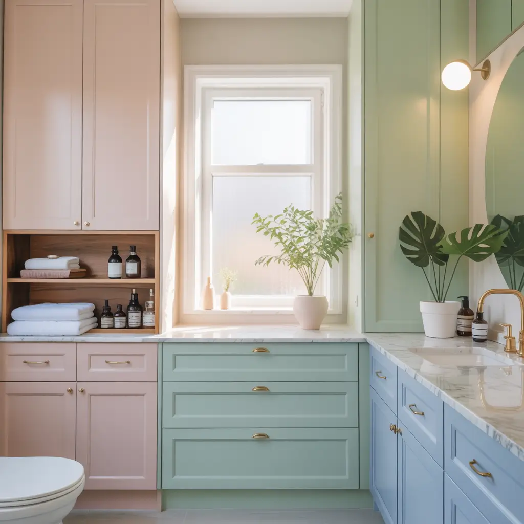
Pastel cabinets bring softness and calm to bathrooms without the boring neutrality of white. I painted my guest bathroom cabinets the palest blush pink last year, and every single person who uses that bathroom comments on how “peaceful” it feels. Who knew a little color could create such vibes?
Choosing Your Perfect Pastel
Not all pastels work in bathrooms. Some look juvenile, some clash with skin tones, and some just feel wrong in humid spaces. I tested approximately forty pastel samples before finding the right one—yes, I’m that person who tapes paint swatches everywhere and stares at them obsessively.
Pastels that actually work:
- Soft blush pink: Flattering lighting, makes everyone look healthy
- Pale mint: Fresh without being minty-toothpaste vibes
- Powder blue: Serene and spa-like
- Lavender gray: Purple without being a kid’s room
- Butter yellow: Sunny but subtle
Avoiding the Nursery Look
The biggest pastel fear? Making your bathroom look like a baby’s room. I get it—I almost abandoned my pink cabinet plan for exactly this reason. The secret to sophisticated pastels? Pairing them with mature elements.
How I keep pastels grown-up:
- Use alongside sophisticated hardware (brass, not plastic)
- Pair with marble or granite counters
- Add modern or vintage light fixtures
- Include natural wood elements
- Keep other colors neutral
Living with Pastel Cabinets
Here’s something nobody tells you—pastel cabinets show dirt less than white but more than dark colors. My blush cabinets hide water spots beautifully but showcase toothpaste splatter with disappointing clarity. Weekly wipe-downs keep them looking fresh.
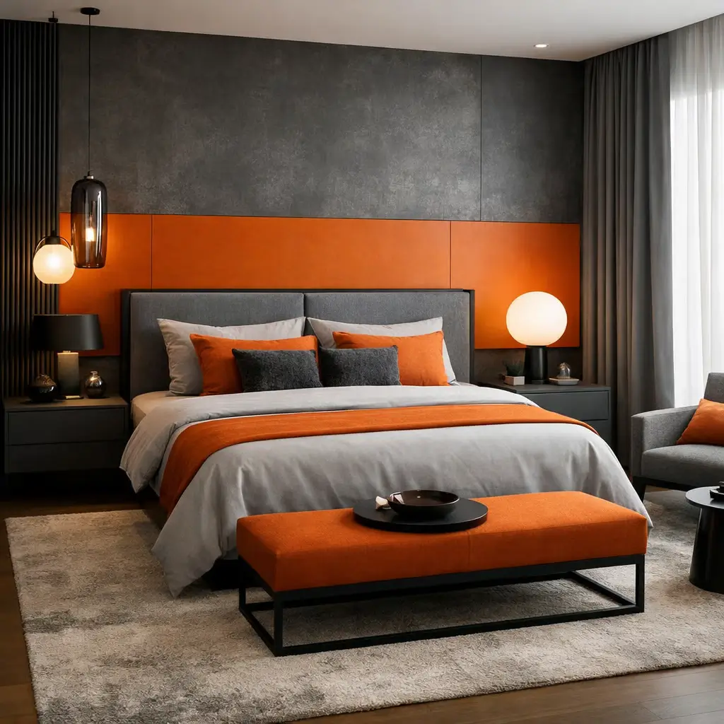
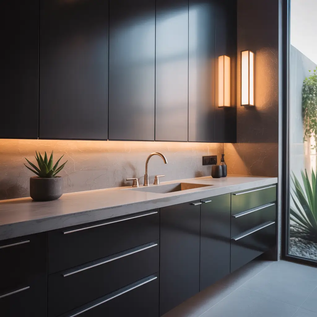
2. Bold Dark Toned Cabinet Colors
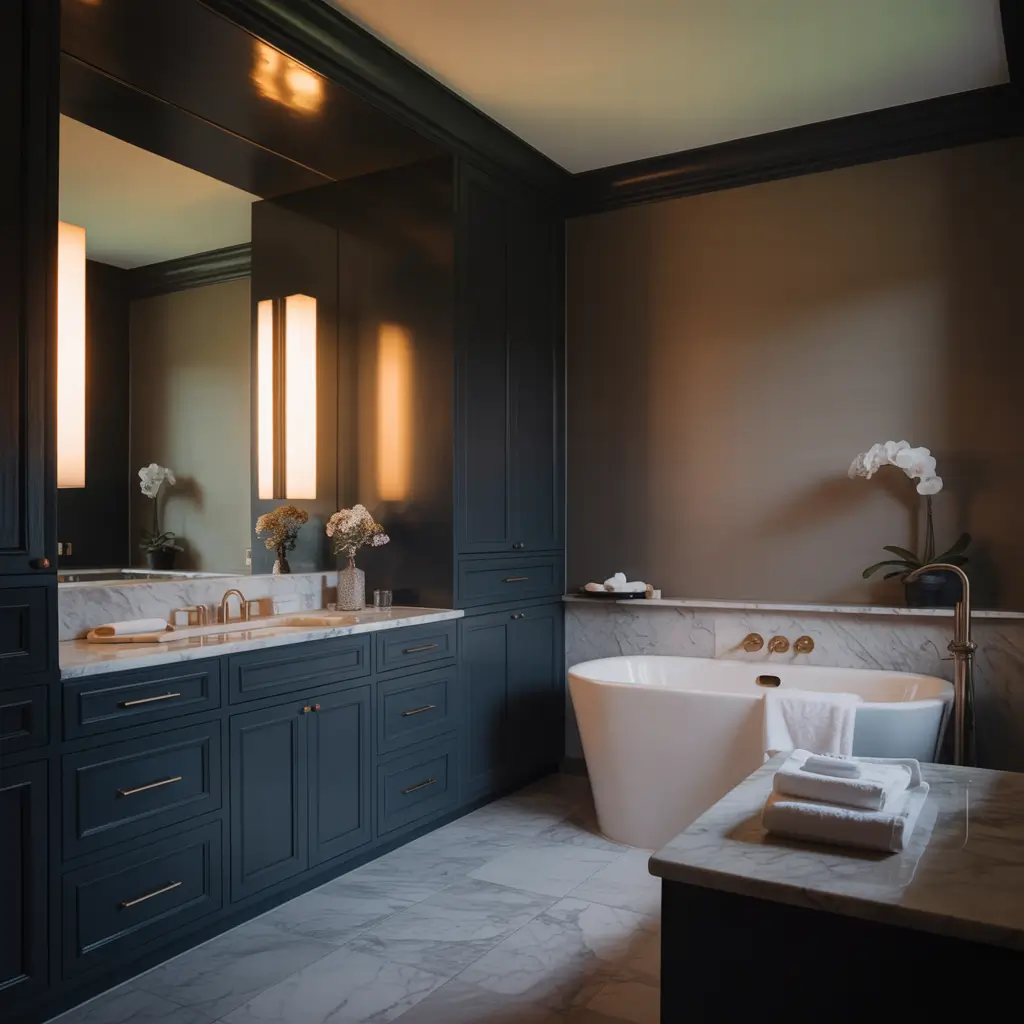
Dark cabinets felt risky until I finally took the plunge and painted my master bathroom vanity deep charcoal. The transformation? Dramatic, moody, and sophisticated in ways my old white cabinets could never achieve.
The Drama of Deep Colors
Dark cabinets make a statement—you walk into a bathroom with navy or charcoal cabinets and immediately know someone made an intentional design choice. My charcoal cabinets anchor the entire bathroom, creating a focal point that actually makes the space feel more designed.
Best dark colors for bathrooms:
- Navy blue: Classic, sophisticated, versatile
- Charcoal gray: Modern and moody
- Forest green: Unexpected and elegant
- Deep plum: Bold without being overwhelming
- Chocolate brown: Warm and grounding
Making Dark Work in Small Bathrooms
Everyone told me dark cabinets would make my small bathroom feel like a cave. They were wrong—sort of. Dark cabinets CAN shrink a space if you do it wrong. But pair them with the right elements, and they add depth instead of darkness.
My small bathroom dark cabinet formula:
- Keep walls light (white or pale gray)
- Add plenty of lighting (under-cabinet LEDs help)
- Use large mirrors to reflect light
- Choose glossy finishes over matte
- Include bright white towels and accessories
The Maintenance Reality
Let’s talk about the elephant in the room—dark cabinets show dust, water spots, and fingerprints like they’re getting paid for it. My charcoal cabinets require almost daily wiping, especially around the handles. Is it worth it? Absolutely. But go in with eyes open.
3. Classic White & Neutral Cabinets

White cabinets are classic for a reason—they’re timeless, versatile, and work with virtually everything. But here’s the plot twist: not all whites are created equal, and choosing the wrong one haunts you every single morning.
The Great White Debate
I’ve painted cabinets white three times, and each time I chose a different shade because the first two were disasters. Pure white looked sterile under my bathroom lighting. Warm white looked yellow. Finally, I discovered the magic of white with just a hint of gray undertone.
White variations that work:
- Cloud white: Soft without being dingy
- Swiss coffee: Warm but not yellow
- Alabaster: Creamy and forgiving
- Chantilly lace: Crisp but not stark
- White dove: Benjamin Moore’s gift to humanity
Beyond Basic White
White doesn’t have to mean boring. I elevated my white cabinets by focusing on other elements—the hardware, the countertop, the overall style. White cabinets become a blank canvas that lets other design choices shine.
Ways to make white interesting:
- Upgrade to statement hardware
- Add texture with shiplap or beadboard
- Install unique countertop materials
- Layer different shades of white
- Include unexpected accent colors
The Timeless Appeal
Here’s why I keep coming back to white despite trying every color—it never goes out of style. My navy cabinets from 2019 already feel slightly dated, but white? White will look appropriate in 2040. Sometimes boring wins.
Also Read: 10 Modern Bathroom Storage Cabinet Ideas for Sleek Spaces
4. Two-Tone Modern Bathroom Cabinets
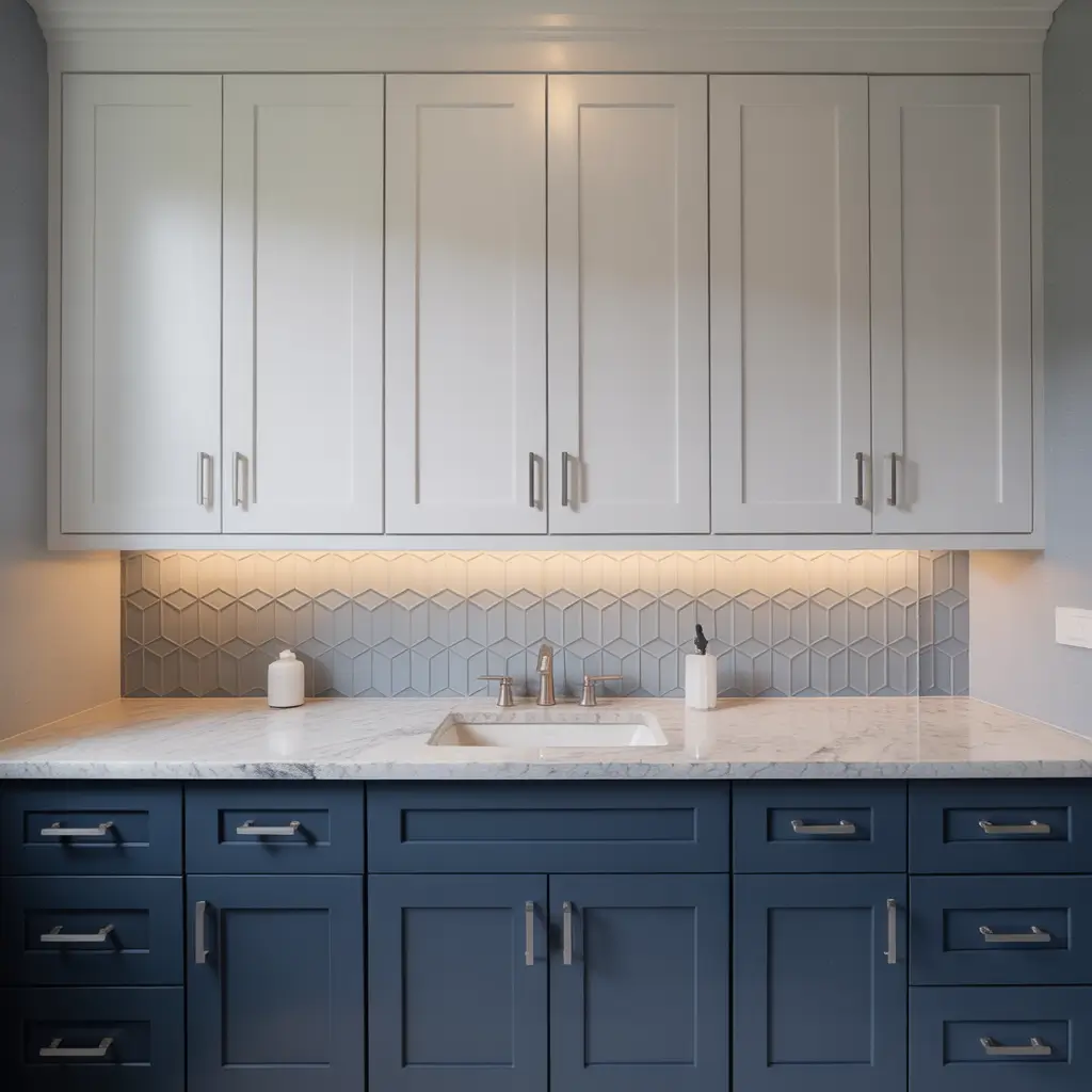
Two-tone cabinets are like the mullet of bathroom design—business on top, party on bottom. Except way more sophisticated and less questionable than that description suggests. I painted my vanity two-tone last year, and it completely transformed the space.
Creating Successful Color Combinations
Choosing two colors that work together requires more thought than I initially gave it. My first attempt paired colors that technically matched but visually fought with each other. Lesson learned—test combinations extensively.
Winning two-tone combos:
- White top, navy bottom: Classic contrast
- Light gray top, dark gray bottom: Subtle sophistication
- Natural wood top, painted bottom: Best of both worlds
- Cream top, sage green bottom: Soft and earthy
- White top, black bottom: Modern drama
The Visual Weight Strategy
The rule I follow? Darker color on bottom, lighter on top. This creates visual grounding and makes cabinets feel stable. I tried it reversed once (dark on top, light on bottom), and the whole vanity felt top-heavy and weird.
Execution Without Regret
Painting two-tone cabinets requires precision and patience. The line where colors meet needs to be crisp and intentional, not “I got tired halfway through painting.” I use painter’s tape religiously and still somehow get bleed-through :/
Application tips:
- Plan the color split at a natural break (drawer line, cabinet separation)
- Use quality painter’s tape
- Apply thin paint coats near the line
- Remove tape while paint is slightly wet
- Touch up carefully with tiny brush
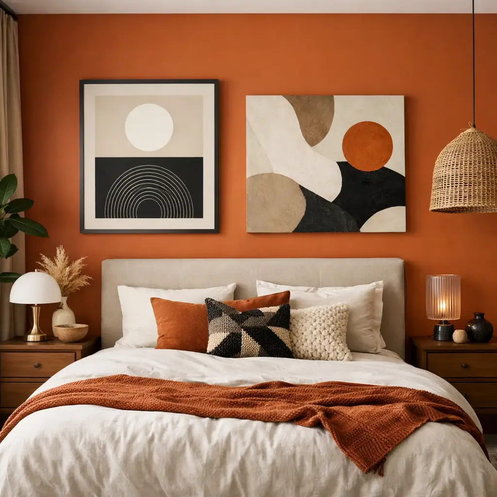
5. Soft Earthy Shades for Cabinets
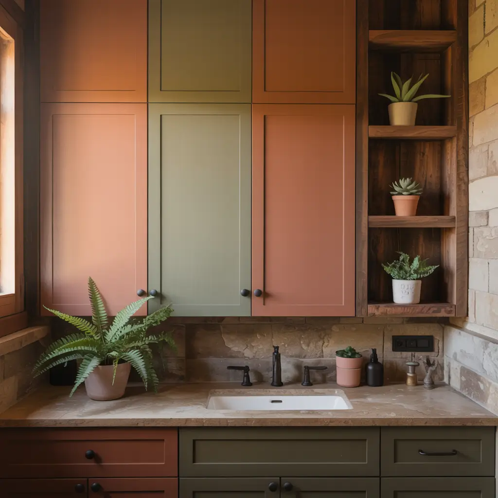
Earthy cabinet colors bring nature indoors and create bathrooms that feel grounded and calm. I painted my powder room cabinets a soft terracotta shade, and guests always comment on how “warm” and “inviting” the space feels.
The Earth Tone Palette
Earth tones work because they’re literally the colors we see in nature—our brains find them inherently soothing. My terracotta cabinets remind me of desert sunsets and make my morning routine feel less rushed somehow.
Earthy colors worth considering:
- Sage green: Herbal and fresh
- Terracotta: Warm and grounding
- Warm taupe: Sophisticated neutral
- Clay: Earthy without being brown
- Soft olive: Subtle and natural
Pairing Earthy Cabinets
Earth tones pair beautifully with natural materials. I combined my terracotta cabinets with marble counters, brass fixtures, and tons of plants. The result feels organic and cohesive instead of trying too hard.
Natural pairings:
- Stone or marble countertops
- Wood accents and accessories
- Natural fiber baskets
- Plants (real ones if possible)
- Brass or bronze hardware
Creating Spa-Like Bathrooms
Earth-toned cabinets automatically make bathrooms feel more spa-like. Add some eucalyptus in the shower, fluffy white towels, and maybe a candle, and suddenly you’re basically living at a wellness resort. Or at least that’s what I tell myself.
6. Moody Jewel-Toned Bathroom Cabinets
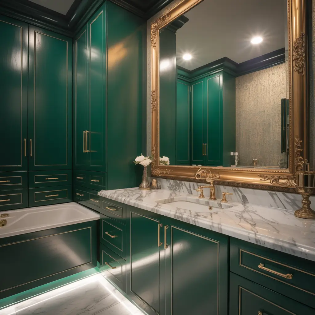
Jewel tones bring richness and luxury to bathrooms in ways neutral colors simply can’t. I painted my half bath cabinets emerald green, and now it’s the most photographed room in my house. Who knew a toilet room could be so Instagram-worthy?
Embracing Rich, Saturated Color
Jewel tones are bold, and they demand commitment. You can’t half-heartedly paint cabinets emerald or sapphire—you’re all in or all out. I spent weeks debating my emerald choice before finally going for it. Zero regrets.
Jewel tones that work:
- Emerald green: Luxe and sophisticated
- Sapphire blue: Rich without being dark
- Amethyst purple: Unexpected elegance
- Ruby red: Bold statement (brave souls only)
- Topaz yellow: Warm jewel tone
Balancing Bold Color
The key to jewel-toned cabinets? Keep everything else relatively neutral. My emerald cabinets work because I paired them with white walls, marble counters, and gold hardware. Too many bold elements creates visual chaos.
Balancing strategy:
- White or neutral walls
- Simple countertop materials
- Metallic hardware (gold works beautifully)
- Minimal patterns elsewhere
- Plenty of negative space
When Jewel Tones Work Best
IMO, jewel tones shine in powder rooms and guest bathrooms—spaces where people spend limited time. I love my emerald cabinets in small doses but might feel overwhelmed if I dealt with them during long morning routines in a master bath.
Also Read: 10 Trendy Bathroom Sink Cabinet Ideas and Minimalist Design Tips
7. Coastal Blue & Aqua Cabinet Ideas
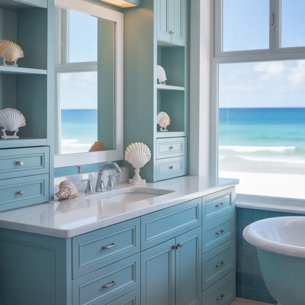
Coastal blue cabinets bring beachy vibes to bathrooms regardless of your actual proximity to water. I live nowhere near an ocean but painted my bathroom cabinets soft aqua, and now I pretend I’m at the beach every morning. Close enough, right?
Finding Your Perfect Blue
Blue is tricky because it spans from almost-green to almost-purple, and choosing the wrong one gives you a bathroom that feels cold instead of coastal. I tested seventeen blue samples before finding my perfect aqua. Yes, seventeen. I have commitment issues.
Coastal blues that work:
- Soft aqua: Classic beach house
- Seafoam: Green-blue hybrid
- Sky blue: Light and airy
- Turquoise: Bold coastal statement
- Weathered blue-gray: Subtle nautical
Creating Coastal Vibes
Coastal cabinets work best with complementary beach-inspired elements. I paired my aqua cabinets with white subway tile, rope mirrors, and lots of natural textures. The result feels beachy without being kitschy seashell explosion.
Coastal companions:
- White or cream walls
- Natural wood elements
- Rope or nautical accessories
- Marble or white countertops
- Brass or nickel hardware
Avoiding the Bathroom = Ocean Theme
Here’s the fine line—coastal doesn’t mean literally underwater. I’ve seen bathrooms where blue cabinets plus fish wallpaper plus wave tiles equals sensory overload. Subtle coastal beats obvious theme every time.
8. Minimalist Gray Cabinet Inspirations
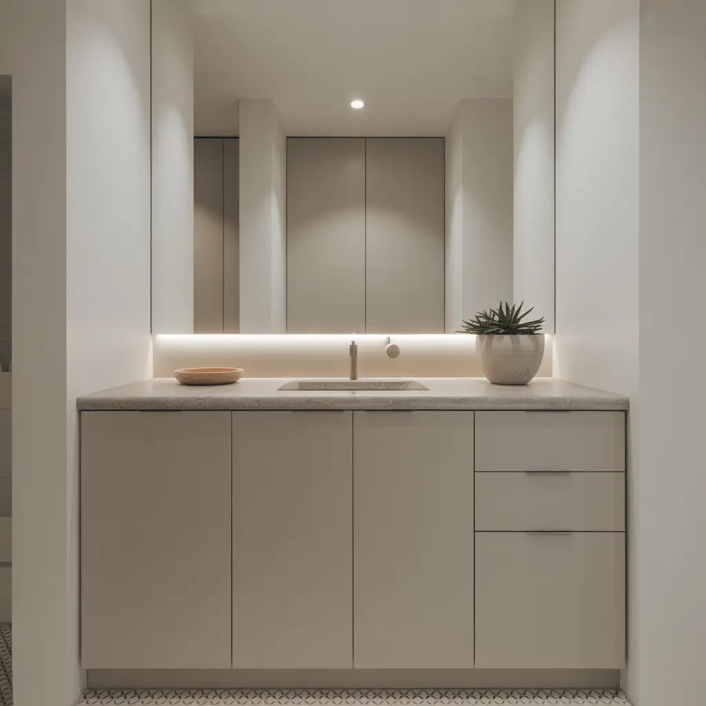
Gray cabinets are the Switzerland of bathroom colors—neutral, versatile, and somehow work with everything. I painted my master bathroom cabinets soft gray after living with bright white for years, and the subtle change made everything feel more sophisticated.
The Fifty Shades of Gray Cabinet
Gray ranges from almost-white to almost-black, with approximately ten million options in between. Choosing the right gray requires understanding undertones—some grays read blue, some read purple, some read green. My first gray cabinet attempt looked lavender under my lighting. Not the vibe I wanted.
Gray options by undertone:
- Warm gray: Beige undertones, cozy feel
- Cool gray: Blue undertones, modern edge
- Greige: Gray-beige hybrid, ultimate neutral
- Charcoal: Deep gray, dramatic impact
- Blue-gray: Subtle color without commitment
Gray as the Ultimate Neutral
Gray works because it pairs with virtually any other color. I’ve styled my gray cabinets with brass, chrome, copper, and black hardware—all looked great. Try that with a bold color and you’ll quickly learn about clashing.
Making Gray Feel Warm
The biggest gray criticism? It can feel cold. I combat this by layering warm elements—wood accessories, warm-toned towels, brass hardware, and plenty of warm lighting. The combination keeps gray from feeling sterile.
9. Warm Wood & Painted Cabinet Combos
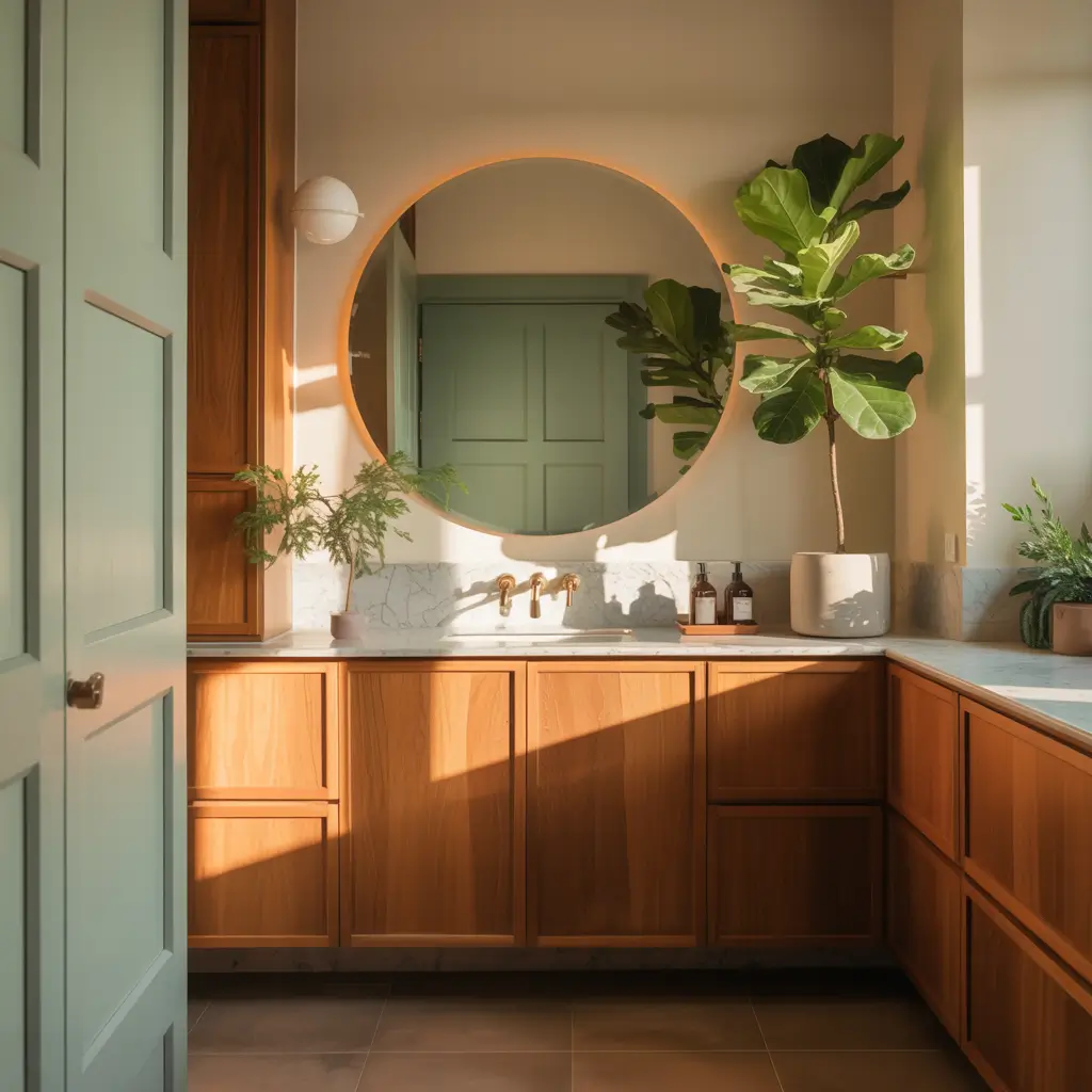
Combining natural wood with painted cabinets creates visual interest and warmth that all-painted or all-wood cabinets can’t achieve alone. I paired painted white base cabinets with natural wood upper cabinets, and the contrast makes both elements shine.
The Best of Both Worlds
Wood brings warmth and texture. Paint brings color and versatility. Together? They create bathrooms that feel both natural and designed. My combo setup gets more compliments than any single-finish cabinet I’ve owned.
Successful combinations:
- White painted base, natural wood top
- Gray painted base, walnut wood open shelves
- Navy painted cabinets, natural wood countertop
- Sage painted cabinets, light oak accents
- Black painted base, natural wood floating shelf
Choosing Compatible Wood Tones
Not all wood tones work with all paint colors. I learned this after pairing cool gray cabinets with warm oak wood—they fought visually. Now I match undertones: warm paint with warm wood, cool paint with cool wood.
Creating Cohesion
The trick to wood and paint combinations? Repeating elements throughout the space. I echo my natural wood cabinet shelves with a wood-framed mirror and wood accessories. The repetition makes it feel intentional instead of random.
Also Read: 12 Clever Bathroom Mirror Cabinet Ideas to Maximize Storage
10. Trendy Matte Black Bathroom Cabinets
Matte black cabinets are having a moment, and honestly, I understand why. I installed matte black cabinets in my renovation last year, and they make everything else in the bathroom look more expensive and intentional.
The Power of Black
Black cabinets create instant drama and sophistication. They’re bold without being colorful, making them easier to live with long-term than, say, hot pink cabinets (don’t ask about my 2015 mistake).
Why matte beats glossy:
- Hides fingerprints better
- Less reflective (softer appearance)
- More sophisticated feel
- Easier maintenance
- Forgiving with imperfections
Making Black Work
Black cabinets require thoughtful planning. Too much black makes bathrooms feel like caves. I balance my black cabinets with white walls, marble counters, and brass hardware. The contrast prevents darkness overload.
Essential balancing elements:
- Plenty of lighting (crucial!)
- Light-colored walls
- Bright countertop materials
- Large mirrors
- Warm metallic accents
The Dust Situation
FYI, black cabinets show dust and water spots more than any color I’ve ever used. I wipe mine down almost daily to maintain that crisp, sophisticated look. High maintenance? Yes. Worth it? Also yes.
11. Vibrant Color Pop Cabinets
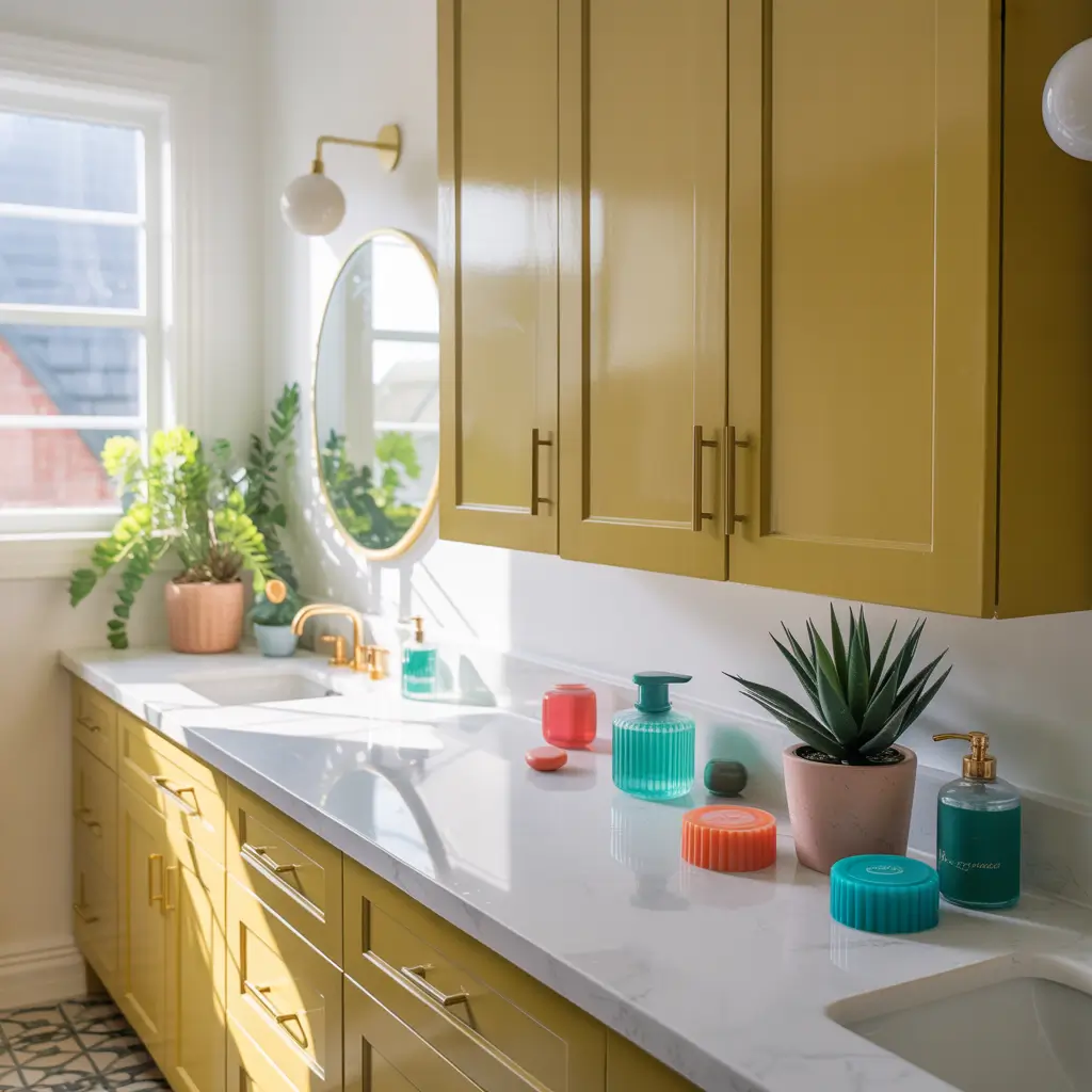
Sometimes you need to go bold. Really bold. I painted my powder room cabinets a saturated coral, and while some people think I’m crazy, I absolutely love walking past that bathroom and seeing that pop of happy color.
Choosing Your Statement Color
Bold cabinet colors require confidence and commitment. You can’t wishy-washy your way into bright yellow cabinets. I deliberated my coral choice for months before finally deciding that life’s too short for boring bathrooms.
Colors that make statements:
- Bright coral: Happy and energetic
- Sunny yellow: Cheerful and warm
- Peacock blue: Vibrant and sophisticated
- Kelly green: Bold and fresh
- Hot pink: For the truly brave
Where Bold Works Best
I reserve vibrant colors for powder rooms and guest bathrooms—spaces where limited exposure prevents color fatigue. My coral cabinets delight me in small doses but might overwhelm if I faced them during long morning routines.
Styling Around Vibrant Cabinets
The key to bold cabinets? Keep everything else simple. My coral cabinets work because the walls are white, the floor is neutral, and accessories are minimal. The cabinets are the star, and everything else plays supporting roles.
12. Elegant Cream & Beige Cabinet Ideas
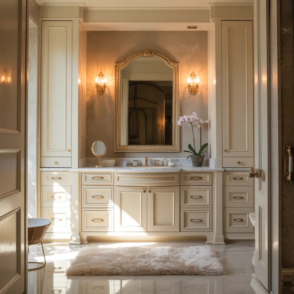
Cream and beige cabinets are sophisticated neutrals that bring warmth white can’t match. I painted my guest bathroom cabinets a soft cream, and the space immediately felt warmer and more inviting than it ever did with stark white.
The Warmth of Cream
Cream cabinets have gotten a bad rap as “builder beige,” but the right cream is actually incredibly elegant. The difference between cheap beige and sophisticated cream? Undertones and quality of paint.
Creams that work:
- Soft ivory: Warm but not yellow
- Antique white: Aged elegance
- Cream with gray undertones: Modern warmth
- Linen: Natural, textured feel
- Bone: Classic neutral
Pairing Cream Cabinets
Cream works beautifully as a bridge between warm and cool elements. I pair my cream cabinets with both brass and chrome successfully—the warmth of cream accommodates both metal temperatures.
Creating Timeless Elegance
Cream cabinets feel classic and timeless in ways trendy colors don’t. My cream cabinets will look appropriate in ten years, while my emerald cabinets might feel dated. Sometimes playing it safe wins the long game.
Bringing Your Color Vision to Life
Choosing bathroom cabinet colors is deeply personal—what makes me happy might make you cringe, and that’s totally fine.
After painting cabinets twelve different colors across various bathrooms, I’ve learned that the “right” color is whatever makes you smile when you see it, even on rough mornings before coffee.
Start by testing samples. I know it seems excessive, but seeing paint on actual cabinet surfaces in your specific lighting saves you from expensive regrets.
I paint large poster boards and lean them against cabinets, living with them for at least a week before committing.
Consider your long-term plans too. Bold colors are amazing if you’re staying put or don’t mind repainting. If you’re selling soon, safer neutrals probably make more financial sense—even if they’re less exciting.
Most importantly, don’t let fear of mistakes prevent you from adding color to your life. Paint is changeable. If you hate it, you can repaint.
I’ve repainted cabinets three times in one bathroom (not my proudest moment), and each color taught me something about what I actually want.
Your bathroom cabinets deserve better than builder-grade boring. Whether you choose serene pastels, dramatic darks, or somewhere in between, make it yours.
Life’s too short for cabinets that don’t spark at least a little joy when you’re stumbling around at 6 AM looking for your toothbrush. Pick a color that makes you happy, grab a paintbrush, and transform those cabinets into something worth waking up to!