12 Beautiful Interior Design Mood Board Ideas to Try Today
- Home Interior Design
 Ben
Ben- 0
- 40 minutes read
Ever started a design project with absolute certainty about what you wanted, only to end up with a room that looks nothing like you imagined? Yeah, me too.
My first living room redesign was supposed to be “sophisticated minimalism” but somehow became “confusing chaos that looks like three different people live here.” The missing ingredient? A proper mood board.
Mood boards are basically the blueprint between your Pinterest dreams and your actual reality. They force you to see how elements work together before you’ve committed money, time, and emotional energy to choices you can’t easily undo.
After creating mood boards for every room in my house (and several friends’ homes), I’ve learned that the difference between cohesive design and expensive regret often comes down to this one planning step.
These twelve interior design mood board ideas cover everything from serene Scandinavian to bold eclectic, giving you templates to start your own design journey.
Whether you’re creating physical boards with fabric swatches and magazine cutouts or going digital with design apps, these mood board concepts will help you visualize your space before making a single purchase.
Because trust me, returning that “perfect” sofa that looks completely wrong in your actual room gets really old really fast.
1. Minimalist Scandinavian Mood Board Inspiration
Minimalist Scandinavian mood boards embrace the art of intentional simplicity – every element earns its place through either beauty or function, preferably both. This aesthetic strips away excess while maintaining warmth, creating boards that feel curated rather than sparse.
The color palette stays deliberately restrained. Whites, soft grays, and natural wood tones form the foundation, with perhaps one muted accent color – dusty rose, sage green, or soft blue. When I created my Scandinavian bedroom mood board, I limited myself to four colors total. The discipline felt restrictive until I saw how cohesive the final result looked.
Texture does the heavy lifting in Scandinavian boards. Linen, wool, natural wood grain, and matte ceramics create visual interest without color chaos. Include fabric swatches that show these textures – a nubby throw, a smooth wood sample, maybe a sheepskin corner.
Scandinavian Mood Board Elements
What to include:
- Natural material samples – wood, wool, linen
- White and neutral paint chips – at least three whites for comparison
- Simple furniture images with clean lines
- Plant photography – greenery adds life
- Lighting fixtures with organic shapes
- Minimal artwork with nature themes
The restraint extends to accessories. One perfect ceramic vase beats five okay decorative objects in Scandinavian design philosophy.
2. Cozy Bohemian Living Room Mood Board
Cozy bohemian mood boards celebrate organized chaos and global influences in ways that feel collected rather than cluttered. These boards burst with pattern, color, and texture – the opposite of minimalism, yet equally intentional.
The color story in boho boards tells adventures. Earth tones anchor everything – terracotta, rust, amber, forest green – while jewel tones add richness. My first bohemian mood board looked like a beautiful mess until I identified the common warm undertone connecting all the patterns. Finding that thread transforms chaos into harmony.
Pattern mixing defines bohemian style. Include multiple fabric samples with different patterns – geometric, floral, tribal – but ensure they share either color family or scale relationship. This is where physical mood boards shine; seeing actual fabric swatches interact reveals whether combinations work.
Bohemian Mood Board Components
Creating layered beauty:
- Multiple textile swatches showing pattern variety
- Macramé or woven texture samples
- Plant imagery – lots of plants
- Vintage furniture inspiration
- Global accent pieces from various cultures
- Warm metallic accents – brass, copper, gold
The key is intentional abundance. More isn’t automatically better – it needs to feel curated over time, not purchased in one overwhelming shopping spree.
3. Modern Farmhouse Kitchen Mood Board Ideas
Modern farmhouse kitchen mood boards blend rustic charm with contemporary functionality for spaces that feel both nostalgic and current. This style has evolved beyond shiplap everything into something more sophisticated and timeless.
The material palette balances old and new. Reclaimed wood, subway tile, marble or quartz counters, black hardware – these elements create the classic modern farmhouse look. Your mood board should show how these materials interact, particularly at transition points where different surfaces meet.
White dominates but doesn’t monopolize. Include your specific white choices – cream, warm white, bright white – because they read completely differently in actual spaces. I’ve seen farmhouse kitchens ruined by mixing cool and warm whites unintentionally.
Farmhouse Kitchen Board Elements
Building the farmhouse feel:
- Cabinet finish samples in white or natural wood
- Countertop material images or actual samples
- Hardware options in black or brass
- Sink style imagery – farmhouse apron sinks
- Lighting fixtures with mixed materials
- Open shelving inspiration shots
The balance prevents costume. Too many rustic elements feels theme park, while too modern loses the farmhouse soul.
Also Read: 10 Stylish Interior Ceiling Design Ideas and Trendy Room Looks
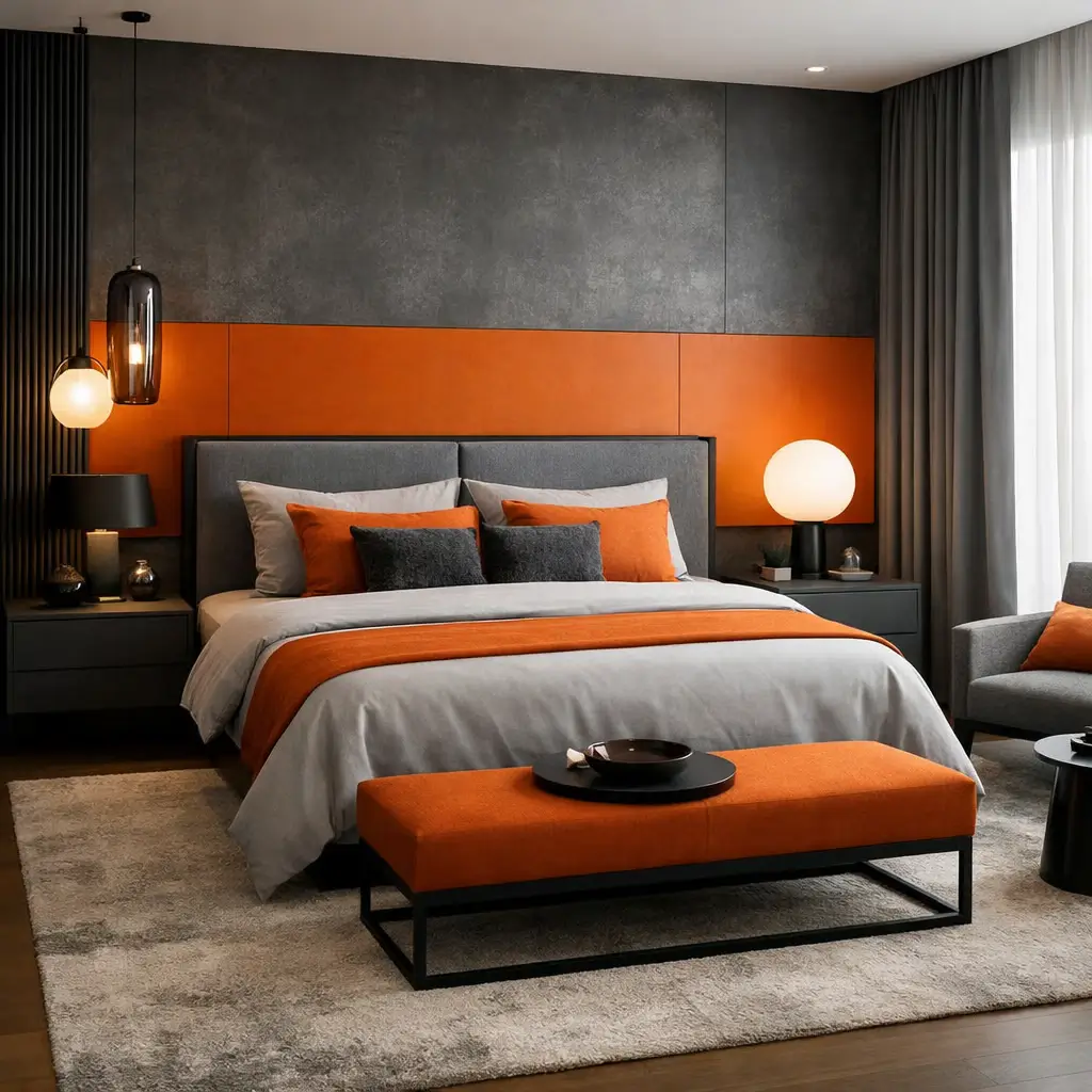
4. Luxury Bedroom Mood Board with Neutral Tones
Luxury bedroom mood boards in neutral tones prove that color restraint can create the richest environments. This approach relies on quality materials and sophisticated layering rather than bold color for impact.
The neutral spectrum expands beyond beige. Warm grays, soft creams, mushroom tones, camel, ivory – these “neutrals” actually encompass tremendous variety. Your mood board should show the specific neutral family you’re working with, because mixing warm and cool neutrals creates visual tension nobody wants in a bedroom.
Texture becomes critically important without color to create interest. Velvet, silk, cashmere, linen, leather – each material reflects light differently and adds depth. Include actual fabric samples whenever possible; photos don’t capture how fabrics feel and behave.
Luxury Neutral Bedroom Elements
Creating sophisticated calm:
- High-quality bedding samples in various textures
- Drapery fabric options showing weight and drape
- Carpet or rug texture samples
- Metallic accent choices – typically gold, brass, or silver
- Upholstered furniture imagery
- Lighting with ambient capability
The luxury reads through quality, not quantity. One stunning throw blanket outperforms three mediocre ones every time.
5. Vibrant Eclectic Mood Board for Creative Spaces
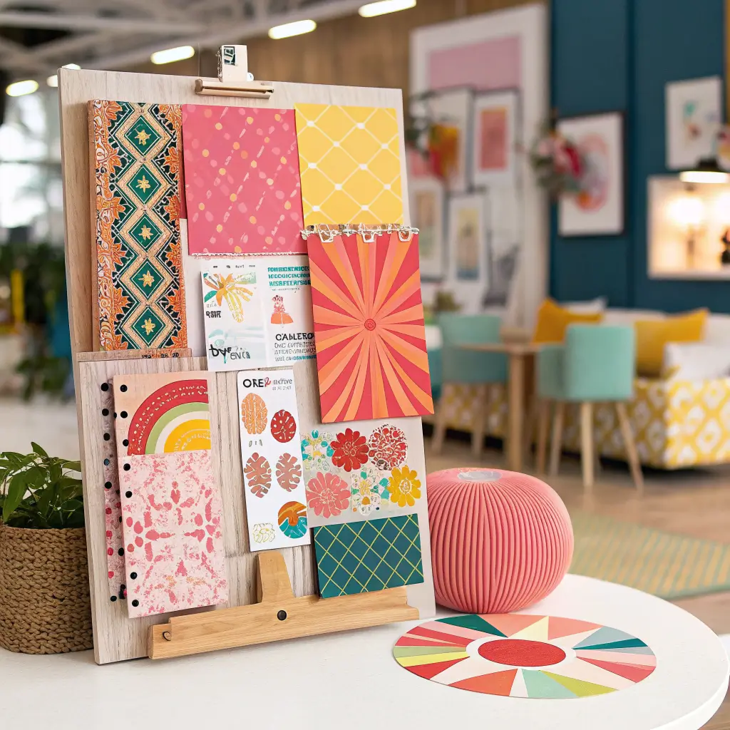
Vibrant eclectic mood boards embrace fearless color and unexpected combinations for spaces that energize and inspire. These boards reject rules in favor of personality – but even rule-breaking benefits from planning.
Color goes bold and stays bold. Multiple saturated colors can coexist when united by intensity level or complementary relationships. My eclectic home office mood board features teal, coral, and mustard – colors that shouldn’t work together but absolutely do because they share similar vibrancy.
The collecting mentality shapes eclectic boards. Mix vintage finds with modern pieces, high-end items with affordable accessories, global influences with local art. The beauty emerges from genuine personal expression rather than catalog matching.
Eclectic Creative Space Elements
Embracing bold choices:
- Saturated color paint chips – at least four bold options
- Mixed pattern fabric swatches
- Artwork imagery in various styles
- Unexpected furniture combinations
- Collectible or vintage objects
- Statement lighting that becomes art
The confidence factor determines success. Half-committed eclectic reads confused, while fully committed eclectic reads intentional.
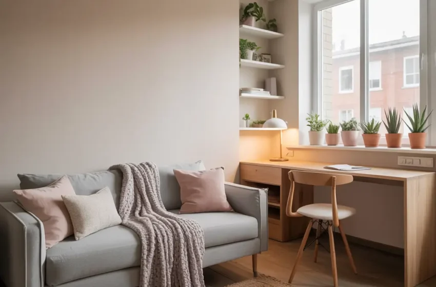
6. Small Apartment Space-Saving Mood Board
Small apartment mood boards prioritize function and visual expansion alongside aesthetics. Every element must justify its footprint, and design choices should make limited space feel larger, not more cramped.
Light colors dominate for good reason. Whites and light neutrals reflect more light and create airiness that dark colors absorb. Your mood board should emphasize this lightness while still including personality through accents.
Multi-functional furniture becomes non-negotiable. Include images of pieces that serve double duty – storage ottomans, murphy beds, nesting tables, expandable dining options. The board should visualize how the space adapts between different uses.
Small Space Board Essentials
Maximizing limited footage:
- Light color palette samples
- Mirror imagery for space illusion
- Multi-functional furniture examples
- Vertical storage solutions
- Streamlined furniture profiles
- Strategic lighting options
The editing process matters most here. What you leave off the small space mood board is as important as what you include.
Also Read: 10 Modern Kids Room Interior Design Ideas for Growing Kids
7. Coastal Beach House Mood Board Inspiration
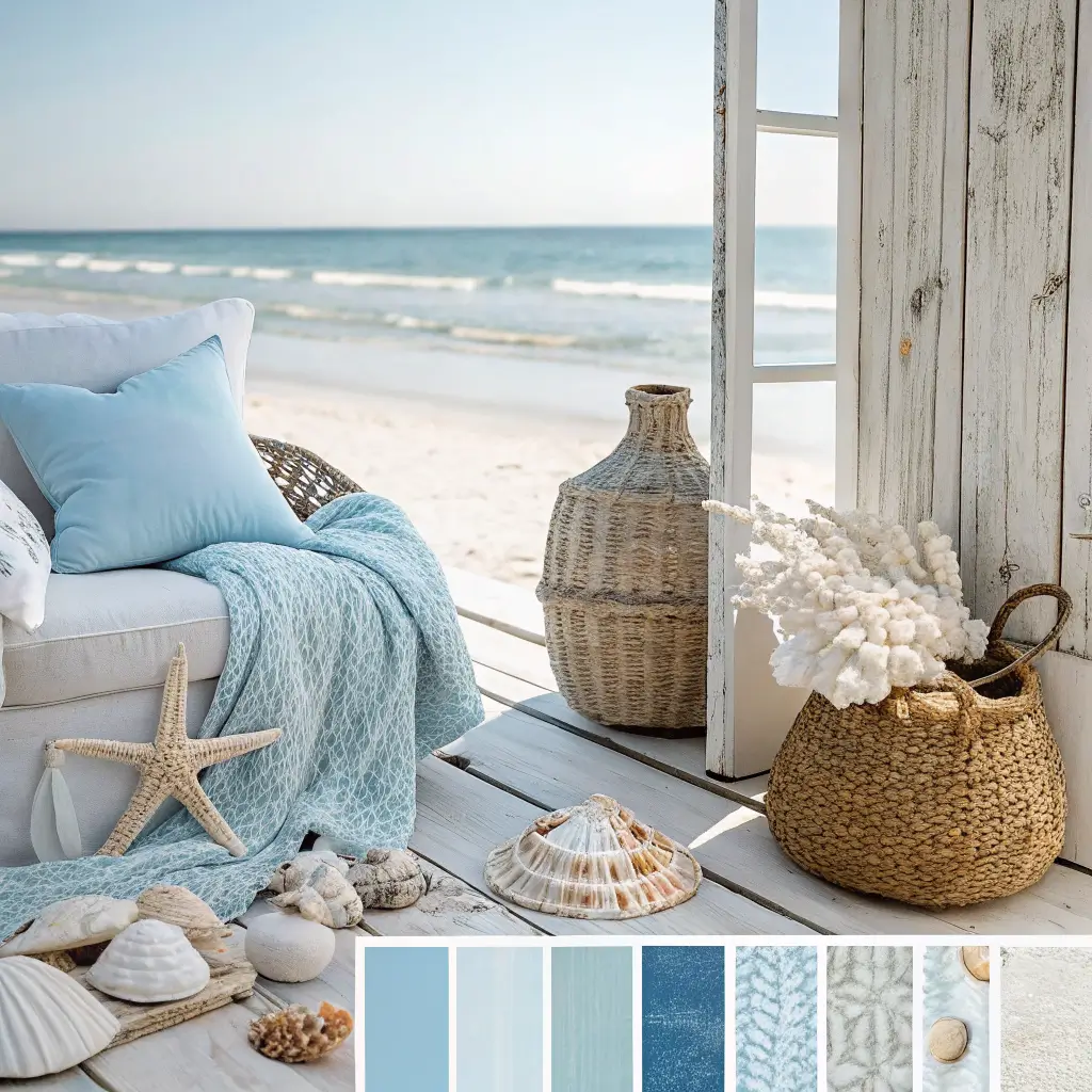
Coastal beach house mood boards capture oceanside relaxation without resorting to cliché shells and anchors. Modern coastal style evokes the feeling of the beach through color, texture, and light rather than literal nautical symbols.
The color palette pulls from actual coastlines. Sand tones, ocean blues, driftwood grays, sea glass greens, sunset corals – these colors work because they exist together naturally. My coastal living room mood board references a specific beach photograph for color accuracy. Real beach hues differ dramatically from stereotypical nautical palettes.
Natural textures reinforce the coastal vibe. Weathered wood, woven seagrass, linen, sisal – materials that could survive salt air even if they never encounter it. Include these actual textures on your board to feel how they complement each other.
Coastal Mood Board Components
Capturing seaside serenity:
- Blue gradient paint chips from sky to deep ocean
- Natural fiber textile samples
- Weathered wood imagery or samples
- Simple, casual furniture styles
- Natural light photography emphasis
- Organic shaped accessories
The sophistication comes from restraint. Skip the obvious beach decor in favor of subtle references that evoke rather than state the coastal theme. FYI, your space should feel like beach living, not a beach souvenir shop.
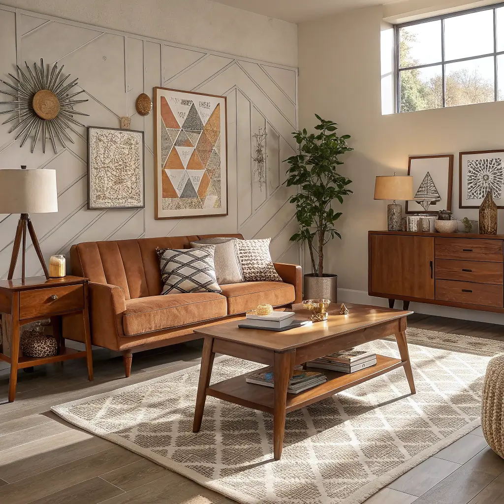
8. Mid-Century Modern Living Room Mood Board
Mid-century modern mood boards celebrate the design revolution of the 1950s and 60s when furniture became sculpture and homes became galleries. This style remains timeless because it prioritized both form and function.
The furniture silhouettes define the era. Tapered legs, organic curves, low profiles – these elements immediately signal mid-century design. Your mood board should feature iconic pieces or well-executed reproductions that capture these distinctive shapes.
The color palette ranges from muted to bold. Warm woods pair with mustard, teal, orange, or olive – the characteristic mid-century accent colors. Include your specific wall color alongside furniture images to see how the palette works together.
Mid-Century Board Elements
Channeling retro sophistication:
- Iconic furniture imagery – Eames, Noguchi, etc.
- Warm wood tones – walnut especially
- Accent color options in period-appropriate hues
- Statement lighting fixtures
- Indoor-outdoor connection imagery
- Abstract art examples
The authenticity debate continues. Original vintage pieces cost fortunes, but quality reproductions capture the aesthetic at accessible prices.
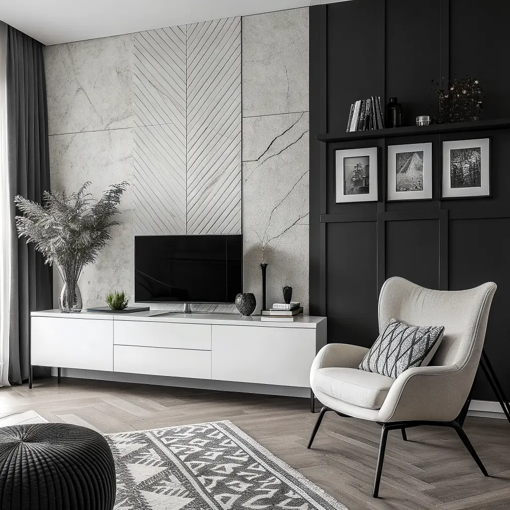
9. Monochrome Black & White Mood Board Ideas
Monochrome black and white mood boards prove that limiting palette creates maximum impact. This approach demands excellence in every other design element since color can’t carry the weight.
The value range provides all the interest. Pure black to pure white with every gray between creates stunning depth when used thoughtfully. Your mood board should show exactly where each element falls on this spectrum and how they’ll interact spatially.
Pattern becomes your best friend in monochrome. Stripes, geometrics, florals, abstracts – all work when limited to black and white. Include multiple pattern samples to see how they complement or clash with each other.
Monochrome Board Components
Creating drama through restraint:
- Multiple gray paint chips showing full spectrum
- Patterned fabric samples in black and white
- Texture variation from matte to glossy
- Material samples – marble, metal, fabric
- Photography or art in black and white
- Accent metal – typically silver or chrome
The maintenance reality check: white surfaces show everything. Include practical material choices that actually survive daily life.
Also Read: 12 Beautiful Coffee Shop Interior Design Ideas for Rustic Charm
10. Colorful Kids Room Mood Board Inspiration
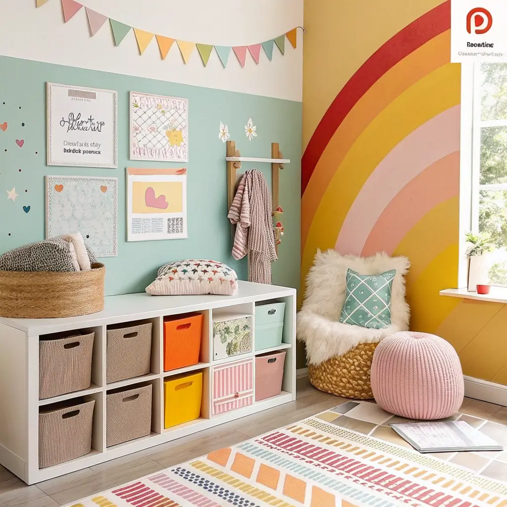
Colorful kids room mood boards balance childhood joy with design sophistication that won’t embarrass you when guests see it. The best kids rooms feel fun without looking chaotic or cartoon-themed.
Color selection requires strategy. Choose a cohesive palette rather than random rainbows. Three to four complementary colors create vibrancy without overwhelming. My daughter’s room mood board features dusty rose, soft teal, and golden yellow – colorful but coordinated.
Growth potential matters in kids spaces. Include elements that adapt as children age rather than requiring complete redesign at each stage. The mood board should feel appropriate for several years of development.
Kids Room Board Essentials
Balancing fun and function:
- Cheerful but sophisticated colors
- Durable material samples – kids destroy things
- Storage solution imagery
- Age-appropriate furniture scales
- Playful patterns that aren’t childish
- Flexible lighting options
The investment calculation shifts here. Spend on items that last through phases while keeping trendy elements easily replaceable.
11. Industrial Loft Style Mood Board Ideas
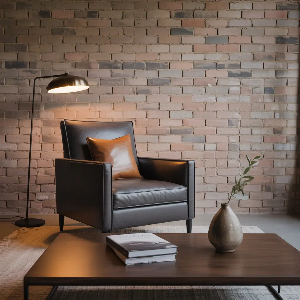
Industrial loft mood boards celebrate raw materials and urban authenticity that turn former factories into sophisticated living spaces. This style reveals rather than conceals, making honest structure the decoration.
The material palette stays hard-edged but warm. Exposed brick, concrete, metal, reclaimed wood, leather – these elements create industrial authenticity. Include actual material samples when possible to see how textures interact.
Warmth prevents industrial spaces from feeling cold. Leather seating, wood accents, warm lighting, textile layers – these additions make raw spaces livable. Your mood board should show this balance between hard and soft elements.
Industrial Board Components
Building urban character:
- Exposed material samples – brick, concrete textures
- Metal finish options – matte black, raw steel
- Warm wood varieties for contrast
- Leather swatch samples
- Industrial lighting fixtures
- Vintage or salvaged piece imagery
The authenticity question matters. Real industrial elements beat fake industrial every time – that brick-look wallpaper doesn’t fool anyone :/
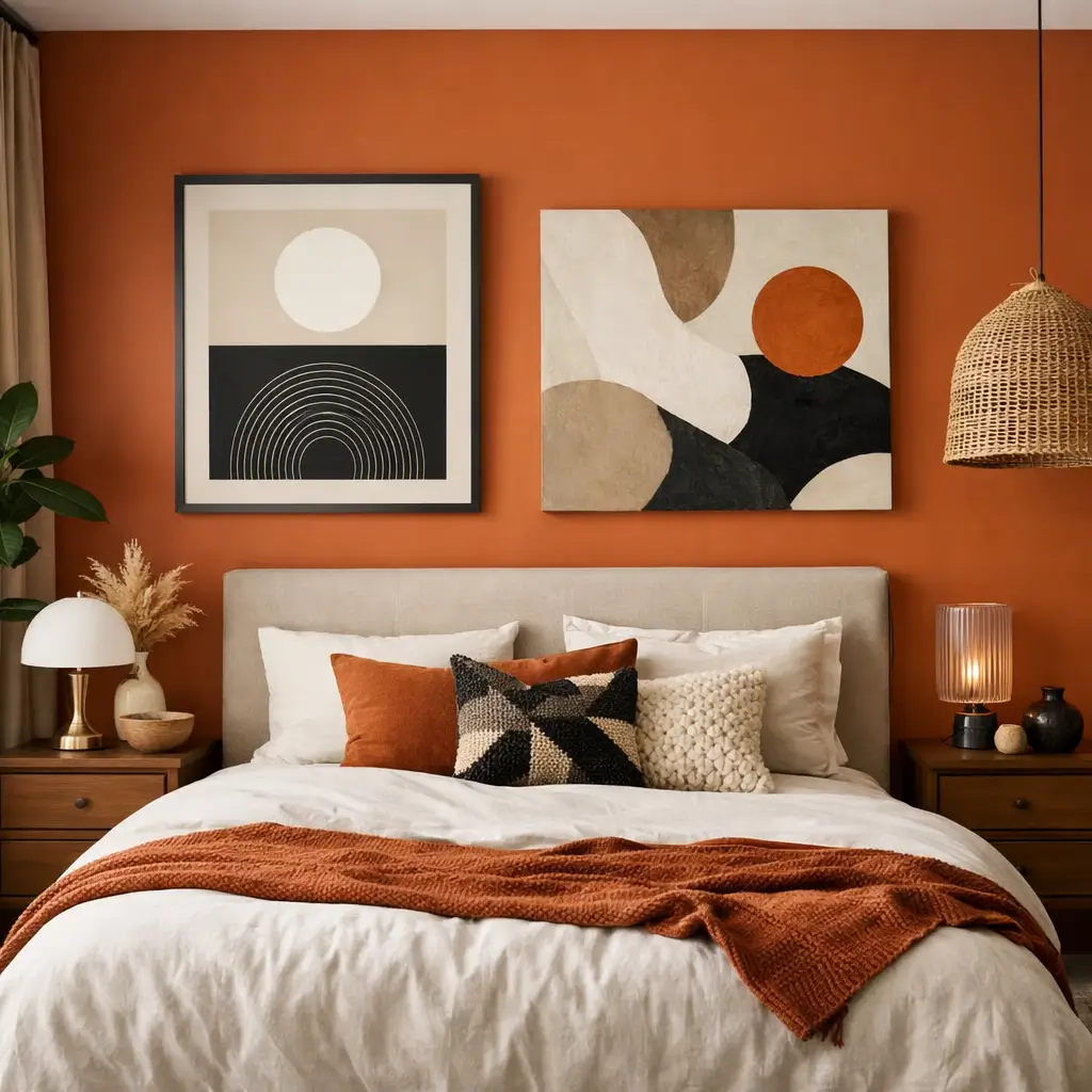
12. Elegant Vintage Chic Mood Board Inspiration
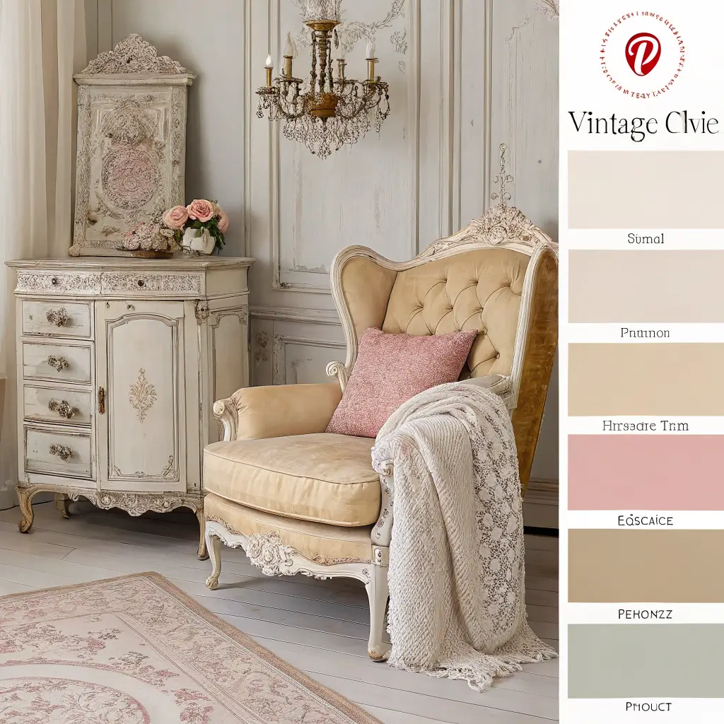
Elegant vintage chic mood boards blend timeless sophistication with curated antique charm for spaces that feel collected over generations rather than decorated last weekend. This style rewards patience and discerning selection.
The era mixing creates richness. Victorian, Art Deco, Mid-Century, Regency – vintage chic borrows from multiple periods united by quality and elegance. Your mood board should show how pieces from different eras converse with each other.
Color palettes lean traditional but not boring. Dusty rose, sage green, French blue, cream, gold – these colors have worked for centuries because they’re genuinely beautiful. Include paint samples alongside fabric and furniture images.
Vintage Chic Board Elements
Cultivating elegant history:
- Antique furniture inspiration imagery
- Rich fabric samples – velvet, silk, brocade
- Ornate detail imagery – frames, hardware
- Crystal or glass accent references
- Vintage pattern fabrics
- Gilt or brass metallic accents
The collection mentality takes time. True vintage chic evolves through years of careful acquisition rather than single shopping trips. IMO, the patience pays off in spaces with genuine soul.
Bringing Your Mood Board to Life
After exploring these twelve interior design mood board ideas, here’s the truth: the best mood board is one you actually use throughout your project.
Pin it where you see it daily, reference it before every purchase, and let it guide decisions when you’re tempted by off-plan impulse buys.
Start with the style that most resonates, then customize mercilessly. Your mood board should reflect your life, not some magazine’s idea of how you should live.
Include photos of your actual space, your existing furniture you’re keeping, your specific lighting conditions.
Remember that mood boards evolve. Add to them, edit them, let them grow as your vision clarifies. That first version rarely survives intact, and that’s perfectly fine. The process of creating and refining is where design decisions actually happen.
The perfect mood board prevents the confusion that leads to expensive mistakes. It gives you confidence to commit to choices and the clarity to say no to things that don’t fit, no matter how beautiful they are in isolation.
Because that gorgeous lamp means nothing if it clashes with everything else you’ve chosen.
Now stop scrolling through more design inspiration and actually start building your mood board. Your future room is waiting for you to visualize it into existence.
And hey, if your first attempt looks like a mess? That’s what mood boards are for – figuring it out before your actual walls are involved 🙂