10 Trendy Bedroom Paint Colors Ideas and Stylish Palettes
- Bedroom Design
 Ben
Ben- 0
- 30 minutes read
Remember that time you stood in the paint aisle for three hours, completely paralyzed by 50 shades of beige? Yeah, me too.
After painting my bedroom four times in two years (I have commitment issues, okay?), I’ve learned that choosing bedroom paint colors doesn’t have to feel like defusing a bomb.
The right paint color transforms your bedroom from “place where I sleep” to “sanctuary I never want to leave.” Wrong color? You’re stuck staring at your mistake every single night.
No pressure, right? But here’s the thing – once you understand what different colors actually do to a space and your mood, the choice becomes surprisingly clear.
So let’s talk about the paint colors that actually work, why they work, and how to avoid my expensive mistakes. These aren’t just pretty colors; these are the ones that’ll make you love your bedroom again.
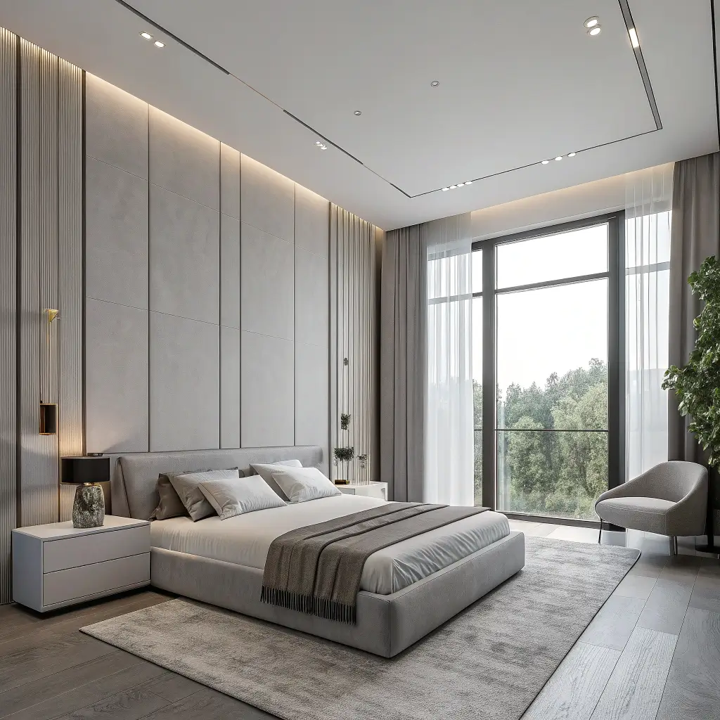
1. Cozy Neutral Bedroom Paint Ideas
Let’s start with the safety net that never fails – cozy neutrals. But hold up, neutral doesn’t mean boring. We’re not talking contractor beige here.
I learned this after painting my bedroom “Accessible Beige” (yes, that’s a real paint name) and feeling like I lived inside a cardboard box. The second attempt with a warm greige completely changed everything. Suddenly my room felt expensive, not expired.
The Secret to Cozy Neutrals
Here’s what makes neutrals actually cozy:
- Warm undertones are non-negotiable (think pink, yellow, or red hints)
- Layer different neutral shades for depth
- Go darker than you think (light neutrals can feel cold)
- Test colors at different times of day
- Consider your natural light situation
My go-to neutral picks that never disappoint? Benjamin Moore’s “Revere Pewter” for that perfect greige, Sherwin-Williams “Agreeable Gray” for warmth without beige, and Farrow & Ball’s “Elephant’s Breath” if you’re feeling fancy. Yes, that last one costs more than my weekly groceries, but sometimes you need to treat yourself.
The biggest mistake people make with neutrals? Going too light. That “barely there” beige you thought looked sophisticated? In bad lighting, it looks like primer. Trust me, I’ve been there.
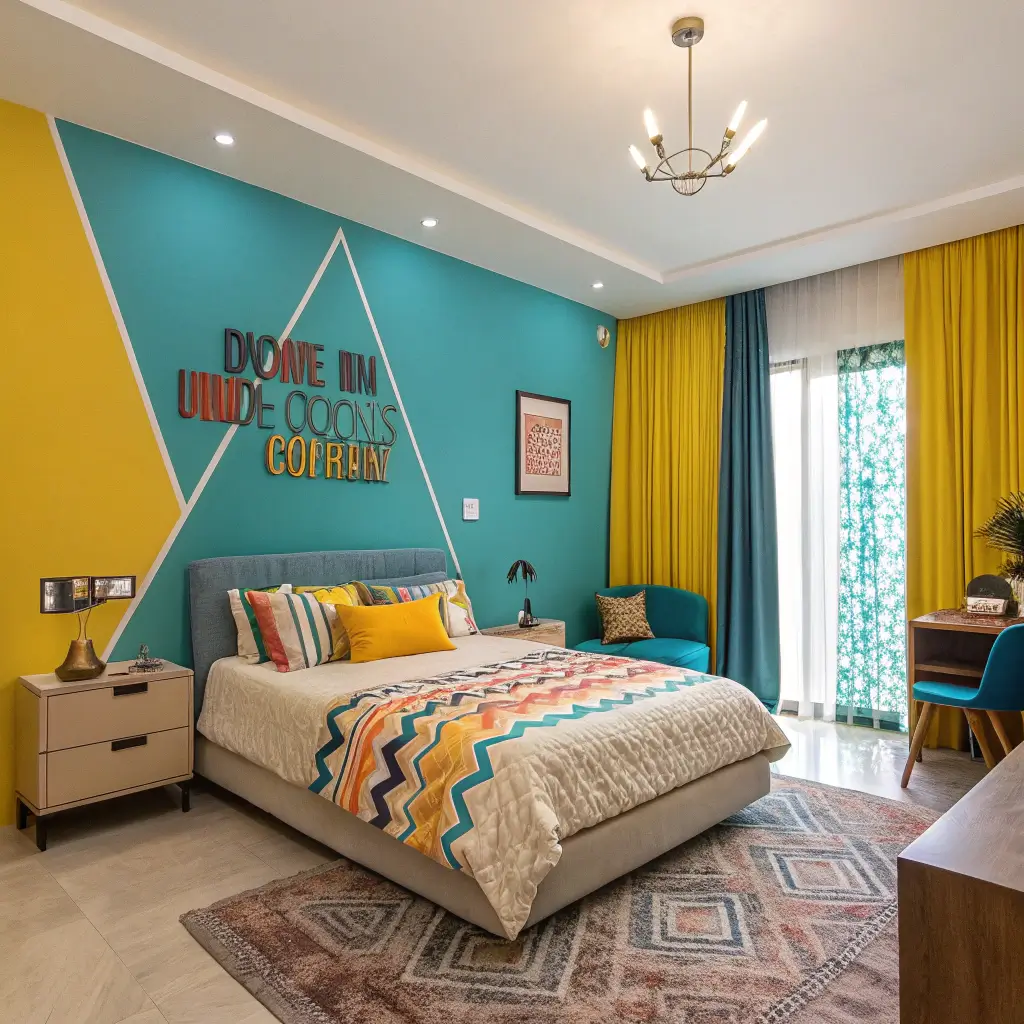
2. Bold and Vibrant Color Combinations
Ready to make a statement? Bold bedroom colors separate the brave from the beige. And no, you don’t have to paint every wall neon pink to make an impact.
My friend painted her bedroom walls deep teal with coral accents, and I thought she’d lost her mind. Three months later, I’m considering copying her entire color scheme. Her bedroom looks like it belongs in a boutique hotel, while mine looks like… well, every other bedroom ever.
Making Bold Colors Work
The bold color playbook includes:
- One accent wall for commitment-phobes
- Deep jewel tones over bright primary colors
- Balance with plenty of white or neutral
- Quality paint matters more with bold colors
- Consider the 60-30-10 rule
Here’s the truth about bold colors – they show every imperfection. That slightly bumpy wall you never noticed? Navy blue will highlight every flaw. Prep work becomes crucial. Sand, prime, and use quality paint. Cheap bright paint looks exactly that: cheap and bright.
Ever notice how bold colors look amazing in magazines but terrifying in your bedroom? That’s because magazines have professional lighting. Your bedroom has that one overhead fixture from 2003. Factor in your actual lighting situation before going bold.
3. Small Bedroom Color Tricks
Small bedrooms need strategic color choices, not white everywhere. That advice about only using white in small spaces? Complete nonsense. I’ve proven this in three different studio apartments.
My 10×10 bedroom currently rocks medium gray walls, and guess what? It looks bigger than when it was white. The key lies in using color to manipulate perception, not avoiding it altogether.
Color Strategies for Tiny Spaces
Make small bedrooms feel larger with:
- Paint the ceiling the same color as walls (creates height)
- Use cool colors to push walls back visually
- Go monochromatic for seamless flow
- Paint trim and doors the same as walls
- Choose mid-tones over extremes
The accent wall trick works differently in small bedrooms. Instead of the wall behind your bed, paint the wall you see when entering. It creates depth and draws the eye through the space. Discovered this by accident when I painted the wrong wall. Happy accident FTW.
Don’t forget about finish. Eggshell or satin reflects more light than flat paint, making spaces feel larger. Just know that higher sheen shows more imperfections. It’s always something, isn’t it?
Also Read: 10 Charming Beige and Pink Bedroom Ideas for Warm Ambiance
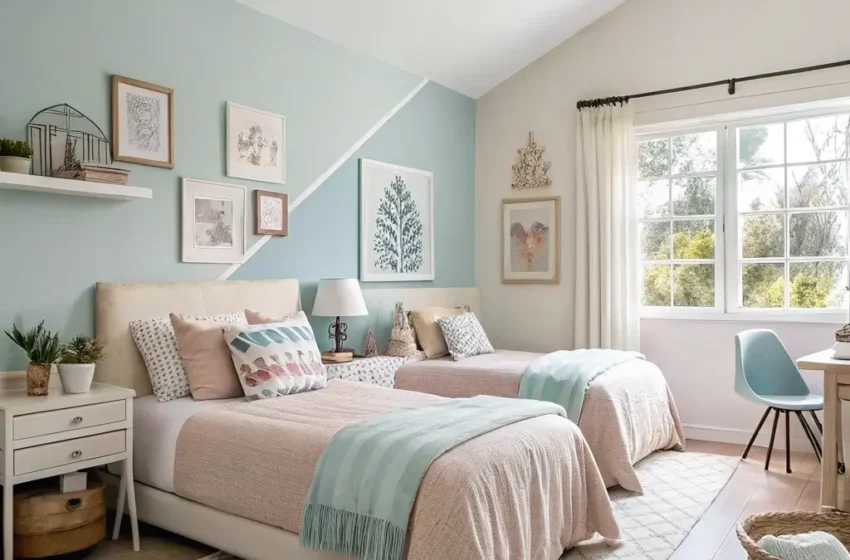
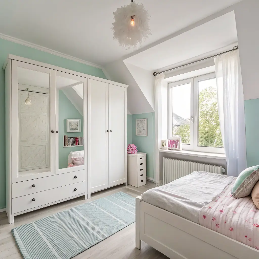
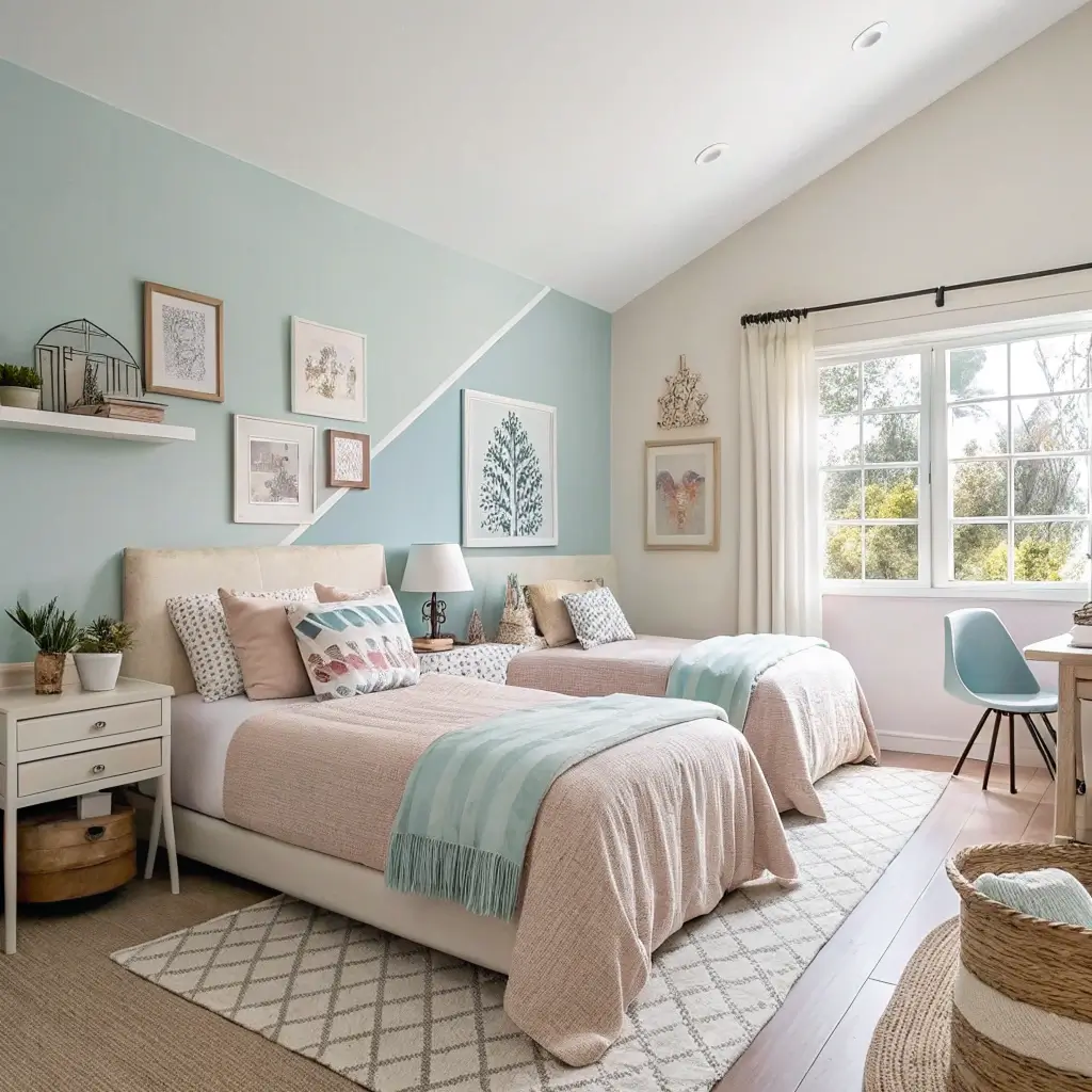
4. Calming Pastel Bedroom Palettes
Pastel bedrooms get a bad reputation for being too sweet, but done right, they create the most serene spaces imaginable. We’re talking sophisticated calm, not Easter egg explosion.
I resisted pastels forever, associating them with nurseries. Then I stayed in an Airbnb with sage green walls that changed my entire perspective. Bought a sample pot that same week and never looked back.
Adult Pastels That Actually Work
Elevate pastels beyond nursery vibes:
- Choose muted pastels over candy colors
- Mix with grays for sophistication
- Use one pastel, not a rainbow
- Add contrast with dark furniture
- Keep bedding neutral or white
The pastels that work best in bedrooms? Soft sage, dusty rose, pale lavender, and powder blue. Skip mint green unless you want to feel like you’re sleeping in toothpaste. Learned that one the hard way :/
Temperature matters with pastels. Cool pastels (blue, green, lavender) calm and soothe. Warm pastels (pink, peach, yellow) energize and cheer. Pick based on what your bedroom needs, not just what looks pretty in the paint chip.
5. Modern Minimalist Bedroom Colors
Minimalist bedrooms need color choices that whisper, not shout. But minimalist doesn’t mean colorless – it means intentional.
My minimalist phase taught me that the “all white everything” approach just made my bedroom feel unfinished. Adding one strategic color changed everything. Now my bedroom feels minimal and intentional, not empty and sad.
Minimalist Color Strategy
The minimalist color formula:
- Stick to three colors maximum
- Include plenty of white space
- Choose colors with gray undertones
- Keep saturation levels consistent
- Let architecture guide color placement
The best minimalist bedroom colors? Soft black (yes, that’s a thing), warm gray, sage green, dusty blue, or terracotta. One color plus white plus natural wood. That’s your entire palette. More than that and you’re not minimalist anymore.
Here’s what nobody tells you about minimalist colors: they need perfect execution. Every brushstroke shows, every corner matters. Minimalism doesn’t hide mistakes; it highlights them. Prep work becomes everything.
6. Dark and Moody Bedroom Hues
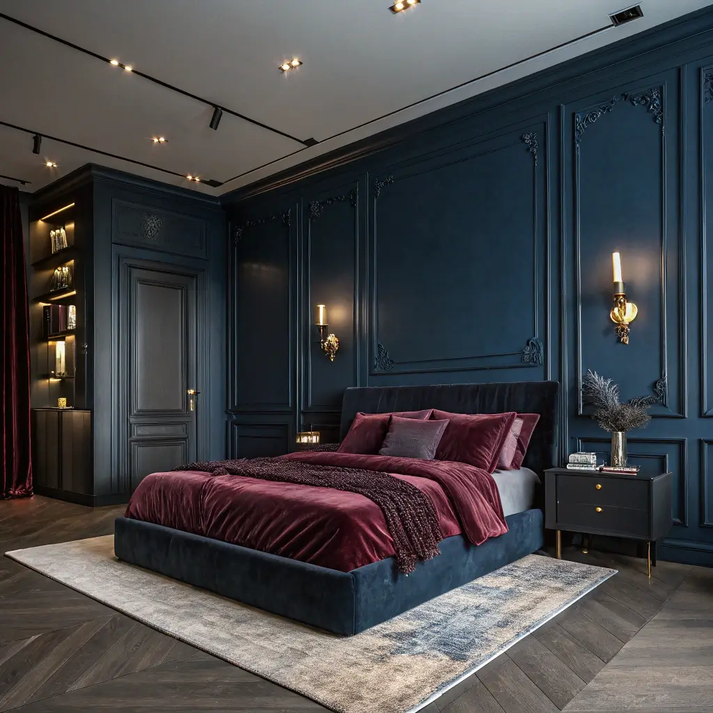
Going dark and moody in the bedroom sounds scary but creates the most incredible cocoon effect. It’s like sleeping inside a luxury cave, but in a good way.
I fought my partner about painting our bedroom charcoal for months. Finally gave in, and now I admit (begrudgingly) that they were right. Our bedroom feels like a high-end hotel suite, and our sleep quality actually improved. Dark rooms signal bedtime to your brain, apparently.
Mastering Moody Colors
Dark colors done right require:
- Proper primer (non-negotiable for dark colors)
- Multiple coats for even coverage
- Warm lighting to prevent cave vibes
- Light bedding for contrast
- Strategic mirrors to bounce light
The dark colors that work? Charcoal gray, navy blue, forest green, deep plum, and chocolate brown. Black can work but requires serious confidence and excellent lighting. Start with charcoal if you’re nervous – it’s the gateway drug to dark walls.
Dark colors make rooms feel smaller but cozier. If your bedroom’s already tiny, own it. Make it an intentional jewel box instead of fighting the size. Sometimes embracing limitations creates better design than fighting them.
Also Read: 12 Inspiring Beige Curtains Bedroom Ideas and Timeless Decor
7. Trendy 2025 Bedroom Color Schemes
Want to know what’s actually trending for 2025 bedroom colors? Not what Pinterest thinks, but what actually works in real bedrooms?
After attending a design conference last month (nerd alert), I learned that warm, earthy tones are replacing cool grays. Finally! The gray everything trend had to die eventually. Now we’re seeing colors that actually make bedrooms feel like bedrooms, not medical facilities.
2025 Colors Worth Trying
The trending colors that’ll actually stick:
- Warm terracotta and clay tones
- Sage and olive greens
- Rich chocolate browns
- Dusty roses and mauves
- Deep, warm blues
The surprise trend? Color drenching – painting walls, ceiling, and trim all the same color. Sounds crazy but creates this incredible immersive effect. Tried it in my guest room with sage green. Everyone wants to sleep there now.
Skip the ultra-trendy colors unless you love repainting. That “color of the year” might be tired by next year. Choose trends that align with your actual style, not just what’s popular on Instagram.
8. Two-Tone Accent Wall Ideas
Two-tone walls give you the best of both worlds – interest without overwhelming commitment. Plus, they make you look like you hired a designer (you didn’t, but they don’t need to know).
I discovered two-tone walls trying to use up leftover paint. Painted the bottom half of my bedroom wall darker gray, top half lighter. Suddenly looked intentional and sophisticated. Sometimes the best designs come from working with what you have.
Two-Tone Techniques That Work
Create stunning two-tone effects with:
- Horizontal splits at chair rail or 2/3 height
- Geometric shapes for modern vibes
- Color blocking with tape
- Gradients for artistic flair
- Complementary or analogous colors only
The easiest two-tone approach? Paint the bottom third of your wall darker than the top. It grounds the space and makes ceilings look higher. Use painter’s tape and a level unless you trust your steady hand (I don’t trust mine).
Color selection matters more with two-tone walls. The colors need to relate somehow – either same color family, complementary colors, or neutrals. Random colors together look like you ran out of paint, not like you made a design choice.
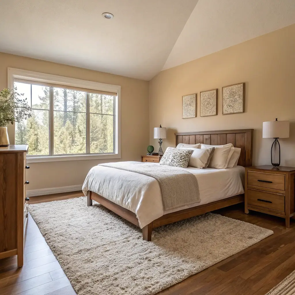
9. Warm and Inviting Bedroom Colors
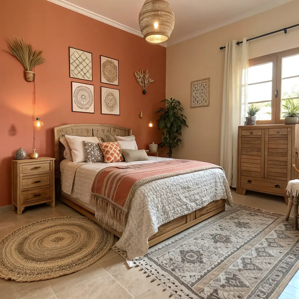
Warm colors in bedrooms create that wrapped-in-a-hug feeling everyone craves. But warm doesn’t have to mean orange everywhere.
My bedroom went from cold and unwelcoming to warm and cozy with one paint change. Switched from cool gray to warm mushroom beige, and suddenly people actually wanted to hang out in there. The temperature of your paint color literally changes the temperature feeling of your room.
Creating Warmth Through Color
Warm bedroom colors that always work:
- Caramel and toffee browns
- Warm grays with brown undertones
- Terracotta and clay
- Soft golds and wheats
- Deep, warm whites
The undertone detective work matters here. That “white” might be warm or cool. That “gray” might lean purple or brown. Hold paint chips against pure white paper to see true undertones. This trick has saved me from many paint mistakes.
Warm colors advance visually, making rooms feel smaller but cozier. Perfect for large, cold bedrooms. Terrible for tiny, stuffy ones. Know your room’s challenges before choosing your temperature.
Also Read: 10 Cozy Green and Beige Bedroom Ideas for a Warm
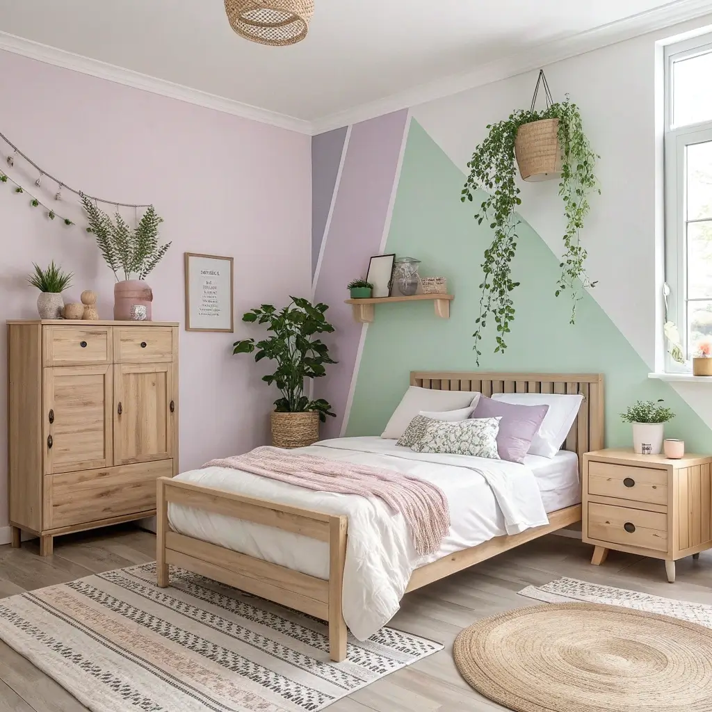
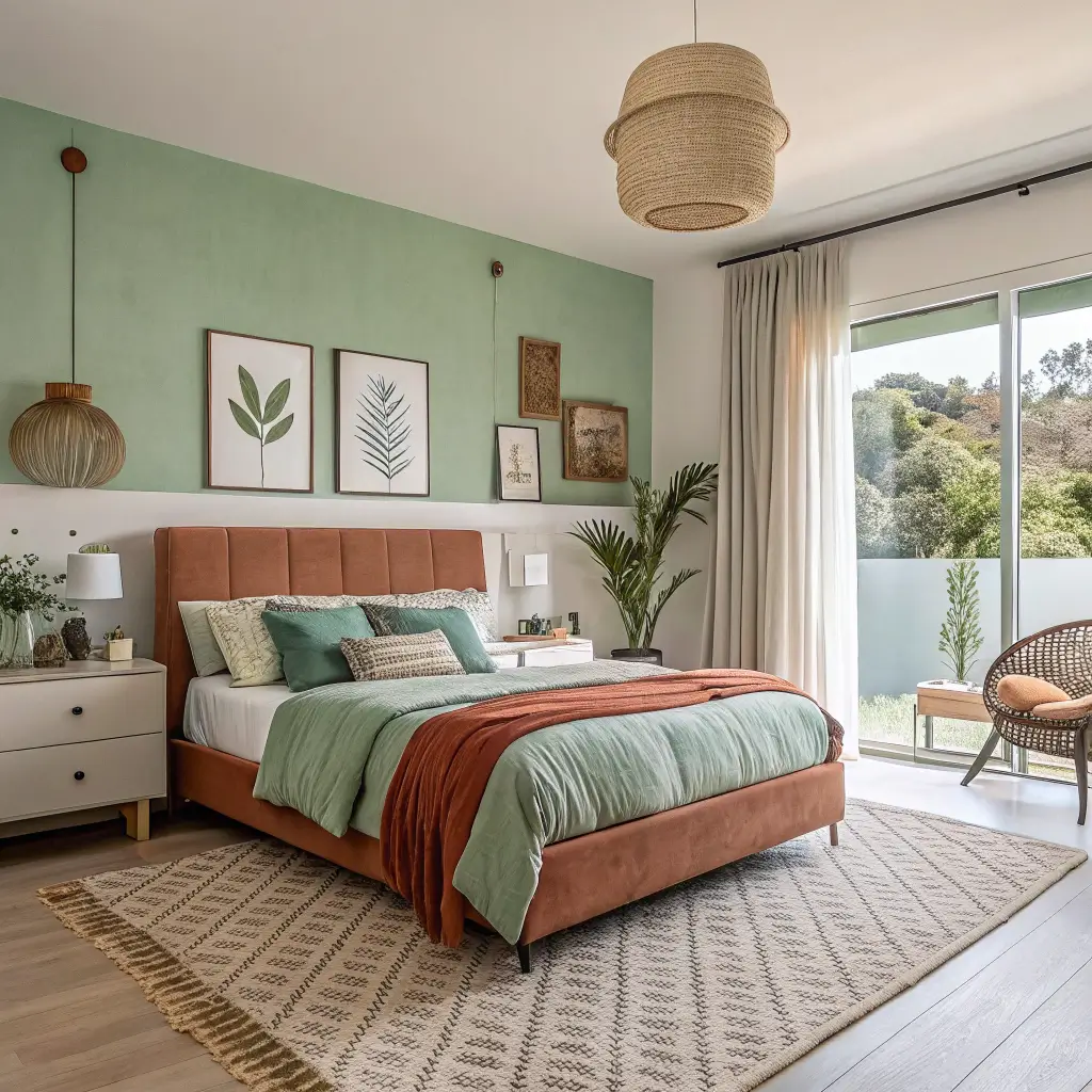
10. Nature-Inspired Bedroom Paint Palettes
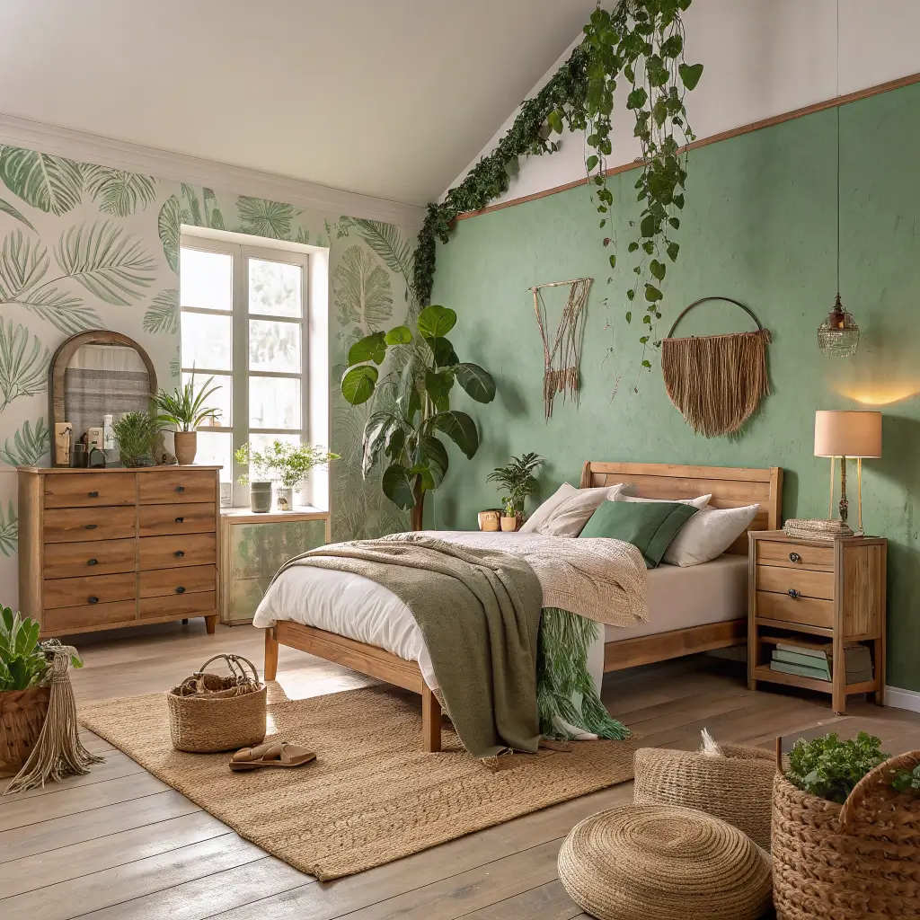
Nature-inspired colors bring the outside in without the bugs and weather. These palettes never go out of style because, well, nature doesn’t do trends.
After a camping trip where I slept better outdoors than in my own bed, I realized my bedroom needed nature colors. Painted the walls soft green, added wood furniture, and boom – instant calm. Sometimes inspiration comes from unexpected places.
Natural Palettes That Ground You
Nature colors for bedroom bliss:
- Sage and eucalyptus greens
- Sky and ocean blues
- Sand and stone beiges
- Bark and earth browns
- Sunset corals and peaches
The combo approach works beautifully here. Sky blue ceiling with sandy beige walls. Forest green accent wall with mushroom gray. Nature rarely uses just one color, so neither should you.
Quality matters more with nature colors because you’re trying to capture something specific. That cheap “forest green” might look more “parking lot green.” Invest in paint samples and test extensively. Your bedroom deserves the real deal.
Making Your Color Choice
Here’s the truth about bedroom paint colors – the best color is the one that makes YOU happy every single day.
Not what’s trending, not what your friend chose, not what looks good on Instagram. What makes you smile when you walk into your bedroom?
Test everything. Paint large swatches on different walls. Live with them for a week. See them in morning light, afternoon sun, and lamplight at night.
The color that still makes you happy after a week of staring? That’s your winner.
Remember, paint isn’t permanent. If you hate it, you can change it. I’ve repainted rooms within months of painting them. Was it annoying? Yes.
Was it worth it to not stare at a color I hated? Absolutely. Your bedroom should be your sanctuary, not your compromise.
Now excuse me while I go stare at paint chips again. Just bought a new house and the bedroom is currently “builder beige.”
The possibilities are endless, and honestly? That’s the exciting part. Happy painting, and may your color choices bring you joy every single morning!