10 Fresh Bedroom Wall Paint Colors Ideas and Stylish Touches
- Bedroom Design
 Ben
Ben- 0
- 30 minutes read
Staring at your bedroom walls wondering if “Builder Beige” is actually a life sentence? Been there.
After repainting my bedroom five times in three years (yes, my friends stage interventions), I’ve learned that bedroom wall paint colors can literally change your entire mood, sleep quality, and general will to adult.
Here’s the thing nobody tells you about bedroom paint: the right color doesn’t just look good, it makes you feel good. Wrong color? You’ll wake up every morning questioning your life choices.
I’ve tested enough paint samples to wallpaper a small country, made every mistake possible, and finally figured out which colors actually work versus which ones just photograph well on Instagram.
Let’s talk about the paint colors that’ll transform your bedroom from “place I sleep” to “sanctuary I never want to leave.” And no, we’re not just talking about fifty shades of gray.
1. Cozy Neutral Bedroom Wall Colors
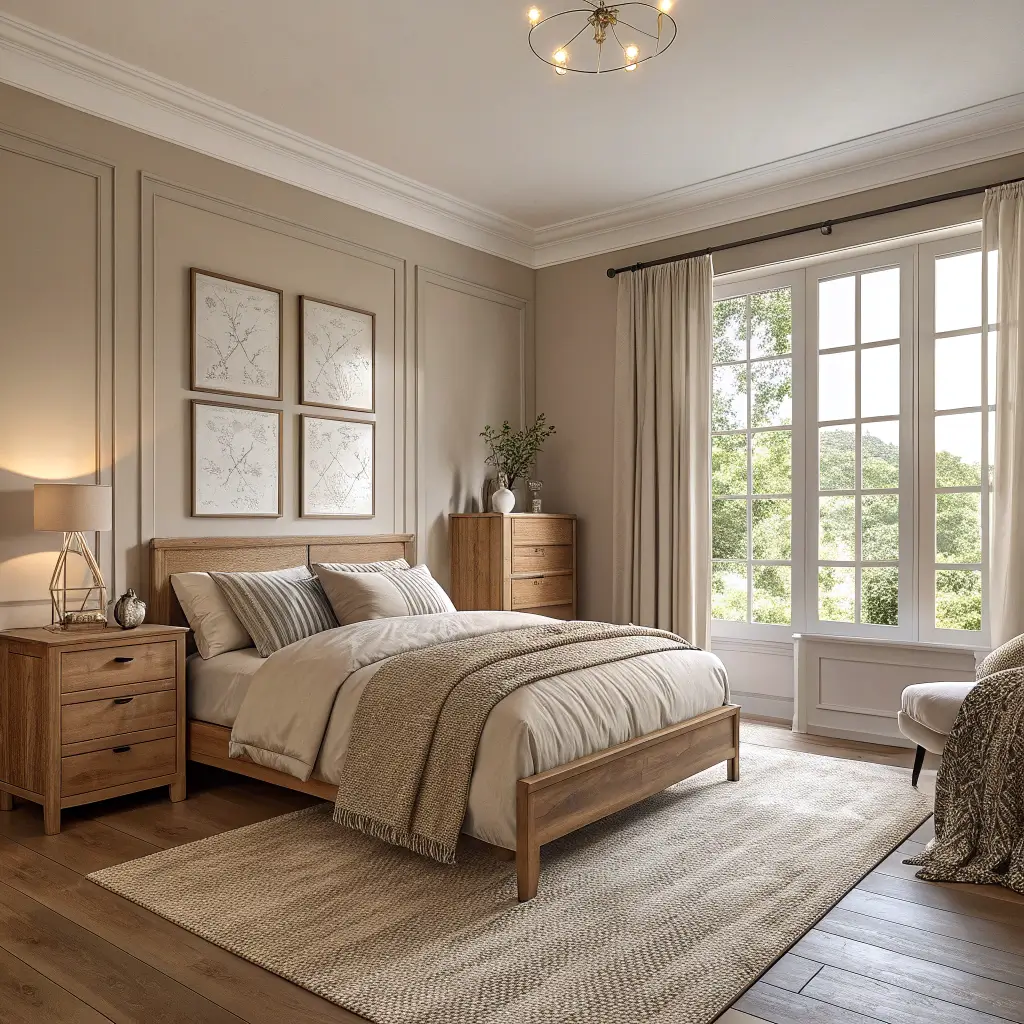
Cozy neutrals are like that reliable friend who never lets you down. They’re not flashy, but they show up every single day making everything better.
I spent two years thinking neutrals meant boring beige or prison gray. Then I discovered warm neutrals like Benjamin Moore’s “White Dove” and suddenly understood why designers obsess over them. These colors create this wrap-you-in-a-blanket feeling without screaming for attention.
Making Neutrals Actually Cozy
The secret to cozy neutral success:
- Choose warm undertones (pink, yellow, or peach hints)
- Layer different neutral shades for depth
- Add texture through fabrics, not just paint
- Go darker than you think you should
- Test at different times of day
My tried-and-true neutral winners? Sherwin-Williams “Accessible Beige” (terrible name, gorgeous color), Benjamin Moore “Revere Pewter” for that perfect greige, and Farrow & Ball “Elephant’s Breath” if you’re feeling fancy. Each creates warmth without the commitment of actual color.
The biggest neutral mistake? Going too light thinking it’ll make your room bigger. Light neutrals without warm undertones just look unfinished. Like you forgot to pick an actual color. Trust me, I lived with primer-looking walls for six months before admitting defeat.
2. Bold and Moody Paint Ideas
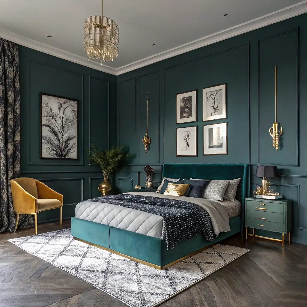
Ready to make a statement? Bold and moody colors separate the brave from the beige. Your bedroom becomes an experience, not just a room.
My journey into moody colors started with one too many glasses of wine and a “what’s the worst that could happen?” attitude. Painted my bedroom wall midnight blue, fully expecting to hate it. Three years later, it’s still blue, and everyone who sees it wants the paint color. Sometimes liquid courage leads to design breakthroughs.
Going Bold Without Regret
The bold color playbook:
- Start with one accent wall if you’re nervous
- Choose jewel tones over primary colors
- Invest in quality paint (cheap bold colors look terrible)
- Add plenty of lighting to show depth
- Balance with neutral bedding
The moody colors worth the risk? Benjamin Moore “Hale Navy” for sophisticated drama, Clare “Current Mood” for deep green elegance, and Farrow & Ball “Railings” for almost-black sophistication. Each makes a statement without screaming.
Here’s what nobody mentions about dark colors: they make rooms feel smaller but cozier. If your bedroom’s already tiny, lean into it. Make it an intentional jewel box instead of fighting the size. My 10×10 bedroom painted charcoal feels like a luxury hotel suite, not a closet.
3. Pastel Bedroom Color Combinations
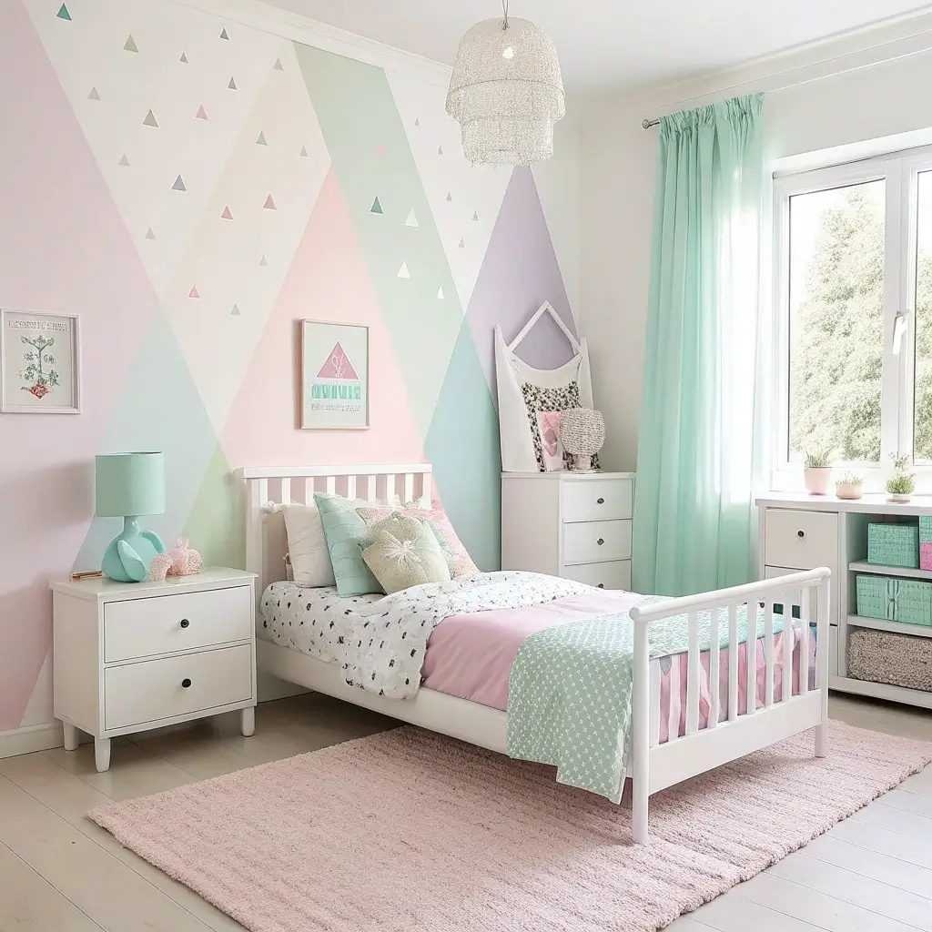
Pastels aren’t just for nurseries and Easter eggs. Adult pastels exist, and they create the most serene bedrooms you’ll ever sleep in.
I fought pastels forever, convinced they’d make my bedroom look like a unicorn threw up. Then I saw a dusty rose bedroom in a hotel that changed everything. Turns out, sophisticated pastels make you feel calm without the saccharine sweetness. Who knew?
Grown-Up Pastel Magic
Making pastels sophisticated:
- Choose pastels with gray undertones
- Combine no more than two pastel shades
- Add black or charcoal accents for edge
- Use white to brighten, not dilute
- Keep patterns minimal
My pastel champions? Benjamin Moore “Tissue Pink” (barely there pink), Clare “Whipped” for subtle lavender, and Sherwin-Williams “Sea Salt” for that perfect blue-green. Each reads as sophisticated neutral with personality.
The lighting situation matters more with pastels than any other color family. That perfect soft pink can look gray in north-facing light or neon under LEDs. Test your pastels for at least a week in different lights. Pastel surprises aren’t usually good surprises.
Also Read: 12 Chic Blue Paint Colors for Bedroom Ideas and Stylish
4. Modern Minimalist Wall Color Schemes
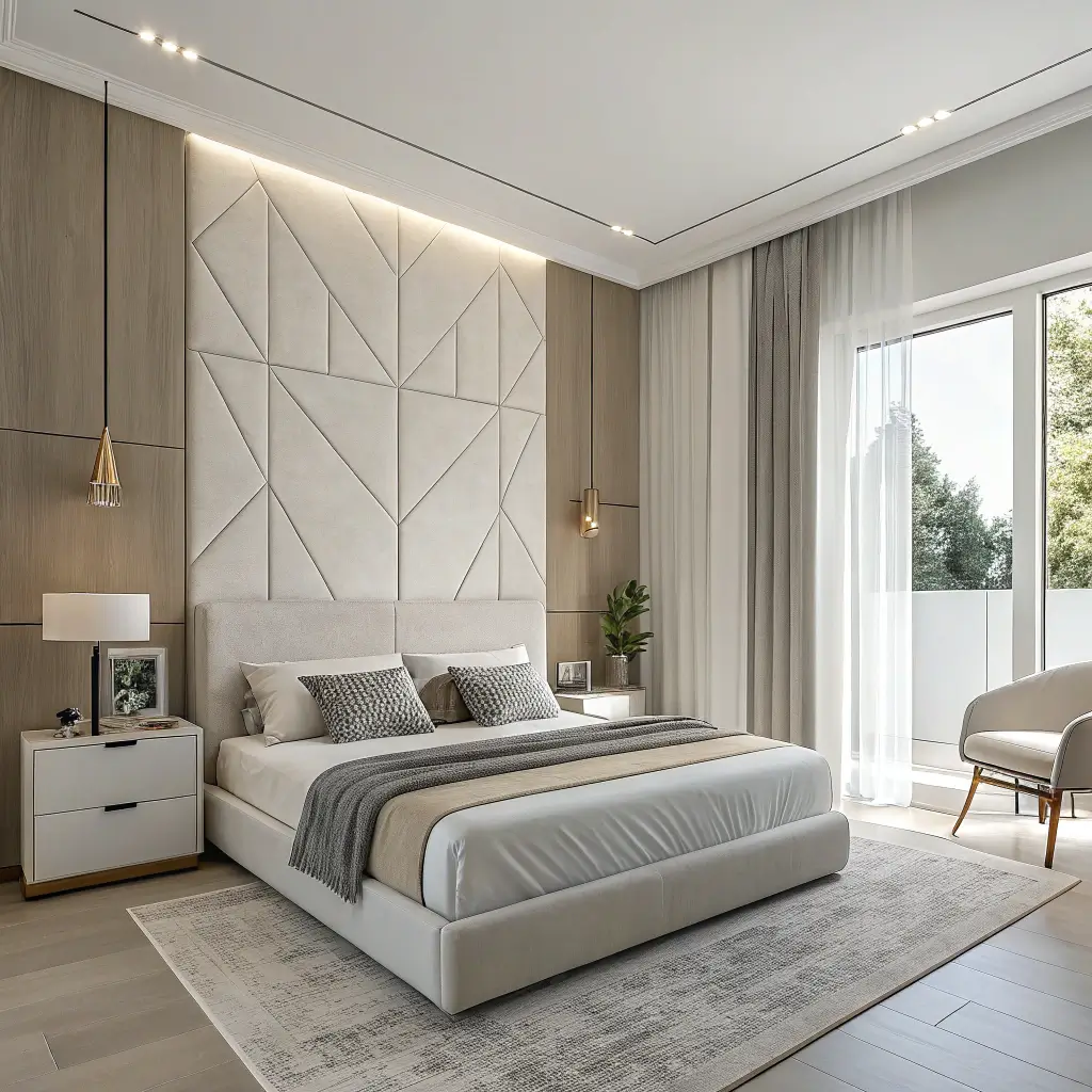
Minimalist colors prove that less really can be more. But minimal doesn’t mean white everywhere like you’re living in an Apple store.
After my maximalist phase crashed spectacularly (turns out, 15 throw pillows don’t equal happiness), I went minimal with colors too. One base color, maybe an accent, done. My bedroom finally felt calm instead of chaotic.
Minimalist Color Strategy
The minimalist approach that works:
- Stick to three colors maximum
- Choose colors with similar saturation levels
- Use the 60-30-10 rule religiously
- Let architecture guide color placement
- Quality over quantity always
The minimalist colors that deliver? Warm white with black accents, soft gray with natural wood, or sage green with cream. Each creates serenity without sterility.
Texture saves minimalist bedrooms from boredom. When you limit color, texture becomes everything. That single gray wall needs interest through paint finish, not just flat color. Eggshell, satin, or even limewash creates depth that flat paint can’t touch.
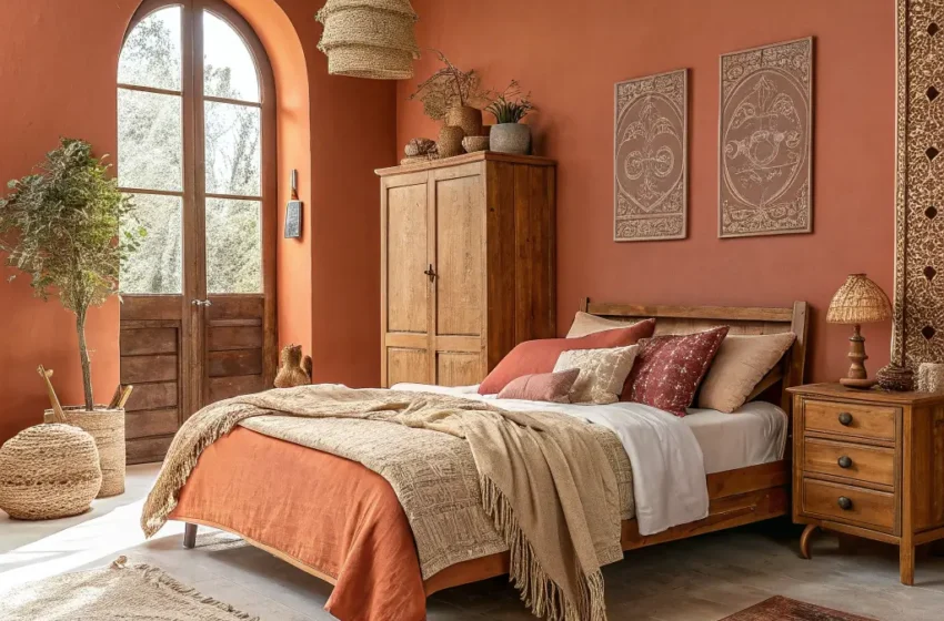
5. Warm Earth Tone Bedroom Walls
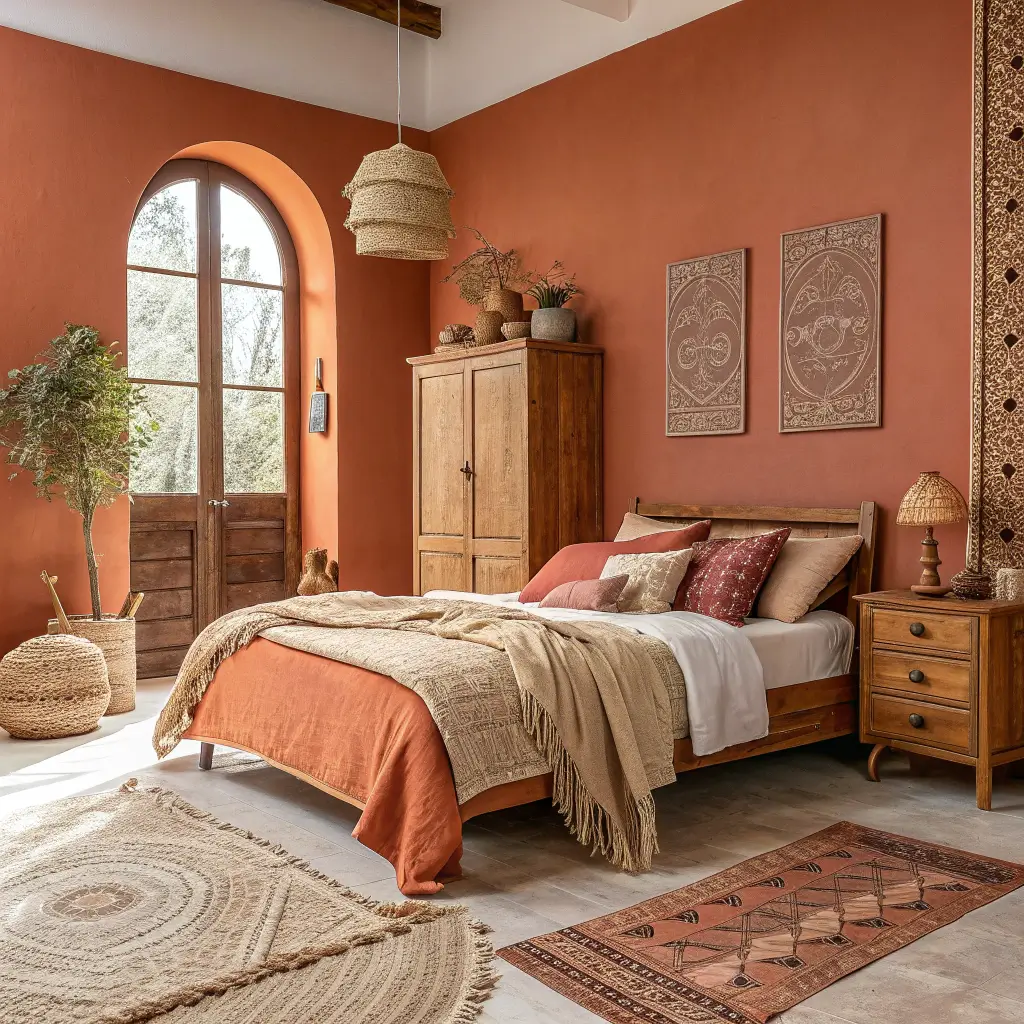
Earth tones ground your bedroom in the best possible way. These colors make you feel secure, cozy, and connected to something bigger than your Instagram feed.
I discovered earth tones after a camping trip where I slept better outside than in my own bed. Came home, painted my walls terracotta, and recreated that outdoor peace inside. No bugs, same zen vibes. Sometimes nature knows best.
Earthy Excellence
Creating an earth tone sanctuary:
- Choose warm browns, terracottas, or ochres
- Layer similar tones for depth
- Add natural textures everywhere
- Include plants (they count as decor)
- Keep metals warm (brass or copper)
My earth tone favorites? Sherwin-Williams “Cavern Clay” for terracotta perfection, Benjamin Moore “Weston Flax” for warm beige, and Clare “Dirty Martini” for sophisticated olive. Each brings nature inside without the maintenance.
The temperature consistency rule applies hard here. Mix warm and cool earth tones and your room looks confused. Stick to either all warm (terracotta, camel, ochre) or all cool (sage, eucalyptus, stone gray). Nature doesn’t mix randomly; neither should you.
6. Calming Blue and Green Shades
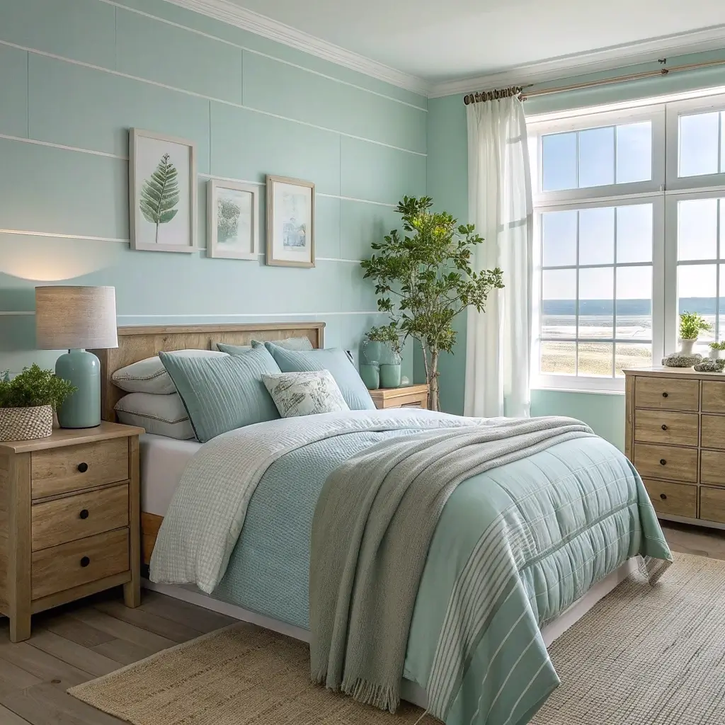
Blue and green walls don’t just look calming; science says they actually lower your heart rate. It’s like having a therapist that never talks back.
My bedroom went from anxious beige to calming sage after reading about color psychology. Placebo effect or actual science? Don’t know, don’t care. I sleep better, and that’s all that matters.
Blue-Green Bedroom Bliss
The calming color formula:
- Choose muted over bright shades
- Consider undertones carefully
- Layer different shades of the same color
- Add warm accents to prevent coldness
- Keep lighting warm, not cool
The blues and greens that actually calm? Benjamin Moore “Palladian Blue” for that perfect spa feeling, Sherwin-Williams “Sea Salt” for coastal calm, and Farrow & Ball “Green Blue” for sophisticated serenity. Each creates peace without boredom.
North-facing rooms need warm-undertoned blues and greens. South-facing can handle cooler shades. East and west? Test both and see what works. Your room’s orientation affects color more than you’d think. Learned this the hard way with a blue that looked gray 90% of the day :/
Also Read: 10 Inspiring Best Bedroom Paint Colors Ideas and Color Combos
7. Romantic Pink and Beige Palettes
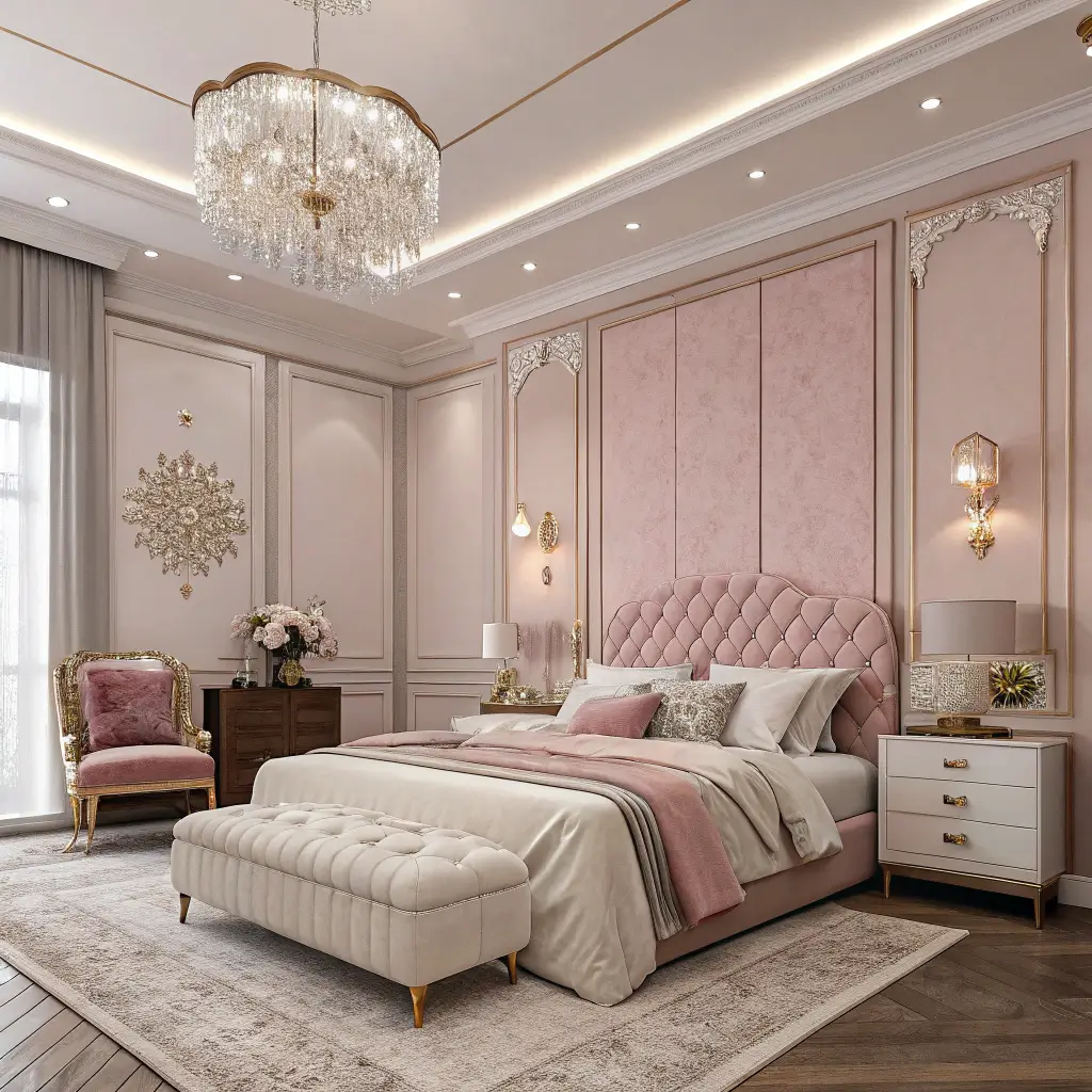
Pink and beige together create the most sophisticated romantic bedrooms that don’t feel like Valentine’s Day exploded.
I accidentally discovered this combo when my “beige” paint dried decidedly pink. Instead of repainting immediately, I lived with it. That happy accident became my favorite bedroom color combo ever. Sometimes mistakes make the best discoveries.
Adult Pink Done Right
Creating sophisticated pink romance:
- Choose muted pinks with gray or beige undertones
- Keep beige as the dominant color
- Add black or navy for contrast
- Use geometric patterns, not hearts
- Include metallic accents sparingly
The pink-beige combos worth trying? Benjamin Moore “Fruit Shake” with “Muslin,” Clare “Wing It” with “Timeless,” or Farrow & Ball “Setting Plaster” with “Dead Salmon” (worst name, best color). Each creates romance without saccharine sweetness.
BTW, pink paint reflects the most flattering light on skin. You’ll look better in your bedroom than anywhere else in your house. Your morning face will thank you, and so will anyone else who sees you there. Just saying.
8. Elegant Gray and White Bedrooms
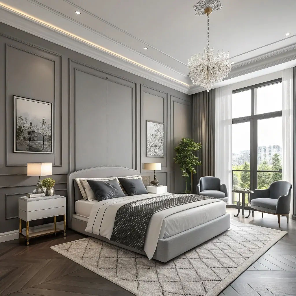
Before you roll your eyes at another gray and white bedroom, hear me out. Done right, this combo creates timeless elegance that never gets old.
My gray and white bedroom survived four years without boring me – a personal record. The secret? Choosing grays with personality and using white strategically, not everywhere like you’re afraid of color.
Gray-White Sophistication
Making gray and white interesting:
- Pick gray with subtle undertones (blue, green, or purple)
- Use multiple shades of both colors
- Add one unexpected element
- Keep metallics consistent
- Layer textures extensively
The combinations that never fail? Benjamin Moore “Stonington Gray” with “Cloud White,” or Sherwin-Williams “Repose Gray” with “Pure White.” These combos photograph beautifully and look expensive even if you DIY’d everything.
The undertone detective work matters massively with gray. Purple undertones photograph blue. Green undertones look institutional. Brown undertones create greige. Test grays against pure white paper to see true undertones. This trick has saved me from many gray mistakes.
9. Vibrant Accent Wall Inspirations
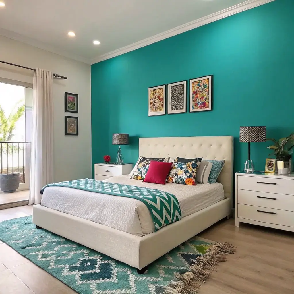
Accent walls let you experiment without full commitment. It’s like dating before marriage, but for paint colors.
I’ve done seven different accent walls in the same bedroom (I have a problem, okay?). Each one completely changed the room’s personality. The best part? When you get bored, you only repaint one wall. Lazy decorators, rejoice!
Accent Wall Excellence
Creating accent wall impact:
- Choose the natural focal wall (usually behind the bed)
- Go bold enough to notice
- Keep other walls neutral
- Use painter’s tape like your life depends on it
- Consider the room’s sight lines
My accent wall victories? Deep teal with white walls, terracotta with cream, and charcoal with light gray. Each created drama without overwhelming the space.
The biggest accent wall fail? Choosing a color too similar to your other walls. That slightly darker beige against beige isn’t an accent wall; it’s a mistake. If you’re doing an accent, make it actually accent something. Go big or go home.
Also Read: 12 Gorgeous Moody Bedroom Paint Colors and Luxe Design Tips
10. Trendy Dark and Deep Colors
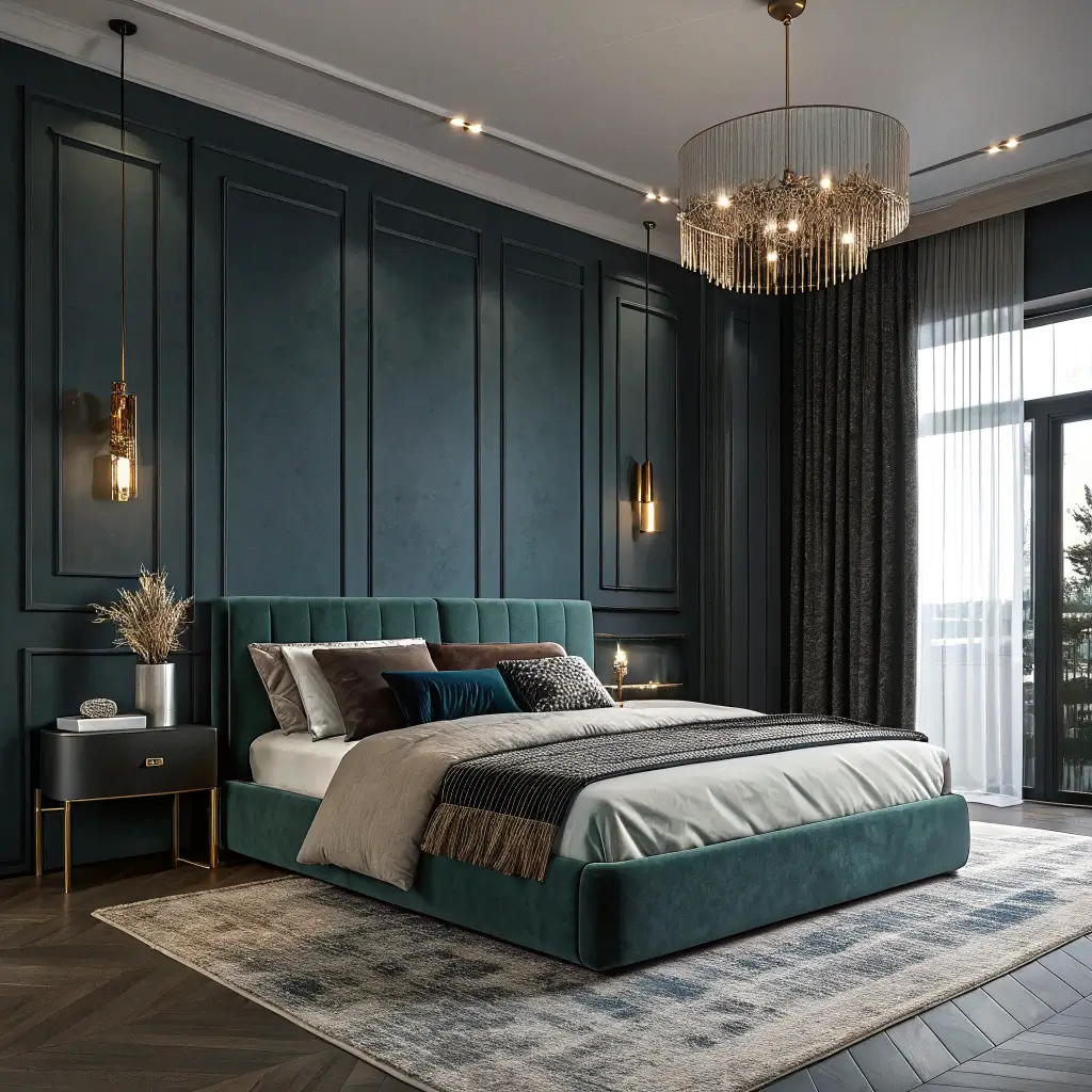
Dark and deep colors are having their moment, and honestly, it’s about time. These colors create atmosphere that light colors could never achieve.
I went dark after years of safe, light colors left me feeling nothing. Painted my bedroom walls deep green, and suddenly the space had mood, personality, depth. Sometimes you need your bedroom to have an opinion, and dark colors definitely have opinions.
Dark Color Domination
Making dark colors work:
- Commit fully – hesitation shows
- Use multiple light sources
- Add mirrors to bounce light
- Keep bedding light for contrast
- Invest in good primer
The dark colors worth trying? Benjamin Moore “Black Forest Green,” Sherwin-Williams “Tricorn Black,” or Clare “Prince.” Each creates drama without making your bedroom feel like a cave.
The finish debate matters more with dark colors. Flat absorbs light (moody but shows everything). Eggshell reflects some (best balance). Satin reflects more (shows every imperfection). Choose based on your walls’ condition and maintenance tolerance.
Making Your Color Choice
Here’s what I’ve learned after all these paint experiments: the best bedroom wall paint colors make YOU happy.
Not what’s trending, not what looks good on Pinterest, not what your friend chose. What makes you smile every morning matters.
Test everything. Paint large samples directly on walls. Live with them for at least a week. See them morning, noon, and night. The color that still excites you after seven days of staring? That’s your winner.
Remember, paint isn’t permanent. If you hate it, repaint it. I’ve repainted within days of finishing because the color was wrong. Annoying? Yes.
Worth it for colors you love? Absolutely. Your bedroom walls see you more than most people do – make them worth looking at.
Now excuse me while I order more paint samples. Just discovered three new colors I haven’t tried, and my walls are looking suspiciously ready for change number six.
Happy painting, friends – may your colors be perfect and your tape lines be straight!