10 Cozy Green Living Room Color Scheme Ideas for Warm Spaces
- Living Room Decor
 Ben
Ben- 0
- 26 minutes read
Green living rooms are having a serious moment, and honestly? It’s about time. I spent years thinking green was just for plants and maybe the occasional throw pillow, but then I painted my living room sage green last summer and everything changed.
Suddenly, my space felt alive, sophisticated, and somehow both energizing and calming at the same time.
Here’s what nobody tells you about green: it’s probably the most versatile color you’ll ever work with. Nature literally gave us hundreds of shades to choose from, and each one brings its own personality to the party.
Whether you want zen spa vibes or bold jewel-tone drama, green delivers every single time.
I’ve spent the last year experimenting with different green color schemes (my partner thinks I’m obsessed, and they’re not wrong), and I’m here to share the combinations that actually work.
Not the Pinterest-perfect-but-impossible-to-live-with schemes, but real combinations that look amazing and feel even better.
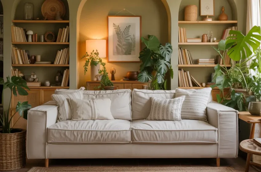
1. Sage Green and Warm White Harmony
Let’s start with the combo that converted me to team green: sage and warm white. This pairing feels like a deep breath after a long day. I discovered this combination completely by accident when I grabbed the wrong paint sample, but sometimes the best designs happen when you’re not trying so hard.
Sage green has this magical quality where it shifts throughout the day. In morning light, it looks fresh and energetic. By evening, it transforms into this cozy, enveloping hue that makes you want to curl up with a book. Pair it with warm white (not bright white – that’s crucial), and you get a space that feels both sophisticated and approachable.
Making This Combo Work
The trick with sage and warm white? Don’t make everything matchy-matchy. Paint your walls sage and keep your trim and ceiling warm white. Or flip it – white walls with a sage accent wall behind your sofa. I’ve tried both approaches, and they each create completely different moods.
Add texture through natural materials like linen, wool, and unfinished wood. These elements bridge the gap between sage and white beautifully. Throw in some brass or copper accents if you want to warm things up even more. Trust me, a brass floor lamp against a sage wall is pure magic.
Your furniture choices matter here too. Cream or oatmeal-colored sofas work brilliantly, but don’t shy away from darker wood pieces. A walnut coffee table grounds the whole scheme and prevents it from floating away into pastel land.
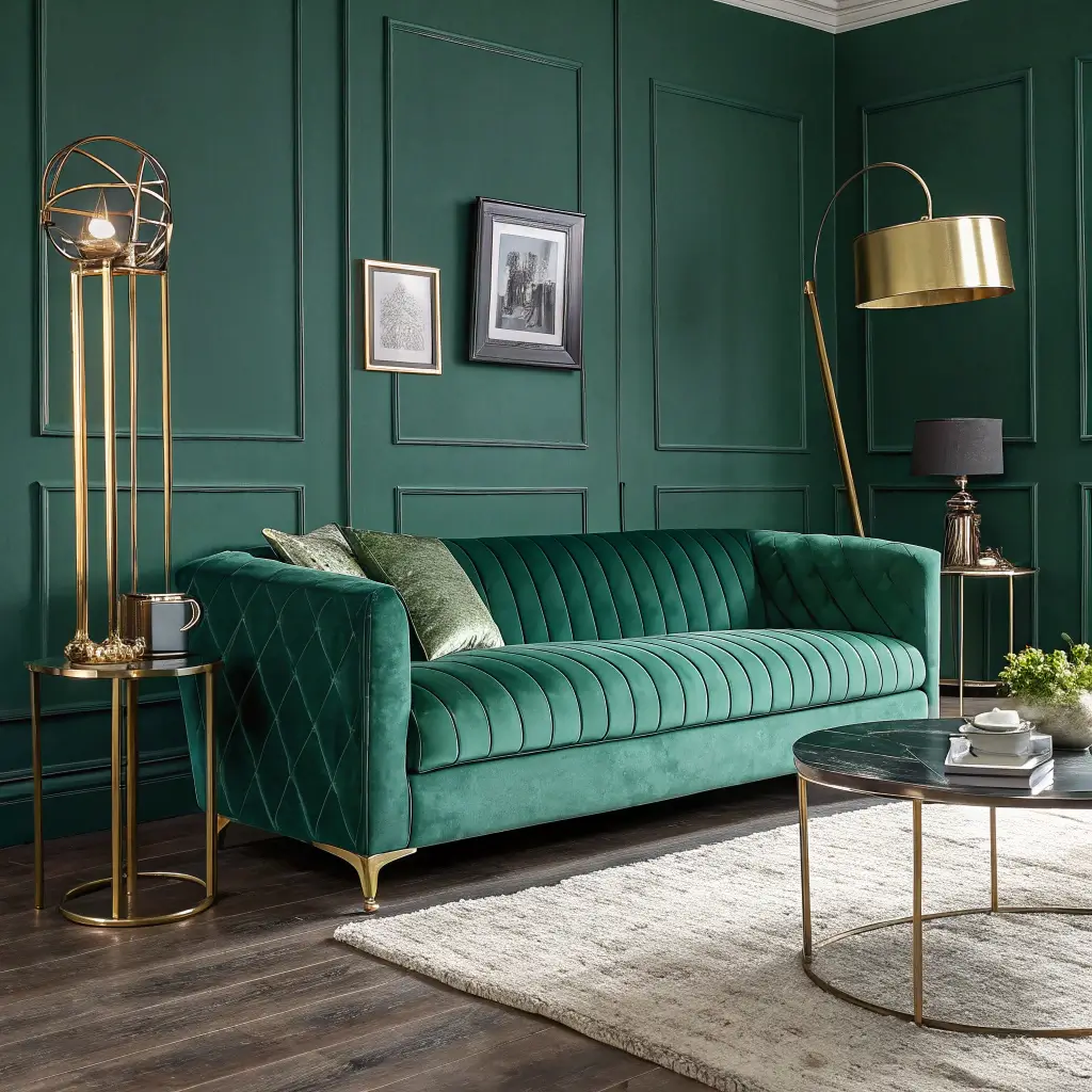
2. Emerald Green with Gold Accent Palette
Ready to go bold? Emerald green and gold together create instant luxury. This isn’t your grandmother’s green and gold (unless your grandmother was incredibly chic) – we’re talking about a modern take that feels fresh and current.
I walked into a boutique hotel lobby in Chicago that nailed this combination, and I literally took pictures of everything. The emerald walls made the space feel intimate and expensive, while gold accents added warmth and prevented the green from feeling too heavy. It’s drama without the melodrama, if that makes sense.
The Gold Standard
When I say gold accents, I don’t mean covering everything in shiny brass. Think strategic touches – picture frames, lamp bases, cabinet hardware, maybe a stunning gold mirror. The key is restraint. You want glamour, not Vegas casino vibes.
Emerald green works best when you give it room to breathe. Paint one statement wall or invest in an emerald velvet sofa. Then layer in creams, whites, or even soft grays to balance the intensity. The gold accents become the jewelry that ties everything together.
Don’t forget about lighting! Emerald green can eat light for breakfast, so make sure you’ve got plenty of it. Layer your lighting with table lamps, floor lamps, and maybe some picture lights to highlight artwork. Those gold fixtures will catch the light and make the whole room sparkle.
3. Olive Green and Natural Wood Balance
This combination makes me think of Italian villas and Sunday morning coffee. Olive green and natural wood create an organic, grounded feeling that works in literally any style home. Modern, traditional, farmhouse – doesn’t matter. This combo adapts like a chameleon.
I learned to love olive green when I inherited my mom’s vintage leather chair in this exact shade. At first, I thought it was too military, too serious. But when I paired it with my oak floors and added some light wood furniture, everything clicked. The olive softened, the wood warmed up, and suddenly my living room felt like a really expensive treehouse.
Wood You Believe It?
The type of wood you choose changes everything. Light woods like pine or birch keep things Scandinavian and fresh. Medium tones like oak or maple create that perfect middle ground. Dark woods like walnut? Now you’re in moody, sophisticated territory.
Mix your wood tones – seriously! This isn’t the ’90s where everything had to match. An oak coffee table, pine shelving, and a walnut side table can all live happily together when olive green is the common thread. The green acts like a neutralizer that makes different wood tones play nicely.
Layer in natural textures like jute rugs, linen curtains, and maybe some leather accents. These materials enhance the earthiness without making your living room feel like a camping lodge. Unless that’s your vibe – then go for it!
Also Read: 12 Stylish Blue and Green Living Room Ideas for Cozy
4. Forest Green with Soft Beige Layers
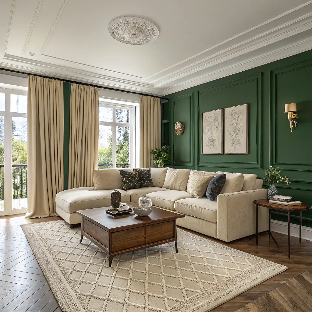
Forest green and beige might sound boring on paper, but execute it right and you’ve got sophisticated comfort that never goes out of style. This combination reminds me of those gorgeous English libraries where you want to sip whiskey and solve mysteries.
The depth of forest green needs the softness of beige to prevent it from overwhelming a space. Think of beige as your supporting actor – not the star, but absolutely essential to the show. Without it, forest green can feel heavy and oppressive. With it? Pure elegance.
Layering Like a Pro
Start with your biggest commitment – usually walls or a sofa. If you paint your walls forest green (brave choice, I salute you), keep your major furniture in various beige tones. Conversely, a forest green sofa looks incredible against beige walls.
Here’s where layering becomes crucial. Add different shades of beige through throws, pillows, and rugs. Mix textures like crazy – bouclé, linen, wool, cashmere if you’re feeling fancy. Each texture catches light differently and prevents the beige from looking flat.
Don’t ignore pattern! A beige and white striped pillow or a subtle geometric rug adds visual interest without competing with your color scheme. Just keep patterns tonal and relatively quiet – let the forest green be the drama queen.
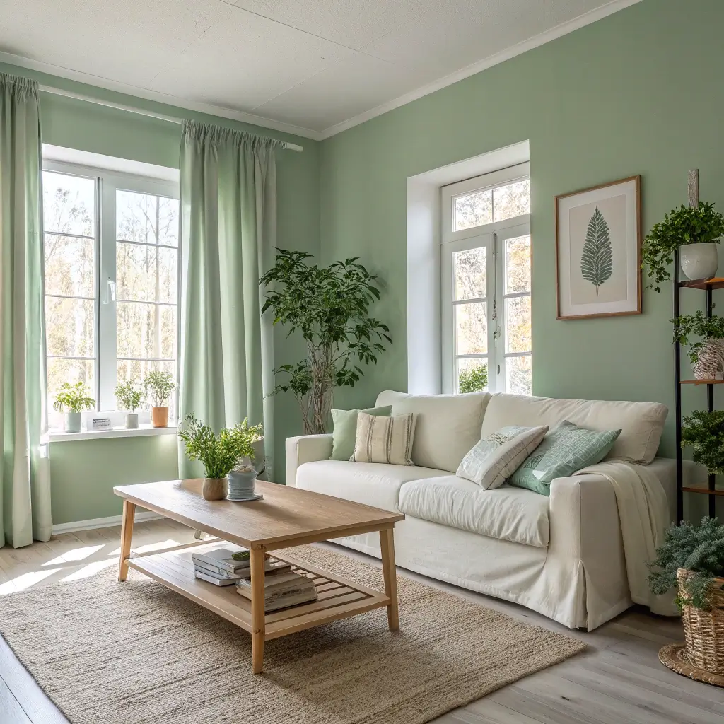
5. Mint Green and Light Gray Serenity

Want a living room that feels like a spa? Mint green and light gray create this incredibly serene atmosphere that makes everyone who enters instantly relax. I painted my guest room this combination, and now nobody wants to leave. It’s become a problem, actually.
Mint green brings freshness without the intensity of deeper greens. It’s cheerful but not aggressive, calming but not boring. Pair it with light gray, and you’ve got a sophisticated palette that works year-round. Spring? Perfect. Dead of winter? Still perfect.
Avoiding the Toothpaste Look
The biggest risk with mint? Making your room look like the inside of a toothpaste tube. The solution lies in choosing the right shade of mint (more sage-mint than bright-mint) and the right gray (warm gray, not blue-gray).
Balance is everything here. If you go mint on the walls, keep larger furniture gray. Or try a gray base with mint accents through artwork, pillows, and accessories. Either approach works, but commit to one – trying to do both usually results in a confused-looking space.
Add warmth through wood tones and metallic accents. Rose gold plays beautifully with mint and gray, as does brass. Even black accents work – a black coffee table or picture frames add sophistication and prevent the palette from feeling too sweet.
6. Dark Green and Cream Cozy Contrast
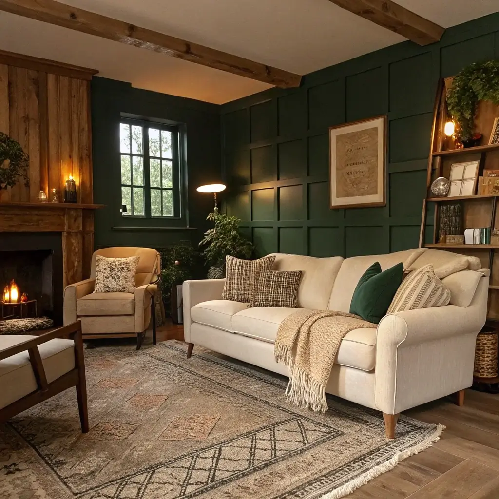
This combination feels like wearing your favorite cashmere sweater. Dark green and cream together create instant coziness without sacrificing style. Every time someone enters my living room (dark green accent wall, cream everything else), they immediately want to sit down and stay awhile.
Dark green has this enveloping quality that makes spaces feel intimate and protective. But pair it with cream instead of stark white, and suddenly that intimacy feels warm rather than cave-like. It’s the difference between cozy and claustrophobic.
Creating Depth and Interest
The contrast between dark green and cream naturally creates depth in your space. Use this to your advantage! Place cream furniture against dark green walls, or dark green furniture against cream walls. The contrast makes both colors pop.
Texture becomes your playground with this palette. A cream sherpa throw on a dark green chair? Gorgeous. Velvet green pillows on a cream linen sofa? Chef’s kiss. Mix smooth and nubby textures to create visual and tactile interest.
Lighting matters more than ever with dark colors. Layer warm lighting throughout the room – table lamps, floor lamps, maybe some sconces. The cream elements will reflect this light, preventing your dark green from creating black holes in your space.
Also Read: 10 Cozy Dark Green Living Room Ideas to Warm Your
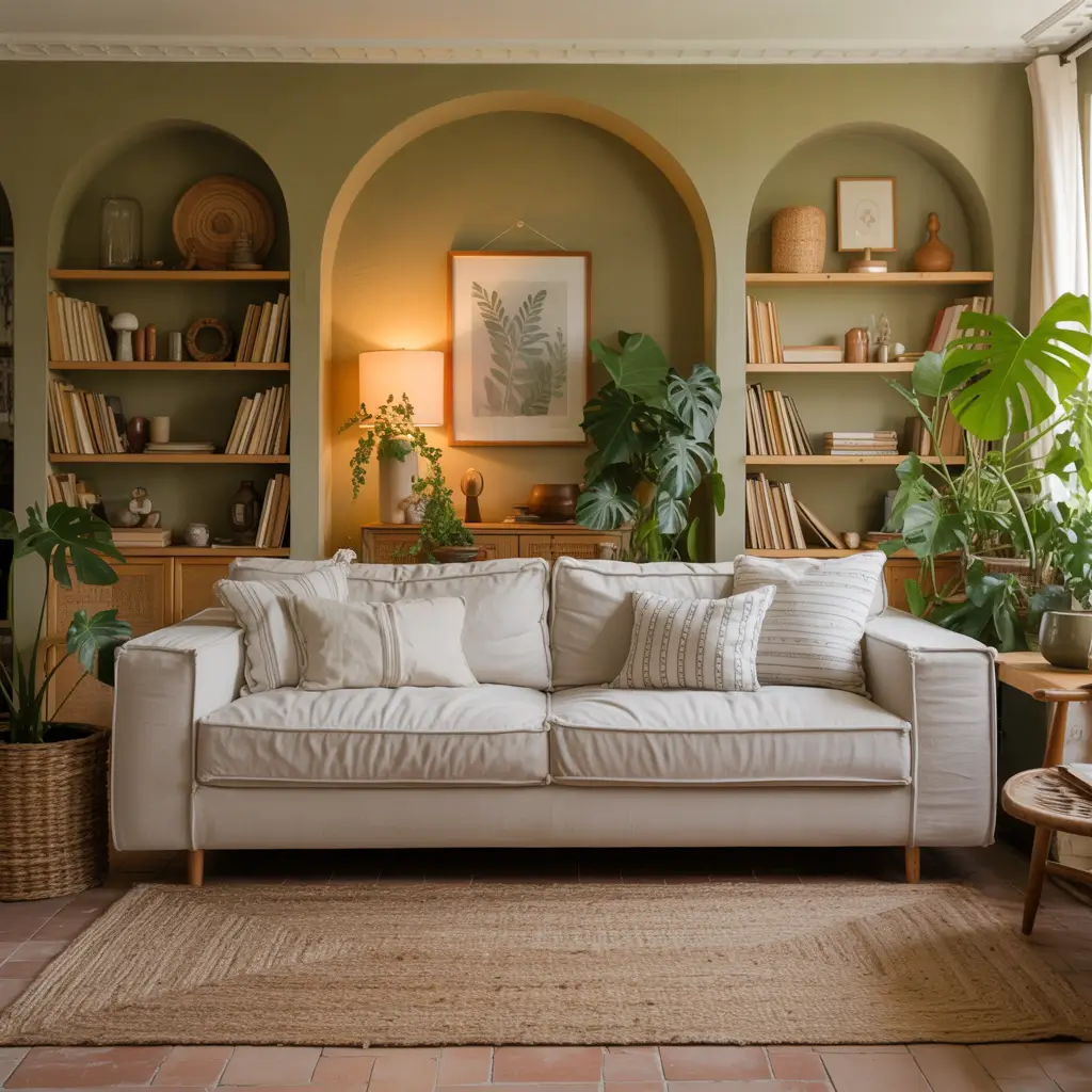
7. Moss Green with Earthy Neutral Tones
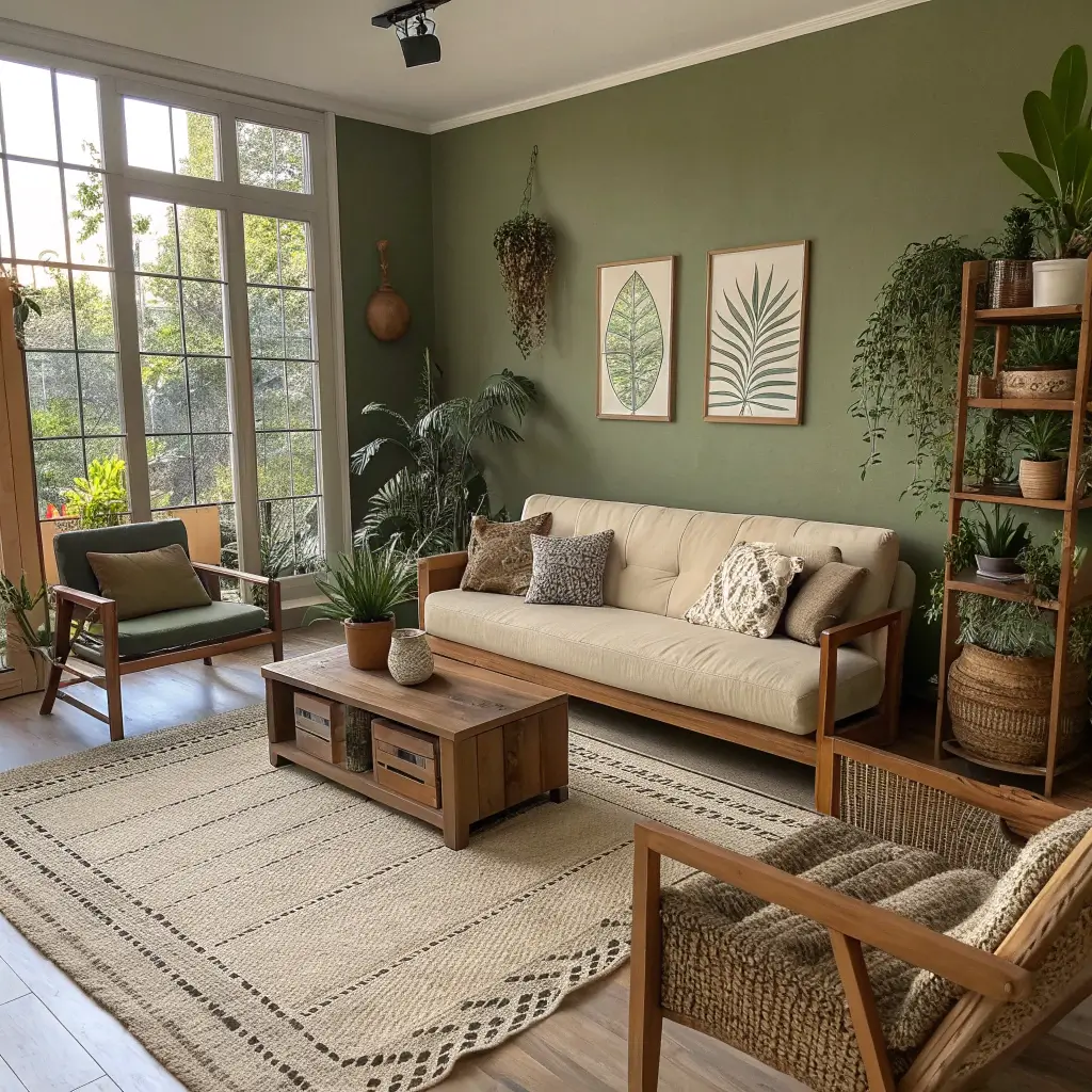
Sometimes you want your living room to feel like a really stylish forest floor (in the best way possible). Moss green with earthy neutrals – think sand, taupe, mushroom – creates this organic flow that feels both natural and intentional.
I stumbled onto this combination while trying to work with my rental’s unfortunate beige carpet. Instead of fighting it, I leaned into the earthiness with moss green accents. Suddenly that boring carpet became part of a cohesive, intentional design scheme. Sometimes you’ve got to work with what you’ve got, right?
Building Your Earth Palette
Start by choosing your specific shade of moss green. Some lean yellow, others lean gray – pick one that complements your existing space. Then build your neutral palette around it. Don’t just stick to one neutral; layer different earth tones for richness.
Think about incorporating actual natural elements. A live-edge wood coffee table, stone coasters, maybe a jute rug. These materials enhance the earthiness without making your living room look like you’re trying to recreate the great outdoors indoors.
Plants obviously work brilliantly here (shocker, I know). But choose your planters carefully – terracotta, concrete, or ceramic in earth tones. Skip the bright white or colorful planters that would break the natural flow.
8. Green and Terracotta Modern Blend
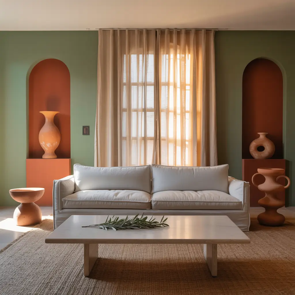
Who says green and orange can’t be friends? When you pair the right shade of green with terracotta, magic happens. This unexpected combination brings warmth and sophistication that feels both retro and completely current.
I first saw this pairing in a restaurant in Austin, and I couldn’t stop staring. The designer had used sage green walls with terracotta accent chairs and artwork. It shouldn’t have worked, but it absolutely did. That meal changed my whole perspective on color combining (and the tacos were pretty good too).
Making Unexpected Colors Work
The secret to green and terracotta? Choose muted versions of both colors. We’re not talking lime green and bright orange here. Think sage, olive, or eucalyptus green paired with dusty terracotta or rust.
Use the 60-30-10 rule: 60% neutral (white, cream, or gray walls), 30% green (sofa or large rug), and 10% terracotta (pillows, throws, artwork). This proportion keeps things balanced and prevents either color from overwhelming the space.
Add black or charcoal accents to ground the scheme. A black metal coffee table or charcoal lamp shades add sophistication and prevent the palette from feeling too southwestern. Unless you want southwestern – then lean into it with leather and geometric patterns!
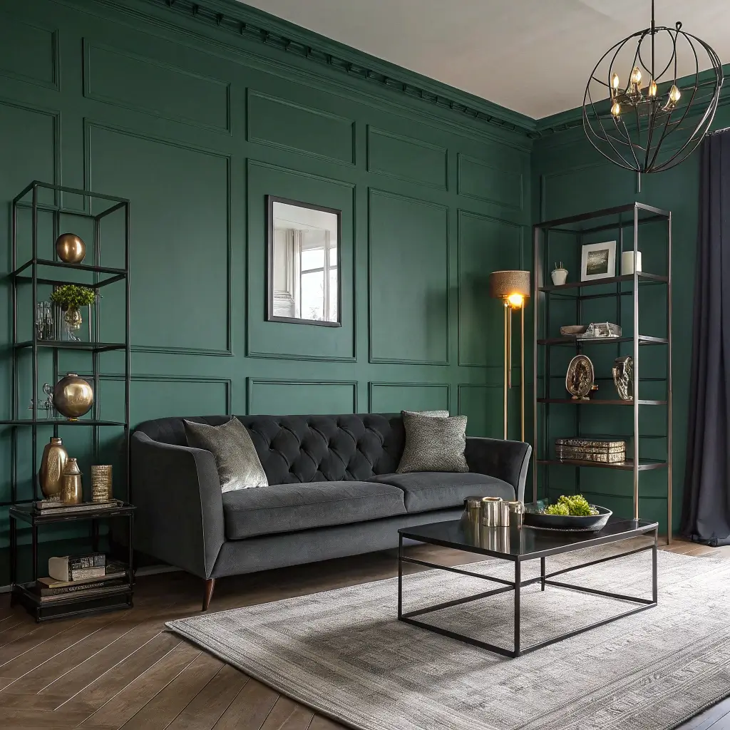
9. Green and Charcoal Contemporary Scheme
Ready for something moody and modern? Green and charcoal together create this incredibly sophisticated vibe that feels like it belongs in a design magazine. But here’s the thing – it’s actually super livable once you know the tricks.
My brother’s bachelor pad uses this scheme, and it completely changed my mind about dark color combinations. His charcoal gray sofa against hunter green walls looks expensive and intentional. Add some modern artwork and good lighting, and you’ve got a space that impresses everyone who walks in.
Balancing Dark and Light
Working with two dark colors requires strategy. You need plenty of light – both natural and artificial. If your room doesn’t have great natural light, this might not be your combo. But if you’ve got good windows? Game on.
Break up the darkness with white or light gray elements. White window trim, light artwork matting, maybe a cream rug. These lighter elements provide visual breathing room and prevent the space from feeling too heavy.
Metallics become incredibly important here. Chrome, steel, or silver accents enhance the contemporary feel while reflecting light around the room. A chrome floor lamp or steel-framed mirror adds function and style while brightening the space.
Also Read: 12 Chic Green Sofa Living Room Ideas and Modern Styling
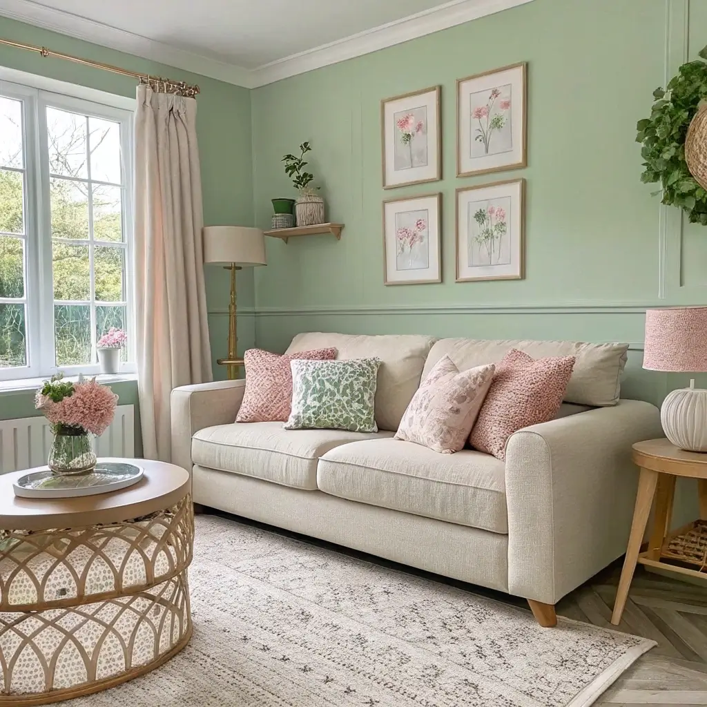
10. Green with Soft Blush Accent Style
Plot twist! Green and pink work together beautifully, especially when you choose soft blush tones instead of bubble gum pink. This combination feels fresh, unexpected, and surprisingly sophisticated. FYI, this combo has completely taken over my Pinterest boards lately.
I tried this in my daughter’s room first (safer to experiment in kids’ spaces, IMO), pairing sage green walls with blush curtains and bedding. The result was so good that I immediately started planning how to sneak this palette into our main living spaces.
Pink and Green Without the Preppy
The key to avoiding country club vibes? Keep both colors muted and sophisticated. Sage or eucalyptus green paired with dusty rose or blush creates a mature, elegant palette. No hot pink, no kelly green – save those for your kid’s birthday party.
Use blush as an accent color rather than a co-star. A couple of blush throw pillows, maybe a piece of artwork with blush tones, or a gorgeous blush ceramic vase. The green should definitely dominate, with pink adding unexpected moments of softness.
Ground the palette with plenty of neutrals. White, cream, or even light wood tones prevent the pink and green from feeling too precious. Add some black accents if you want to add edge – a black frame or lamp base adds instant sophistication.
Bringing Your Green Dreams to Life
So there you have it – ten green color schemes that actually work in real living rooms inhabited by real humans.
The beauty of green? It plays well with almost everything, adapts to any style, and never really goes out of fashion.
Start small if you’re nervous. Maybe just paint one accent wall or invest in a green sofa. Once you see how green transforms your space, you’ll wonder why you waited so long.
The biggest mistake people make? Overthinking it. Pick a scheme that speaks to you and go for it.
Remember, your living room should make you happy every time you walk in. Whether you go bold with emerald or keep it chill with sage, the best color scheme is one that reflects your personality and makes you want to actually live in your living room.
What’s holding you back from going green? Seriously, pick your favorite combo from this list and start planning.
Your living room is waiting for its green moment, and trust me – you won’t regret making the leap. After all, if Mother Nature chose green as her signature color, who are we to argue? 🙂