12 Modern Grey Kitchen Tiles Ideas and Small Space Solutions
- Kitchen Tiles Ideas
 Ben
Ben- 0
- 50 minutes read
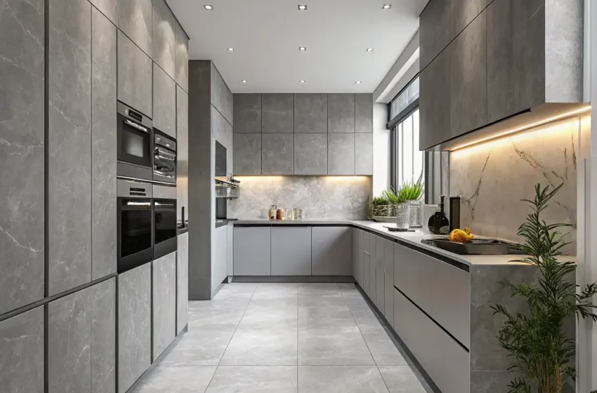
Grey kitchen tiles might sound boring on paper—like choosing “neutral” as your favorite color. But here’s the honest truth: grey has become the unsung hero of kitchen design, and for incredibly good reasons.
I spent months agonizing over tile choices for my own kitchen renovation, convinced that grey would make my space look dull and uninspired.
Fast forward two years, and my grey herringbone backsplash remains the single best design decision I made. Guests compliment it constantly, and I still smile every time I walk in to make coffee.
The magic of grey lies in its incredible versatility. It plays beautifully with virtually every color, adapts to any design style from farmhouse to ultra-modern, and hides dirt and wear better than white ever could.
Plus, grey kitchen tiles photograph like a dream—your Instagram followers will thank you.
Whether you’re planning a complete kitchen overhaul or simply refreshing your backsplash, these 12 grey kitchen tile ideas offer something for every taste and budget. Let’s find your perfect match.
1. Light Grey Subway Tiles with White Cabinets

The classic combination of light grey subway tiles paired with white cabinets creates timeless elegance that never feels outdated. This pairing has dominated Pinterest boards and design magazines for years, and honestly, the hype proves completely justified.
Light grey subway tiles add subtle warmth and depth that pure white tiles simply cannot achieve. Your kitchen gains visual interest without overwhelming the senses. The soft grey tone creates a gentle backdrop that lets your cabinets, countertops, and accessories shine.
Why This Combination Works So Well
The contrast creates perfect balance:
- White cabinets brighten the space and reflect light
- Grey tiles prevent the sterile, clinical feeling that all-white kitchens sometimes develop
- The combination feels fresh yet sophisticated
- Both elements remain neutral enough to accommodate changing decor trends
For optimal results, choose a light grey with warm undertones rather than cool, blue-based greys. Warm greys feel more inviting and complement the typical warm lighting found in kitchens. Cool greys can make spaces feel uninviting, especially in rooms without abundant natural light.
Grout Color Considerations
Your grout color dramatically impacts the final appearance:
- White grout creates a seamless, cohesive look that minimizes the grid pattern
- Light grey grout offers a subtle, understated finish
- Dark grey grout makes each tile pop and creates a more graphic, modern effect
I personally recommend matching your grout closely to your tile color for this classic combination. The subtle, blended look feels more elegant and timeless than high-contrast options. Save the dramatic grout for more statement-making tile choices.
2. Dark Charcoal Hexagon Floor Tiles
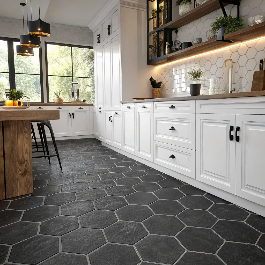
Ready to make a serious design statement? Dark charcoal hexagon floor tiles deliver drama and sophistication that rectangular tiles simply cannot match. The geometric shape adds visual intrigue, while the deep charcoal color grounds your kitchen with confidence and presence.
Hexagon tiles have experienced a massive resurgence recently, and I completely understand why. They feel simultaneously vintage and modern—a clever trick that few design elements manage successfully. Your kitchen feels both timeless and on-trend.
Selecting the Right Size
Hexagon tiles come in various sizes, each creating different effects:
- Small hexagons (1-2 inches) create intricate, mosaic-like patterns perfect for vintage or eclectic kitchens
- Medium hexagons (3-4 inches) offer versatility and work in most kitchen sizes
- Large hexagons (6+ inches) make bold, contemporary statements and work best in spacious kitchens
- Oversized hexagons (12+ inches) create dramatic, modern impact with fewer grout lines
For dark charcoal specifically, larger sizes often work better because they minimize grout lines and create cleaner visual flow. Too many grout lines in a dark tile can feel busy and overwhelming.
Pairing Charcoal Floors with Cabinet Colors
Dark charcoal floors demand thoughtful cabinet pairings:
- White cabinets create maximum contrast and brighten the space
- Light grey cabinets offer sophisticated, tonal harmony
- Natural wood cabinets add warmth and organic balance
- Deep navy or forest green create bold, dramatic statements
FYI, dark floors show dust and crumbs more readily than lighter options. If you despise sweeping (no judgment here), you might want to consider this practical reality before committing. However, the aesthetic payoff often justifies the extra maintenance for design-focused homeowners.
3. Patterned Grey Moroccan Backsplash
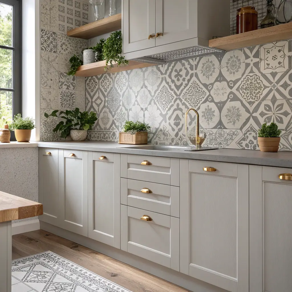
Want your backsplash to become the undeniable star of your kitchen? Patterned grey Moroccan tiles inject personality, artistry, and cultural depth into any space. These intricate designs transform a functional surface into genuine artwork.
Moroccan-inspired patterns feature beautiful geometric designs, arabesques, and traditional motifs that have evolved over centuries. The grey colorway keeps things sophisticated and prevents the patterns from feeling overwhelming or chaotic.
Choosing Your Pattern Style
Moroccan tile patterns range from subtle to bold:
- Geometric patterns with repeating shapes feel structured and modern
- Arabesque patterns with flowing curves feel romantic and traditional
- Star patterns create dynamic focal points
- Quatrefoil patterns blend traditional and contemporary aesthetics
- Zellige-style tiles with subtle variations feel handcrafted and organic
For kitchens with simple cabinetry and minimal decor, you can embrace bolder, more intricate patterns. If your kitchen already features significant visual activity—colorful appliances, open shelving with displayed items, patterned countertops—opt for subtler Moroccan designs to prevent visual competition.
Making Moroccan Tiles Work in Various Kitchen Styles
Surprisingly, Moroccan tiles adapt beyond bohemian or Mediterranean kitchens:
- In modern kitchens, grey Moroccan tiles with geometric patterns feel unexpectedly contemporary
- In farmhouse kitchens, they add worldly sophistication
- In transitional kitchens, they bridge traditional and modern elements beautifully
- In eclectic kitchens, they become natural focal points
I once helped a friend choose Moroccan tiles for her otherwise minimal, modern kitchen. She worried they would clash—instead, they elevated the entire space and became an incredible conversation starter.
Also Read: 10 Fresh Yellow Kitchen Tiles Ideas for Light Filled Kitchens
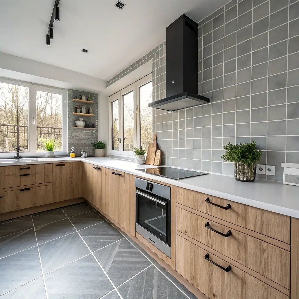
4. Matte Grey Large Format Wall Tiles
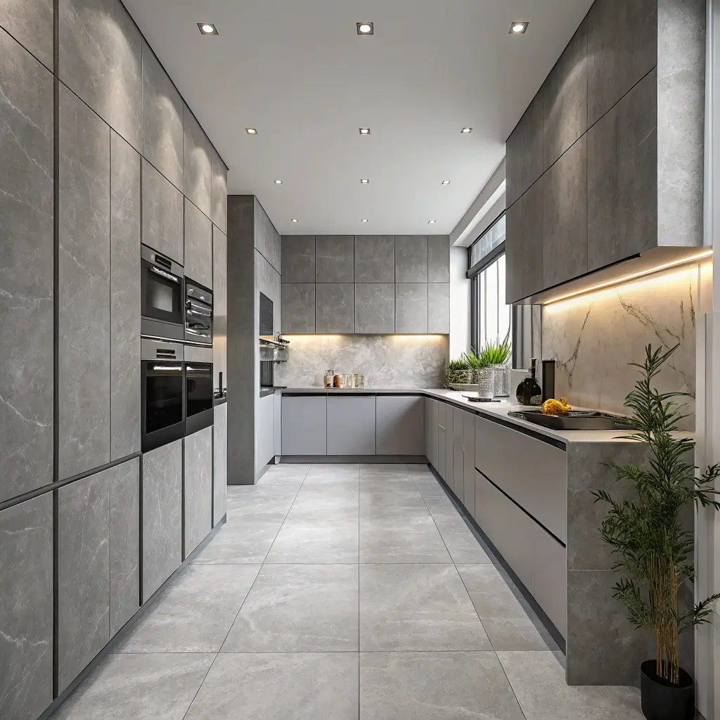
Large format matte grey wall tiles deliver sleek, sophisticated aesthetics that feel genuinely luxurious. Fewer grout lines create seamless surfaces that read as clean, modern, and high-end. The matte finish prevents glare and adds subtle texture that photographs beautifully.
This approach works particularly well in contemporary kitchens where clean lines and minimal visual noise reign supreme. Large format tiles—typically 12×24 inches or larger—transform your walls into smooth, uninterrupted surfaces.
Benefits of Matte Finish for Kitchens
Matte tiles offer practical advantages beyond aesthetics:
- Hide water spots and fingerprints better than glossy alternatives
- Reduce glare from natural and artificial light
- Create depth and texture that flat, shiny surfaces lack
- Feel more sophisticated and less dated than high-gloss options
- Complement both warm and cool design elements effortlessly
The only consideration: matte tiles can feel slightly rougher, making them marginally harder to wipe clean than glossy alternatives. For backsplash areas behind stovetops, you might prefer a satin or semi-gloss finish that combines aesthetic appeal with easier maintenance.
Installation Considerations
Large format tiles require skilled installation and proper wall preparation:
- Walls must be perfectly level—imperfections show dramatically with large tiles
- Professional installation often proves worthwhile despite higher costs
- Weight requires appropriate adhesives and wall support
- Cutting requires specialized tools for clean, precise edges
When done correctly, large format matte grey tiles create that seamless, high-end look you see in design magazines. The investment in professional installation typically pays off in the final result.
5. Grey Herringbone Tiles with Wooden Accents

The grey herringbone pattern paired with wooden accents creates warmth and visual interest that plain stacked tiles cannot achieve. The diagonal zigzag pattern adds movement and energy while maintaining sophistication.
This combination has become my personal favorite—my own kitchen features grey herringbone backsplash tiles with walnut open shelving, and the warmth factor transformed a potentially cold space into something genuinely inviting.
Why Herringbone Pattern Elevates Grey Tiles
The herringbone layout adds dimension through:
- Directional movement that draws the eye across surfaces
- Classic craftsmanship feel that suggests quality and attention to detail
- Visual interest without introducing additional colors or patterns
- Sophisticated texture that works in both traditional and modern spaces
Herringbone layouts require more tiles and skilled installation compared to standard brick patterns. Budget approximately 10-15% extra material for cuts and waste. The investment proves worthwhile for the dramatic visual impact.
Selecting Complementary Wood Tones
Different wood tones create different moods with grey herringbone tiles:
- Light oak or maple maintain brightness and feel Scandinavian
- Walnut adds rich warmth and sophistication
- Reclaimed wood brings character and rustic charm
- White oak offers contemporary warmth with subtle grain
For cooler grey tiles, warmer woods like walnut provide essential balance. For warmer grey tiles, lighter woods maintain overall brightness. The interplay between grey and wood tones deserves careful consideration during your selection process.
6. Glossy Grey Subway Tiles for Modern Kitchens

While matte finishes currently dominate trends, glossy grey subway tiles still deliver fantastic results in modern kitchens. The reflective surface bounces light throughout the space, creating brightness and energy that matte tiles simply cannot achieve.
Glossy finishes feel particularly appropriate in kitchens with limited natural light. The reflective quality maximizes whatever light exists, making your kitchen feel more open and alive.
The Case for Glossy Finishes
Glossy tiles excel in specific situations:
- Small or dark kitchens benefit from light reflection
- Modern, sleek aesthetics often incorporate reflective surfaces
- Easy maintenance appeals to practical homeowners
- Visual depth comes from reflected light and shadows
The main consideration: glossy surfaces show every smudge, water spot, and fingerprint. If you cook frequently or have children constantly touching surfaces, you’ll wipe these tiles more often than matte alternatives. Some people find this acceptable; others find it maddening.
Choosing the Right Grey Shade
Glossy finishes intensify color perception:
- Darker greys appear even deeper and more dramatic
- Lighter greys can look almost silver or metallic
- Mid-tones offer the most versatility
- Undertones (blue, green, warm) become more noticeable
IMO, medium grey tones work best for glossy subway tiles. They provide enough visual interest without overwhelming, and the reflective surface adds just enough drama without feeling excessive. Test samples in your actual kitchen before committing—glossy colors can shift significantly under different lighting conditions.
Also Read: 10 Unique Patterned Kitchen Tiles Ideas for Stylish Interiors
7. Soft Dove Grey Tiles with Brass Fixtures

The pairing of soft dove grey tiles with brass fixtures creates sophisticated warmth that feels both timeless and perfectly on-trend. This combination elevates kitchens beyond basic neutrals into genuinely luxurious territory.
Dove grey—that soft, warm-toned grey with subtle hints of taupe—provides the perfect backdrop for brass’s warm metallic glow. The combination feels intentional, cohesive, and surprisingly cozy.
Why Brass and Grey Work Beautifully Together
The pairing succeeds because:
- Warm brass counterbalances grey’s potential coolness
- Metallic sheen adds luxury without overwhelming
- Both elements feel timeless yet currently popular
- The combination photographs exceptionally well
Brass fixtures include cabinet hardware, faucets, light fixtures, range hoods, and even appliance accents. You don’t need brass everywhere—a few strategic touches create significant impact.
Selecting the Right Dove Grey Tone
Dove grey varies in warmth and undertone:
- Warm dove grey with taupe or cream undertones pairs best with brushed brass
- Cool dove grey with subtle blue undertones works better with polished brass
- True dove grey offers maximum versatility with any brass finish
Consider your overall kitchen lighting when selecting dove grey tiles. North-facing kitchens might need warmer grey tones to prevent spaces from feeling cold. South-facing kitchens handle cooler greys beautifully.
8. Concrete-Look Grey Tiles for Industrial Style
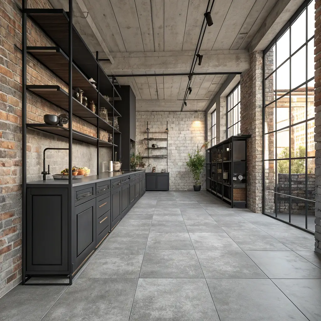
Concrete-look grey tiles deliver industrial aesthetics without the practical challenges of actual concrete. You get that raw, urban vibe with easier installation, better durability, and significantly lower costs.
Real concrete surfaces require sealing, can crack, and prove challenging to install. Concrete-look porcelain tiles offer the aesthetic without the headaches—a trade-off that makes sense for most homeowners.
Achieving Authentic Industrial Vibes
Key elements for industrial kitchen success:
- Large format tiles minimize grout lines for seamless concrete appearance
- Matte or textured finishes feel more authentic than glossy options
- Subtle variation in color prevents artificial uniformity
- Matching grout color creates continuous surface appearance
Pair concrete-look tiles with exposed elements like open shelving in metal or reclaimed wood, visible ductwork, industrial pendant lights, and black metal fixtures. The combination creates cohesive industrial aesthetics that feel intentional rather than incomplete.
Softening Industrial Edges
Pure industrial style can feel harsh in kitchen environments. Balance concrete-look tiles with softer elements:
- Indoor plants and herbs bring life and organic warmth
- Wooden cutting boards and accessories add natural texture
- Fabric elements like window treatments or chair cushions soften edges
- Artwork and decorative items inject personality
The goal involves creating industrial-inspired spaces that still feel welcoming and comfortable for daily living. Your kitchen should look cool while remaining a place where people actually want to gather and cook.
9. Grey Tiles with White Grout for Contrast
Sometimes the simplest choices create the most dramatic effects. Grey tiles with white grout transform basic tile installations into graphic, eye-catching features. The high contrast makes each tile pop and creates distinct visual patterns.
This approach works particularly well with geometric tile shapes—subway tiles, hexagons, or fish scales—where the grout lines become intentional design elements rather than necessary interruptions.
Creating Maximum Visual Impact
Contrast intensity depends on grey shade:
- Dark charcoal with white grout creates maximum drama
- Medium grey with white grout offers balanced contrast
- Light grey with white grout provides subtle definition
- Varying grey shades with white grout create gradient effects
Consider your kitchen’s overall busy-ness level when deciding on contrast intensity. High-contrast tile installations demand attention and work best in otherwise simple spaces. If your kitchen already features significant visual activity, lower contrast might serve better.
Grout Maintenance Realities
White grout requires more maintenance than colored alternatives:
- Stains and discoloration show readily
- Regular sealing prevents absorption of dirt and liquids
- Cleaning products must remain appropriate for grout types
- Resealing every 1-2 years maintains appearance
Epoxy grout offers better stain resistance than traditional cement-based options. The higher initial cost often proves worthwhile for high-contrast installations where grout appearance matters significantly. Consider this upgrade seriously if you choose the grey tiles with white grout approach.
Also Read: 10 Dreamy Blue Kitchen Tiles Ideas and Timeless Styles
10. Gradient Grey Mosaic Tiles

Gradient grey mosaic tiles create stunning ombré effects that transform flat surfaces into artistic features. These tiles transition from light to dark (or dark to light), creating movement and visual drama that solid colors cannot achieve.
Mosaic tiles come pre-mounted on mesh backing, making installation more manageable despite the intricate appearance. The small individual tiles create complex, sophisticated surfaces that feel genuinely special.
Layout Options for Gradient Mosaics
Several approaches work beautifully:
- Vertical gradient from light at top to dark at bottom grounds the space
- Horizontal gradient creates movement across walls
- Central gradient with darker edges frames focal points
- Random gradient offers organic, natural variation
For backsplashes, vertical gradients typically work best. Starting lighter at cabinet level and graduating darker toward countertops creates natural visual weight and draws the eye downward toward work surfaces.
Selecting Quality Mosaic Tiles
Not all mosaic tiles perform equally:
- Look for consistent thickness across all tiles
- Check mesh backing quality for durability during installation
- Verify color consistency within and across sheets
- Choose appropriate materials for kitchen environments (porcelain, glass, or stone)
Quality mosaics cost more but install better and last longer. Cheap mosaics often feature inconsistent sizing, weak backing, and color variations that become apparent only after installation. Ask for samples and inspect them carefully before ordering full quantities.
11. Small Kitchen Grey Checkerboard Tiles

Grey checkerboard floor tiles bring classic charm and visual interest to small kitchens that might otherwise feel cramped or forgettable. The alternating pattern creates energy and personality without overwhelming compact spaces. 🙂
Checkerboard patterns feel retro in the best possible way—think classic diners, European bistros, and vintage farmhouses. The grey and white combination updates this traditional pattern for contemporary spaces.
Making Checkerboard Work in Small Spaces
Smart strategies for compact kitchens:
- Smaller tile sizes (4-6 inches) suit modest square footage
- Diagonal installation makes rooms feel larger than straight rows
- Light grey with white prevents spaces from feeling heavy
- Matching wall colors to the lighter tile color expands visual space
Diagonal checkerboard installation costs slightly more due to additional cuts and waste. However, the spatial benefits in small kitchens often justify this investment. The diagonal lines trick the eye into perceiving more space than actually exists.
Balancing Busy Floors with Calm Walls
Checkerboard patterns demand attention—balance them with simpler elements elsewhere:
- Choose solid cabinet colors rather than patterned or heavily detailed options
- Keep backsplashes simple with solid tiles or subtle patterns
- Limit decorative accessories to prevent visual overload
- Select minimal hardware that doesn’t compete for attention
The floor becomes your primary design feature. Let it shine by simplifying everything else in the kitchen. This approach creates sophisticated spaces that feel intentionally designed rather than accidentally chaotic.
12. Textured Stone Grey Tiles for Luxury Kitchens

For those seeking genuine luxury, textured stone grey tiles deliver sophistication that manufactured tiles cannot replicate. Natural stone—slate, limestone, marble, or travertine—brings organic beauty, unique variation, and timeless elegance to high-end kitchens.
Each natural stone tile differs slightly from every other, creating surfaces that feel authentic and alive. The textured surfaces add dimensional interest and tactile appeal that flat tiles simply cannot achieve.
Selecting the Right Grey Stone
Different grey stones offer distinct characteristics:
- Grey slate features rich texture and dramatic variation
- Grey limestone offers subtle elegance with softer patterns
- Grey marble delivers luxury with veining and movement
- Grey travertine provides warm, earthy sophistication
Consider both aesthetics and practicality when choosing natural stone. Marble requires regular sealing and shows etching from acidic substances. Slate proves more durable but features more dramatic texture. Limestone offers a middle ground with moderate maintenance requirements.
Caring for Natural Stone Tiles
Natural stone demands proper maintenance:
- Seal upon installation and reseal annually
- Clean with pH-neutral products specifically designed for stone
- Address spills immediately to prevent staining
- Use protective pads under heavy items
- Avoid acidic cleaners that damage stone surfaces
The maintenance commitment proves worthwhile for many homeowners who prioritize authentic materials and luxury aesthetics. Natural stone kitchens age beautifully, developing character over time that manufactured materials cannot replicate.
Bringing Your Grey Kitchen Tile Vision to Life
Grey kitchen tiles offer remarkable versatility—these 12 ideas merely scratch the surface of possibilities.
From classic subway tiles to luxurious natural stone, grey adapts to virtually any design style and budget level.
Key takeaways for your grey tile journey:
- Consider undertones carefully—warm greys versus cool greys dramatically impact overall kitchen feel
- Test samples in your actual kitchen under various lighting conditions
- Grout color matters enormously—it can transform or undermine your tile choice
- Balance grey with warm elements to prevent cold, sterile atmospheres
- Match tile style to kitchen personality—modern spaces suit sleek options; traditional kitchens welcome classic patterns
The best grey kitchen tiles reflect your personal style while functioning beautifully for daily life.
Don’t choose tiles based solely on aesthetics—consider maintenance requirements, durability, and how they’ll look after years of actual use.
Before ordering full quantities, always get samples and live with them for at least a week. Hold them against your cabinets, countertops, and flooring. View them in morning light and evening light.
Make sure you genuinely love them before committing.
Your kitchen deserves tiles that make you happy every single day—grey happens to do that exceptionally well. Now go find your perfect shade and pattern. Your stunning grey kitchen awaits! :/