12 Gorgeous Moody Bedroom Paint Colors and Luxe Design Tips
- Bedroom Design
 Ben
Ben- 0
- 34 minutes read
So you’re tired of living in a white box that looks like every other bedroom on Instagram? Good. Let’s talk about moody bedroom paint colors that actually have personality.
I spent years believing the lie that bedrooms needed to be light and bright. Then I painted my bedroom wall dark teal on a whim (okay, after three glasses of wine), and suddenly understood why people pay therapists.
Dark walls literally changed how I felt about my entire life. Dramatic? Maybe. True? Absolutely.
Here’s the thing about moody colors – they create atmosphere that beige could never achieve. They turn your bedroom from just a sleeping space into an actual experience.
After helping dozens of friends go dark (paint-wise), I’ve learned which moody colors work magic and which ones just make you feel like you’re living in a cave.
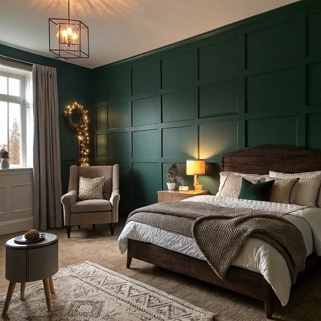
1. Deep Emerald Serenity Bedroom
Let’s kick things off with deep emerald green – the moody color that somehow makes everyone look good. It’s like nature’s Instagram filter for your bedroom.
I discovered emerald’s power when I stayed at a boutique hotel in Portland. Their emerald bedroom made me feel rich, even though I’d just spent my last $200 on that room. Came home, immediately painted my bedroom emerald, and now everyone thinks I hired a designer. I didn’t, but I’ll take the compliment.
Making Emerald Work Its Magic
The emerald bedroom success formula:
- Go fully saturated – watered-down emerald looks swampy
- Pair with brass or gold hardware for instant luxury
- Add cream or blush textiles to soften the intensity
- Use multiple light sources to show color depth
- Include plants to enhance the natural vibe
The biggest mistake people make with emerald? Choosing one with too much yellow. You want jewel-tone emerald, not grass green. Hold the paint chip next to actual emerald jewelry (or a photo if you’re not fancy). If they don’t match, keep looking.
Natural light transforms emerald throughout the day. Morning light makes it fresh and energizing. Evening light turns it mysterious and cocooning. It’s basically two bedrooms for the price of one paint job.
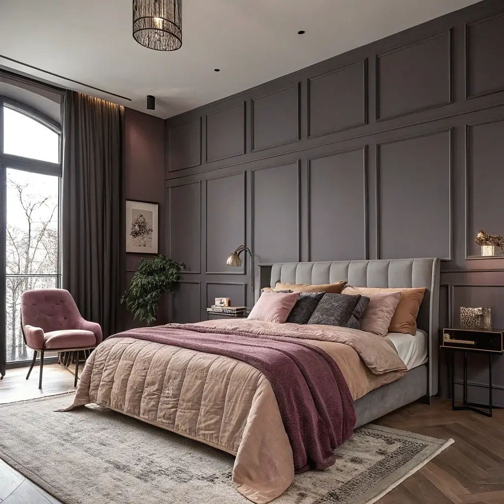
2. Charcoal and Blush Contrast Walls
Charcoal and blush together sounds like it shouldn’t work, but trust me, this combination slaps. It’s moody meets romantic, and somehow they balance each other perfectly.
My best friend thought I’d lost it when I suggested this combo for her bedroom. Two weeks later, she’s sending me daily texts about how much she loves it. The charcoal gives depth and drama, while blush keeps things from feeling too heavy. It’s the design equivalent of tough on the outside, soft on the inside.
The Contrast Game
Nailing the charcoal-blush balance:
- Charcoal on the focal wall, blush on others
- Keep the ratio 70% charcoal, 30% blush
- Use white bedding to bridge the colors
- Add metallics in rose gold or copper
- Choose matte finishes for both colors
Temperature matters here. Cool charcoal with warm blush creates intentional tension. Both cool or both warm looks muddy. You want that contrast to sing, not mumble.
The placement strategy changes everything. Charcoal behind the bed, blush everywhere else? Dramatic and grounding. Reverse it? Softer but still sophisticated. Test both with large samples before committing.
3. Midnight Blue Cozy Retreat
Midnight blue creates the ultimate sleep sanctuary. It’s like wrapping your bedroom in the night sky, minus the light pollution and airplane noise.
I fought against blue in the bedroom for years (seemed too predictable). Then I painted one wall midnight blue as a “test” and never painted it back. That was three years ago. My sleep quality improved, my room looked expensive, and suddenly everyone wanted to hang out in my bedroom. Not mad about it.
Deep Blue Bedroom Mastery
Creating the perfect midnight blue space:
- Choose blue with purple or black undertones
- Paint all walls for maximum cocoon effect
- Layer different blue textiles for depth
- Add warm wood tones to prevent coldness
- Invest in warm lighting (crucial with dark blue)
Here’s what nobody tells you about midnight blue – it photographs terribly but looks amazing in person. Your Instagram might suffer, but your actual life improves. Pick your priorities.
The ceiling question always comes up. Paint it blue too? Only if you’re brave and have high ceilings. Otherwise, keep it white but use the darkest white you can find. Stark white against midnight blue looks harsh.
Also Read: 10 Trendy Bedroom Paint Colors Ideas and Stylish Palettes
4. Moody Mauve Accent Walls
Moody mauve might sound like your grandmother’s bedroom, but modern mauve hits different. We’re talking sophisticated purple-gray, not Easter egg pink.
I stumbled onto mauve completely by accident. Ordered “gray” paint online (rookie mistake), and it arrived decidedly purple. Figured I’d try it anyway. That happy accident became my favorite bedroom color ever. Sometimes the best designs come from mistakes.
Modern Mauve Magic
Making mauve moody, not grandma:
- Select mauve with gray undertones
- Keep it to one or two walls max
- Pair with charcoal or navy accents
- Use geometric patterns, not florals
- Add black hardware for edge
The undertone detective work matters massively with mauve. Too pink and you’re in princess territory. Too gray and it’s just… gray. You want that perfect purple-gray balance that makes people ask, “What color is that exactly?”
Lighting transforms mauve more than any other moody color. LED bulbs make it look gray. Warm bulbs bring out the purple. Test your actual bedroom lighting before committing. I learned this after repainting. Twice.
5. Dark Teal Tranquil Escape
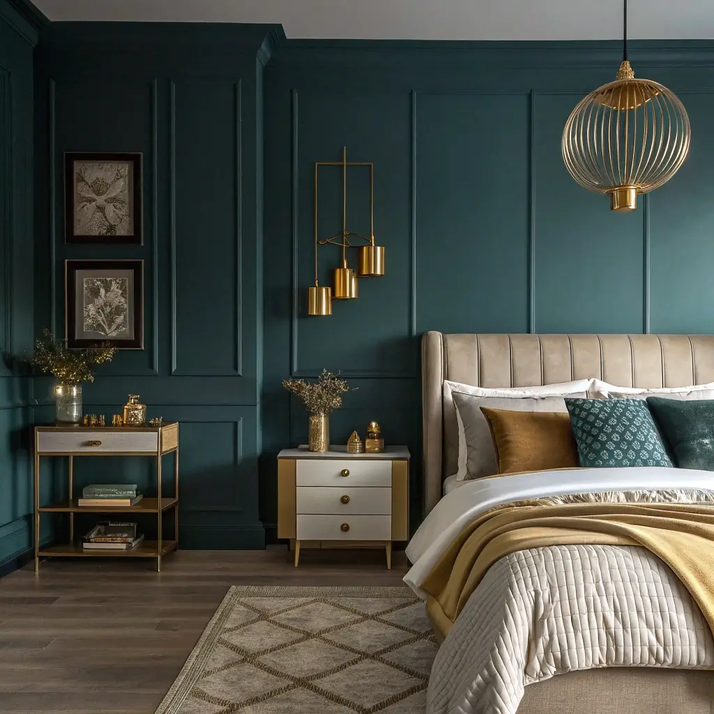
Dark teal delivers ocean vibes without the sand in your sheets. It’s sophisticated, unexpected, and somehow both energizing and calming.
This color saved my master bedroom from terminal blandness. Had beige walls for two years (playing it safe), then went full teal. The transformation felt like moving to a different house. My boring bedroom suddenly had personality, depth, and this incredible jewel-like quality that makes me happy every single morning.
Teal Transformation Tips
Dark teal bedroom essentials:
- Go darker than you think – medium teal looks medical
- Mix with coral or gold accents for warmth
- Include plenty of white to prevent heaviness
- Use velvet or silk textures to enhance richness
- Add mirrors to bounce color around
The green-blue balance in your teal matters. Too green feels retro (not in a good way). Too blue becomes navy. You want that perfect peacock moment. Benjamin Moore’s “Pacific Ocean” nails it, FYI.
Don’t cheap out on teal paint. Bad quality shows immediately with rich colors. That $15 gallon versus $50 gallon? The difference shows. Your bedroom walls aren’t the place to budget. Learned this lesson the expensive way.
6. Smoky Gray Minimalist Bedroom
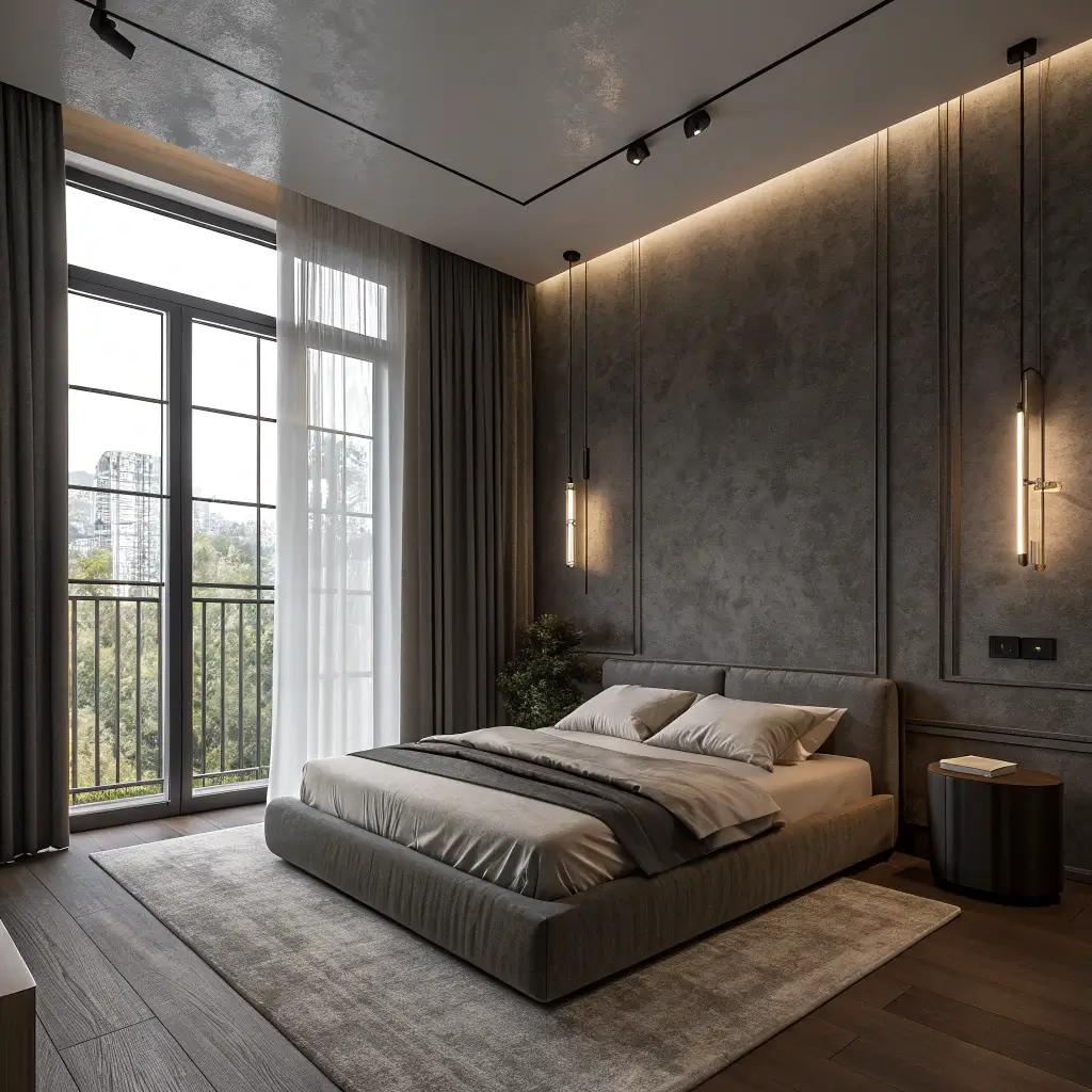
Think gray is boring? Smoky gray says otherwise. It’s moody without being dramatic, sophisticated without trying too hard.
My minimalist phase coincided with discovering smoky gray, and honestly, it was meant to be. This isn’t your average gray – it’s got depth, movement, and this subtle moodiness that regular gray can’t touch. My bedroom went from “empty” to “intentionally minimal” with one color change.
Smoky Sophistication
The smoky gray strategy:
- Choose gray with blue or purple undertones
- Keep furniture minimal and modern
- Layer different gray tones for interest
- Add one pop of color (or don’t)
- Texture becomes everything
The finish matters more with smoky gray than other colors. Flat looks dead. High gloss looks commercial. Eggshell or satin gives that perfect subtle sheen that makes gray interesting. Small detail, huge impact.
Smoky gray works with literally everything. Change your bedding, art, or furniture, and gray adapts. It’s the chameleon of moody colors. Perfect for commitment-phobes who redecorate constantly (guilty).
Also Read: 10 Charming Beige and Pink Bedroom Ideas for Warm Ambiance
7. Rich Plum Luxe Vibes
Rich plum screams luxury louder than any other moody color. It’s bold, unapologetic, and makes every bedroom look expensive.
I toured a million-dollar home last year (for fun, not buying), and their plum master bedroom stopped me cold. Came home to my white walls and felt personally attacked by their blandness. One gallon of plum paint later, my $50K condo bedroom looks like it belongs in that million-dollar home. Paint is basically the best ROI ever.
Plum Perfection Process
Creating plum luxury:
- Deep plum only – light plum looks cheap
- Pair with gold everything
- Include velvet or silk textures
- Keep lighting warm and layered
- One plum wall or all four, no in-between
The red-blue balance in plum determines everything. Too red becomes burgundy. Too blue becomes purple. You want that perfect eggplant moment that feels rich, not royal. Test extensively – plum mistakes hurt.
Here’s the truth about plum: it’s high maintenance. Shows every flaw, needs perfect application, and requires confidence. But when it works? Nothing else comes close to that luxe feeling.
8. Forest Green Dramatic Corners
Forest green brings the outdoors in while maintaining serious drama. It’s grounding and energizing simultaneously – nature’s own contradiction.
My spare bedroom became my favorite room after painting it forest green. Guests now request to stay over (weird flex, but okay). The color creates this incredible cocoon feeling that makes people never want to leave. Sometimes I sleep in there just for the vibe change.
Forest Green Excellence
The forest green formula:
- Choose green with brown undertones
- Paint all walls for maximum impact
- Add natural wood and leather
- Include plenty of plants (obviously)
- Layer cream and beige textiles
Forest green at night transforms completely. Under lamplight, it becomes almost black but with depth regular black lacks. It’s mysterious without being scary. Perfect for people who want drama without committing to actual black.
The trim question always comes up. White trim creates classic contrast. Painted trim (same color) creates modern immersion. I’ve done both. Both work. Pick based on your courage level.
9. Ink Black Statement Wall Ideas
Let’s talk about ink black – the ultimate moody move. Everyone thinks you’re crazy until they see it. Then they want it too.
I painted my bedroom wall black after a breakup (cliché, I know), expecting to hate it and repaint immediately. Three years later, it’s still black, and I’ve built my entire room around it. Sometimes emotional decisions lead to the best designs.
Black Wall Bravery
Making black walls work:
- One wall only unless you’re very brave
- Use pure black, not almost-black
- Add tons of lighting (seriously, tons)
- Include mirrors to prevent cave vibes
- Keep everything else lighter
The finish debate with black is real. Flat black looks like a chalkboard. Glossy black looks like a mall. Satin finish gives depth without shine. This detail makes or breaks black walls.
Black shows everything – dust, fingerprints, nail holes. Accept this going in. You’ll be touching up constantly. But that dramatic impact? Worth every touch-up session. IMO, black walls are the ultimate power move 🙂
Also Read: 12 Inspiring Beige Curtains Bedroom Ideas and Timeless Decor
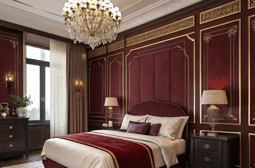
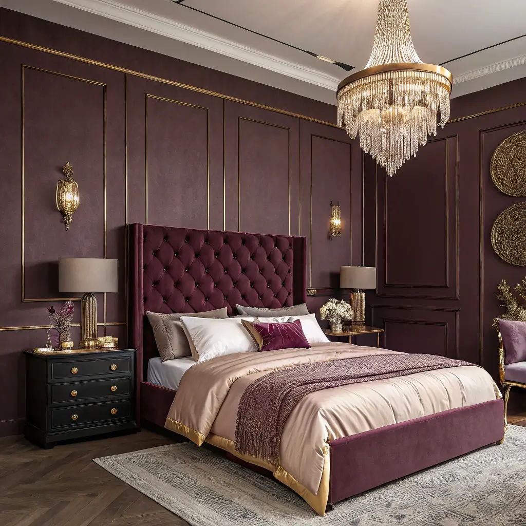
10. Burgundy and Gold Elegant Bedroom
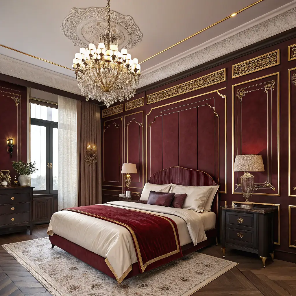
Burgundy and gold together create old-world elegance that feels fresh, not fussy. It’s rich, warm, and surprisingly livable.
I discovered this combo in a vintage hotel in New Orleans. Their burgundy and gold bedroom made me feel like royalty (even though I was there for a budget conference). Recreated it at home for roughly the cost of two nights in that hotel. Sometimes inspiration strikes in unexpected places.
Burgundy Brilliance
The burgundy-gold blueprint:
- Deep burgundy only – light looks dated
- Real gold accents, not brass
- Include cream to lighten the mood
- Velvet and leather textures essential
- Layer lighting at different heights
Burgundy needs confidence. It’s not a maybe color. You either own it completely or it owns you. Test it extensively because burgundy regret hits different than other color regrets.
The gold ratio matters. Too much and you’re in casino territory. Too little and burgundy feels heavy. Aim for 70% burgundy, 20% cream, 10% gold. This formula never fails.
11. Slate Blue Calm and Cozy Space
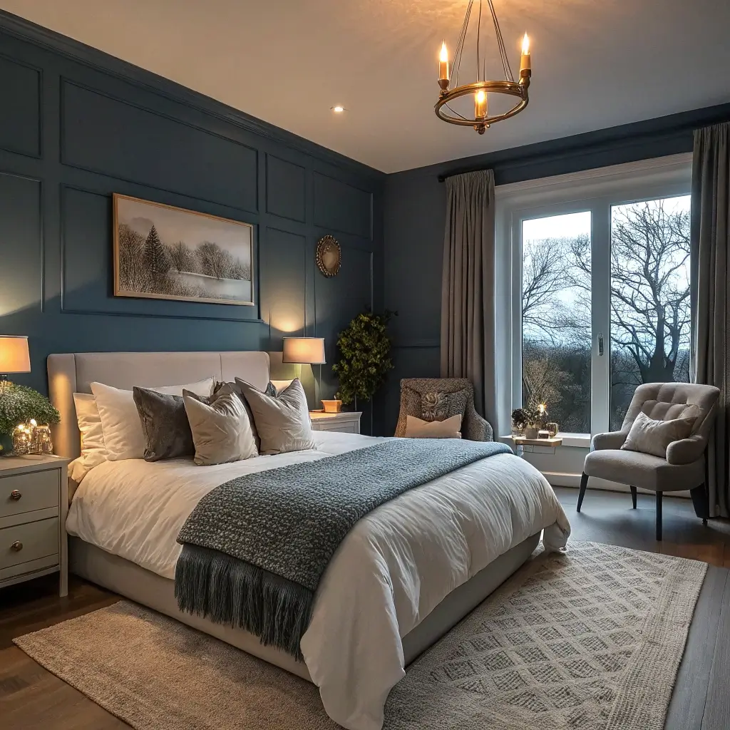
Slate blue delivers moodiness without the drama. It’s the introvert of moody colors – quiet but interesting.
My anxiety-prone friend painted her bedroom slate blue on my recommendation. She texted me two weeks later saying she’d never slept better. The color creates this instant calm that white walls could never achieve. Sometimes the right paint color is better than meditation apps.
Slate Blue Success
Creating slate blue serenity:
- Choose blue-gray, not gray-blue
- Works on all walls or just one
- Pair with white and natural wood
- Keep patterns minimal
- Add texture through fabrics
Slate blue photographs beautifully (unlike midnight blue). Your bedroom looks good in real life AND on Instagram. Win-win for those of us living double lives online and off.
The temperature flexibility of slate blue amazes me. Works with warm accents, cool accents, or both. It’s basically the Swiss Army knife of moody colors. Perfect for people who redecorate seasonally.
12. Chocolate Brown Warm Ambiance
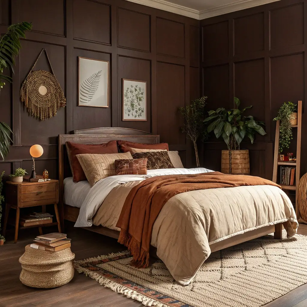
Chocolate brown is having a moment, and honestly, it’s about time. This moody color wraps your bedroom in warmth without the commitment of black or drama of jewel tones.
I painted my bedroom chocolate brown after years of cool grays left me feeling cold. The warmth hit immediately. My bedroom went from sleek and modern to cozy and inviting. Sometimes you need your bedroom to hug you, and chocolate brown delivers.
Brown Done Right
The modern brown bedroom guide:
- Rich chocolate only – milk chocolate looks muddy
- Mix with cream and camel tones
- Add black accents for edge
- Include varied wood tones
- Layer warm lighting extensively
The undertone situation with brown determines everything. Red undertones feel traditional. Gray undertones feel modern. Choose based on your vibe, not what’s trending. Brown transcends trends anyway.
Here’s what surprised me about chocolate brown – it makes other colors pop. That cream bedding looks creamier. That gold hardware looks goldier. Brown enhances everything around it while maintaining its own mood.
Your Moody Bedroom Journey
Look, moody bedroom paint colors aren’t for everyone. Some people genuinely love white walls, and that’s valid. But if you’re reading this, you’re probably ready for something more.
The best moody color is the one that makes you excited to go to bed and happy to wake up. Whether that’s dramatic emerald or subtle slate blue doesn’t matter.
What matters is that your bedroom finally feels like YOUR bedroom, not some generic space.
Remember, paint isn’t permanent. If you hate it, repaint it. I’ve repainted bedrooms within weeks of painting them. Was it annoying? Sure. Was living with a color I hated worse? Absolutely.
Your bedroom sees you at your most vulnerable – make sure it’s a space that supports you.
Now excuse me while I go stare at paint chips again. Writing this has me thinking about trying plum, and once that thought enters your brain, there’s no going back.
Happy painting, and may your moody bedroom be everything you dreamed and more!