10 Stylish Moody Green Living Room Ideas for Dark Decor
- Living Room Decor
 Ben
Ben- 0
- 27 minutes read

Moody green living rooms are having their moment, and honestly? It’s about time. I spent years thinking dark green walls would make my living room feel like a cave, until I finally took the plunge and painted my walls a deep forest green.
Best decision I’ve made since ditching my beige addiction. Now my living room feels like a sophisticated cocktail lounge where interesting conversations happen, even when I’m just binge-watching reality TV in my pajamas.
Here’s what makes moody green so special: it brings drama without the commitment issues of black, and sophistication without the coldness of gray. These deep, rich greens create atmosphere that lighter colors simply can’t achieve.
They make your morning coffee feel like a ritual and your evening wine taste better (okay, that might be psychological, but still).
I’ve experimented with every shade of moody green imaginable over the past few years, from barely-there sage to go-big-or-go-home emerald. Some worked brilliantly, others taught me valuable lessons about the importance of good lighting.
Let me share ten moody green living room ideas that actually work in real life, not just in those impossibly perfect Instagram posts.
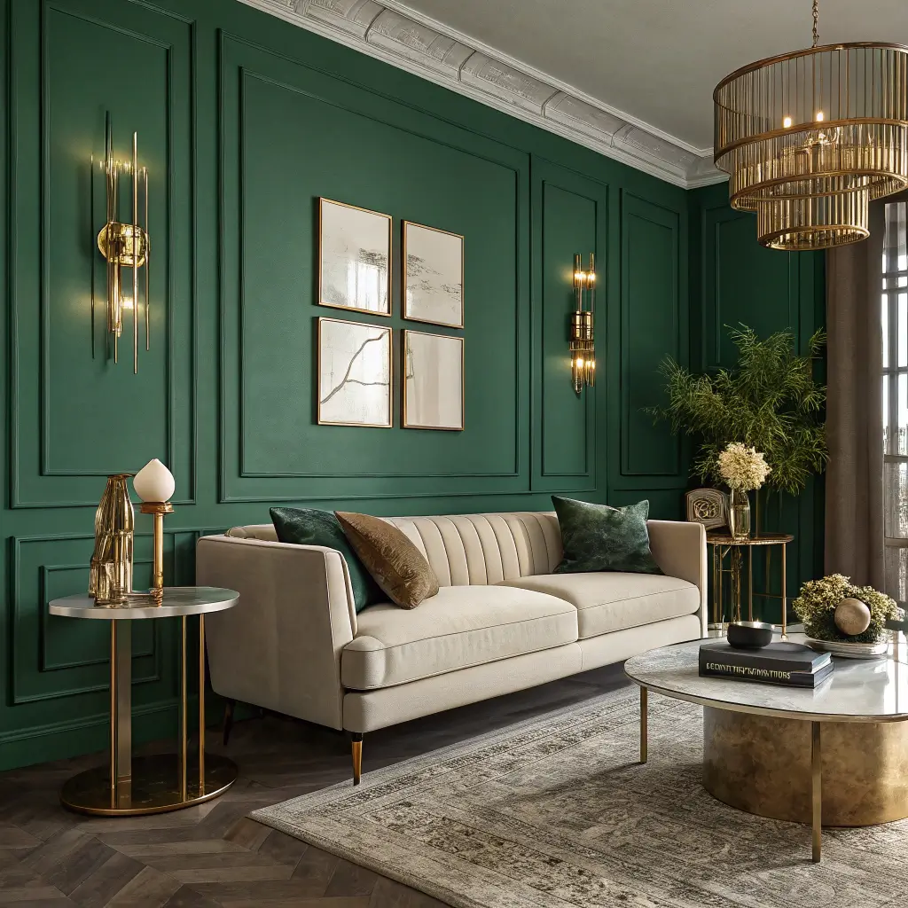
1. Emerald Green Walls with Warm Brass Accents
Emerald walls with brass accents create the kind of sophisticated drama that makes people stop mid-sentence when they walk into your living room. I discovered this combination at a speakeasy-style bar and immediately knew I had to recreate it at home. The emerald walls make everything feel intimate and luxurious, while brass accents add warmth that prevents the space from feeling too serious.
The magic happens in the interplay between cool emerald and warm brass. The metals catch light and create these gorgeous reflections on the green walls throughout the day. My brass floor lamp literally makes my emerald walls glow at sunset – it’s become my favorite time to be in the living room.
Making Emerald and Brass Work Together
Start with quality paint – this isn’t the time to cheap out. Deep emerald needs good coverage and the right finish. I went with an eggshell finish that has just enough sheen to reflect light without looking like a disco ball. Matte looked too flat, semi-gloss was too much.
Layer your brass accents at different heights. Picture frames at eye level, a coffee table at knee height, maybe a brass planter on the floor. This distribution creates visual movement and prevents all the metallics from clustering in one spot. I’ve got brass elements scattered throughout, and they create this gorgeous golden thread that ties the room together.
Don’t overdo the brass – it should accent, not dominate. Think of brass like jewelry for your room. A statement mirror, some cabinet hardware, maybe a side table. Too much and you’ll feel like you’re living in a trumpet.
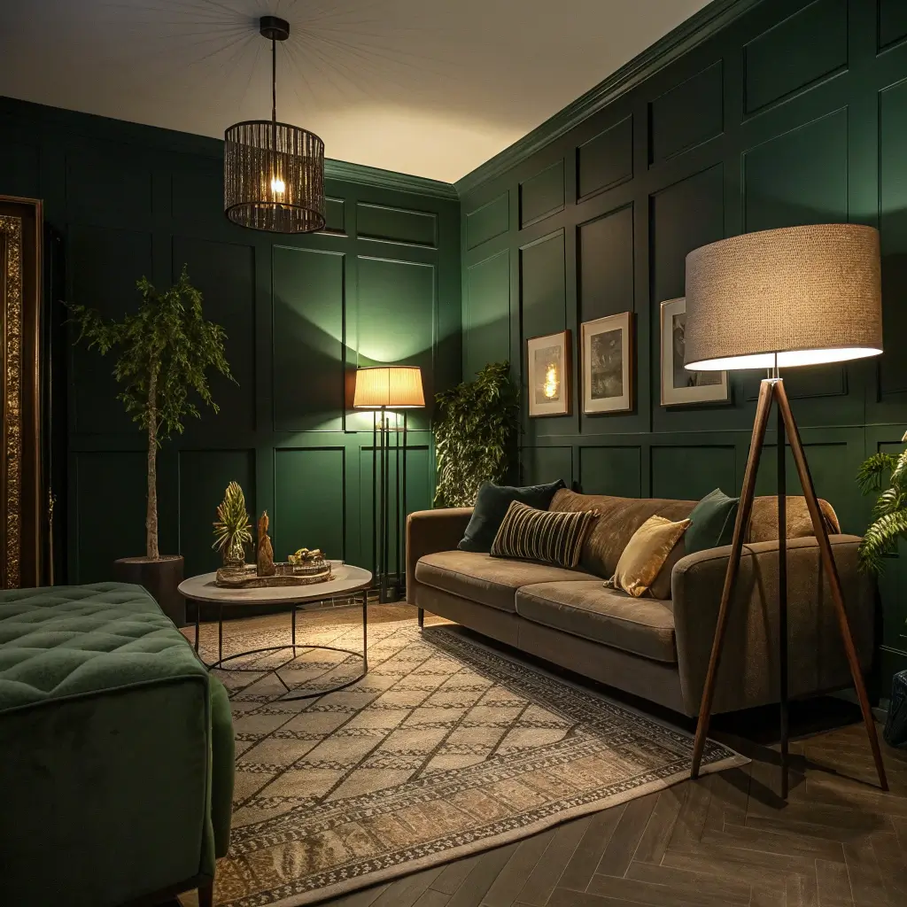
2. Forest Green Living Room with Layered Ambient Lighting
Forest green walls demand proper lighting, or you’ll literally be living in a forest at night. I learned this the hard way when I first painted my walls and relied on one overhead light. Felt like camping indoors, and not in a good way. Now, with layered ambient lighting, my forest green living room feels like the coziest retreat imaginable.
The key lies in creating multiple light sources at different levels. This approach prevents dark corners and creates depth that makes the green look rich rather than murky. Each light source serves a purpose while contributing to the overall mood.
Mastering the Light Layers
Start with your anchor lighting – usually a ceiling fixture or chandelier. But here’s the thing: it shouldn’t be your only light source. I use my ceiling light maybe 10% of the time. It’s there for when I need to find something I dropped, not for creating ambiance.
Add task lighting where you need it. Reading lamps by chairs, picture lights above artwork, maybe a desk lamp if you work in your living room. These focused lights make the space functional while adding to the overall glow. My reading corner has its own dedicated lamp that makes that forest green wall look absolutely dreamy in the evenings.
The real magic comes from ambient lighting. Table lamps, floor lamps, even candles all contribute to the mood. I have five different ambient light sources in my living room, and I usually have at least three on at any given time. Warm bulbs are non-negotiable – cool white will make your forest green look sickly.
3. Moody Olive Green Lounge with Natural Wood Tones
Olive green and natural wood together create this grounded, earthy sophistication that feels both moody and welcoming. I stumbled onto this combination when I inherited my grandmother’s walnut furniture and couldn’t afford to replace it after painting my walls olive. Turns out, Grandma’s furniture was exactly what my moody olive room needed.
What makes this pairing work is the natural harmony between the colors. Olive has those yellow-brown undertones that complement wood beautifully. Different wood tones bring out different aspects of olive – light woods brighten it, dark woods deepen it.
Balancing Wood and Olive
Mix your wood tones confidently. I’ve got walnut, oak, and even some pine in my olive living room, and they all work together. The olive acts as a unifying element that makes mismatched woods look intentional rather than random. This saved me from having to buy a matching furniture set.
Keep the wood natural or minimally stained. Heavy, dark stains can make the room feel too heavy when paired with moody olive. Let the natural grain show through. My coffee table’s natural edge against olive walls looks like art.
Add other natural materials to enhance the organic vibe. Jute rugs, linen curtains, maybe some leather accents. These materials bridge the wood and olive while adding textural interest. My leather armchair in cognac brown is the perfect intermediary between my olive walls and wood furniture.
Also Read: 10 Luxurious Green and Blue Living Room Ideas to Impress
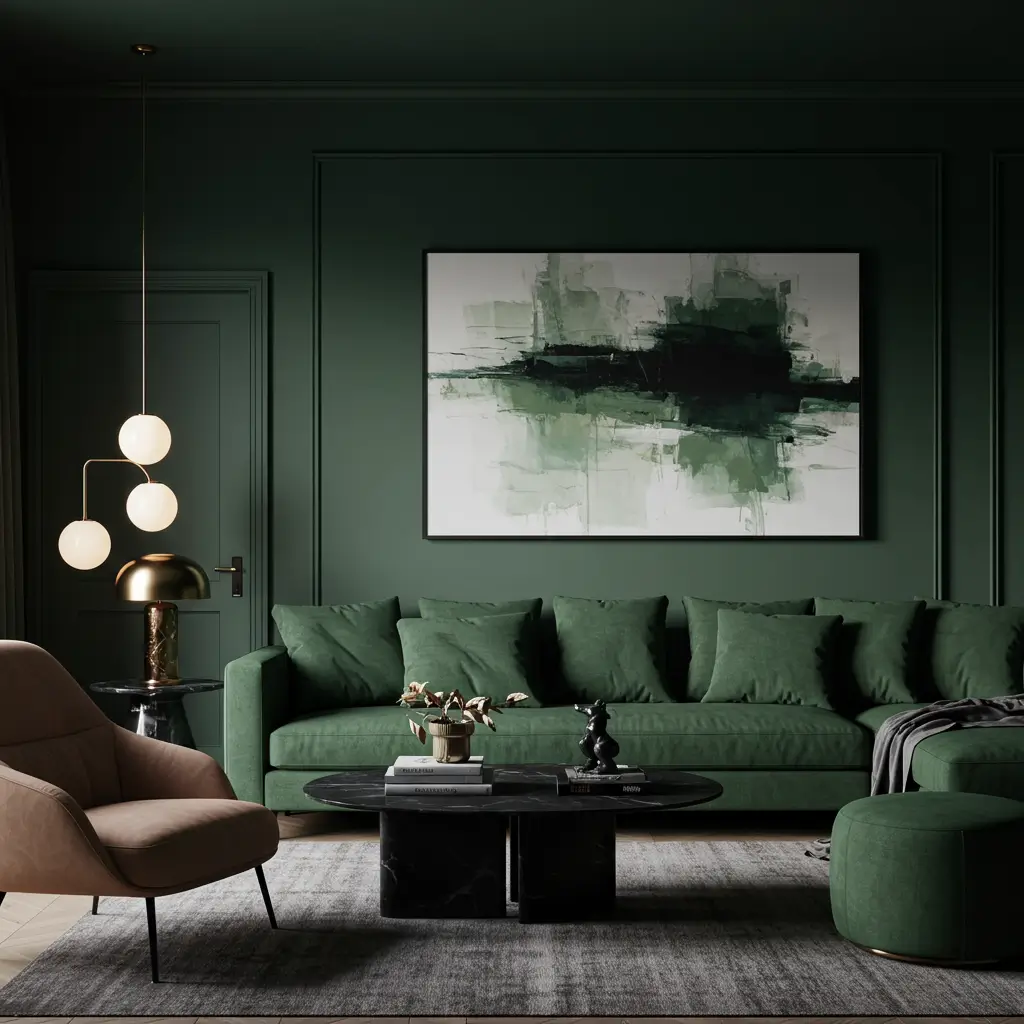
4. Dark Green Living Room with Black Trim Contrast

Dark green walls with black trim create the kind of sophisticated edge that makes your living room feel like it should be in a design magazine. I was terrified of this combination initially – wouldn’t it be too dark? Too gothic? Nope. It’s dramatic in the best possible way.
The black trim grounds the dark green and creates definition that prevents everything from blurring together. It’s like adding eyeliner to your walls – suddenly everything looks more defined and intentional. My living room went from “nice green walls” to “wow, who’s your designer?” just by painting the trim black.
Creating Contrast Without Darkness
The trick is using pure black, not off-black or charcoal. The sharp contrast is what makes this work. Wimpy gray-black trim just looks muddy against dark green. I repainted my trim three times before getting the right black, and it was worth every coat.
Keep plenty of white or light elements to balance the darkness. White ceiling, light furniture, maybe a cream rug. These elements prevent the room from feeling oppressive. My white linen sofa against dark green walls with black trim creates this gorgeous high-contrast situation that everyone comments on.
FYI, this combo requires commitment to cleanliness. Every speck of dust shows on black trim, and dark green walls show every fingerprint. But the sophistication payoff is worth the extra dusting, IMO.
5. Vintage-Inspired Green Living Room with Velvet Textures
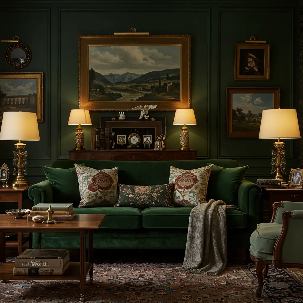
Vintage vibes and moody green velvet create the kind of old-money elegance that makes you want to sip whiskey and discuss literature (even if you’re really drinking boxed wine and watching Netflix). I found a vintage green velvet sofa at an estate sale, built my entire living room around it, and now I feel like I live in a period drama.
Velvet adds depth to moody green that flat fabrics can’t match. The way light plays across velvet throughout the day creates constant visual interest. Morning light makes it look fresh and energized. Evening lamplight turns it mysterious and inviting.
Achieving Vintage Glamour
Mix different velvet pieces but keep them in the same color family. My forest green velvet sofa pairs with sage velvet pillows and an olive velvet ottoman. The variety prevents monotony while maintaining cohesion. All matching velvet looks like you bought the showroom set.
Balance velvet’s luxury with more casual textures. Linen, cotton, maybe some wool. These everyday materials prevent your living room from feeling too precious. Nobody wants to be afraid to sit in their own living room.
Add vintage-inspired accessories that aren’t actually vintage. Real vintage can be expensive and high-maintenance. Vintage-style pieces give you the look without the worry. My “antique” brass mirror is actually from Target, and nobody knows the difference.
6. Deep Green Living Room with Neutral Linen Balance

Deep green walls with neutral linen furniture create this perfect balance between drama and livability. I discovered this combination after panicking about my newly painted deep green walls. The linen sofa I already owned suddenly became the perfect counterpoint to all that intensity.
Linen’s casual texture prevents deep green from feeling too formal or heavy. It adds lightness without competing for attention. The natural wrinkles and relaxed vibe of linen make the deep green feel approachable rather than intimidating.
Finding the Right Balance
Choose linen in warm neutrals rather than stark white. Oatmeal, sand, natural flax – these tones warm up deep green. Pure white can feel too stark and create harsh contrast. My oatmeal linen sectional softens my deep green walls perfectly.
Layer different linen pieces throughout the room. Curtains, pillows, throws – each addition increases the textural interest. The key is varying the weights and weaves. My heavy linen curtains, medium-weight sofa, and lightweight throw create beautiful textural layers.
Don’t worry about wrinkles – they’re part of linen’s charm. Trying to keep linen perfectly pressed in a lived-in room is a losing battle. Embrace the rumpled elegance. It actually makes the moody green feel more relaxed and inviting.
Also Read: 12 Fresh Green and Pink Living Room Ideas for Bright
7. Moody Green and Gold Luxury Living Space
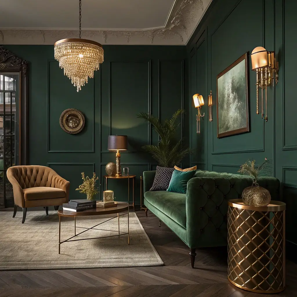
Moody green and gold together create instant luxury that looks way more expensive than it probably is. I started adding gold accents to my hunter green living room after seeing this combo in a high-end hotel. Now my living room feels like it belongs in the same tax bracket, even though my budget definitely doesn’t.
Gold elevates moody green from simply dramatic to genuinely luxurious. The warm metal adds glamour without gaudiness (when done right). It’s the difference between a nice green room and a space that makes people assume you have excellent taste and deep pockets.
Achieving Affordable Luxury
Use gold strategically, not everywhere. A gold-framed mirror, some picture frames, maybe a side table. The restraint is what makes it luxurious rather than Vegas-y. I have exactly five gold elements, and that’s plenty for my medium-sized living room.
Mix gold finishes for a collected look. Bright gold, antiqued gold, rose gold – variety prevents that “bought it all at once” feeling. My gold accents span three different finishes, and they look intentionally eclectic rather than mismatched.
Remember that gold-toned doesn’t have to mean real gold. Brass, bronze, and copper all create similar warmth. My “gold” frames are actually brass from the thrift store, spray-painted to the perfect shade. Luxury is about the look, not the actual materials :/
8. Shadowy Green Living Room with Statement Wall Art
Shadowy green walls create the perfect gallery backdrop for statement art. I discovered this accidentally when I hung my colorful abstract painting against my dark sage wall. The art popped in a way it never did against white walls, and suddenly I understood why galleries often use colored walls.
Dark green makes colors in artwork appear more vibrant while providing sophisticated contrast for black and white pieces. It’s like giving your art a stage to perform on. My living room has become a rotating gallery where I switch out pieces seasonally.
Creating Gallery Vibes
Choose art that contrasts with your green. Light, bright pieces pop dramatically. Black and white photography looks incredibly sophisticated. Even other greens create interesting tonal plays. My coral and pink abstract against shadowy green is everyone’s favorite piece.
Light your art properly or lose the impact. Picture lights, track lighting, or strategically placed lamps – artwork against dark walls needs illumination. I installed battery-operated picture lights that make my art glow without complicated wiring.
Don’t overcrowd your walls. Dark green walls make a statement on their own. A few well-chosen, well-lit pieces have more impact than a cluttered gallery wall. I stick to three major pieces and rotate them quarterly to keep things fresh.
9. Dark Botanical Green Living Room Aesthetic
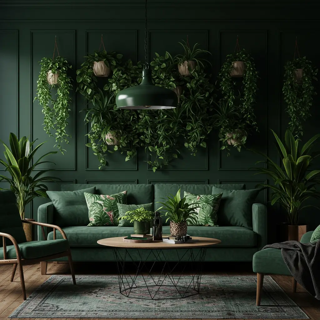
Dark botanical green brings the jungle indoors in the moodiest way possible. This isn’t your bright, cheerful plant-lover’s green – it’s sophisticated, mysterious, and slightly wild. I went full botanical in my living room last year, and now it feels like a very chic greenhouse where cocktails are always appropriate.
The beauty of botanical green is its complexity. It’s not quite emerald, not quite forest – it’s the color of deep jungle shadows. Pair it with actual plants and botanical prints, and you’ve created an interior rainforest that’s moody rather than tropical.
Embracing the Botanical Darkness
Layer real plants against botanical green walls for depth. The various greens create this gorgeous tonal story that feels natural and designed simultaneously. My monstera against botanical green walls looks like it’s emerging from the jungle.
Choose planters that enhance the mood. Dark ceramics, aged terracotta, or weathered concrete work better than bright white or colorful options. The planters should feel like they belong in the jungle too. My collection of dark gray planters disappears into the overall design.
Add botanical prints and patterns sparingly. When your walls are already botanical green, you don’t need palm print everything. One botanical cushion or piece of art is plenty. I learned this after going overboard initially – looked like I was living in a leaf.
Also Read: 10 Chic Green and Orange Living Room Ideas to Refresh
10. Cozy Moody Green Living Room with Soft Neutral Accents
Moody green with soft neutrals creates the perfect balance between dramatic and livable. This combination gives you all the sophistication of dark green without the cave-like feeling some people fear. I discovered this balance after my all-dark-green phase nearly gave me seasonal depression.
Soft neutrals – cream, beige, warm gray – add breathing room to moody green spaces. They reflect light, create visual breaks, and make the green feel intentional rather than overwhelming. My living room now feels cozy and moody rather than dark and gloomy.
Creating Cozy Without Sacrificing Mood
Use the 60-30-10 rule modified for moody spaces. 60% neutrals (walls, large furniture), 30% moody green (accent wall, curtains, major chair), 10% accent colors. This proportion maintains moodiness without overwhelming. My cream walls with green accent wall and furniture follow this perfectly.
Layer textures in both neutrals and greens. Soft throws, nubby pillows, smooth ceramics – textural variety prevents the limited color palette from feeling flat. Each texture catches light differently, creating visual interest without color chaos.
Warm lighting is absolutely crucial. Cool lights will make the green look sickly and the neutrals look gray. Warm bulbs make everything glow. I use 2700K bulbs exclusively, and they make my moody green elements look rich rather than murky.
Making Moody Green Work for You
There you have it – ten ways to embrace moody green in your living room without living in actual darkness.
The key to moody green success lies in understanding that “moody” doesn’t mean “gloomy.” It means atmospheric, sophisticated, and intentional.
Start with whatever level of moodiness feels comfortable. Maybe that’s one dark green accent wall, or perhaps you’re ready to go full emerald everything.
There’s no wrong answer as long as you balance the darkness with light (literally and figuratively). Test samples extensively, invest in good lighting, and don’t forget to add elements that reflect your personality.
Remember, moody green living rooms are about creating atmosphere, not following rules. If you want to pair forest green with hot pink, do it. If black trim scares you, skip it.
The best moody green living room is one that makes you feel something every time you enter it.
The biggest mistake people make with moody green? Not committing fully to whatever level they choose. Half-hearted moodiness just looks confused.
So pick your shade, grab your paintbrush, and create that sophisticated haven you’ve been dreaming about. Your living room is ready for its moody moment, and trust me, you won’t regret embracing the dark (green) side 🙂