12 Gorgeous Painted Bedroom Furniture Ideas for Stylish Rooms
- Bedroom Design
 Ben
Ben- 0
- 35 minutes read

Let’s be honest – we’ve all stared at that boring brown dresser or those outdated nightstands wondering if we should just bite the bullet and buy new ones. Been there, done that.
But here’s a little secret: a can of paint might be all you need to completely transform your bedroom furniture.
I’ve personally rescued at least seven “hopeless” furniture pieces from the donation pile with nothing but paint, some basic tools, and a weekend of work.
I’m not even particularly crafty (my friends still laugh about the Pinterest-fail birthday cake I made last year), but painting furniture is surprisingly forgiving.
After transforming everything from family heirlooms to Facebook Marketplace finds, I’ve collected plenty of ideas, techniques, and yes, a few cautionary tales worth sharing.
Whether you’re looking to refresh a single piece or give your entire bedroom a makeover, these twelve painted furniture ideas will inspire you to pick up a paintbrush and create something amazing. Let’s dive in!
Ombre Gradient Dresser
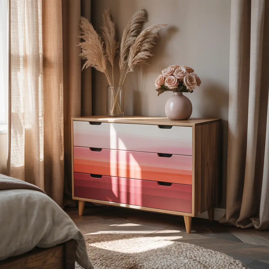
Sunset Vibes for Your Bedroom
An ombre gradient dresser creates this gorgeous color transition that catches your eye immediately. I painted my bedroom dresser with a sunset-inspired gradient that shifts from deep orange to soft peach, and it’s now the undisputed statement piece in my room.
The beauty of the ombre technique is how it transforms a plain, boxy piece of furniture into something with dimension and visual interest. The gradual color shift makes even the most basic dresser look like a custom, high-end piece. Plus, it allows you to incorporate multiple shades that tie into your bedroom’s color scheme.
What makes this technique special is that no two ombre pieces look exactly alike. Each one has its own unique transition, making your furniture truly one-of-a-kind. You can go bold with dramatic color shifts or subtle with tonal variations of the same hue.
How to Create the Perfect Ombre:
• Choose colors in the same family for easier blending (like light blue to navy or pale pink to magenta)
• Work while the paint is still wet to create seamless transitions
• Use a spray bottle with water to keep your paint workable
• Blend with a dry brush technique where colors meet
• Apply multiple thin coats rather than one thick one
I learned the hard way that patience is crucial for this project. My first attempt looked more like distinct stripes than a gradient because I rushed the blending process. Take your time in the transition areas, and don’t be afraid to go back and forth between colors until you achieve that perfect fade.
Chalkboard Painted Nightstands
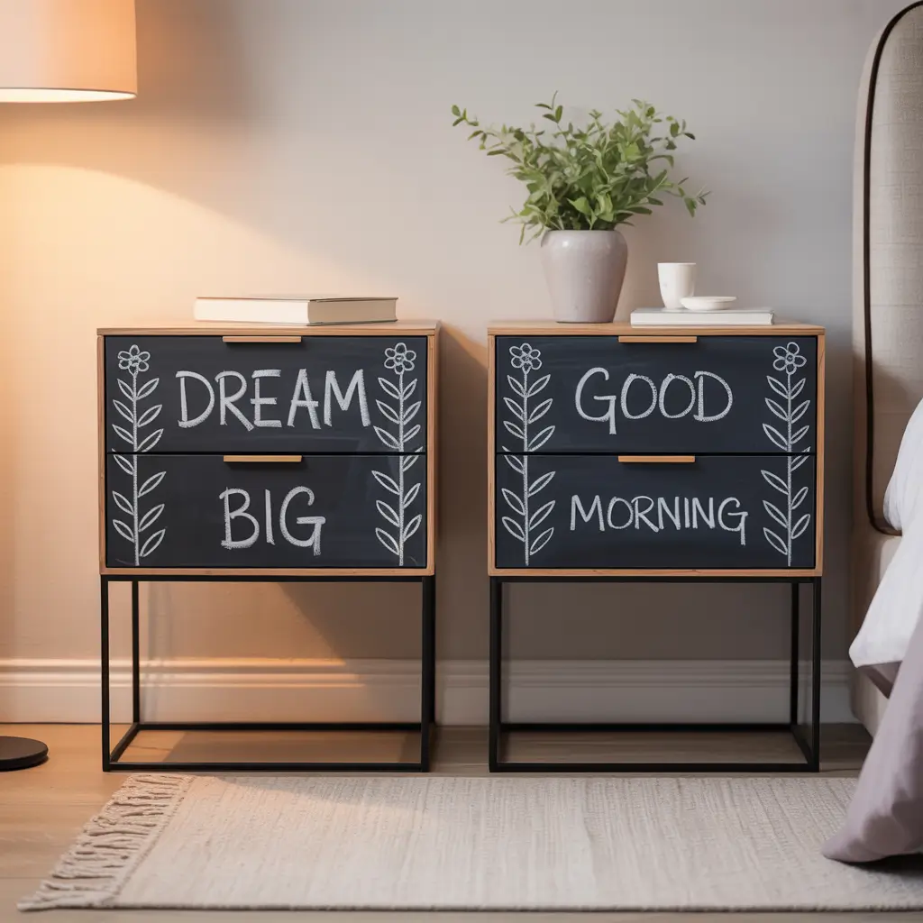
Functional Art for Your Bedside
Chalkboard painted nightstands are basically the Swiss Army knife of bedroom furniture – practical, fun, and surprisingly versatile. I painted the top surface of my nightstands with chalkboard paint, and they’ve become much more than just a place to put my phone.
I use mine for everything from jotting down midnight ideas to leaving myself morning reminders. My partner writes me little notes sometimes, and I’ve even been known to doodle on them during phone calls. They add this playful, interactive element to the bedroom that standard nightstands just don’t have.
The contrast between the chalkboard surface and a colorful base creates visual interest while serving a practical purpose. You can customize the base color to match your bedroom palette, creating a perfect blend of function and style.
Making Chalkboard Furniture Work:
• Prime thoroughly before applying chalkboard paint for best results
• Season your finished surface by rubbing chalk over it and wiping clean
• Choose a complementary color for the base that pops against the black surface
• Apply at least two coats of chalkboard paint for optimal writing surface
• Keep chalk and erasers in a small container on or in the nightstand
Ever wondered if chalkboard paint really works? It absolutely does, but here’s a pro tip I wish I’d known earlier: don’t skimp on the proper chalk markers. Regular chalk works, but chalk markers give you more precision and less dust – important when you’re talking about furniture right next to where you sleep!
Two-Tone Accent Bed Frame
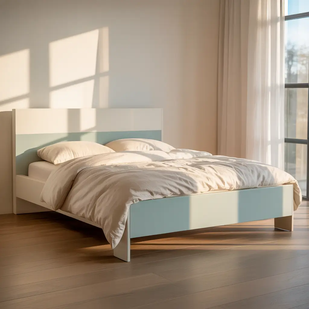
Color Blocking Your Centerpiece
A two-tone painted bed frame turns the largest piece of furniture in your bedroom into a designer-worthy focal point. I transformed my basic wooden bed frame by painting the headboard a deep navy blue while keeping the frame a crisp white, and the result looks like something from a boutique hotel.
The two-tone approach gives you the best of both worlds – you get to incorporate a bold color without overwhelming the room. It’s also perfect for highlighting architectural details on more ornate frames. Those curved edges, spindles, or carved details really pop when emphasized with a contrasting color.
What makes this idea particularly great is its adaptability to any style. You can go contemporary with stark contrasts like black and white, traditional with navy and cream, or playful with unexpected color combinations.
Two-Tone Tips and Tricks:
• Use painter’s tape for clean, professional-looking lines
• Choose colors with the same undertone for a cohesive look
• Paint the more intricate sections with the lighter color (usually easier)
• Consider natural breaks in the furniture design for color changes
• Test your color combination on a small, hidden area first
The biggest challenge with two-tone furniture is deciding where to make the color transition. I recommend looking for natural dividing lines in the piece’s construction – the point where the headboard meets the frame, for example, creates a logical separation for color blocking.
Also Read: 10 Trendy Bedroom Furniture Layout Ideas to Inspire You
Pastel Vintage Vanity
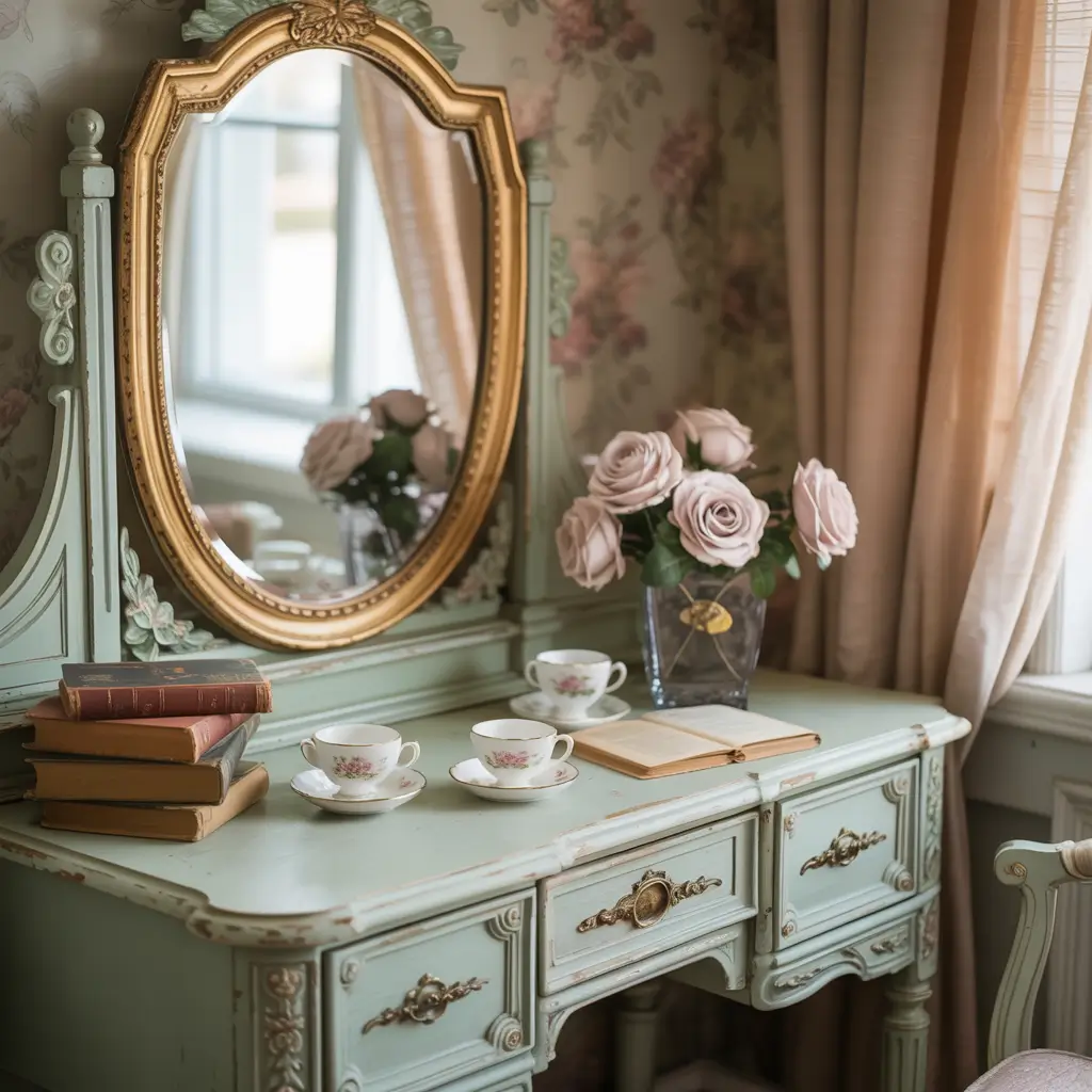
Soft Colors, Strong Statement
Pastel painted vanities bring a soft, feminine touch to bedroom furniture without veering into childish territory. I rescued a vintage vanity from a thrift store and painted it a beautiful mint green, and it immediately became the piece that visitors compliment first when they see my bedroom.
Pastel colors work particularly well on vanities with curved lines or ornate details, emphasizing their vintage charm while giving them a fresh, updated feel. The subtle color creates a perfect balance – interesting enough to catch the eye but soft enough to blend harmoniously with the rest of your decor.
The beauty of pastels is how they can make heavy, dark vintage pieces feel light and airy. That bulky vanity your grandmother handed down suddenly becomes delicate and elegant with a coat of soft lavender or pale blue.
Perfect Pastel Painting:
• Sand thoroughly before painting for smooth results
• Use primer designed for glossy surfaces if your vanity has an existing finish
• Apply multiple thin coats rather than one thick coat
• Consider slightly different pastel shades for drawers or details
• Protect your finished piece with a clear topcoat in matte or satin finish
My vanity project taught me an important lesson about hardware: sometimes keeping the original handles and pulls provides beautiful contrast against a pastel background. Those aged brass pulls that looked dated against dark wood suddenly become vintage chic against soft mint green. Don’t automatically assume you need to replace all the hardware!
Metallic Gold Accent Drawers
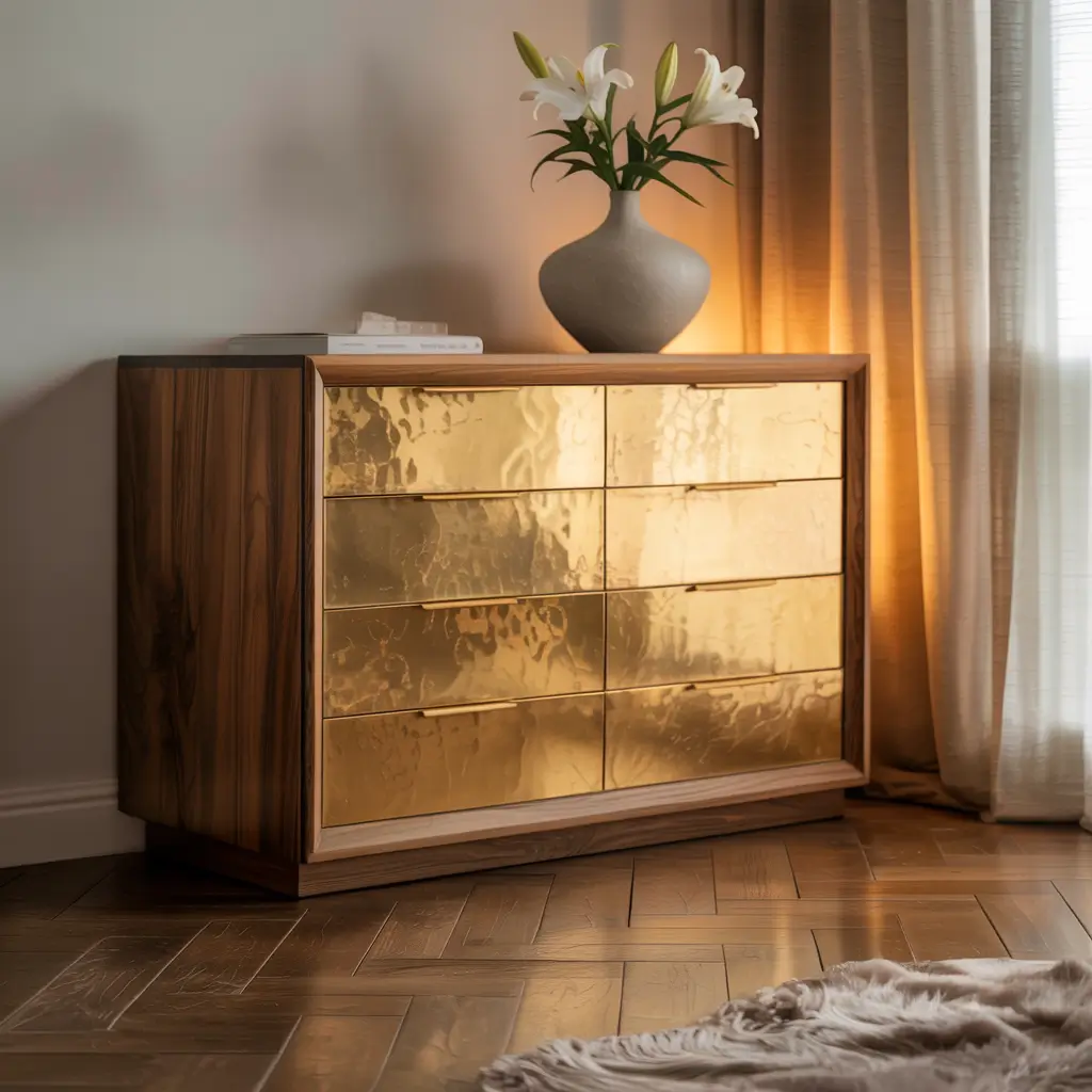
The Midas Touch for Your Furniture
Metallic gold accents add instant luxury to bedroom furniture without the designer price tag. I updated a basic IKEA dresser by painting just the drawer fronts with metallic gold paint, and people constantly ask where I “invested” in such an expensive-looking piece.
The key to successful metallic accents is restraint. Painting just the drawer fronts or cabinet doors creates high-impact contrast while avoiding the “trying too hard” look that can come from all-over metallic paint. The result is sophisticated rather than showy.
What makes metallic accents so effective is how they catch and reflect light. They add dimension to flat surfaces and create visual interest that changes throughout the day as natural light shifts in your bedroom.
Metallic Painting Success:
• Choose quality metallic paint – the cheap stuff never looks convincing
• Apply a gray or black primer first for richer metallic coverage
• Use a foam roller for smooth surfaces and a synthetic brush for details
• Build up multiple thin coats rather than one thick one
• Seal with a clear topcoat made specifically for metallic paint
FYI, real gold leaf is another option for those feeling adventurous. I tried it on a small nightstand, and while it was more time-consuming than metallic paint, the result has a depth and authenticity that paint can’t quite match. For beginners though, quality metallic paint offers impressive results with much less frustration.
Color-Blocked Wardrobe

Geometric Style for Storage
Color-blocked wardrobes transform utilitarian storage into artistic statements. I revamped my plain wardrobe by painting it with a geometric color-block design in teal, white, and mustard, and it now looks like a custom piece that could grace the pages of a design magazine.
Unlike two-tone furniture that follows the natural lines of the piece, color blocking creates intentional geometric shapes that can completely transform the wardrobe’s appearance. Diagonal blocks, rectangles, or even circles add visual interest that draws the eye and breaks up the mass of a large piece.
The beauty of color blocking is its versatility. You can go bold and contemporary with strong contrasts, subtle and sophisticated with tonal variations, or playful with unexpected color combinations. The wardrobe becomes your canvas.
Color-Blocking Basics:
• Create a paper template for complex shapes before painting
• Use high-quality painter’s tape for crisp lines
• Press tape edges firmly to prevent bleeding
• Remove tape while paint is still slightly wet for cleanest edges
• Balance your color choices – two or three colors work better than many
The trickiest part of color blocking? Getting those clean, sharp lines. I learned to seal the edge of the painter’s tape by brushing a thin layer of the base color along the tape edge and letting it dry before applying the new color. This prevents bleeding and gives you those satisfyingly crisp transitions between colors.
Also Read: 12 Glamorous Luxury Bedroom Furniture Ideas and Dreamy Setups
Distressed Rustic Painted Bureau

Perfectly Imperfect Charm
Distressed paint finishes turn ordinary bedroom furniture into pieces with history and character. I transformed a plain pine bureau with chalk paint and strategic distressing, and it now looks like a treasured antique rather than a boring basic.
The magic of distressed furniture is the depth and interest created by revealing glimpses of what lies beneath the paint. Whether you’re exposing raw wood, a previous color, or the natural grain pattern, distressing adds layers of visual texture that draw you in.
What makes this technique particularly appealing is its forgiving nature. Unlike techniques that require precision, distressing actually benefits from imperfection. Each nick, scratch, and worn edge tells a story and adds to the piece’s character.
Distressing Done Right:
• Use chalk paint for easiest distressing with minimal prep work
• Focus distressing on edges and areas that would naturally wear over time
• Layer different paint colors for more interesting reveals when distressed
• Use varying techniques (sanding, chipping, vaseline resist) for natural-looking wear
• Seal your finished piece with wax or polyurethane to protect the distressed finish
Have you ever worried about messing up a painting project? Distressing is perfect for people who stress about perfection. I’m that person who typically measures seventeen times and still manages to mess up the cut, but with distressing, those “mistakes” actually improve the final look. It’s weirdly liberating to deliberately rough up your freshly painted surface!
Floral Hand-Painted Headboard

Blooming Beautiful Focal Point
A hand-painted floral headboard transforms your bed into a true work of art. I created a simple floral design on my plain wooden headboard using just three colors, and it’s now the standout element that ties my entire bedroom together.
Don’t panic if you’re not an artist – simple floral designs can be surprisingly forgiving. Stylized flowers using basic shapes often look more modern and intentional than attempts at realism. A few curved lines for stems, round dots for flower centers, and petal shapes around them can create stunning results.
The impact of a hand-painted headboard comes from its uniqueness. In a world of mass-produced furniture, a piece with your personal artistic touch brings irreplaceable character to your bedroom.
Floral Painting Approaches:
• Start with a solid base coat in a neutral or complementary color
• Use reference images for inspiration but adapt to your skill level
• Begin with pencil outlines if you’re nervous about freehand painting
• Consider a stencil for more complex designs or if you’re a beginner
• Apply a protective clear coat to ensure your artwork lasts
My first attempt at a floral headboard taught me an important lesson: embracing imperfection often leads to more interesting results. I initially tried to make every flower identical and perfect, but the headboard really came alive when I allowed variation in size, shape, and detail. The slight irregularities make it look authentically handcrafted rather than machine-produced.
Monochrome Minimalist Chest
Understated Elegance in One Color
Monochrome painted furniture proves that simplicity can make the boldest statement. I painted a vintage chest of drawers in a single shade of charcoal gray – hardware and all – and the result is this incredibly sophisticated, gallery-like piece that elevates my entire bedroom.
The monochrome approach works by emphasizing shape and form rather than color variation. When everything is the same shade, your eye appreciates the silhouette and architectural details of the piece in a new way. It’s like looking at a sculpture rather than a functional piece of furniture.
What makes this idea particularly striking is how it transforms the most ornate pieces into contemporary statements. That heavily detailed chest with elaborate handles that looked fussy in its original state becomes sleek and modern when painted entirely in one color.
Monochrome Magic Tips:
• Choose a high-quality paint with depth for most impact
• Consider different finishes for subtle variation (matte body with glossy drawers)
• Paint all hardware or replace with pieces in the same color
• Use proper primers for adhesion on different materials
• Apply thin, even coats for the smoothest finish
The toughest decision with monochrome furniture? Choosing the right color. I recommend selecting a shade that contrasts with your walls – a dark monochrome piece pops dramatically against light walls, while a light monochrome piece stands out beautifully against darker backgrounds.
Also Read: 10 Modern Dark Furniture Bedroom Ideas with Bold Colors
Bold Jewel-Tone Side Table

Small Piece, Big Impact
A jewel-tone painted side table proves that small furniture can make massive statements. I painted my bedroom side table a rich emerald green, and despite being the smallest piece in the room, it somehow manages to be the one that visitors notice first.
Jewel tones – those rich, saturated colors like sapphire blue, ruby red, emerald green, and amethyst purple – have incredible depth that makes them perfect for statement pieces. They add luxury and drama without requiring much space.
What makes jewel tones work so well for small pieces is how they serve as accent colors. They add visual punch without overwhelming the room’s color scheme, creating a perfect focal point that enhances rather than competes with your overall design.
Jewel-Tone Tips:
• Apply a tinted primer that complements your jewel tone for better coverage
• Consider high-gloss finishes to enhance the gem-like quality
• Balance with neutral elements elsewhere in the room
• Use gold or brass hardware to enhance the luxury feel
• Apply multiple thin coats for the deepest, richest color
The best part about experimenting with bold colors on side tables? Low commitment, high reward. If you’re nervous about introducing strong color into your bedroom, a side table requires minimal paint and effort. If you don’t love it, you can easily repaint it – but in my experience, these punchy little pieces usually become favorites.
Striped Pattern Dresser
Linear Interest for Basic Pieces
Striped furniture transforms simple dressers into dynamic focal points. I painted alternating stripes of cream and sage green on an otherwise unremarkable dresser, and it instantly became a piece that looks custom-designed rather than budget-friendly.
The beauty of stripes is their versatility. You can go bold with high-contrast colors, subtle with tonal variations, playful with varying widths, or sophisticated with consistent thin lines. The pattern brings movement and energy to static pieces while creating visual texture.
What I love most about striped furniture is how it draws the eye horizontally or vertically, allowing you to visually reshape your piece. Vertical stripes on a squat dresser create the illusion of height, while horizontal stripes on a tall, narrow piece make it appear more substantial.
Stripe Success Strategies:
• Measure and mark precisely before taping for even stripes
• Use a laser level for perfectly straight lines
• Press tape edges firmly to prevent bleeding
• Remove tape while paint is still slightly wet
• Consider varying stripe widths for more dynamic patterns
One warning about striped furniture: it’s addictive. I started with my dresser and ended up adding coordinating stripes to my mirror frame, lamp base, and even a small trash bin. Stripes have this magical ability to tie disparate elements together into a cohesive design story – just know when to stop before your bedroom starts to resemble a circus tent! 🙂
Matte Black Modern Nightstand

Dark Drama for Bedside Style
Matte black painted furniture adds instant sophistication to any bedroom. I transformed a pair of basic pine nightstands with matte black paint, and they now look like expensive designer pieces rather than the budget finds they actually were.
There’s something about matte black that makes even the simplest shapes look intentional and high-end. The non-reflective finish absorbs light rather than reflecting it, creating this depth and presence that draws the eye without being flashy or obvious.
The beauty of matte black is its versatility – it works with absolutely any color scheme or design style. Whether your bedroom is bohemian, minimalist, traditional, or eclectic, matte black pieces add grounding visual weight that balances the overall composition.
Matte Black Mastery:
• Sand thoroughly between coats for the smoothest possible finish
• Use a high-quality primer designed for dark colors
• Apply with a foam roller for streak-free results
• Consider black chalk paint for ultimate matte finish
• Protect with a clear matte sealer to prevent fingerprints and wear
Ever noticed how high-end furniture stores always include black pieces in their displays? There’s a reason for that. Black creates contrast that makes other elements in the room pop while serving as a visual anchor. My matte black nightstands make the brass lamps sitting on them look more luxurious and the white bedding appear crisper and brighter. It’s like the perfect little black dress for your bedroom – it makes everything else look better.
Transforming Your Bedroom One Piece at a Time
After exploring these twelve painted furniture ideas, I hope you’re feeling inspired to grab a paintbrush and transform your bedroom.
The beauty of painted furniture is that it allows you to create custom pieces that perfectly reflect your style, color preferences, and personality without breaking the bank.
Remember, you don’t have to tackle everything at once. Start with a single piece – maybe that neglected nightstand or the dresser you’ve never quite loved.
A successful first project will build your confidence and probably leave you eyeing every other piece of wooden furniture in your home as a potential canvas.
The most important tip I can share from my own furniture painting journey? Preparation matters more than technique.
Take the time to clean, sand, and prime properly, and even the simplest paint job will look professional. Rush those steps, and even the most elaborate design won’t save a piece that peels or chips within months.
And don’t be afraid to make mistakes! The worst that can happen is you need to sand it down and start over.
Unlike many DIY projects where mistakes are permanent, painted furniture is forgiving – you can always add another coat, try a different technique, or completely change direction.
So what are you waiting for? That perfect shade of paint and that boring bedroom set are destined to meet. Your future Instagram-worthy bedroom (and your wallet) will thank you for taking the painted furniture plunge!