10 Elegant Pink Tiles Kitchen Ideas to Transform Your Home
- Kitchen Tiles Ideas
 Ben
Ben- 0
- 51 minutes read
Pink tiles in a kitchen might sound unconventional. But trust me—this unexpected color choice creates some of the most stunning, personality-filled cooking spaces imaginable.
I’ll admit it: I dismissed pink kitchen tiles for years. The idea felt too feminine, too risky, too likely to date badly.
Then I stumbled across a gorgeous blush pink subway tile kitchen on Instagram and couldn’t stop thinking about it. That single image changed my entire perspective on kitchen color possibilities.
Pink kitchens have surged in popularity recently, and for good reason. This versatile color family spans everything from subtle blush whispers to bold fuchsia statements.
Pink adds warmth that cool neutrals cannot match while remaining surprisingly sophisticated when executed thoughtfully.
Whether you prefer gentle pastel touches or vibrant hot pink accents, pink tiles offer incredible design opportunities.
From retro-inspired checkerboard floors to luxurious pink and gold combinations, this color transforms ordinary kitchens into spaces with genuine character.
Ready to explore pink tile kitchen ideas that challenge conventional design thinking? These ten approaches prove that pink belongs in modern kitchens just as much as traditional white or grey.
1. Blush Pink Subway Tile Kitchen

Blush pink represents the gentlest entry point into pink kitchen territory. These soft tiles add warmth without overwhelming, sophistication without drama.
The Blush Pink Appeal
Blush pink subway tile kitchens deliver color’s benefits with neutral’s restraint. This muted shade adds personality while maintaining the approachability that classic subway formats provide.
Why blush pink subway tiles work:
- Subtle color introduction: Warm without demanding attention
- Sophisticated neutrality: Functions almost like a warm white
- Universal flattery: Suits diverse kitchen styles effectively
- Timeless potential: Soft enough to age gracefully
- Gender-neutral warmth: Appeals across household preferences
- Familiar format: Subway shape provides reassuring recognition
Styling Blush Pink Subway Tiles
Pair blush pink tiles with complementary elements for cohesive designs:
White cabinets create fresh, airy atmospheres where blush provides gentle warmth. This combination suits modern farmhouse and contemporary kitchens equally.
Grey cabinets add sophisticated depth alongside blush warmth. The cool-warm contrast creates balanced, interesting spaces.
Natural wood cabinets enhance blush’s organic warmth. Light oak and walnut both complement pink beautifully.
Brass hardware elevates blush tiles into genuinely luxurious territory. The warm metallic enhances pink’s golden undertones.
Marble countertops add luxury that blush supports elegantly. White marble with subtle grey veining pairs perfectly.
Consider grout carefully with blush tiles. White grout emphasizes each tile distinctly. Matching blush or cream grout creates seamless, unified surfaces. Grey grout adds contemporary edge to soft coloring.
2. Bold Pink Accent Wall Tiles

Sometimes subtle isn’t the goal. Bold pink accent walls make statements that timid approaches cannot achieve.
The Statement Wall Approach
Bold pink accent wall tiles concentrate dramatic color in defined areas. This focused application creates impact without overwhelming entire kitchens.
Why bold pink accent walls succeed:
- Contained drama: Strong color stays within boundaries
- Focal point creation: Draws attention intentionally
- Personality expression: Shows confident design choices
- Reversibility potential: Single walls can update more easily
- Budget efficiency: Less tile coverage reduces costs
- Maximum impact ratio: Small area, big effect
Bold Pink Shade Options
Different pink intensities create different moods:
Coral pink brings warm, tropical energy. This orange-leaning pink suits coastal and bohemian kitchens.
Raspberry pink delivers rich, berry-toned drama. This sophisticated shade suits contemporary and Art Deco spaces.
Fuchsia creates maximum vibrant impact. This attention-demanding shade suits confident, artistic homeowners.
Dusty rose offers bold presence with vintage undertones. This romantic shade suits traditional and eclectic kitchens.
Terracotta pink provides earthy warmth with pink influences. This grounded shade suits Mediterranean and rustic spaces.
Position bold pink walls strategically:
- Behind ranges: Natural focal points benefit from color enhancement
- Open shelving backdrops: Pink backgrounds display items beautifully
- Kitchen nook walls: Defined areas suit bold color treatment
- Island backs: Visible surfaces create unexpected impact
3. Soft Pastel Pink Backsplash Designs

Pastel pink backsplashes add feminine charm without overwhelming practicality. These gentle tiles brighten spaces while maintaining sophisticated restraint.
Understanding Pastel Pink
Soft pastel pink backsplash designs embrace gentle coloring that adds interest without dominating. These tiles feel fresh, light, and perpetually welcoming.
Why pastel pink backsplashes appeal:
- Gentle presence: Add color without visual weight
- Light enhancement: Pale tones reflect illumination beautifully
- Cheerful atmospheres: Create uplifting cooking environments
- Broad compatibility: Work with numerous design styles
- Approachable introduction: Ease into pink gradually
- Feminine without excess: Tasteful rather than overwhelming
Pastel Pink Tile Formats
Pastel pink works across various tile formats:
Subway tiles provide familiar framework for unexpected color. This combination balances novelty with recognition.
Hexagon tiles add geometric interest alongside gentle color. The shape’s natural appeal complements soft pink beautifully.
Fish scale tiles bring Art Deco elegance in pastel tones. These curved shapes feel romantic and sophisticated.
Square mosaics create textured surfaces with delicate coloring. Multiple small tiles add visual complexity.
Large format tiles minimize grout lines for seamless pastel surfaces. Modern proportions suit contemporary pink applications.
Consider finish effects on pastel pink tiles. Glossy finishes reflect light brilliantly, maximizing pastel brightness. Matte finishes feel more contemporary and sophisticated. Textured surfaces add depth to gentle coloring.
IMO, pastel pink backsplashes work best with crisp white surroundings. The contrast keeps pink feeling fresh rather than saccharine.
Also Read: 12 Creative Subway Tiles Kitchen Ideas and Unique Color Combos
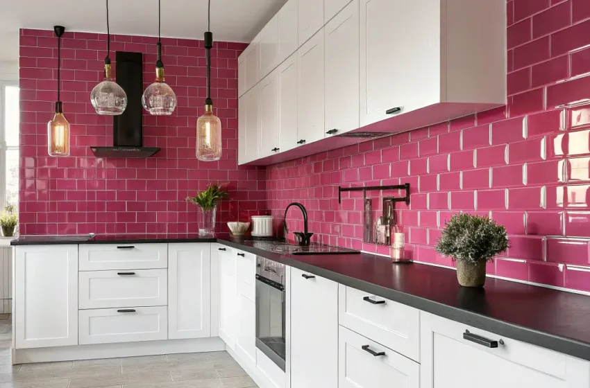
4. Modern Pink and White Kitchen Combo

Pink and white together create fresh, contemporary spaces that feel both current and timeless. This combination balances color with classic neutrality.
The Pink-White Partnership
Modern pink and white kitchen combinations blend colorful personality with clean neutrality. This partnership allows pink to shine while white provides essential breathing room.
Why this combination succeeds:
- Visual balance: Pink warmth balanced by white freshness
- Contemporary credibility: Clean aesthetic suits modern tastes
- Flexibility foundation: White allows pink adjustments over time
- Light maximization: White reflects alongside pink warmth
- Broad appeal: Combination satisfies diverse preferences
- Timeless potential: Neither element dates quickly
Pink and White Application Strategies
Pink backsplash with white cabinets represents the most popular approach. Pink tiles become focal points against clean white surroundings.
White backsplash with pink accents reverses the relationship. Pink appears in smaller doses—perhaps behind open shelving or in defined accent zones.
Pink and white patterned tiles incorporate both colors within single tiles. Geometric patterns, florals, or abstract designs blend colors seamlessly.
Pink floors with white walls and cabinets ground spaces in color while maintaining brightness above eye level.
Alternating pink and white tiles create checkerboard or striped patterns. These graphic approaches suit retro-inspired or bold contemporary kitchens.
Maintain consistent undertones between pink and white selections. Warm pinks pair with cream whites. Cool pinks suit pure whites. Mismatched undertones create subtle discord.
5. Retro Pink Checkerboard Floor Tiles
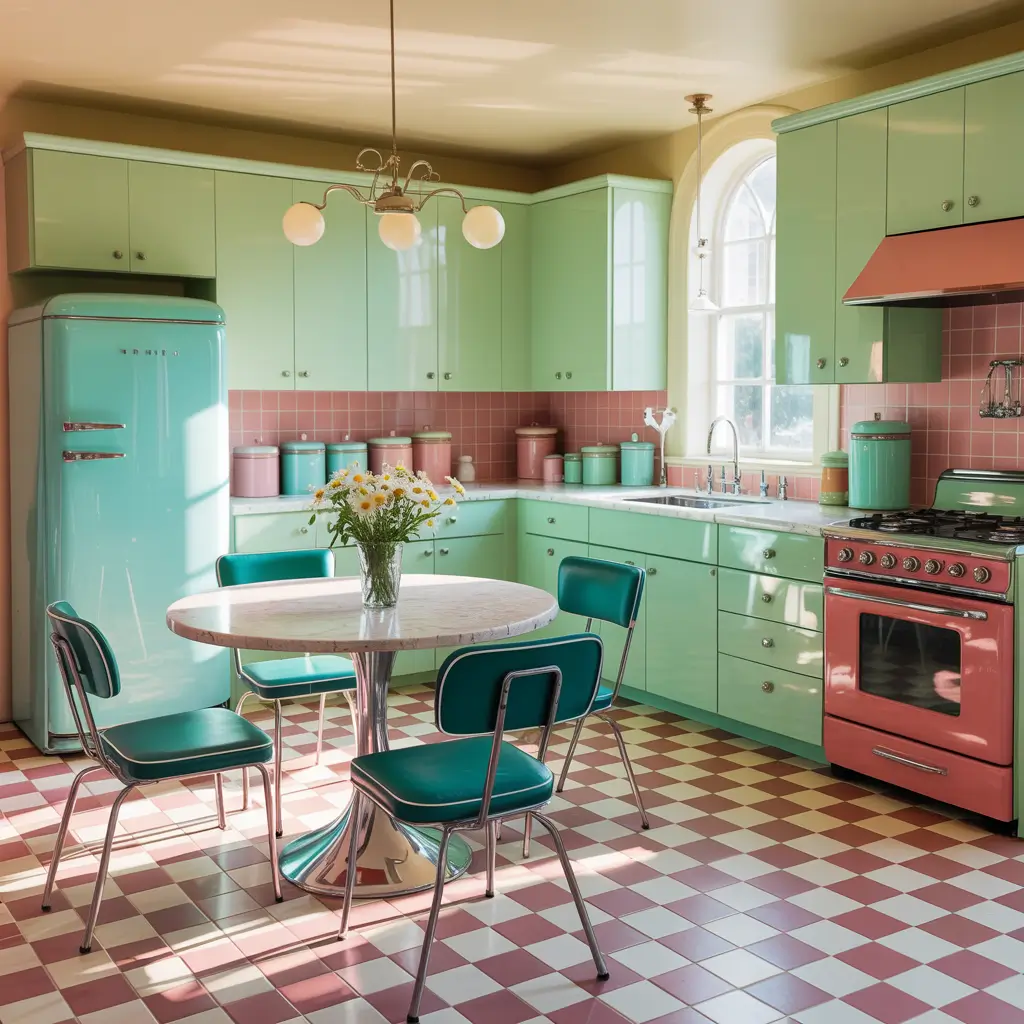
Checkerboard patterns carry nostalgic charm, and pink versions transport kitchens to stylish mid-century aesthetics.
The Retro Checkerboard Appeal
Retro pink checkerboard floor tiles combine classic pattern with unexpected color. This approach delivers vintage personality with contemporary relevance.
Why pink checkerboard floors captivate:
- Nostalgic reference: Evokes 1950s diner charm
- Pattern energy: Checkerboard creates dynamic visual movement
- Unique expression: Pink updates familiar pattern unexpectedly
- Conversation starting: Guests inevitably notice and comment
- Joyful atmosphere: Playful pattern enhances cooking enjoyment
- Design confidence: Shows bold aesthetic commitment
Pink Checkerboard Variations
Pink and white checkerboard creates the classic look with soft femininity. This combination suits cheerful, bright kitchen atmospheres.
Pink and black checkerboard adds dramatic edge to retro styling. This bold combination suits confident, artistic spaces.
Pink and cream checkerboard softens contrast while maintaining pattern. This gentler version suits traditional kitchens wanting vintage touches.
Multiple pink tones create ombre or gradient checkerboard effects. This contemporary interpretation updates vintage references.
Large format checkerboard (12×12 inch or larger tiles) feels more contemporary. Smaller squares (4×4 or 6×6 inch) feel more authentically retro.
Style pink checkerboard floors with complementary vintage elements:
- Chrome or retro-style appliances
- Vinyl or leather bar stools
- Pendant lights with vintage silhouettes
- Open shelving with displayed dishware
- Pastel accessories and small appliances
6. Matte Pink Kitchen Tile Inspiration

Matte finishes add sophistication that glossy surfaces cannot match. Matte pink tiles feel contemporary, subtle, and genuinely refined.
The Matte Finish Advantage
Matte pink kitchen tiles absorb light softly rather than reflecting it harshly. This finish creates velvety surfaces that feel warm and approachable.
Why matte pink works:
- Sophisticated subtlety: Refined without flash or glare
- Contemporary credibility: Matte finishes dominate current design
- Fingerprint forgiveness: Shows smudges less than glossy
- Warm perception: Light absorption creates cozy effects
- Photography excellence: Matte surfaces photograph beautifully
- Adult approach: Feels mature rather than girlish
Matte Pink Application Ideas
Matte pink backsplashes create sophisticated focal points without harsh reflections. These surfaces photograph beautifully and maintain elegant presence.
Matte pink floor tiles deliver practical durability with refined appearance. Their slip resistance adds safety alongside style.
Matte pink accent walls provide color without competing reflections. These surfaces suit spaces with abundant natural light.
Matte pink tile islands create unexpected sophistication when applied to vertical island surfaces. This placement surprises visitors pleasantly.
Pair matte pink tiles with complementary finishes:
- Brushed brass hardware (avoiding shiny contrast)
- Matte black fixtures (contemporary partnership)
- Honed marble countertops (matching matte sophistication)
- Satin wood finishes (complementary softness)
The key involves consistency in finish approach. Matte pink alongside glossy elements creates jarring contrast. Unified matte aesthetics feel more intentionally designed. 🙂
Also Read: 10 Creative Kitchen Tiles Texture Ideas and Unique Patterns
7. Pink and Gold Luxe Kitchen Ideas
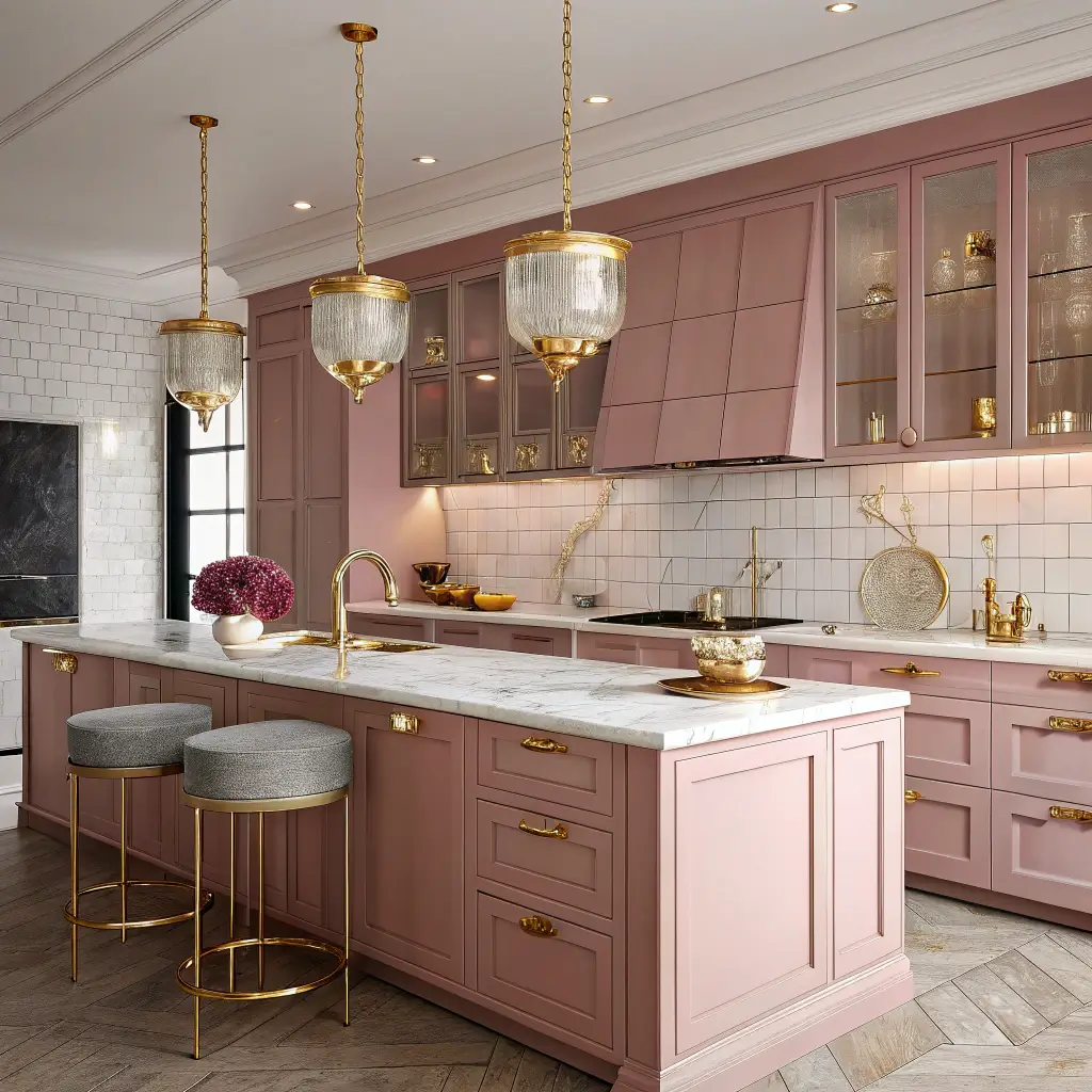
Pink meets gold in combinations that scream luxury. This pairing creates glamorous spaces that feel special and indulgent.
The Luxe Combination Appeal
Pink and gold luxe kitchen ideas combine warm color with warm metallic for maximum elegance. This partnership references Art Deco glamour while feeling thoroughly contemporary.
Why pink and gold captivate:
- Undeniable luxury: Both elements communicate opulence
- Warm harmony: Shared warmth creates cohesive palettes
- Visual richness: Complex combination engages eyes continuously
- Historical glamour: References elegant design eras
- Statement making: Impossible to mistake for ordinary
- Photography excellence: Creates stunning visual content
Incorporating Gold Elements
Apply gold strategically alongside pink tiles:
Gold hardware on cabinets creates consistent metallic presence throughout pink-tiled kitchens. Handles, knobs, and pulls provide repeated gold touches.
Gold fixtures (faucets, light fixtures) add functional glamour. These statement pieces enhance pink tiles’ luxurious potential.
Gold grout within pink tiles creates subtle shimmer. This unexpected detail adds luxury without additional fixtures.
Gold-veined tiles incorporate metallic within tile surfaces themselves. These premium options eliminate need for separate gold elements.
Gold accessories (trays, utensil holders, decorative objects) complete luxe aesthetics. These changeable elements allow easy updates.
Consider gold finish consistency. Polished gold feels most glamorous but shows fingerprints. Brushed gold offers easier maintenance with sophisticated appearance. Antique gold suits vintage-inspired pink kitchens.
8. Pink Tiles with Natural Wood Cabinets
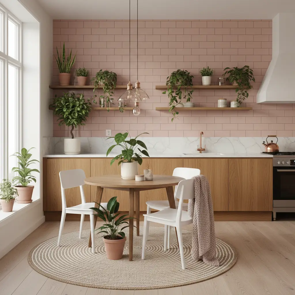
Pink and natural wood create unexpectedly harmonious partnerships. Both materials share organic warmth that creates cohesive, inviting spaces.
The Pink-Wood Partnership
Pink tiles with natural wood cabinets combine manufactured color with natural material beauty. This pairing feels warm, grounded, and surprisingly sophisticated.
Why pink and wood work together:
- Shared warmth: Both materials carry warm undertones
- Organic connection: Pink references natural flowers and sunsets
- Textural contrast: Smooth tiles against wood grain
- Balanced femininity: Wood grounds pink’s delicate nature
- Broad style flexibility: Works in modern, rustic, and transitional spaces
- Timeless potential: Natural materials transcend trends
Wood Tone Considerations
Different wood tones create different effects with pink tiles:
Light oak maintains brightness alongside pink. This airy combination suits Scandinavian and contemporary kitchens.
Walnut adds rich depth that complements deeper pink tones. This sophisticated pairing suits modern and mid-century spaces.
Cherry wood brings reddish undertones that harmonize with coral and warm pinks. This traditional combination suits classic kitchens.
Ash or maple provides neutral wood tone that lets pink dominate. These lighter woods support pink as the star.
Reclaimed wood adds rustic character alongside pink’s softness. This unexpected combination suits eclectic and bohemian kitchens.
Consider pink shade selection based on wood choice. Warmer pinks (coral, peachy) suit warmer woods. Cooler pinks (dusty rose, mauve) work with cooler-toned woods.
9. Vibrant Hot Pink Kitchen Accents
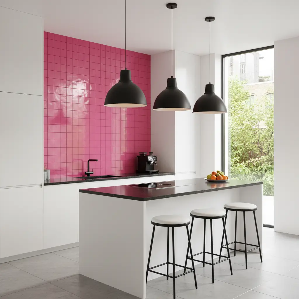
Forget subtle—hot pink makes statements that whisper cannot achieve. These vibrant accents demand attention and celebrate boldness.
Embracing Bold Color
Vibrant hot pink kitchen accents reject timidity for confident color expression. These intense tiles create focal points that define entire kitchen personalities.
Why hot pink accents work:
- Unmissable impact: Impossible to overlook or ignore
- Personality declaration: Shows confident aesthetic preferences
- Energy injection: Vibrant color energizes cooking spaces
- Conversation guarantee: Guests comment without prompting
- Mood enhancement: Bold color affects emotions positively
- Design courage: Demonstrates willingness to take risks
Strategic Hot Pink Placement
Apply hot pink sparingly but confidently:
Behind range focal points: Hot pink tiles behind cooktops create stunning statements. This natural focal point deserves bold treatment.
Open shelf backing: Vibrant pink backgrounds make displayed items pop. This application adds drama without overwhelming.
Accent strips or borders: Hot pink bands within neutral tile fields create graphic interest. Define zones or add color strategically.
Kitchen niche treatments: Built-in niches or alcoves suit bold color. These defined spaces contain vibrancy appropriately.
Island accent panels: Apply hot pink to visible island surfaces. This unexpected placement surprises and delights.
Balance hot pink with grounding neutrals:
- White cabinets prevent color competition
- Grey tones add sophisticated contrast
- Natural wood provides organic grounding
- Black accents add contemporary edge
FYI, hot pink requires confidence and commitment. Tentative applications look accidental. Bold, intentional placement looks designed.
Also Read: 10 Inspiring Moroccan Tiles Kitchen Ideas and Pattern Magic
10. Minimalist Pink Tile Kitchen Concepts

Minimalism and pink might seem contradictory, but subtle pink enhances minimal spaces with warmth that white cannot provide.
Pink in Minimal Spaces
Minimalist pink tile kitchen concepts prove that reduction doesn’t require colorlessness. Gentle pink adds warmth to minimal frameworks without compromising simplicity.
Why minimalism welcomes pink:
- Warm neutrality: Soft pink functions as warm neutral
- Human comfort: Adds coziness that pure white lacks
- Subtle interest: Color provides visual engagement minimally
- Unexpected element: Pink in minimal spaces surprises pleasantly
- Sophisticated restraint: Muted tones suit reduced aesthetics
- Photography excellence: Creates stunning minimal imagery
Minimalist Pink Execution
Apply pink within strict minimalist frameworks:
Single color commitment: Choose one pink shade and apply consistently. Avoid multiple pink tones that introduce complexity.
Seamless surfaces: Match grout to tile for uninterrupted pink planes. Minimize visual breaks that disrupt minimal aesthetics.
Large format tiles: Reduce grout lines for cleaner, simpler surfaces. Bigger tiles suit minimalist proportions.
Matte finishes: Soft surfaces suit minimal sophistication. Avoid reflective finishes that add visual complexity.
Limited material palette: Combine pink tiles with only one or two other materials. Restraint defines minimalism.
Complete minimalist pink kitchens with appropriate companions:
- Handleless cabinets in white or grey
- Integrated appliances eliminating visual breaks
- Clear countertops without accessories
- Hidden storage eliminating visual clutter
- Careful lighting avoiding fixture accumulation
The key involves letting pink speak quietly. Minimal pink kitchens use color as accent rather than statement. Restraint honors both minimalism and pink’s potential.
Choosing Your Pink Kitchen Approach
After exploring these ten pink tile kitchen ideas, you likely have favorites emerging. Consider these factors before committing.
Shade Selection
Different pinks create different effects:
- Warm pinks (coral, peach) suit warm-toned kitchens
- Cool pinks (mauve, dusty rose) suit grey-toned spaces
- Bright pinks (fuchsia, hot pink) demand attention
- Muted pinks (blush, pale rose) function as near-neutrals
Lighting Considerations
Pink appearance shifts dramatically with lighting:
- Natural light reveals pink’s true character
- Warm artificial light enhances pink warmth
- Cool artificial light can make pink appear grey or flat
- Under-cabinet lighting illuminates pink backsplashes effectively
Longevity Assessment
Consider long-term satisfaction:
- Subtle pinks tend to age well
- Trendy hot pinks may date more quickly
- Classic blush maintains timeless appeal
- Bold statements suit those comfortable with change
Household Harmony
Ensure pink suits everyone:
- Muted tones often satisfy diverse preferences
- Accent applications reduce commitment concerns
- Warm undertones feel less specifically feminine
- Strategic placement allows personal style expression
Final Thoughts
Pink kitchen tiles represent design confidence. Choosing color—especially unexpected color—demonstrates willingness to express personality rather than defaulting to safe neutrals.
I’ve come far from dismissing pink kitchens entirely. That Instagram photo of blush subway tiles opened my eyes to possibilities I’d never considered.
Now I see pink as legitimate, sophisticated, and genuinely beautiful in kitchen contexts.
Whether you embrace subtle blush whispers, bold hot pink statements, or sophisticated matte finishes, pink tiles add warmth and character that grey and white cannot match.
Take your time selecting your pink approach. Order generous samples—pink varies dramatically between screens and reality.
View samples under your kitchen’s specific lighting at different times. Consider household preferences honestly.
Your kitchen deserves tiles that bring you joy. For many homeowners, pink delivers exactly that—warmth, personality, and unexpected beauty that transforms cooking spaces into genuinely special environments.
Now go find your perfect pink. Your colorful kitchen awaits. 🙂