10 Beautiful Store Shelves Design Ideas and Eye-Catching Displays
- Floating Shelves
 Ben
Ben- 0
- 26 minutes read
Ever walked into a store and felt instantly drawn to browse, even though you just came in for one thing? That magnetic pull isn’t magic – it’s smart shelving design doing its job.
After spending way too many years helping retailers transform their spaces from “meh” to “must-explore,” I’ve seen firsthand how the right shelving can literally make or break a store’s success.
Let me share something that’ll blow your mind: customers make about 82% of their purchasing decisions right there in the store, staring at your shelves.
No pressure, right? But here’s the good news – you don’t need a massive budget or a degree in interior design to create shelving that sells.
You just need to understand what actually works and why shoppers’ brains respond to certain setups better than others.
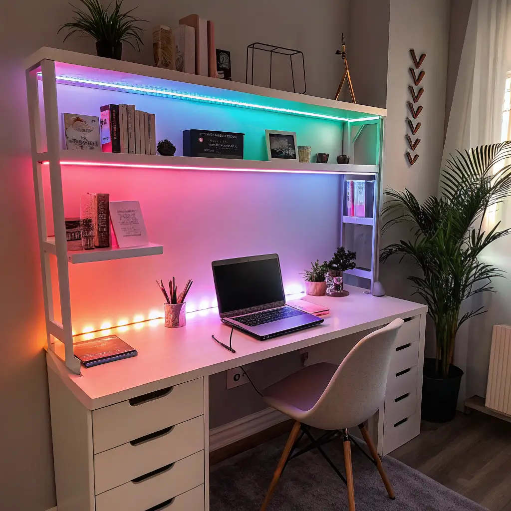
Minimalist Floating Store Shelves: Less Clutter, More Sales

Minimalist floating shelves are like the little black dress of retail design – they never go out of style and make everything look more expensive. I installed these in a boutique last year, and the owner called me crying (happy tears!) because her sales jumped 30% in the first month. No joke.
The beauty of floating shelves lies in what you don’t see. No bulky brackets, no distracting supports – just your products appearing to levitate against the wall. This creates an upscale gallery feel that makes even budget items look premium. Your $20 candles suddenly look like they belong in a $200-per-night hotel lobby.
Why Floating Shelves Actually Float Sales
The psychological impact hits different with floating shelves. Customers unconsciously associate the clean lines with quality and organization. I’ve watched shoppers spend twice as long browsing floating shelf displays compared to traditional units. They actually slow down and engage with products instead of speed-walking past.
Installation needs to be bulletproof though. I learned this the hard way when a poorly mounted shelf crashed down during Black Friday at a client’s store. Now I always use heavy-duty brackets rated for triple the expected weight. Better paranoid than picking up broken merchandise.
Space between shelves matters more than you’d think. Too close and products feel cramped. Too far and you’re wasting valuable wall real estate. I stick to 12-14 inches for most products, adjusting based on item height. This creates breathing room that lets each product shine without making customers play Tetris to grab what they want.
Industrial Pipe Shelving Display: The Urban Edge That Sells

Industrial pipe shelving brings that Brooklyn-warehouse-turned-boutique vibe that millennials and Gen Z eat up with a spoon. I helped a friend transform her failing vintage clothing store with industrial shelving, and now she has lines out the door on weekends. The shelves didn’t just display products – they became part of the brand story.
The raw, unfinished look of pipes and wood creates an authentic atmosphere that resonates with customers tired of cookie-cutter retail. It suggests craftsmanship, sustainability, and that whole “we’re not like other stores” energy that modern shoppers crave.
Building Your Industrial Empire
Black iron pipes cost more than galvanized, but trust me, spring for the black. The aesthetic difference justifies the price bump every single time. Galvanized pipes scream “plumbing aisle,” while black iron whispers “curated shopping experience.”
Mix pipe configurations to create visual interest. I combine straight runs with 90-degree elbows and T-joints to build shelving that looks intentionally designed rather than thrown together. Each shelf becomes a mini architectural statement that frames your products perfectly.
Wood choice can make or break the industrial look. Reclaimed wood is ideal, but new wood stained to look weathered works too. I once used brand-new pine and tried to pass it off as reclaimed – customers weren’t fooled. Now I either go authentic or own the newness with a quality stain job.
Modular Cube Shelf Systems: The Transformer of Retail
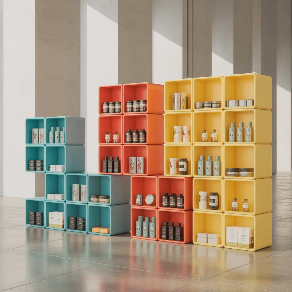
Modular cube shelves are basically retail Legos – endlessly reconfigurable and surprisingly addictive to arrange. I’ve seen store owners completely refresh their look every season just by rearranging the same cube units. It’s like getting a new store design four times a year without the renovation costs.
The flexibility factor sells itself. Having a sale? Create a cube tower for featured items. New product line? Reconfigure into a showcase wall. Slow Tuesday? Spend an hour reimagining your display. The possibilities keep your store fresh without constant investment.
Mastering the Modular Game
Start small and expand gradually. I watched one retailer blow their entire shelving budget on cubes, then realize they needed other display types too. Begin with a starter set, see how customers respond, then grow your cube collection strategically.
Create zones within your cube arrangements. I designate certain cube clusters for specific product categories or price points. This invisible organization helps customers navigate without feeling overwhelmed by choice. They think they’re randomly browsing, but you’re actually guiding their journey.
Don’t fill every cube to capacity. Empty cubes or minimally styled ones create visual breathing room and highlight neighboring products. I follow the 70/30 rule – 70% filled, 30% negative space. This prevents the dreaded “warehouse wall” effect that makes customers feel like they’re shopping in a storage unit.
Also Read: 12 Elegant Plant Shelves Ideas and Minimalist Styling
Rustic Wooden Retail Shelves: The Warmth That Welcomes Wallets
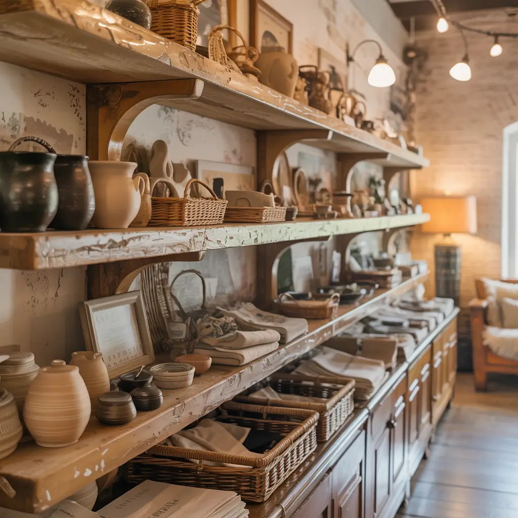
Rustic wooden shelves make customers feel like they’ve discovered a hidden gem rather than just another store. The organic warmth creates an emotional connection that modern materials can’t touch. I installed rustic shelving in a gift shop that was struggling against online competition – their in-store sales doubled because people wanted the “experience” of shopping there.
Wood tells a story that resonates with our cave-person brains. We trust it, we’re drawn to it, and most importantly, we linger near it. Rustic shelves slow down the shopping pace in the best possible way.
Crafting Your Rustic Retail Paradise
Authenticity beats perfection every time with rustic shelving. Those knots, grain variations, and even small cracks aren’t flaws – they’re character. I once had a client want to fill all the knot holes. I talked them out of it, and customers constantly compliment the “authentic” feel.
Vary your wood widths and thicknesses. Uniform rustic is an oxymoron. I mix 2×8 boards with 2×10s and even throw in the occasional 2×12 for larger displays. This creates a collected-over-time feel that can’t be bought off the shelf.
Protect the wood without hiding it. Three coats of matte polyurethane preserves the rustic look while protecting against the daily assault of customer handling. Glossy finish kills the vibe faster than fluorescent lighting in a candlelit restaurant.
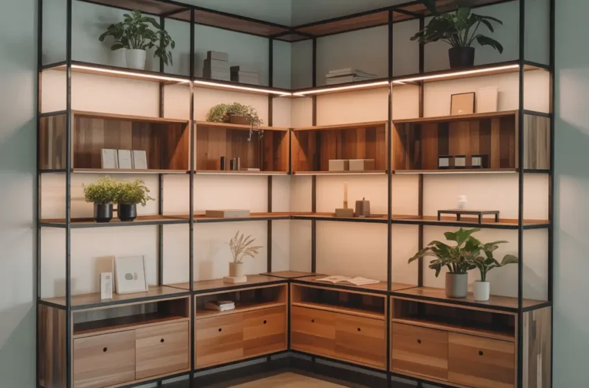
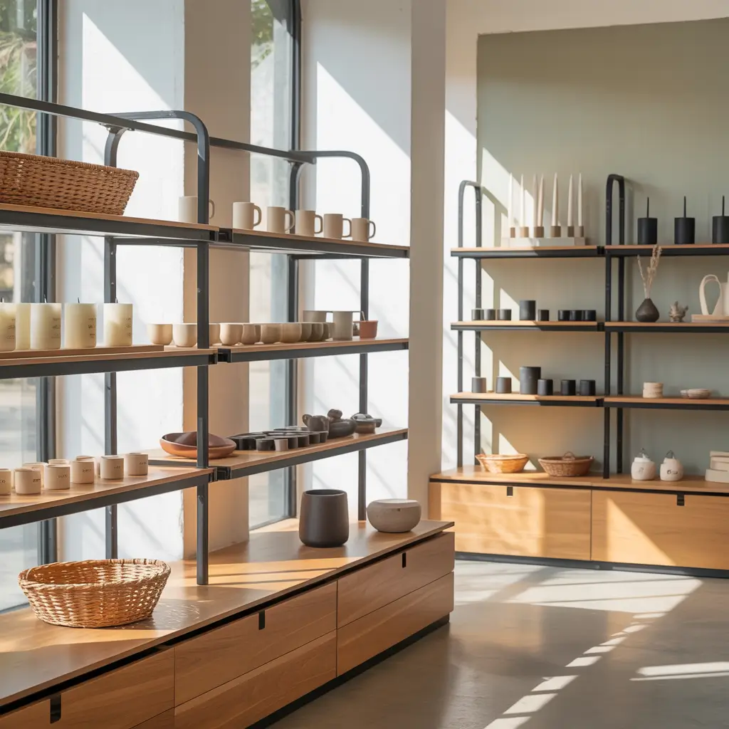
Wall-Mounted Grid Shelving Ideas: The Flexible Framework
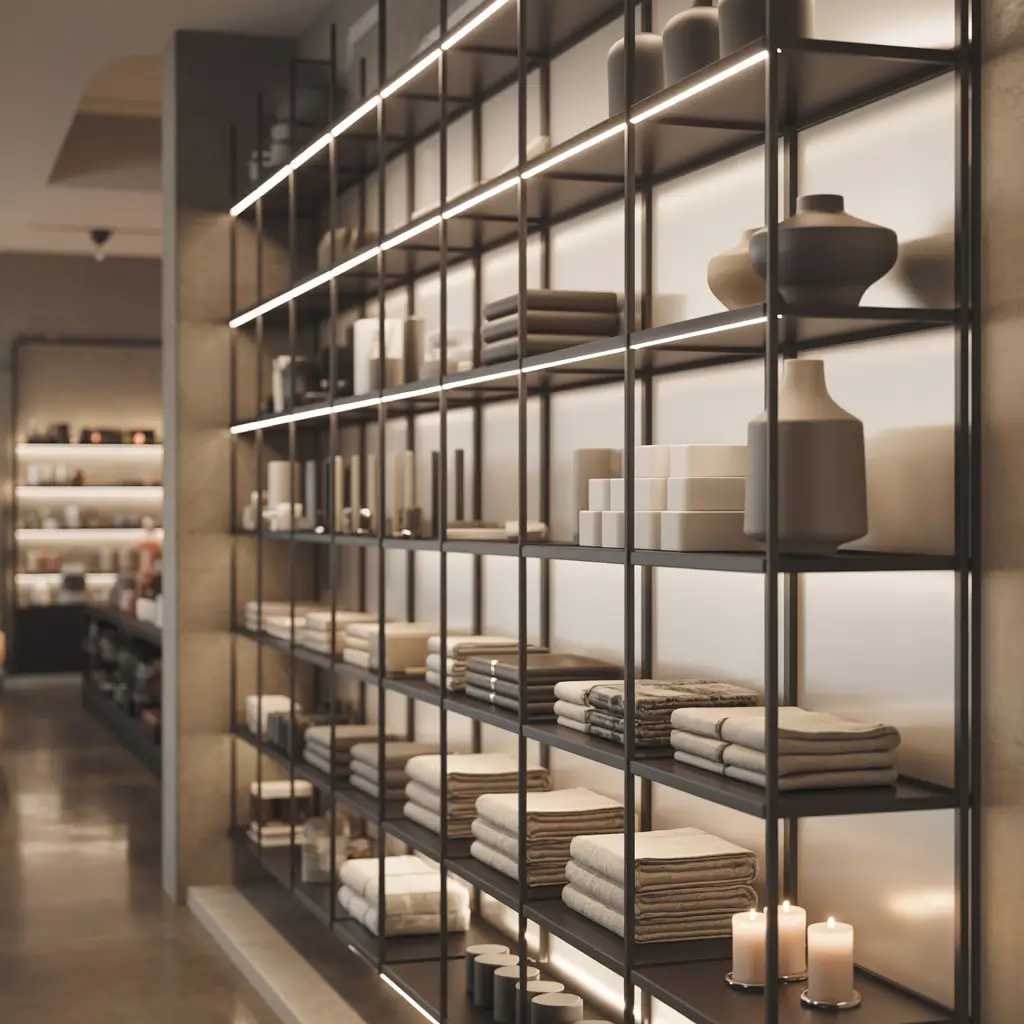
Grid shelving systems are the Swiss Army knife of retail display – infinitely adaptable and surprisingly elegant when done right. I’ve installed these in everything from hardware stores to high-end boutiques, and they work everywhere because they disappear behind the products.
The grid becomes a neutral framework that highlights whatever you’re selling. Hooks, shelves, baskets – everything clips on and rearranges in seconds. It’s like having a store that can shapeshift based on inventory needs.
Gridlock? More Like Grid-Unlock!
Choose your grid material based on your brand, not your budget. Wire grids work for industrial vibes, while slatwall grids suit upscale retail. I’ve seen stores cheap out on grids and regret it when the flimsy material bends under product weight.
Plan your grid zones before installation. I map out sections for different product types, ensuring heavy items have reinforced mounting points. Nothing kills the shopping mood like a sagging grid wall.
Invest in quality accessories from day one. Cheap hooks and shelves break, bend, and generally make your products look sad. I learned this after replacing an entire store’s grid accessories three months after opening. Buy once, cry once, as they say.
Color-Coded Product Shelves: The Rainbow Revenue Road
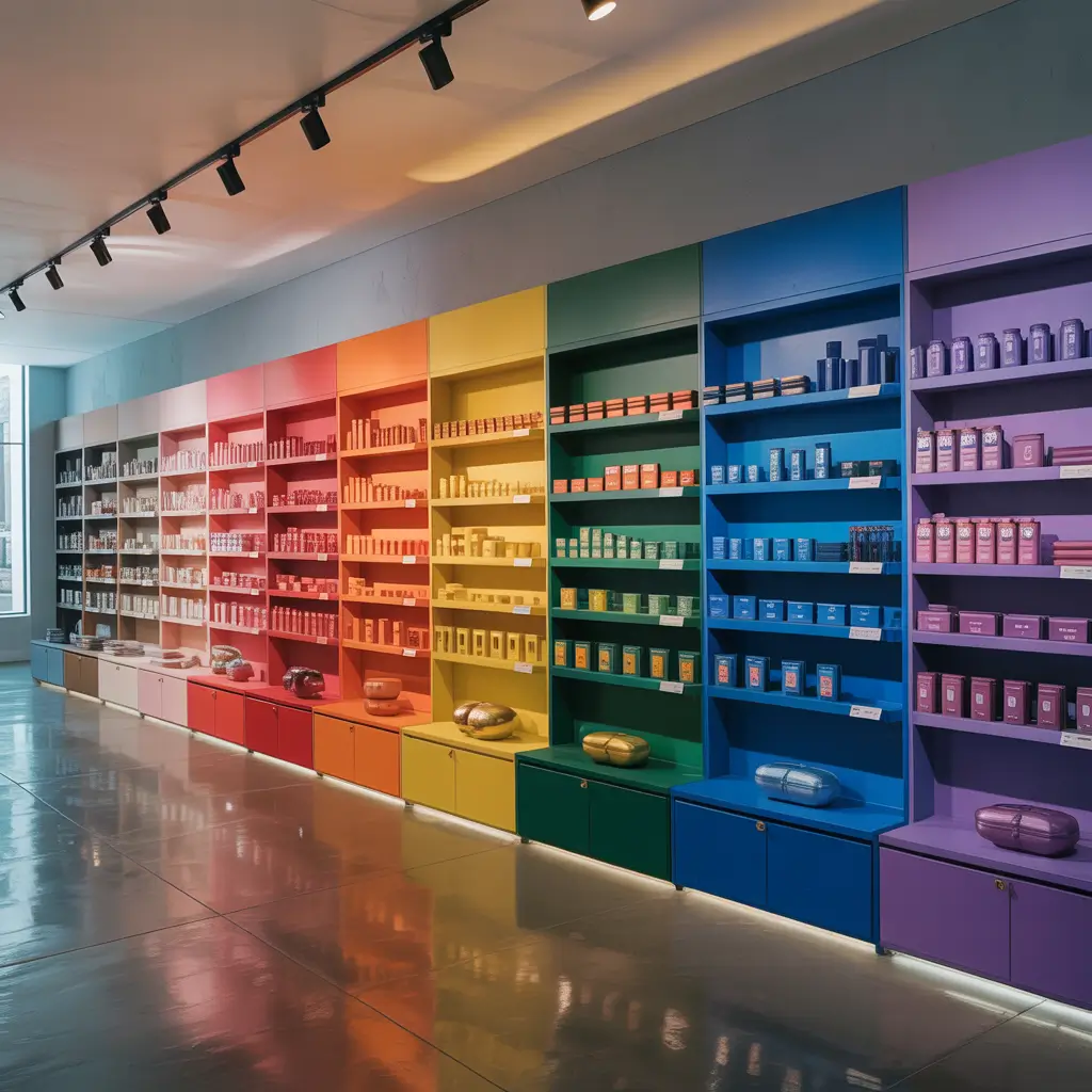
Color-coded shelving turns shopping into a visually satisfying treasure hunt. Customers don’t even realize they’re being psychologically guided through your store – they just know they enjoy the experience. I helped a toy store implement color-coding, and parents started staying longer because their kids were mesmerized by the rainbow effect.
The organization goes beyond aesthetics. Color-coding helps customers find what they need faster while discovering items they didn’t know they wanted. It’s sneaky psychology at its finest.
Creating Your Colorful Commerce Canvas
Decide between product color-coding or shelf color-coding. Product arrangement by color works for items with varied hues. Colored shelves themselves work better for neutral products that need visual pop. I tried both in the same store once – sensory overload isn’t a good look :/
Maintain color consistency throughout the store. If red means “sale” on one wall, don’t make it mean “new arrivals” on another. Customer brains appreciate predictable patterns, even if they don’t consciously notice them.
Update color stories seasonally. Spring pastels, summer brights, fall earth tones, winter jewel tones – rotating color schemes keeps regular customers engaged. I’ve watched people return monthly just to see “what color story you’re telling now.”
Also Read: 10 Smart Bathroom Shelves Over Toilet Ideas for Small Spaces
Corner Maximizing Display Shelves: The Forgotten Goldmine
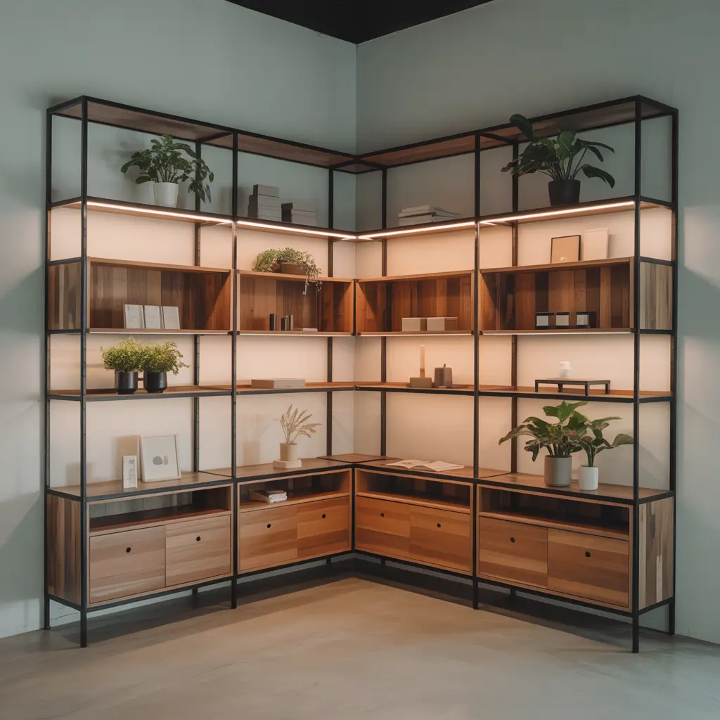
Corner shelves transform dead zones into profit centers. Most retailers ignore corners or stuff them with clearance items, missing huge opportunities. I turned a boutique’s “bermuda triangle” corner into their bestselling section with the right shelving approach.
Corners naturally create intimate shopping moments. Customers feel slightly separated from the main flow, making them more likely to pause and really examine products. It’s like creating a store within a store.
Conquering Corner Challenges
Curved corner shelves prevent the harsh angle problem. Square shelves meeting at 90 degrees create an uninviting crease. I use curved units that flow naturally, guiding customers around the corner instead of into it.
Light corners more than straight walls. Shadows love corners, and shadows hide products. I install spotlights or LED strips specifically for corner displays. The extra illumination draws eyes and eliminates the cave effect.
Create corner destinations, not corner afterthoughts. Place your most interactive or Instagram-worthy products here. Customers love discovering special items in unexpected places – it makes them feel like savvy shoppers who found the secret stash.
Tiered Open Shelf Designs: The Stadium Seating of Retail
Tiered shelving gives every product a front-row seat. Nothing gets lost in the back, nothing gets overshadowed – every item gets its moment in the spotlight. I implemented tiered shelving in a cosmetics store, and they reported customers saying they could “finally see everything” for the first time.
The visibility factor can’t be overstated. When customers can see all options at once, they make faster decisions and often buy more. No more crouching, reaching, or giving up because they can’t see what’s available.
Building Your Tiered Empire
Calculate tier heights based on product packaging, not arbitrary measurements. I measure the tallest item in each category and add 2 inches for easy grabbing. This prevents the annoying “can’t quite reach” scenario that makes customers move on.
Angle matters more than height. A slight backward tilt (5-10 degrees) improves visibility dramatically without making products slide. I learned this after creating perfectly flat tiers that still hid back-row products.
Keep tier depth shallow for frequently touched items. Deep tiers mean customers knock over front items reaching for back ones. I limit depth to 8 inches for items people handle, deeper only for “look don’t touch” displays.
Glass and Metal Showcase Shelves: The Luxury Look for Less
Glass and metal shelving instantly elevates product perception. That $30 purse suddenly looks like a $300 investment piece when displayed on glass. I’ve seen retailers double their average transaction value just by switching to glass shelving for premium items.
The transparency creates an airy, upscale environment that makes customers feel they’re shopping somewhere special. It’s psychological pricing without changing price tags.
Mastering the Glass Class
Tempered glass isn’t optional – it’s essential. I witnessed a non-tempered shelf shatter when a customer set down a heavy purse. The cleanup, liability issues, and customer trauma aren’t worth saving a few bucks.
Edge treatment affects the entire aesthetic. Polished edges look premium, beveled edges add elegance, and raw edges scream “budget.” I always recommend polished edges minimum – they’re safe and sophisticated.
Support brackets should enhance, not distract. Chunky brackets ruin the ethereal effect of glass. I use minimal chrome or brass supports that complement rather than compete with the transparency.
Also Read: 10 Stylish DIY Shelves Ideas and Unique Storage Solutions
Rotating Carousel Store Shelves: The Engagement Engine
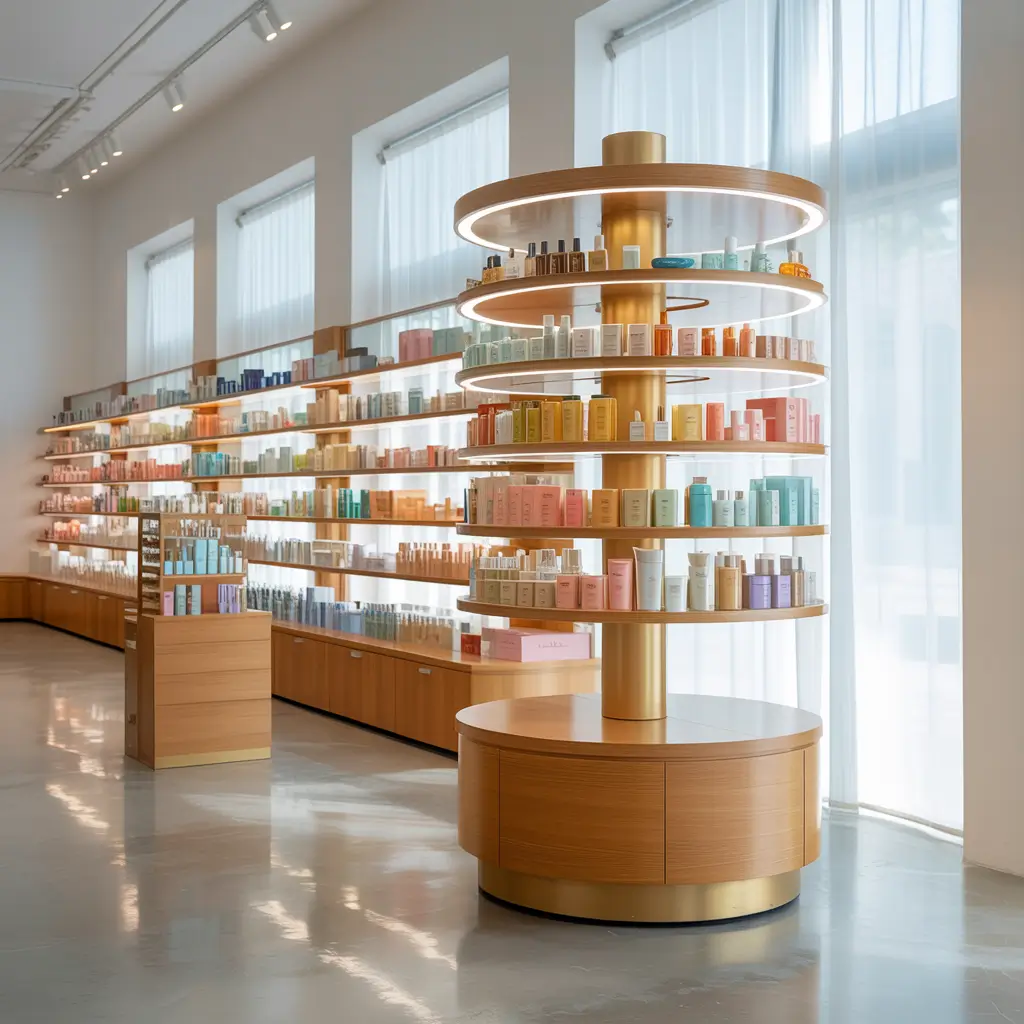
Rotating carousel shelves turn passive browsing into active exploration. Customers love the interactive element – it makes shopping feel less like a chore and more like a discovery process. I installed carousel shelves in a jewelry store, and dwell time increased by 40%. People literally couldn’t stop spinning them!
The 360-degree visibility means no dead angles, no hidden products, and no missed opportunities. Every spin reveals something new, keeping customers engaged way longer than static displays.
Spinning Up Your Sales
Weight distribution prevents the wobbles. I learned to load carousels evenly after watching one tip over because all the heavy items were on one side. Now I treat them like washing machines – balanced loads only.
Height should accommodate comfortable spinning. Too tall and shorter customers can’t reach the top. Too short and you’re wasting vertical space. I aim for 5.5 feet maximum height, with premium items at eye level.
Manual rotation beats motorized for retail. Motorized seems fancy but removes customer control. People want to spin at their own pace, pause when something catches their eye, and feel like they’re actively shopping rather than watching a presentation.
Making Your Store Shelves Work Smarter
Here’s what fifteen years of retail shelving has taught me: the best shelving design is the one that matches your products, your customers, and your brand story.
I’ve seen minimalist floating shelves fail in antique stores and rustic wooden shelves flop in tech shops. Context matters more than trends.
Start with one shelving style and test it thoroughly before committing to a store-wide rollout. I always recommend a pilot section where you can measure customer engagement, sales conversion, and practical maintenance needs.
What looks amazing on Pinterest might be a nightmare to keep clean in real life.
Remember, your shelves are silent salespeople working 24/7 (or at least during store hours). They should guide customers, showcase products, and create an environment where spending money feels like a pleasure, not a pain.
The right shelving doesn’t just display products – it tells your brand story, creates shopping experiences, and ultimately drives sales.
BTW, don’t forget the maintenance factor. The most beautiful shelving in the world becomes a liability if it requires constant upkeep you can’t maintain.
Choose designs that look great even when they’re not perfectly styled – because let’s face it, retail life is messy, and perfection is exhausting.
Your store shelves should work as hard as you do. Whether you go minimal, industrial, or full rainbow, make sure they’re earning their keep by turning browsers into buyers.
Now get out there and shelf it up! Your products (and your profit margins) will thank you 🙂