10 Inspiring Best Bedroom Paint Colors Ideas and Color Combos
- Bedroom Design
 Ben
Ben- 0
- 30 minutes read
Picking the wrong bedroom paint color is like choosing the wrong life partner – you’ll wake up every day wondering what you were thinking.
Trust me, I’ve repainted my bedroom seven times in five years, and each mistake taught me something valuable about what actually works.
After spending roughly the GDP of a small country on paint samples, I’ve finally cracked the code on bedroom paint colors that don’t make you want to immediately repaint.
These aren’t just pretty colors from Pinterest; these are the ones that actually improve your mood, sleep, and general will to exist.
So let’s talk about the paint colors that transform your bedroom from “place where I collapse” to “sanctuary I never want to leave.”
And yes, I tested every single one of these myself because apparently, I have nothing better to do with my weekends.
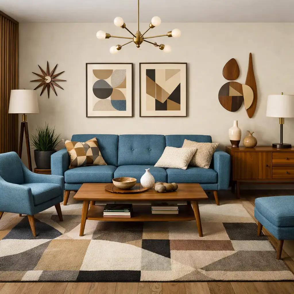
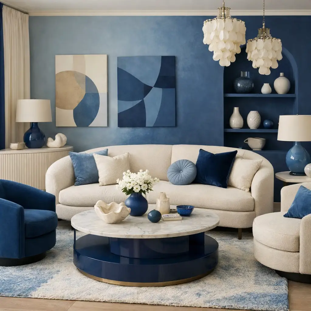
1. Serene Blue Bedroom Color Schemes
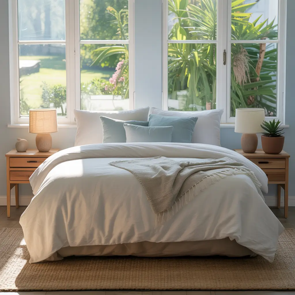
Blue bedrooms get a bad rap for being cold, but serene blue color schemes create the most calming spaces when you nail the right shade. We’re not talking about that aggressive electric blue your teenager wants – we’re talking sophisticated, sleep-inducing blues.
I painted my bedroom “Healing Aloe” by Benjamin Moore (yes, it’s blue despite the name) after reading that blue lowers heart rate and blood pressure. Placebo effect or science? Don’t know, don’t care – I sleep like a baby now.
Finding Your Perfect Blue
The blue bedroom success formula involves:
- Soft, muted blues over bright primary shades
- Warm undertones to prevent hospital vibes
- Layering different blue tones for depth
- White or cream accents to brighten
- Natural wood to add warmth
My favorite blues that actually work? Farrow & Ball’s “Borrowed Light” for barely-there blue, Benjamin Moore’s “Cloudy Sky” for medium intensity, and Clare’s “Current Mood” for something deeper. Skip anything called “Baby Blue” unless you want to feel like you’re sleeping in a nursery.
The north-facing room situation matters with blue. North light makes blue look colder, so choose blues with gray or green undertones. South-facing rooms can handle cleaner blues. Learned this after my north-facing bedroom looked like an ice cave with the wrong blue.
2. Cozy Warm Neutral Bedroom Palettes
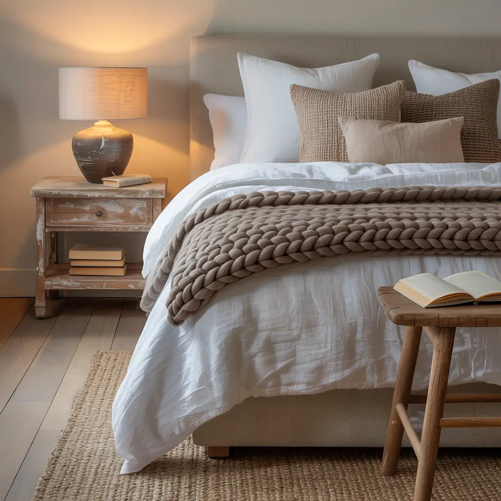
Warm neutrals are having their moment, and honestly, it’s about time we moved past the gray everything trend. These colors wrap your bedroom in a hug without screaming for attention.
My journey with warm neutrals started when I got tired of explaining that my gray walls were “actually quite warm in person.” Switched to actual warm colors, and suddenly nobody needed explanations. The walls just felt good.
The Warm Neutral Game Plan
Creating cozy with warm neutrals:
- Choose beiges with pink or yellow undertones
- Layer multiple neutral shades
- Add texture through fabrics, not color
- Include natural materials
- Keep whites warm, not stark
The winners in my warm neutral experiments? Sherwin-Williams “Accessible Beige” (terrible name, great color), Benjamin Moore “White Dove” for trim, and Clare “Current Mood” for something richer. These colors make every bedroom feel expensive, even if your furniture came from Facebook Marketplace.
Temperature consistency keeps warm neutrals from looking muddy. Mix warm with cool neutrals and you get confusion. Stick to one temperature family throughout the room. Your eyes will thank you.
3. Moody Dark Bedroom Paint Inspirations
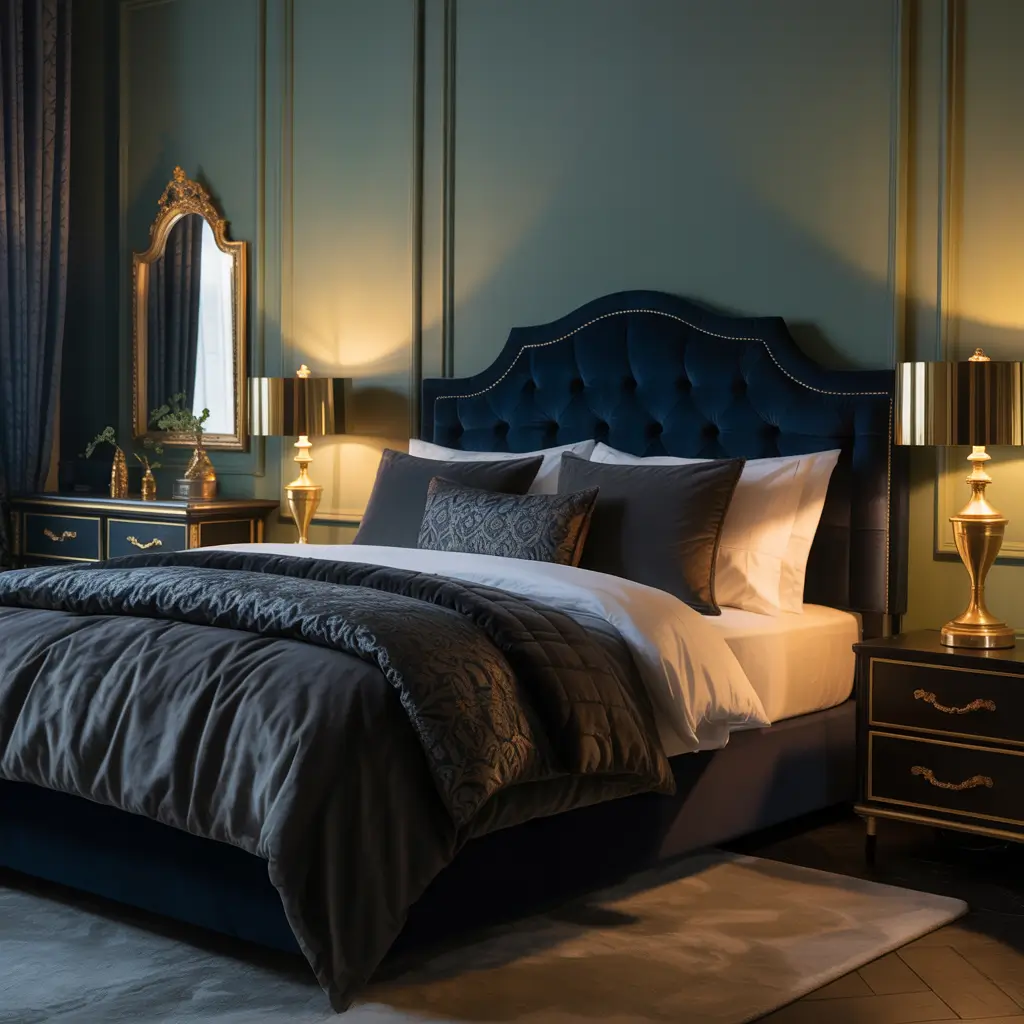
Going dark and moody in the bedroom sounds scary until you actually do it. Then you wonder why you spent years living in beige purgatory.
I fought my partner about painting our bedroom charcoal for six months. Finally caved, and now I admit they were right (but don’t tell them). Dark walls create this cocoon effect that makes you actually want to go to bed. Revolutionary concept, right?
Dark Paint Without the Dungeon
Making dark colors work requires:
- High-quality paint (cheap dark paint looks terrible)
- Multiple coats for even coverage
- Strategic lighting placement
- Light bedding for contrast
- Confidence in your choice
My dark color champions? Benjamin Moore “Wrought Iron” for sophisticated black, Farrow & Ball “Hague Blue” for dramatic navy, and Sherwin-Williams “Urbane Bronze” for the dark color skeptics. Each creates mood without making your bedroom feel like a cave.
The trim question with dark walls always comes up. Paint it the same color for modern drama or keep it white for classic contrast. I’ve done both. Both work. Choose based on your courage level and how often you want to touch up scuffs.
Also Read: 12 Gorgeous Moody Bedroom Paint Colors and Luxe Design Tips
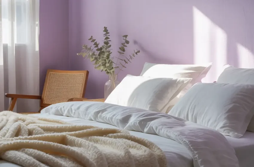
4. Pastel Bedroom Colors for a Calm Vibe
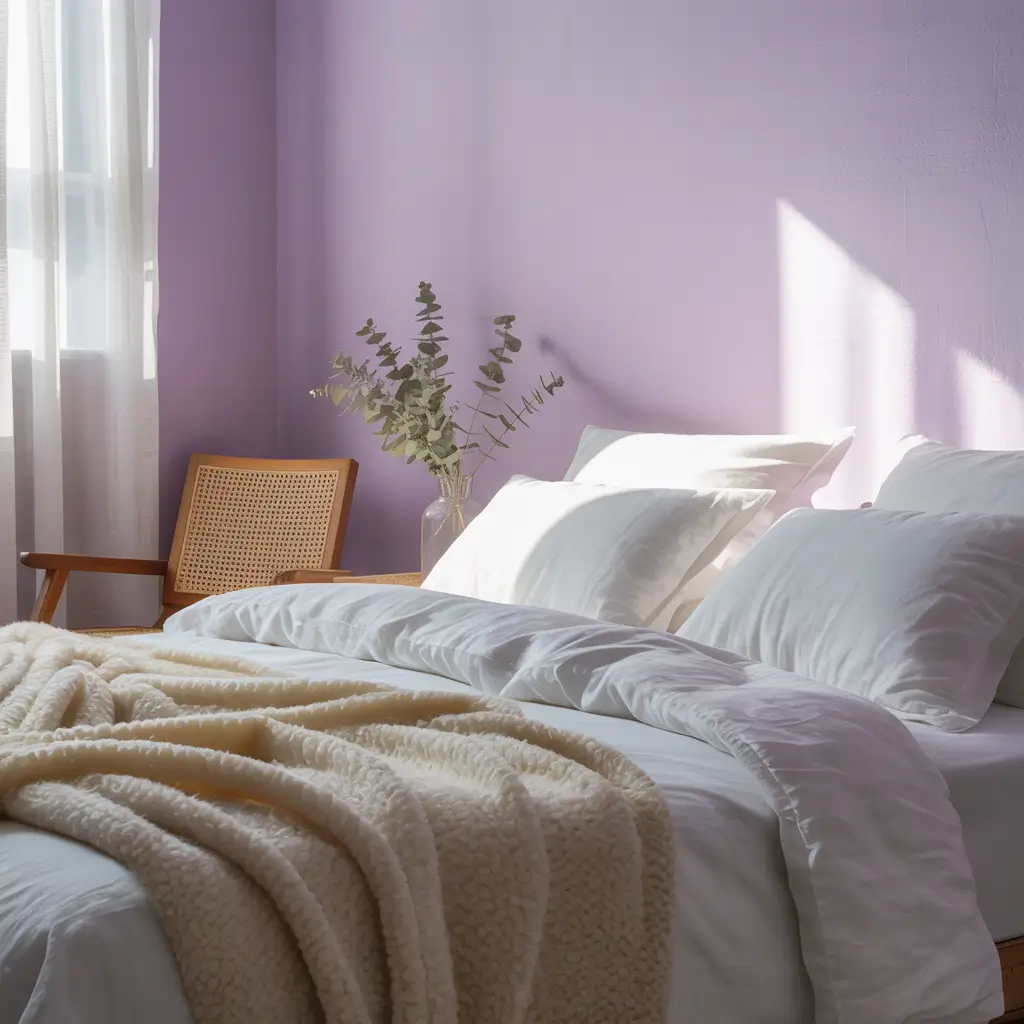
Pastel bedrooms aren’t just for nurseries and people who collect unicorns. Adult pastels exist, and they create the most serene bedrooms imaginable.
I resisted pastels forever because I associated them with Easter eggs and gender reveal parties. Then I saw a dusty rose bedroom that changed everything. Turns out, sophisticated pastels make you feel calm without the saccharine sweetness.
Grown-Up Pastels That Work
The adult pastel strategy:
- Choose muted pastels with gray undertones
- Limit to one or two pastel shades
- Balance with plenty of white
- Add black accents for sophistication
- Skip anything described as “candy”
The pastels that actually work in adult bedrooms? Benjamin Moore “Tissue Pink” (barely pink), Clare “Whipped” for soft lavender, and Farrow & Ball “Cromarty” for sophisticated sage. These read as neutrals with personality, not rainbow explosion.
Lighting transforms pastels more than any other color family. Test your chosen pastel at different times of day. That perfect pink might look gray in morning light or neon under your bedside lamp. Paint samples on multiple walls and live with them for a week.
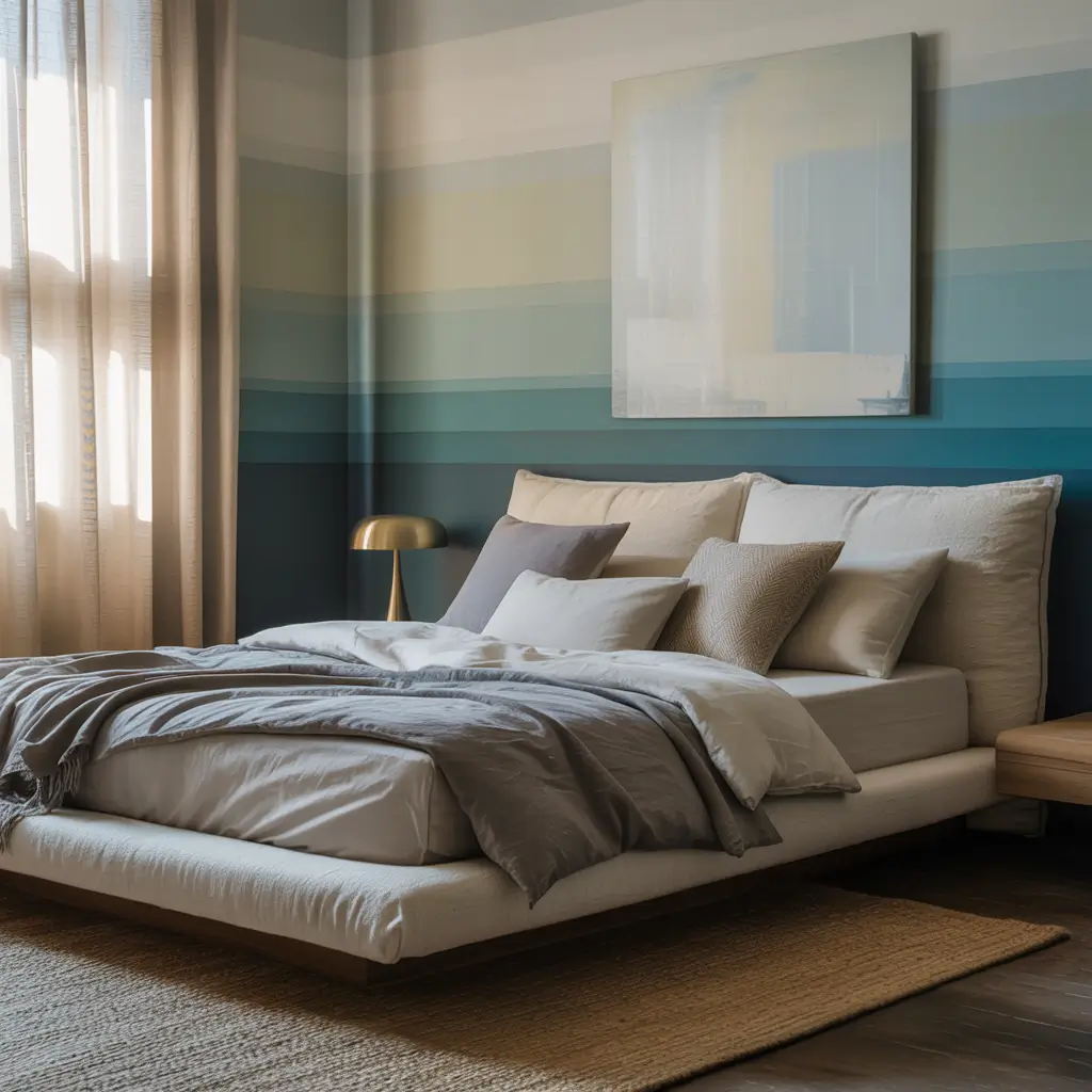
5. Elegant Gray and White Bedroom Combos
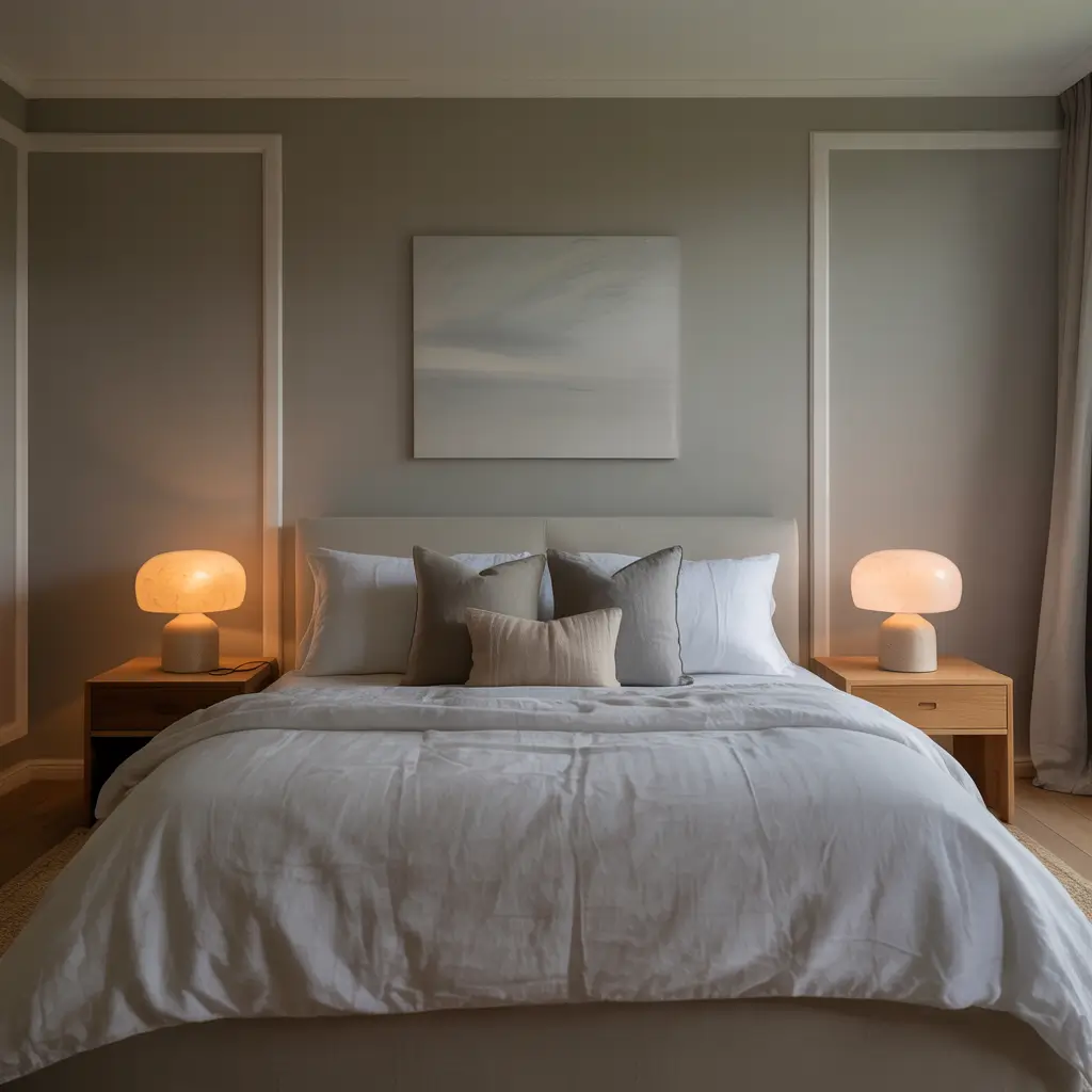
Before you roll your eyes at another gray and white bedroom, hear me out. Done right, this combo creates timeless elegance that never feels dated.
My gray and white bedroom survived three years without boring me to tears – a personal record. The secret? Choosing the right gray (harder than it sounds) and using white strategically, not everywhere.
Gray and White Without the Yawn
Making gray and white interesting:
- Pick gray with subtle undertones
- Use multiple shades of each color
- Add texture through materials
- Include one unexpected element
- Keep metallics consistent
The gray-white combinations that never fail? Benjamin Moore “Stonington Gray” with “Cloud White” trim, or Farrow & Ball “Pavilion Gray” with pure white bedding. These combos look expensive even if you painted them yourself in your pajamas (guilty).
The undertone situation with gray determines everything. Purple undertones feel cold. Green undertones look institutional. Blue undertones work best in bedrooms. Brown undertones create that perfect “greige” everyone’s obsessing over. Pick your fighter wisely.
6. Vibrant Accent Wall Ideas for Bedrooms
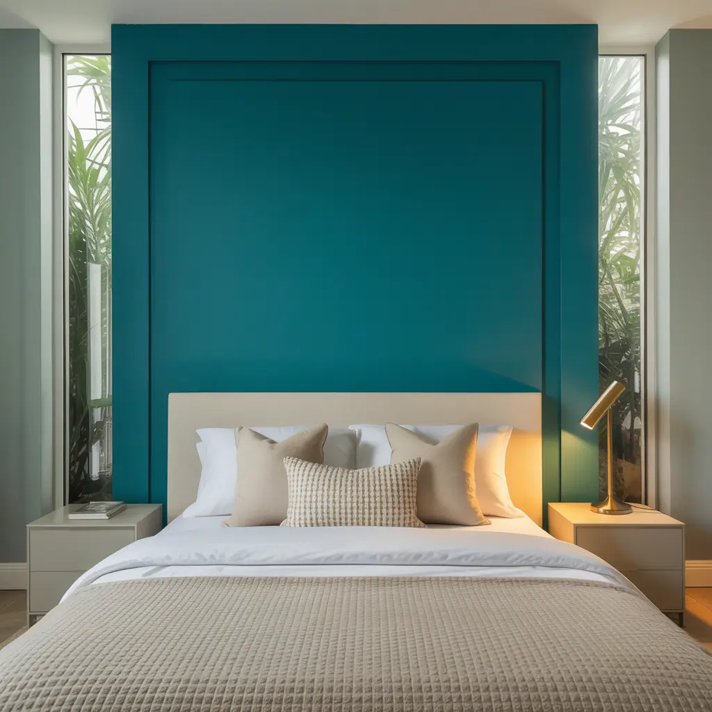
Accent walls let you experiment with color without the full commitment. It’s like dating before marriage, but for paint.
I’ve done five different accent walls in the same bedroom (I have a problem, okay?), and each one completely changed the room’s personality. The best part? When you get bored, you only have to repaint one wall. Lazy people, rejoice!
Accent Wall Excellence
Creating impact with accent walls:
- Choose the focal wall (usually behind the bed)
- Go bold or go home
- Keep other walls neutral
- Use painter’s tape religiously
- Consider the room’s natural focal point
My favorite accent wall victories? Deep teal behind the bed with white walls, terracotta accent with beige surroundings, and black accent wall with gray everywhere else. Each created drama without overwhelming the space.
The biggest accent wall mistake? Choosing a color too close to your other walls. If you’re doing an accent wall, make it actually accent something. A slightly darker beige against beige isn’t an accent; it’s indecision.
Also Read: 10 Trendy Bedroom Paint Colors Ideas and Stylish Palettes
7. Soft Pink and Beige Bedroom Inspirations
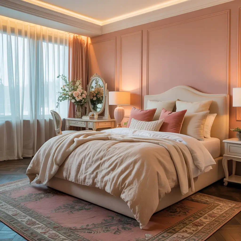
Pink and beige together sound like they shouldn’t work, but this combo creates the most sophisticated, calming bedrooms I’ve ever seen.
My friend’s pink and beige bedroom converted me from a pink hater to pink advocate. The combination feels warm and inviting without being precious or childish. It’s basically the grown-up version of the princess bedroom you wanted at age seven.
Pink and Beige for Adults
Making pink and beige sophisticated:
- Choose dusty or muted pinks
- Keep beige as the dominant color
- Add black or charcoal accents
- Use geometric patterns, not florals
- Include natural textures
The pink-beige combinations worth trying? Benjamin Moore “Fruit Shake” (terrible name, beautiful color) with “Muslin,” or Clare “Wing It” with “Timeless.” These combos feel current without being trendy.
BTW, pink reflects flattering light on everyone. It’s like having a permanent Instagram filter in your bedroom. Your morning face will thank you, and so will anyone else who sees you there 😉
8. Modern Minimalist Bedroom Color Ideas
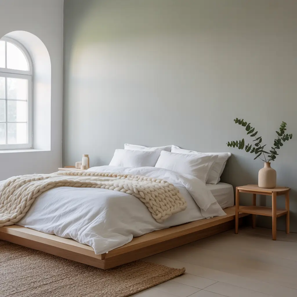
Minimalist bedrooms need colors that whisper, not shout. But minimal doesn’t mean boring – it means intentional.
After my maximalist phase crashed and burned (turns out 47 throw pillows don’t equal happiness), I went minimal with color choices too. One base color, one accent, done. My bedroom finally felt calm instead of chaotic.
Minimalist Color Mastery
The minimalist color formula:
- Stick to three colors max
- Choose colors with similar saturation
- Include plenty of white space
- Let architecture guide placement
- Quality over quantity always
My minimalist color victories? All white with black accents, sage green with natural wood, and warm gray with cream. Each creates calm without feeling empty or cold.
The texture trick saves minimalist bedrooms from boredom. When you limit color, texture becomes your playground. Linen, wool, wood, metal – mix textures within your limited color palette. Suddenly minimal feels rich, not restricted.
9. Earthy Tones for Relaxing Bedrooms
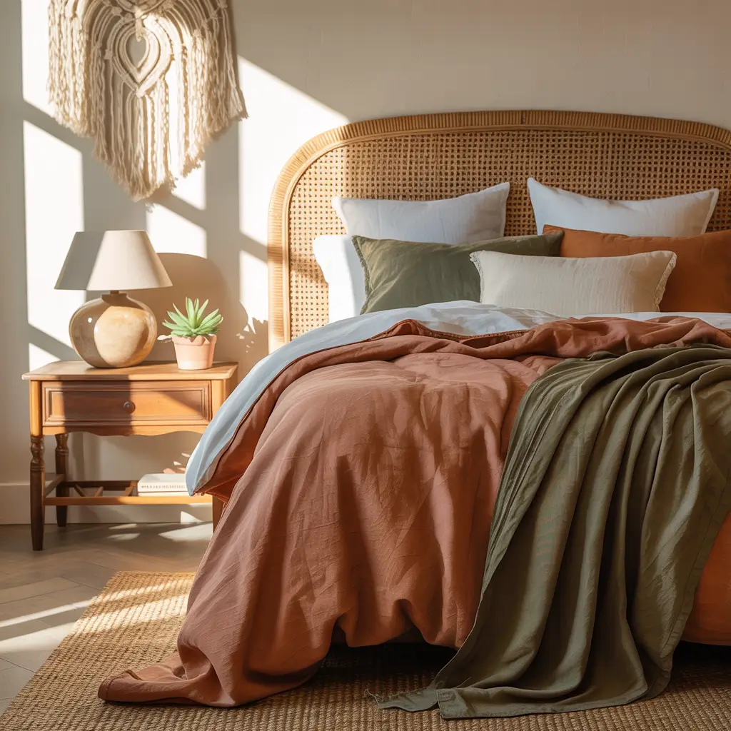
Earthy tones bring nature inside without the maintenance of actual nature. These colors ground your bedroom in the best way possible.
I discovered earthy tones after a camping trip where I slept better outdoors than in my own bed. Came home, painted my bedroom terracotta, added olive green accents, and recreated that outdoor calm inside. No bugs, same vibes.
Earth Tone Excellence
Creating natural calm with earth tones:
- Choose warm browns and terracottas
- Add sage or olive greens
- Include natural textures
- Keep patterns organic
- Layer similar tones
The earth tones that actually relax? Sherwin-Williams “Cavern Clay” for terracotta, Benjamin Moore “October Sky” for dusty brown, and Clare “Current Mood” for sage. These colors make bedrooms feel grounded and secure.
Don’t mix warm and cool earth tones. Warm terracotta with cool sage looks confused. Stick to either all warm (terracotta, camel, gold) or all cool (sage, eucalyptus, stone). Nature doesn’t mix temperatures randomly, neither should you.
Also Read: 10 Charming Beige and Pink Bedroom Ideas for Warm Ambiance
10. Trendy Two-Tone Bedroom Paint Concepts
Two-tone paint gives you variety without chaos. It’s perfect for people who can’t choose just one color (me, I’m people).
My two-tone journey started with leftover paint and desperation. Painted the bottom half of my walls charcoal, top half white. Everyone thought I hired a designer. Sometimes the best designs come from working with what you have, not against it.
Two-Tone Triumph
Making two-tone walls work:
- Choose related colors (same family or complementary)
- Use horizontal splits for traditional feel
- Try geometric patterns for modern vibe
- Measure everything twice
- Use quality painter’s tape
The two-tone combos that never fail? Navy bottom with white top, sage bottom with cream top, or charcoal bottom with light gray top. Each creates visual interest without overwhelming the space.
The proportion question matters. Traditional chair rail height? One-third up the wall. Modern look? Split right in the middle. Dramatic effect? Two-thirds up. Pick your proportion based on ceiling height and desired impact.
Your Perfect Bedroom Color Journey
Here’s what I’ve learned after all these paint experiments: the best bedroom paint colors are the ones that make YOU happy.
Not what’s trending on Instagram, not what your friend chose, not what some design blog insists is “timeless.”
Test everything. Paint large samples directly on your walls. Live with them for at least a week. See them in morning light, afternoon sun, and lamplight.
The color that still makes you smile after staring at it for seven days? That’s your winner.
Remember, paint isn’t permanent (thank goodness). If you hate it, repaint it. I’ve repainted bedrooms within weeks of painting them.
Was it annoying? Yes. Was living with a color I hated worse? Absolutely. Your bedroom should be your happy place, not your compromise place.
Now if you’ll excuse me, I just discovered three new paint colors I want to try, and my bedroom walls are looking suspiciously ready for change number eight.
My partner says I have a problem. I say I have a hobby. Happy painting, friends – may your colors be perfect and your painter’s tape never fail!