12 Timeless Neutral Bedroom Paint Colors and Warm Inviting Hues
- Bedroom Design
 Ben
Ben- 0
- 35 minutes read
Neutral paint colors have a reputation problem. People hear “neutral” and immediately think “beige nightmare from 2003” or “boring real estate listing.”
But here’s the truth I discovered after painting my bedroom neutrals five different times – neutral bedroom paint colors can be absolutely gorgeous when you choose the right ones.
I used to be that person who thought neutrals were cop-outs. Spent three years with bold teal walls feeling very proud of myself.
Then I repainted neutral and realized I’d been sleeping terribly in what was essentially a nightclub. Neutrals changed everything – better sleep, easier decorating, and a room that didn’t give me a headache.
After testing what feels like every shade of beige, gray, and everything in between (my paint sample collection rivals some hardware stores), I’ve found the neutral colors that actually have personality.
These aren’t your builder-grade basics. These are the neutrals that make people ask for your paint color instead of assuming you just forgot to choose one.
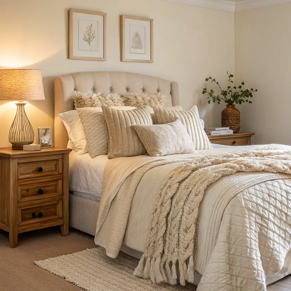
1. Soft Beige Serenity
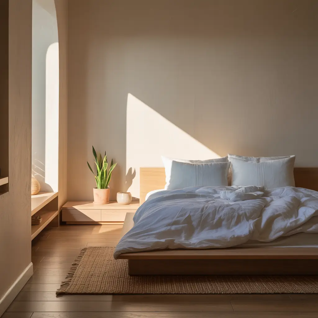
Soft beige is having a serious comeback, and honestly, it deserves it. This isn’t your grandma’s contractor beige – we’re talking about sophisticated, warm beiges that make bedrooms feel like expensive hotel rooms.
I fought against beige for years because of bad memories involving rental apartments and zero personality. Then I painted my bedroom Benjamin Moore’s “Cotton Balls” (terrible name, gorgeous color), and suddenly understood why designers never stopped loving beige. The color wraps the room in warmth without screaming for attention.
Making Beige Actually Serene
The soft beige success formula:
- Choose beiges with pink or yellow undertones
- Layer different beige shades for depth
- Add white bedding to brighten the space
- Include natural wood for texture
- Test in your actual lighting (crucial with beige)
My soft beige champions? Benjamin Moore “Cloud White” (barely beige but perfect), Sherwin-Williams “Accessible Beige” (warm and foolproof), and Farrow & Ball “String” (if you’re feeling fancy). Each creates that wrapped-in-cashmere feeling without looking dated.
The biggest beige mistake? Going too light thinking it’ll feel airy. Pale beige without proper undertones just looks like you forgot to finish painting. Go two shades darker than your gut says, and thank me later.
2. Warm Taupe Retreat
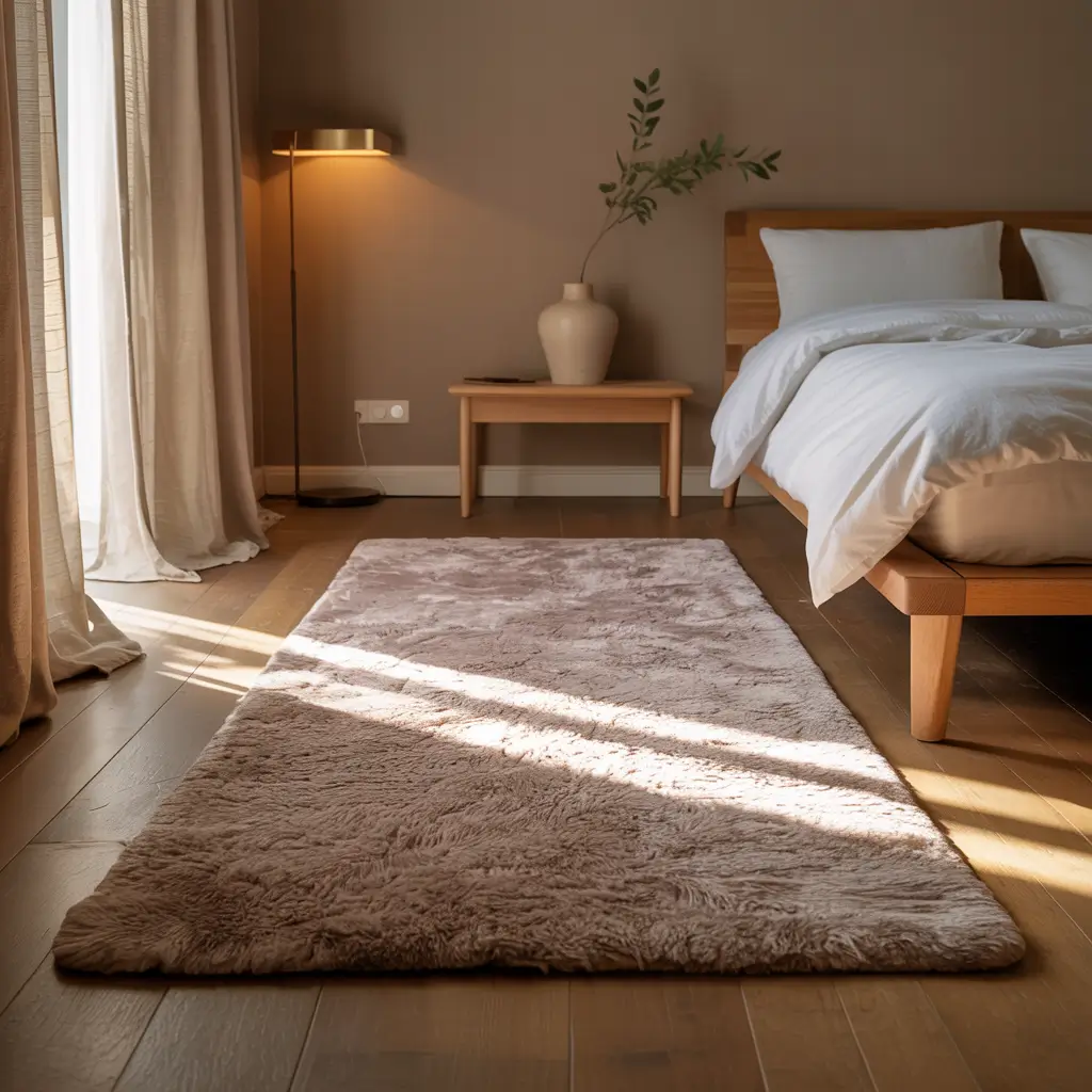
Taupe sits in that perfect spot between brown and gray, giving you warmth and sophistication simultaneously. It’s basically the Switzerland of paint colors – neutral but with character.
My master bedroom went taupe after I got tired of cool grays making the space feel like an office. Painted it Sherwin-Williams “Mega Greige,” and the transformation shocked me. Suddenly my bedroom felt cozy instead of clinical. Sometimes the right neutral fixes problems you didn’t know you had.
Taupe That Actually Works
Creating a warm taupe retreat:
- Choose taupe with brown undertones, not gray
- Pair with cream or ivory bedding
- Add warmth through textiles
- Include metal accents in brass or gold
- Layer lighting at multiple heights
The taupe colors worth trying? Sherwin-Williams “Mega Greige” (perfectly balanced), Benjamin Moore “Revere Pewter” (the internet’s favorite for good reason), or Behr “Sandstone Cliff” (warm and grounding). Each brings sophistication without coldness.
Temperature matters massively with taupe. Cool taupe feels corporate. Warm taupe feels like home. Hold your paint chip against pure white paper to see true undertones. This trick has saved me from many taupe disasters.
3. Crisp White Minimalist
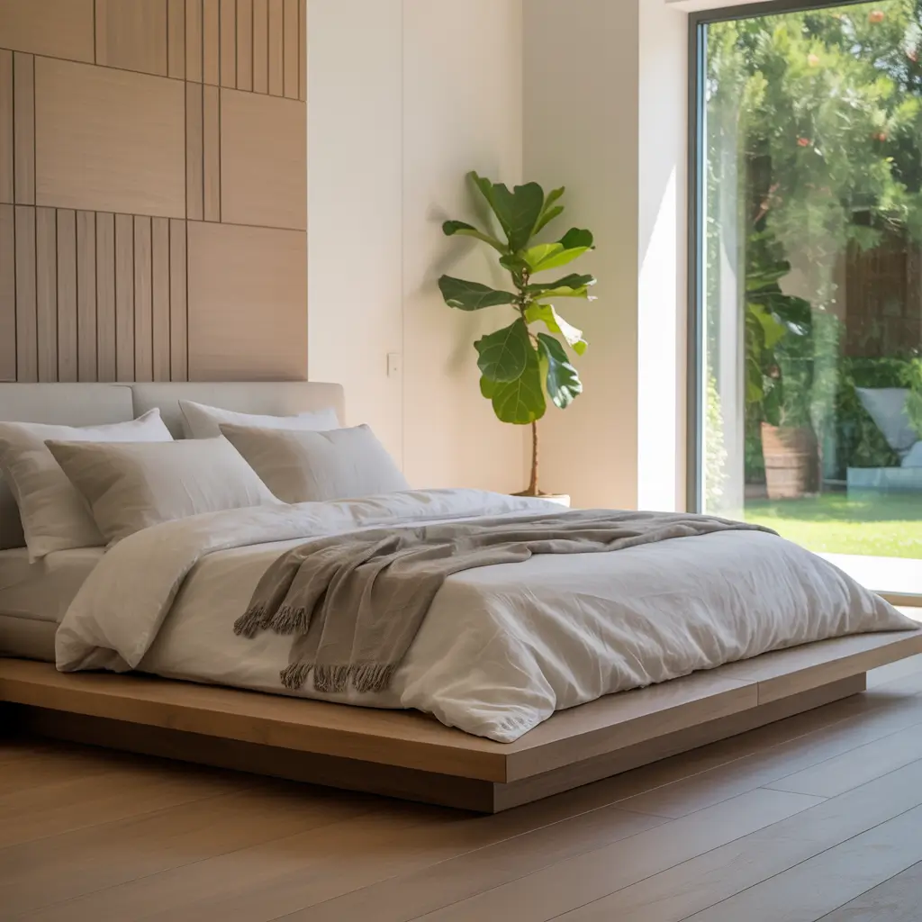
White bedrooms get hate for being too stark, but the right white creates the most serene, minimalist spaces imaginable. The key? Choosing warm whites, not hospital whites.
I painted my guest bedroom white after years of thinking white was boring. Used Benjamin Moore’s “White Dove” instead of pure white, and guests now ask to extend their stays. White done right feels clean and calming, not cold and sterile.
White Bedroom Excellence
Making white minimalist work:
- Choose warm whites with cream or yellow undertones
- Layer different white shades for depth
- Add texture through materials, not color
- Include natural elements for warmth
- Keep one or two accent colors max
My white paint winners? Benjamin Moore “White Dove” (perfect warm white), Sherwin-Williams “Alabaster” (creamy perfection), or Farrow & Ball “Pointing” (sophisticated warm white). Each creates calm without that dental office vibe.
The white bedroom trap? Thinking all whites are the same. They’re not. Cool whites look blue or gray next to warm whites. Sample extensively, and choose whites that make you feel calm, not anxious.
Also Read: 10 Cool Boys Bedroom Paint Colors Ideas for Modern Spaces
4. Greige Chic Bedroom
Greige (gray + beige) solves the eternal “gray or beige?” debate by choosing both. It’s the perfect neutral for commitment-phobes and people who can’t make decisions (guilty on both counts).
My bedroom’s been greige for three years – a personal record for me not repainting. The color reads as gray in morning light, beige in evening light. It’s like having two rooms for the price of one paint job. Efficiency at its finest.
Greige Bedroom Mastery
Creating greige chic:
- Choose greige with warm undertones (avoid cool greige)
- Layer both gray and beige accents
- Add warmth with wood tones
- Include varied textures
- Keep metals consistent (all warm or all cool)
The greige colors that deliver? Benjamin Moore “Balboa Mist” (perfect balance), Sherwin-Williams “Agreeable Gray” (warmer than it sounds), or Clare “Dirty Martini” (sophisticated and modern). Each creates that elusive perfect neutral.
Undertone consistency matters with greige. Your greige needs to play nice with your floors, furniture, and natural light. Test samples on all walls because greige can look completely different depending on light exposure.
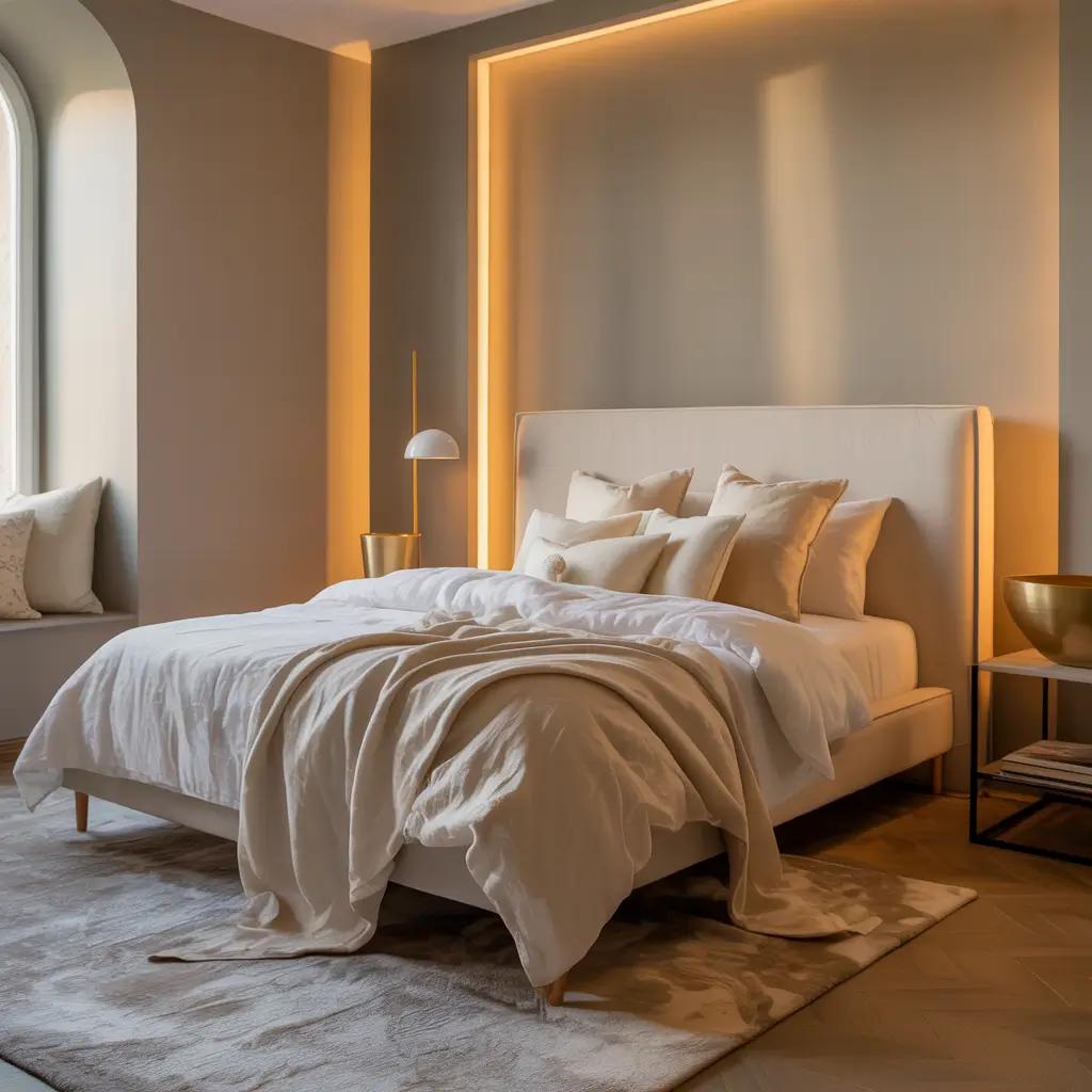
5. Cozy Cream Vibes
Cream brings all the warmth of beige with extra sophistication. It’s soft, inviting, and makes everything in your bedroom look more expensive.
I discovered cream’s magic when painting my bedroom for a home listing. The real estate agent insisted on cream, I wanted bold color. Cream won (professionals know things), and the room photographed beautifully. Never went back to bold after seeing how cream transformed the space.
Cream Bedroom Coziness
Making cream cozy, not boring:
- Select cream with yellow or pink undertones
- Layer with white for contrast
- Add deeper neutrals for grounding
- Include warm lighting
- Mix in metallic accents
My cream favorites? Benjamin Moore “Cream Fleece” (soft and warm), Sherwin-Williams “Natural Choice” (perfect cream), or Behr “Bit of Sugar” (sweet without saccharine). Each creates instant warmth.
The cream challenge? It shows dirt more than darker neutrals. But honestly, that’s motivation to keep your bedroom clean. Accidental life improvement through paint color choice 🙂
6. Subtle Sand Tones
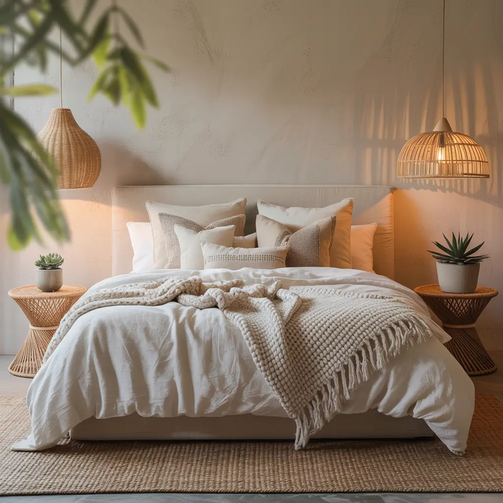
Sand colors bring beach vibes without the literal sand in your bed. These warm, earthy neutrals ground bedrooms in the best possible way.
My bedroom went sandy beige after a beach vacation where I slept better than I had in months. Couldn’t move to the beach (budget constraints), but I could definitely bring those colors home. Now my bedroom feels like a permanent vacation minus the sunburn.
Sand Tone Success
Creating sandy serenity:
- Choose sand with warm peachy undertones
- Mix with white and natural textures
- Add coastal-inspired accents sparingly
- Include natural fibers (jute, linen)
- Keep the vibe relaxed, not themed
The sand tones worth trying? Benjamin Moore “Sandy Hook Gray” (perfect sand), Sherwin-Williams “Kilim Beige” (warm and versatile), or Farrow & Ball “String” (sophisticated sand). Each captures that beachy calm without looking like a theme park.
Skip the seashell decor. Let the color do the work. Sand tones create coastal vibes without needing anchors and “Beach” signs everywhere. Subtlety is your friend here.
Also Read: 10 Fresh Bedroom Wall Paint Colors Ideas and Stylish Touches
7. Elegant Stone Hues
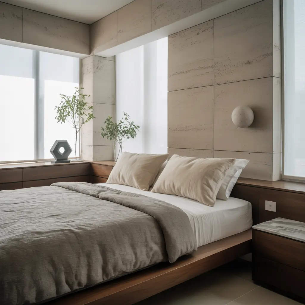
Stone colors bring architectural sophistication that makes bedrooms feel intentional and designed. These cool-toned neutrals work in any style from modern to traditional.
I painted my bedroom a stone gray after touring a boutique hotel with the most elegant rooms I’d ever seen. Matched the color at the paint store (not creepy, just resourceful), and suddenly my bedroom looked like it belonged in a design magazine instead of a basic apartment.
Stone Color Sophistication
Making stone hues elegant:
- Choose stone colors with subtle warmth
- Pair with crisp whites
- Add texture through materials
- Include one warm element
- Layer different stone shades
My stone color picks? Benjamin Moore “Stonington Gray” (classic stone), Sherwin-Williams “Mindful Gray” (warm stone), or Behr “Dolphin Fin” (perfect medium stone). Each brings elegance without coldness.
The trick with stone colors? They need warm lighting to avoid feeling cold. LED bulbs make stone look flat. Warm incandescent or warm LED bulbs bring out the subtle warmth in stone colors. Small detail, massive difference.
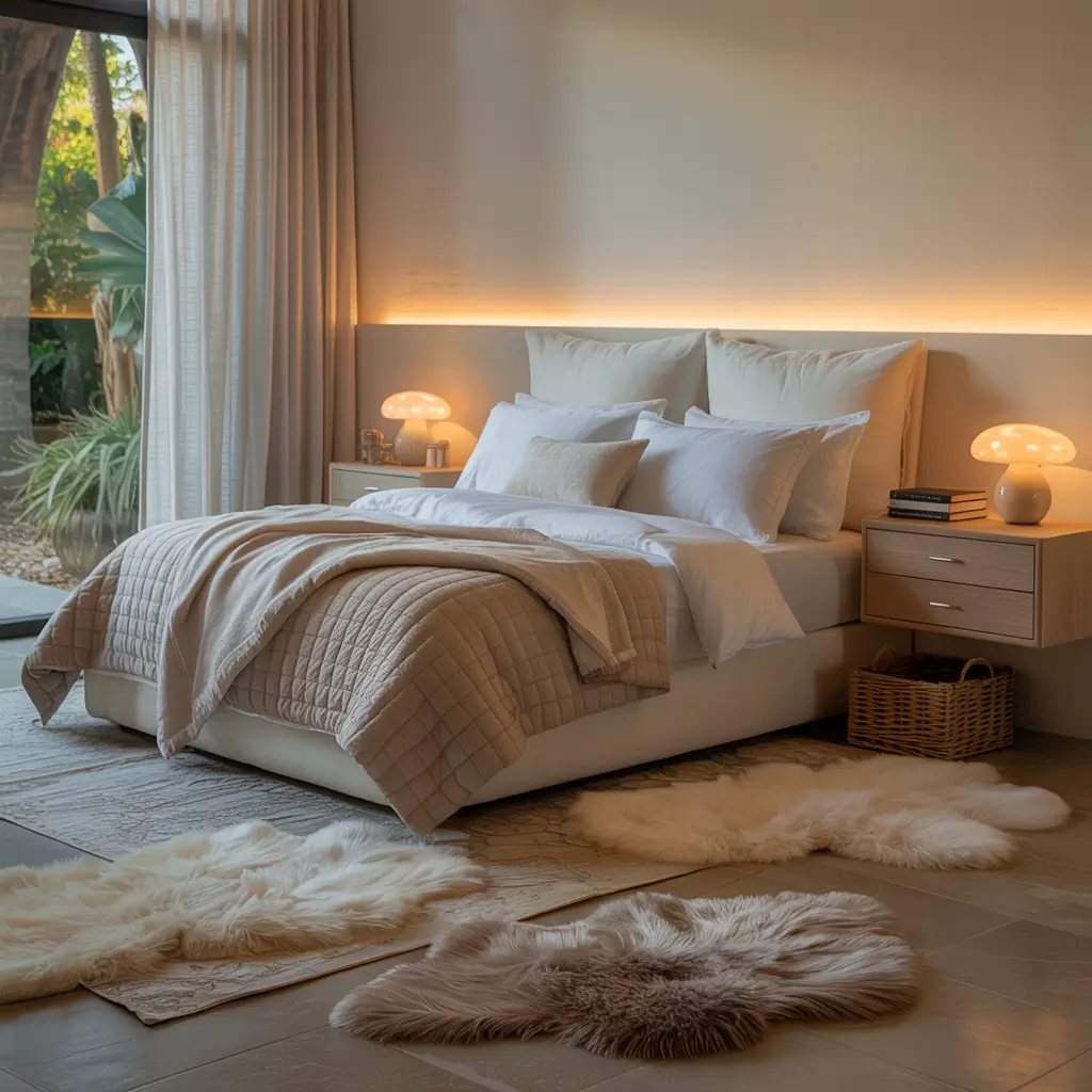
8. Calm Mushroom Shades
Mushroom might sound weird, but these greige-taupe hybrids create the calmest bedrooms imaginable. They’re sophisticated, current, and work with absolutely everything.
My friend’s bedroom went from chaotic blue to mushroom, and her sleep improved dramatically. The color has this grounding quality that just makes you want to relax. Sometimes the right neutral is better than melatonin.
Mushroom Color Magic
Creating mushroom calm:
- Select mushroom with brown-gray undertones
- Layer with cream and white
- Add natural wood elements
- Include cozy textures
- Keep patterns minimal
The mushroom shades that work? Sherwin-Williams “Perfect Greige” (mushroomy perfection), Benjamin Moore “Elmira White” (soft mushroom), or Clare “Penthouse” (modern mushroom). Each creates instant serenity.
Mushroom works in any bedroom because it’s truly neutral. North-facing room? Works. South-facing? Also works. It’s the chameleon of paint colors, adapting to whatever light you give it.
9. Classic Ivory Escape
Ivory sits between white and cream, giving you brightness with warmth. It’s classic, timeless, and never looks dated no matter how trends change.
I’ve had ivory in three different bedrooms across ten years. The color never gets old because it’s genuinely timeless. While everyone else repaints to keep up with trends, ivory just keeps working year after year.
Ivory Bedroom Elegance
Making ivory work:
- Choose ivory with warm yellow undertones
- Use varying shades for depth
- Add contrast through furniture
- Include metallic accents
- Keep bedding white or cream
My ivory champions? Benjamin Moore “Linen White” (perfect ivory), Sherwin-Williams “Divine White” (warm ivory), or Farrow & Ball “Slipper Satin” (luxe ivory). Each creates classic beauty.
The beauty of ivory? It makes everything else in your room look better. Your furniture looks richer, your bedding looks crisper, your art looks more expensive. It’s the supporting actor that makes everyone else shine.
Also Read: 12 Chic Blue Paint Colors for Bedroom Ideas and Stylish
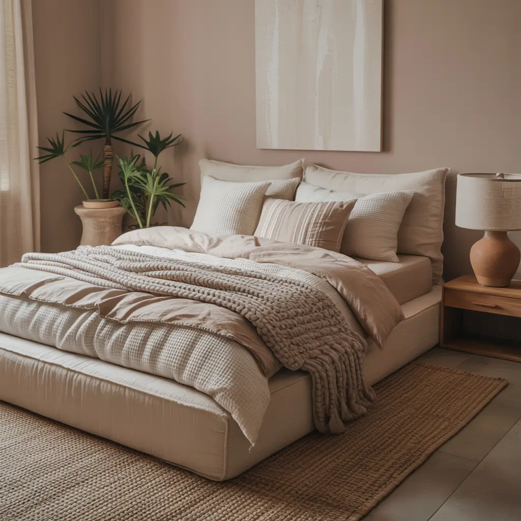
10. Light Mocha Ambiance
Light mocha brings coffee shop coziness home. These warm brown-tinged neutrals create the most inviting bedrooms without being too dark.
My bedroom went light mocha during a cold winter when I needed all the warmth I could get. The color literally felt warmer than my previous gray walls. Paint can’t change actual temperature, but it definitely affects perceived warmth.
Mocha Bedroom Warmth
Creating mocha ambiance:
- Select mocha with warm brown undertones
- Pair with cream and ivory
- Add darker brown accents
- Include warm metals
- Layer warm lighting
The mocha colors worth considering? Sherwin-Williams “Kilim Beige” (mocha-ish beige), Benjamin Moore “Smokey Taupe” (light mocha), or Behr “Coffee with Cream” (perfect name, perfect color). Each brings that cozy coffee shop feeling.
Light mocha works best in rooms with good natural light. In dark rooms, it can feel heavy. Test extensively if your bedroom doesn’t get much sun. Or embrace the cozy cave vibe. Both are valid choices, IMO.
11. Muted Clay Haven
Clay colors bring earthy sophistication that’s having a major moment. These terracotta-adjacent neutrals add warmth and personality without being too bold.
I painted my bedroom clay after seeing it everywhere on Pinterest and wondering if it was just trendy or actually good. Two years later, still love it. Turns out, some trends stick around because they genuinely work.
Clay Color Creation
Making muted clay work:
- Choose clay with muted, not bright, tones
- Balance with plenty of cream
- Add natural textures
- Include plants for life
- Keep metals warm
My clay picks? Sherwin-Williams “Cavern Clay” (muted perfection), Benjamin Moore “Sycamore” (sophisticated clay), or Clare “Matcha Latte” (olivey clay). Each brings warmth without overwhelming.
The clay trend might eventually fade, but muted clay stays neutral enough to transcend trends. It’s bold enough to have personality but neutral enough to work long-term. Best of both worlds.
12. Timeless Putty Palette
Putty sits in that perfect neutral zone – not quite beige, not quite gray, just perfectly balanced. It’s the ultimate timeless neutral that works forever.
My bedroom’s been putty for four years because I literally can’t find anything better. The color works with every season, every style change, every new bedding purchase. It’s the neutral that keeps on giving.
Putty Perfection
Creating timeless putty bedrooms:
- Select putty with balanced undertones
- Layer multiple neutral shades
- Add interest through texture
- Include varied materials
- Keep the overall vibe calm
The putty colors that deliver? Benjamin Moore “Collingwood” (perfect putty), Sherwin-Williams “Versatile Gray” (putty-ish gray), or Behr “Cotton Grey” (soft putty). Each creates that perfect forever neutral.
The test of timeless? Can you see this color working in ten years? With putty, the answer is always yes. It’s not trendy, not dated, just consistently good. Sometimes boring reliability is exactly what your bedroom needs.
Your Perfect Neutral Journey
Here’s what I’ve learned from my neutral bedroom adventures: neutral bedroom paint colors work because they don’t fight with your life.
They create a backdrop that lets you sleep, think, change your mind, and evolve without requiring a repaint.
The best neutral for your bedroom? The one that makes you feel calm when you walk in and peaceful when you wake up. Test everything.
Live with samples for at least a week. See them in morning light, afternoon sun, and lamplight. The neutral that still feels right after seven days of staring? That’s your winner.
Remember, neutrals aren’t boring – they’re versatile. They let you change your bedding, art, and furniture without clashing. They grow with your style instead of locking you in. That’s not boring; that’s smart.
Now excuse me while I go look at paint samples again. Just discovered three new neutrals I haven’t tried yet, and my walls are looking suspiciously ready for experiment number six.
My partner says I have a problem. I say I’m conducting important research. Happy painting, and may your neutrals be anything but boring!