10 Trendy Bookshelf Wallpaper Ideas and Wall Styling Secrets
- Bookshelf Styling
 Ben
Ben- 0
- 42 minutes read
You’ve got a bookshelf that works perfectly fine, holds all your books, does its job – but something about it feels flat. Like a pizza without toppings. Functional, sure, but missing that extra magic. Here’s the secret most design blogs won’t tell you straight: the wall behind your bookshelf matters just as much as the shelf itself.
I figured this out after spending three months styling and restyling my living room bookcase. Moved books around, added plants, swapped decor pieces – nothing clicked. Then I put up a bold geometric wallpaper behind it, and suddenly everything made sense. That single wall treatment transformed my boring bookshelf into the focal point everyone notices first when walking through my front door.
Bookshelf wallpaper ideas aren’t just about decoration. They’re about creating depth, contrast, and personality that shelves alone can’t deliver. Whether you rent and need something temporary or own your place and want to go all out, these wall styling secrets will completely change how your bookshelves look and feel.
Floating Shelf Wallpaper Backdrops
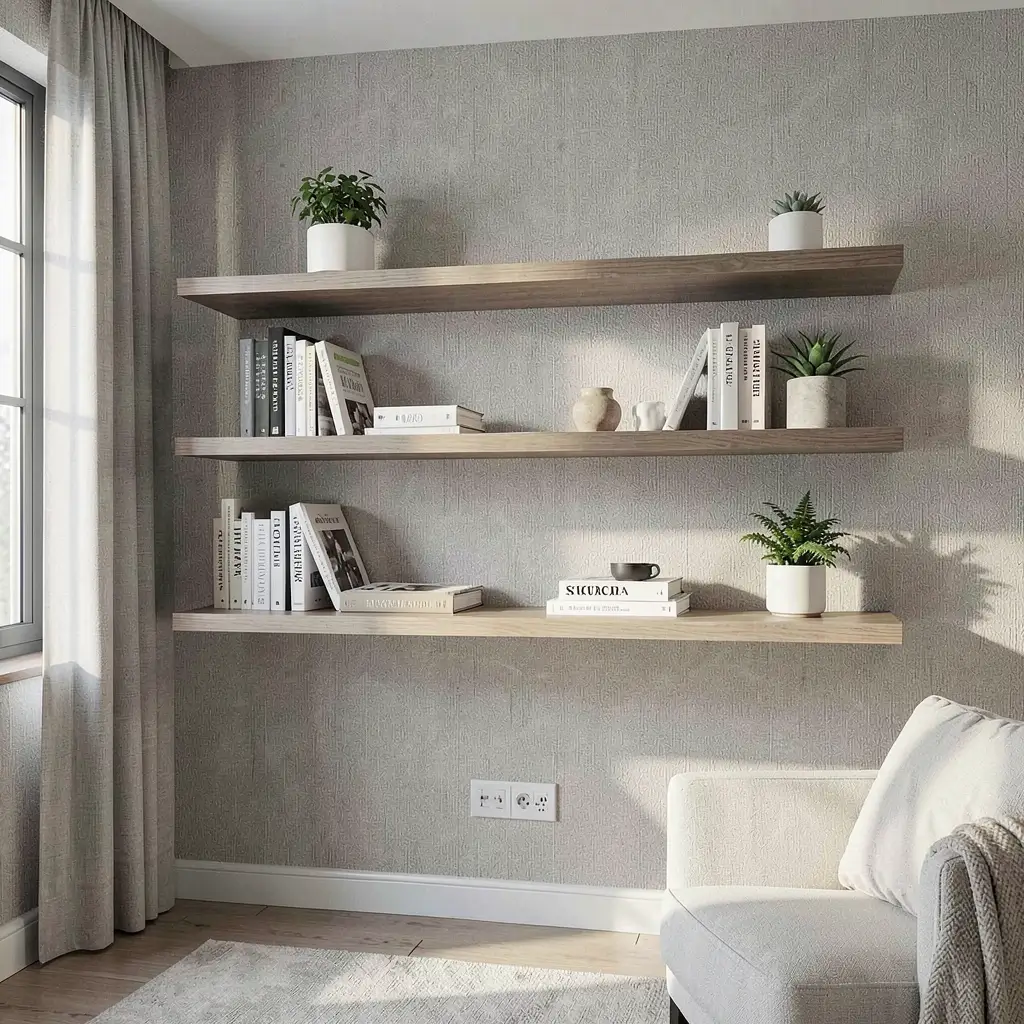
Floating shelves against wallpaper backdrops create this layered effect that makes flat walls look three-dimensional. I discovered this combo when my bare white wall made my walnut floating shelves look lonely and disconnected.
The wallpaper acts like a stage curtain, giving your floating shelves context and visual grounding. Without it, shelves can feel random – just wood sticking out of drywall. With the right backdrop? They become part of a designed composition.
Choosing Backdrops for Floating Shelves
Not every wallpaper works behind floating shelves:
- Medium-scale patterns complement without competing
- Solid textures add depth subtly
- Vertical stripes make walls feel taller
- Muted tones let shelf contents shine
- Subtle metallics catch light around shelf edges
I made the mistake of choosing a loud tropical print behind narrow shelves. The books practically disappeared against the pattern chaos. Lesson learned: your backdrop should support, not steal the show.
Installation Strategy
Smart placement makes the difference:
- Wallpaper the entire wall for cohesion
- Create a panel just behind the shelf area
- Extend 6 inches beyond shelves on each side
- Match pattern alignment across shelf breaks
- Consider peel-and-stick for easy updates
My current setup uses a subtle linen-textured wallpaper behind three staggered floating shelves. The texture catches light differently throughout the day, making the same wall feel dynamic without screaming for attention.
Minimalist Monochrome Bookshelf Walls
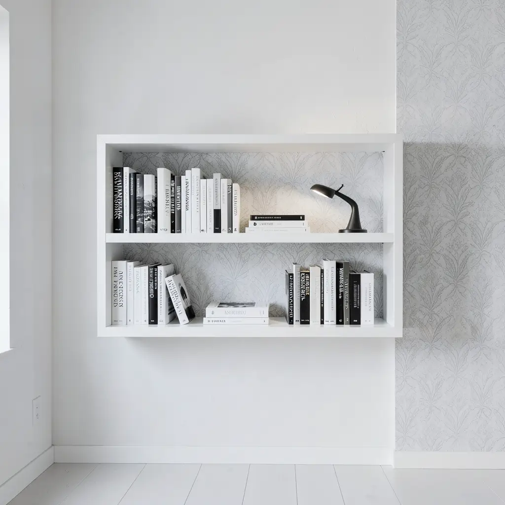
Minimalist monochrome bookshelf walls prove that one color family can create stunning impact when you layer it thoughtfully. I went full monochrome in my office – black wallpaper, dark gray shelves, books arranged by shade – and the effect is honestly kind of dramatic.
Ever noticed how black-and-white photos feel more artistic than color ones? The same principle applies to bookshelf walls. Removing color forces your eye to notice shapes, textures, and compositions you’d otherwise overlook.
Building Your Monochrome Palette
Choose your base and build from there:
- Black backgrounds with white shelves for maximum contrast
- Warm grays for sophisticated subtlety
- All white with cream and ivory variations
- Charcoal tones for moody atmospheres
- Navy-to-white for a monochrome twist
My office uses charcoal grasscloth wallpaper behind matte black shelves. Books with white and gray spines pop against the dark background like stars in a night sky.
Making Monochrome Interesting
Prevent monochrome from feeling flat:
- Mix textures aggressively (smooth, rough, woven)
- Vary finishes between matte and glossy
- Include metallic accents for punctuation
- Play with scale using large and small objects
- Add one natural element like a plant
The danger of monochrome? It can feel sterile if you don’t layer enough textures. My grasscloth wallpaper provides woven texture, while a small potted fern adds organic relief.
Boho Patterned Bookshelf Corners
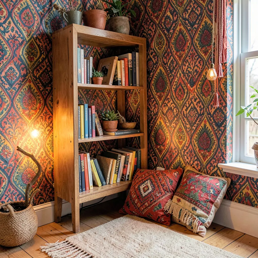
Boho patterned wallpaper behind bookshelf corners creates those warm, eclectic spaces that feel like they evolved naturally over years of travel and collecting. My reading corner went from boring to bohemian with one roll of Moroccan-inspired wallpaper.
The beauty of boho patterns lies in their deliberate imperfection. They celebrate hand-drawn lines, organic shapes, and cultural influences that mass-produced geometric prints can’t replicate. Behind a bookshelf, these patterns add layers of visual interest that complement rather than clash with collected objects.
Selecting Boho Patterns
Find patterns that breathe:
- Moroccan tile motifs for Mediterranean vibes
- Block print designs for Indian inspiration
- Ikat patterns for textile-based warmth
- Mandala prints for spiritual spaces
- Paisley variations for classic bohemian
FYI, the trick to boho wallpaper is choosing warm undertones. Cool-toned patterns read more modern than bohemian, even if the design itself feels organic.
Styling the Boho Corner
Layer elements that enhance the pattern:
- Woven baskets echoing textile motifs
- Brass or copper bookends and accents
- Crystals and stones for natural elements
- Macramé details on nearby hooks
- Colorful book spines complementing the palette
I styled my boho corner with vintage travel books and a small collection of brass figurines from flea markets. Everything feels curated over time, which is exactly the boho spirit.
Also Read: 10 Trendy Wooden Bookshelf Ideas to Refresh Your Room
Vintage Library Wallpaper Themes
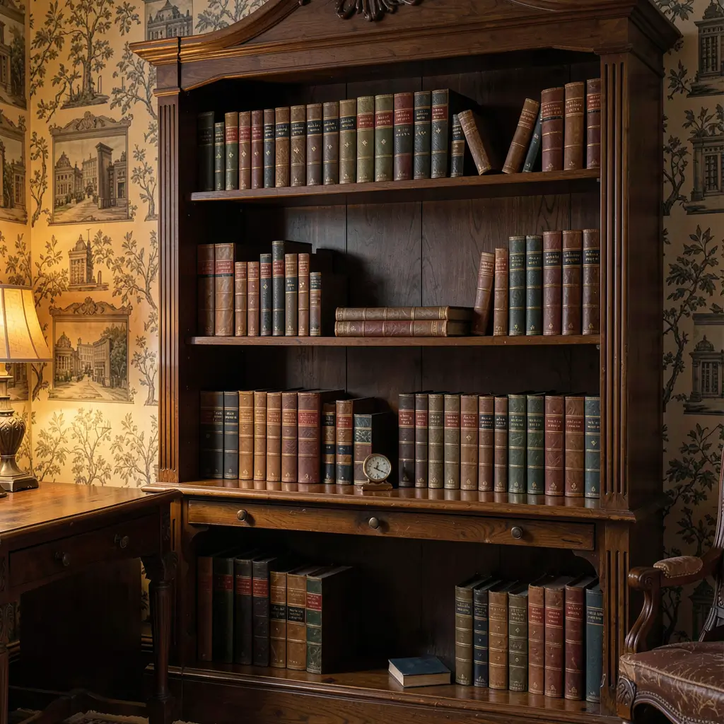
Vintage library wallpaper creates instant old-world sophistication that makes your actual bookshelf feel like an extension of an aristocratic collection. I put a faux library wallpaper in my guest room, and every visitor asks if those painted books are real.
These wallpapers come in two varieties: trompe l’oeil prints that realistically depict book spines, and vintage-inspired patterns featuring literary motifs like antique typography and manuscript illustrations. Both create atmosphere that modern prints simply can’t match.
Types of Library-Themed Wallpapers
Explore different approaches:
- Trompe l’oeil bookshelves for realistic illusions
- Antique map patterns for exploratory themes
- Manuscript and script designs for literary vibes
- Old newspaper prints for editorial aesthetics
- Vintage botanical plates for natural history
I chose an antique map wallpaper behind my study bookshelf. It creates this sense that every book on those shelves contains adventures waiting to unfold.
Placement and Pairing Wisdom
Make vintage themes work authentically:
- Pair with dark wood shelving for cohesion
- Use warm lighting to enhance aged tones
- Include actual vintage books for layered authenticity
- Add brass fixtures matching the era
- Frame the wallpaper with molding for a panel effect
The worst thing you can do? Put modern IKEA shelving against ornate vintage wallpaper. The style clash creates confusion rather than character. Match your eras, at least loosely.
Nature-Inspired Bookshelf Murals
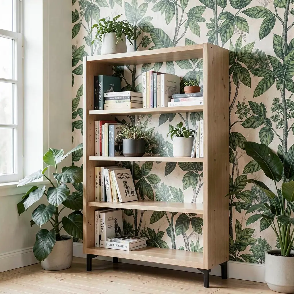
Nature-inspired murals behind bookshelves transform your wall into a window overlooking forests, gardens, or mountain landscapes. My bedroom bookshelf sits against a watercolor forest mural, and I genuinely feel calmer every time I reach for a book.
These murals work because they create visual depth that extends beyond your physical wall. Your bookshelf becomes a foreground element in a larger scene, adding dimension that solid colors or small patterns can’t achieve.
Choosing Your Natural Scene
Different scenes serve different moods:
- Dense forests for cozy enclosure
- Ocean horizons for calming openness
- Botanical gardens for lush detail
- Mountain ranges for dramatic scale
- Meadow wildflowers for cheerful lightness
I tested three different murals using digital mockups before committing. The forest won because it made my small bedroom feel like a woodland cabin retreat.
Mural and Shelf Integration
Merge your mural with actual shelving:
- Align shelf placement with mural horizon lines
- Let the mural peek through open shelf spaces
- Choose shelf colors that blend with the scene
- Style with natural objects that echo the mural
- Use plants that match the depicted ecosystem
My forest mural peeks through between books, creating glimpses of painted trees that blend with the real pothos trailing from the top shelf. Visitors take a second to figure out where the mural ends and reality begins.
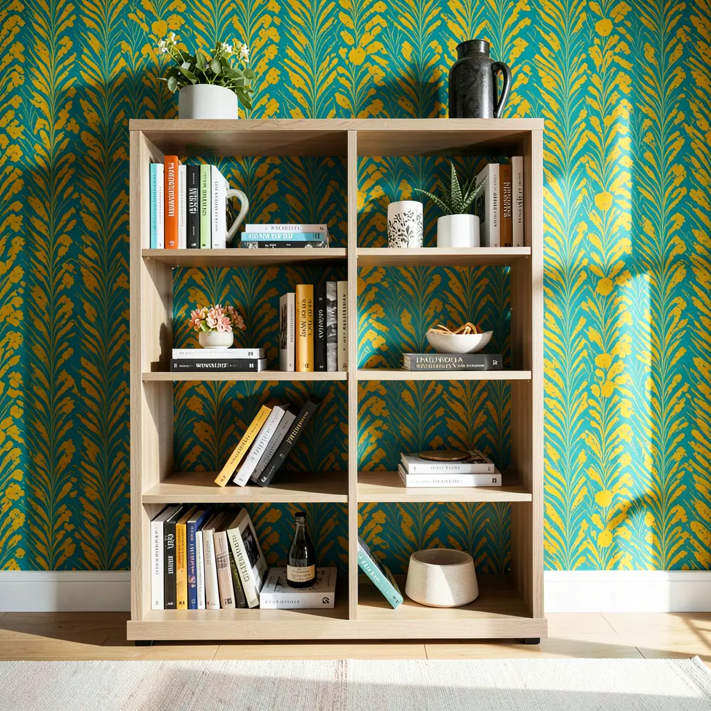
Geometric Accent Wallpaper Behind Shelves
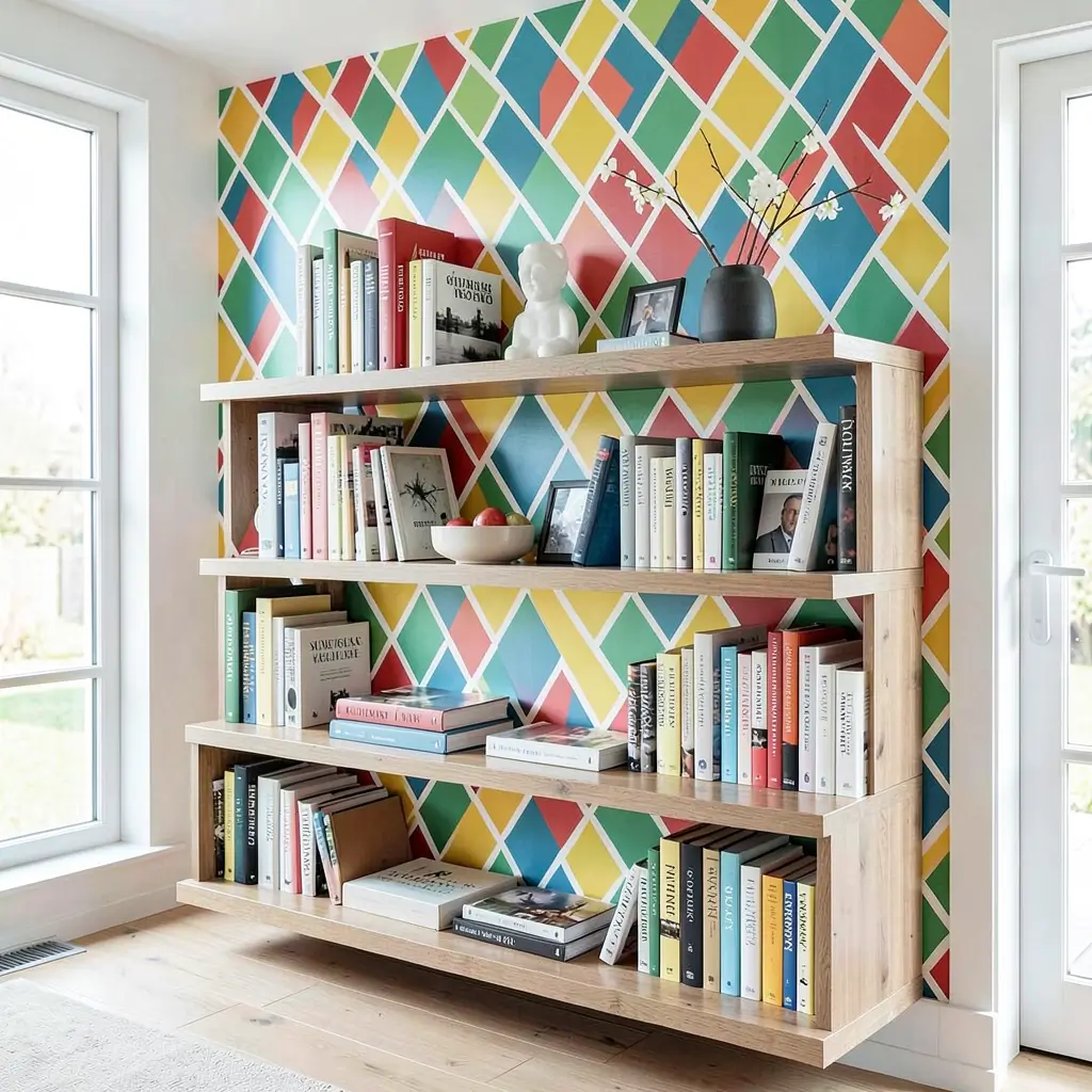
Geometric accent wallpaper behind bookshelves adds structure and rhythm that amplifies your shelf styling. I’m slightly obsessed with geometric patterns, and putting them behind shelving creates this organized energy that makes even messy bookshelves look intentional.
The angular precision of geometric wallpaper contrasts beautifully with the organic shapes of books, plants, and decorative objects on your shelves. It’s that sweet spot where order meets personality.
Geometric Patterns That Work
Choose based on your room’s existing energy:
- Hexagons for honeycomb warmth
- Chevrons for dynamic movement
- Diamonds for Art Deco sophistication
- Triangles for contemporary edge
- Overlapping circles for softer geometry
My home office features a muted gold hexagon wallpaper behind white shelves. The geometric structure makes my chaotic book collection look deliberately eclectic rather than randomly scattered.
Scale and Color Considerations
Getting geometry right requires attention to:
- Large-scale patterns for spacious walls
- Small-scale patterns for compact areas
- High contrast for bold statements
- Low contrast for subtle texture
- Metallic elements for added dimension
IMO, the scale of your pattern should inversely relate to your shelf depth. Deep shelves handle large patterns well because you see less wallpaper between items. Shallow shelves need smaller patterns that remain readable in narrow glimpses.
Also Read: 10 Amazing Vintage Bookshelf Ideas for Timeless Style
Ombre Gradient Bookshelf Designs
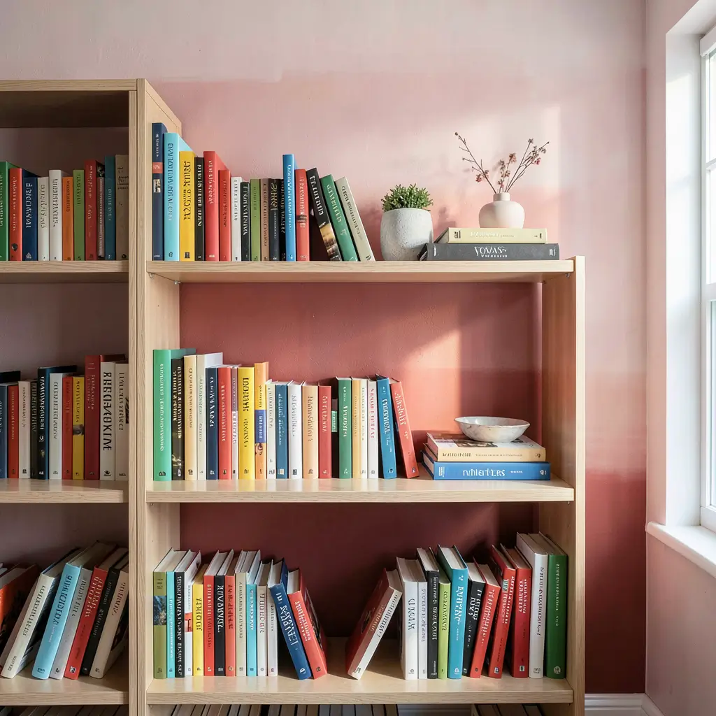
Ombre gradient wallpaper behind bookshelves creates a color journey that adds movement and emotion to static shelving. I tried this in my reading nook and nearly cried at how perfect it looked. No exaggeration – it’s that good.
Gradients work because they mimic natural phenomena like sunsets and ocean depths. Your brain reads them as calming transitions rather than static color blocks. Behind a bookshelf, this gradual shift creates a backdrop that enhances displayed items without fighting them for attention.
Popular Gradient Directions
Each direction changes the mood:
- Top-to-bottom dark to light opens up space
- Bottom-to-top light to dark grounds furniture
- Side-to-side creates lateral movement
- Center outward spotlights the middle shelf
- Corner radiating draws eyes to focal points
I went with a deep teal fading to soft mint from bottom to top. The dark base grounds my bookshelf while the light top makes my ceiling feel higher. Win-win.
Coordinating Books with Gradients
Take it further by matching content:
- Arrange book spines to echo the gradient
- Transition decorative objects from dark to light
- Place darker items against lighter wallpaper sections
- Let lighter objects sit against darker areas
- Use the gradient as an organizing principle
My books roughly follow the gradient from dark leather-bound volumes at the bottom to pastel paperbacks at the top. The coordination looks intentional and creates visual harmony that random arrangement never achieves.
Bold Color Pop Wallpaper Ideas
Sometimes you just need to be loud. Bold color pop wallpaper behind bookshelves announces your personality without apology. I put electric blue wallpaper behind my white bookshelf, and it’s basically the first thing anyone comments on when entering my apartment.
Bold colors work behind bookshelves because the shelf contents break up the intensity. Without books and objects, a neon wall might overwhelm. With them, the color peeks through gaps and frames objects, creating energy without causing visual headaches.
Colors That Pack a Punch
Choose your statement wisely:
- Emerald green for sophisticated drama
- Electric blue for modern energy
- Hot pink for fearless personality
- Burnt orange for warm intensity
- Deep purple for creative spaces
My electric blue choice surprised even me. I almost chickened out and went with safe gray, but life’s too short for boring walls behind boring bookshelves.
Balancing Bold Backdrops
Keep bold walls from overwhelming:
- Use neutral shelving against vivid walls
- Include white objects for visual breaks
- Add metallic accents that reflect color
- Incorporate the wall color in small shelf details
- Ensure adequate lighting to prevent cave effects
The balancing act is real. Too many colorful objects against a bold wall creates visual noise. I keep about 40% of my shelf items neutral to let the wallpaper breathe.
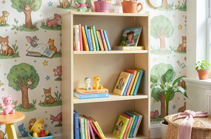
Illustrated Storybook Wallpaper Panels
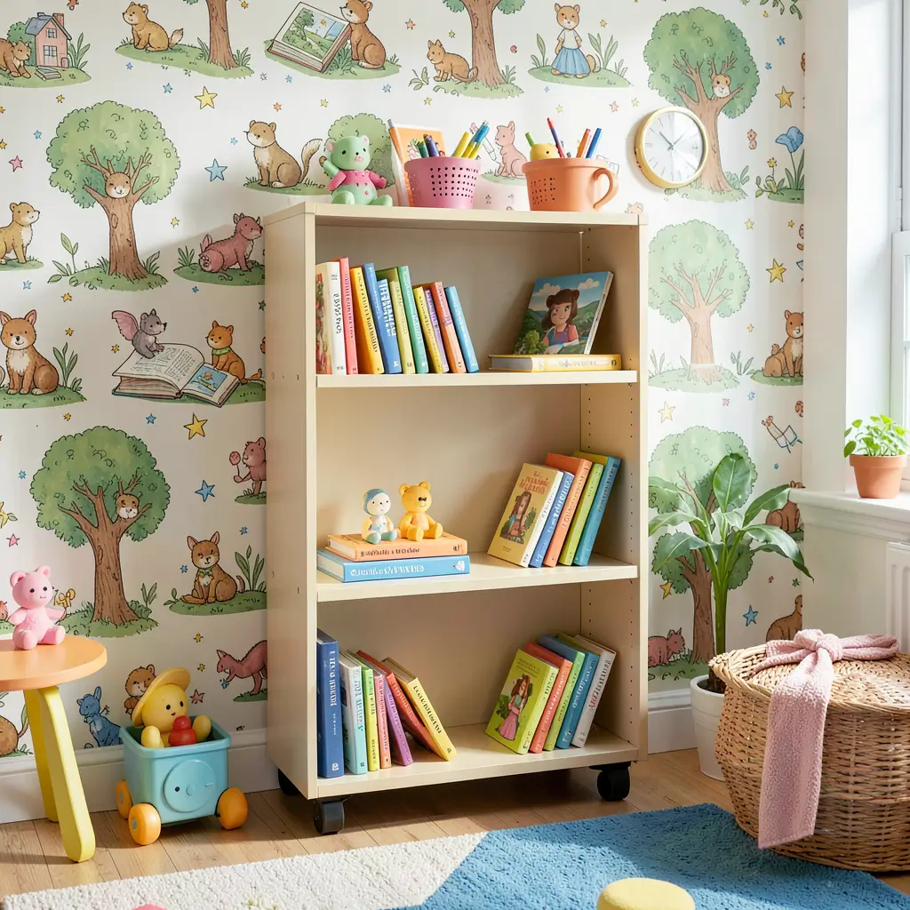
Illustrated storybook wallpaper transforms bookshelf walls into narrative experiences. My daughter’s room features a hand-illustrated woodland scene behind her bookshelves, and she “reads” the wall as often as she reads her actual books.
These wallpapers work brilliantly in children’s spaces, reading rooms, and creative offices where imagination matters. They create environments that inspire storytelling beyond what’s printed on pages.
Finding the Right Illustration Style
Match the art to your space’s personality:
- Watercolor illustrations for dreamy softness
- Pen and ink drawings for detail lovers
- Digital art prints for modern clarity
- Folk art styles for cultural richness
- Whimsical cartoons for playful spaces
I commissioned a local artist to create a custom illustration that we then had printed as wallpaper. It cost more than off-the-shelf options, but the result is truly one-of-a-kind.
Integrating Story and Storage
Make illustrations and shelves work together:
- Position shelves at natural break points in the image
- Let illustrations flow above and below shelves
- Match book themes to illustrated scenes
- Use shelf styling that complements the art style
- Treat shelves as part of the illustration’s world
My daughter’s woodland mural continues behind her shelf brackets, making her books look like they’re nestled among illustrated trees. The boundary between wallpaper and bookshelf disappears completely.
Also Read: 10 Beautiful Mini Bookshelf Ideas for Elegant Corners
Textured 3D Effect Bookshelf Walls
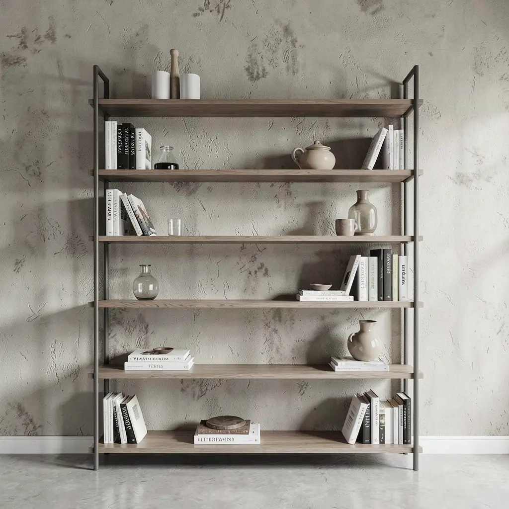
Textured 3D effect wallpaper behind bookshelves adds physical dimension that flat prints can’t replicate. I touched a faux brick wallpaper at a friend’s house and did a genuine double-take – it felt real enough to fool anyone standing more than three feet away.
These wallpapers use embossing, raised patterns, and tactile surfaces to create depth you can actually feel. Behind a bookshelf, they add an architectural element that makes your storage feel built into the wall rather than placed against it.
Textured Options Worth Considering
Each texture creates different vibes:
- Faux brick for urban loft feelings
- Stone patterns for rustic weight
- Wood plank effects for cabin warmth
- Concrete textures for industrial edge
- Woven grasscloth for organic softness
My home office uses a faux concrete textured wallpaper that makes my wooden shelves pop dramatically. The contrast between rough wall texture and smooth wood creates visual tension that keeps the space interesting 🙂
Making Textures Practical
Consider these practical elements:
- Durability varies widely between products
- Cleaning requirements differ by texture
- Installation complexity increases with depth
- Lighting dramatically affects texture visibility
- Shelf mounting may need longer hardware
I needed longer screws for my shelf brackets because the textured wallpaper added nearly a quarter inch of material. Small detail, but ignoring it means wobbly shelves and regret.
Making Your Wallpaper Choice Count
After transforming multiple walls across three apartments and one house, I can confidently say that bookshelf wallpaper is the single most impactful upgrade you can make to your shelving. It costs less than new furniture, takes a weekend to install, and completely redefines how your room feels.
The key takeaway from all ten ideas? Your wall is not just a background – it’s part of the design. Whether you choose a bold color pop, a subtle texture, or an illustrated storybook scene, that wall treatment elevates everything sitting in front of it.
Start by identifying your room’s current energy. Calm space that needs life? Go bold or geometric. Busy room that needs grounding? Try monochrome or ombre. Creative space needing inspiration? Illustrated panels or nature murals will deliver.
Don’t overthink it, though. The best wallpaper choice is the one that makes you excited to walk into your room. Trust your gut, grab some samples, hold them behind your shelf, and see what sparks joy. Your bookshelf has been waiting for this upgrade – and once you see the transformation, you’ll wonder why you ever settled for a plain white wall behind your books.
Now go transform that wall. Your books deserve a better stage.