10 Trending Small Shop Design Ideas for Fresh Store Looks
- Shop Design
 Ben
Ben- 0
- 50 minutes read
Look, I get it—you’ve got a small shop space, and you’re staring at those four walls wondering how on earth you’re going to make this tiny spot look like the trendy boutiques you see on Instagram. Been there, scrolled through that. The good news? Small doesn’t mean boring, cramped, or forgettable. Actually, some of the coolest shops I’ve visited were practically closet-sized, yet they packed more personality than those sprawling megastores.
So let’s talk real solutions here. I’m sharing ten design ideas that actually work for small shops—no fantasy budgets required, no impossible Pinterest dreams. These are practical, trendy approaches that’ll give your store a fresh look without making you remortgage your house. Ready to transform that space?
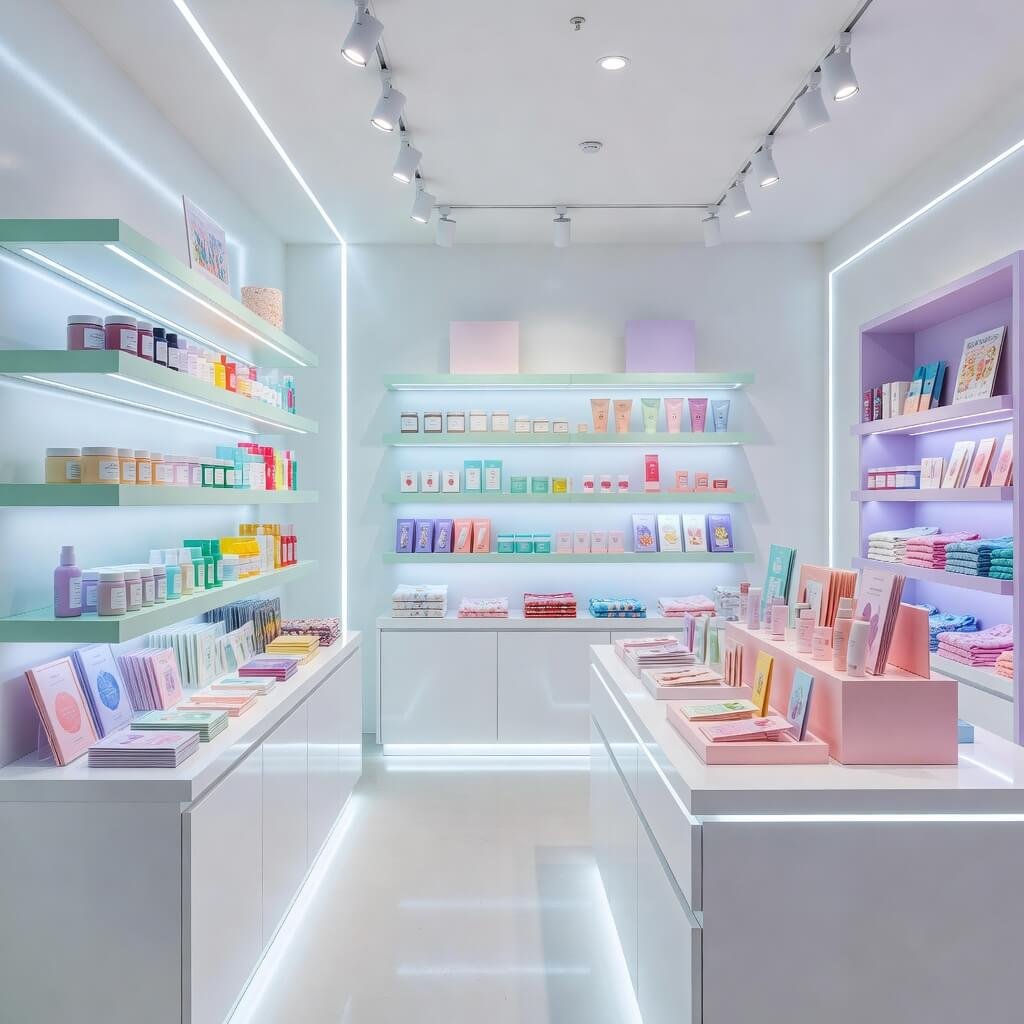
Minimal Modern Small Boutique Shop Layout Ideas
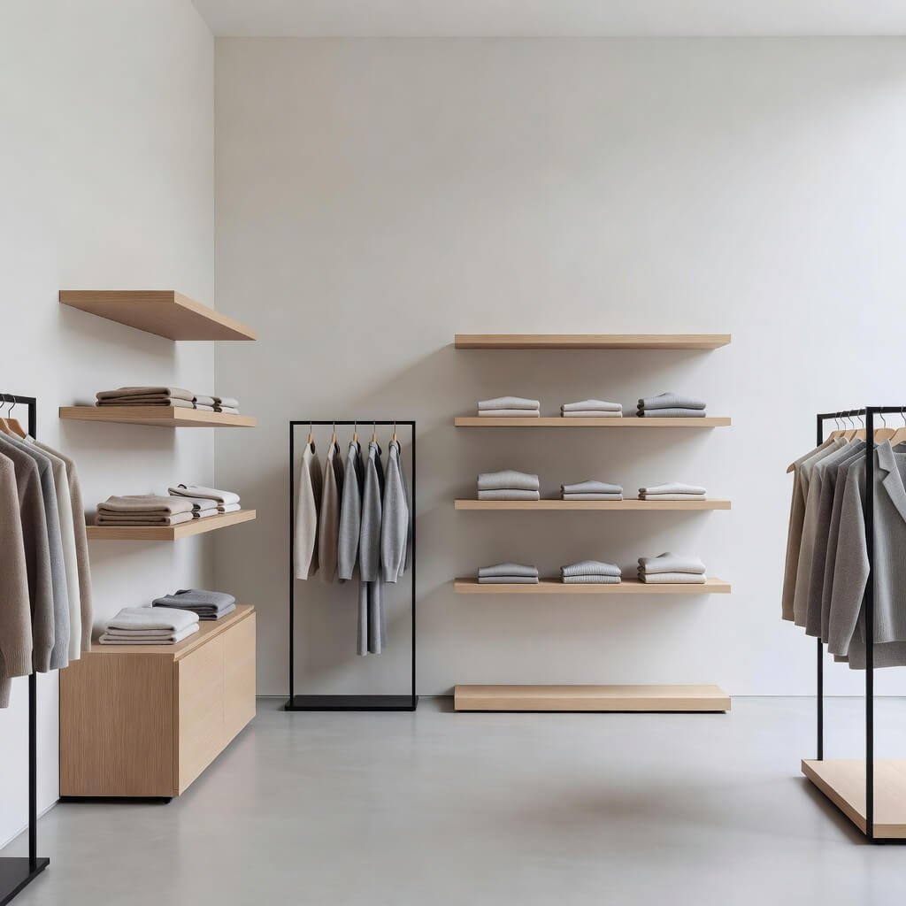
You know what’s hilarious? People think minimalism means “boring white box with three items inside.” Wrong. Minimalism is about intentional design, and honestly, it’s a small shop owner’s secret weapon.
When you work with limited square footage, every single element needs to earn its place. I learned this the hard way when I helped my friend redesign her accessories boutique. We started by ripping out all the cluttered fixtures she’d inherited from the previous tenant. The transformation was insane.
Here’s what makes minimal modern layouts work:
Strategic Product Placement
- Display fewer items but showcase them properly
- Use clean lines and geometric shelving units
- Keep walkways clear and unobstructed
- Let negative space breathe around products
Color Palette Discipline
- Stick to 2-3 main colors maximum
- White, grey, and one accent color is your best friend
- Match your fixtures to your color scheme
- Keep flooring simple and monochromatic
The psychology behind this? Your customers’ eyes don’t know where to look when there’s visual chaos everywhere. A minimal layout guides their attention exactly where you want it. Plus, it photographs beautifully for social media—and let’s be real, that matters now.
One thing I absolutely love about minimal modern design is the flexibility. You can easily swap out accent colors seasonally without a complete overhaul. Spring pastels? Done. Fall earth tones? Easy. Your shop stays fresh without constant expensive renovations.
Budget Friendly Small Retail Shop Design Concepts
Okay, can we talk about budget for a second? Not everyone has thousands lying around for a complete store makeover. Shocking, I know 🙂
I’ve seen entrepreneurs blow their entire startup capital on fancy fixtures, then wonder why they can’t afford inventory. Don’t be that person. Smart design doesn’t require a massive budget—it requires creativity and hustle.
DIY Solutions That Don’t Look Cheap
Listen, DIY gets a bad rap because people associate it with crooked shelves and spray-painted disasters. But when you do it right, nobody knows the difference.
Pegboard Wall Systems
- Costs like $30 for a full wall
- Infinitely customizable for any product
- Looks intentionally industrial and trendy
- Rearrange your display weekly if you want
Crate and Pallet Displays
- Source them free from local businesses
- Sand them down and add a wood stain
- Stack creatively for dimension
- Gives that “upcycled chic” vibe everyone loves
Paint Magic
- A fresh coat of paint costs peanuts
- Accent walls create focal points instantly
- High-contrast colors make spaces feel bigger
- DIY geometric patterns add personality
Thrift Store Treasure Hunting
FYI, some of my favorite shop fixtures came from thrift stores and estate sales. That vintage ladder for hanging scarves? Eight bucks. The antique dresser repurposed as a checkout counter? Forty dollars. Character costs less than you think when you know where to look.
The trick is seeing potential instead of just seeing old junk. That dated bookshelf becomes a product display with new hardware and paint. Those old window frames? Perfect for creating a rustic partition or wall art. Get creative, and suddenly your “budget” design looks intentionally eclectic and curated.
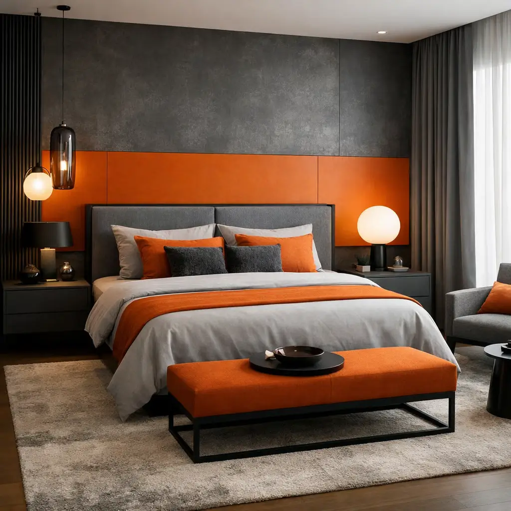
Luxury Style Small Space Shop Interior Ideas
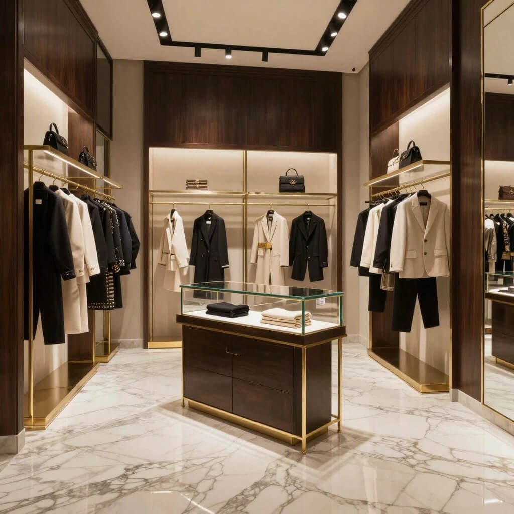
Now we’re getting fancy. Ever wonder why luxury boutiques feel so special even when they’re tiny? It’s not magic—it’s strategic design choices that signal quality and exclusivity.
Small luxury shops work because they embrace the boutique experience. You’re not trying to be a department store. You’re creating an intimate, special shopping environment where customers feel like VIPs.
Material Matters
The materials you choose communicate value immediately. I walked into a small jewelry shop once that couldn’t have been more than 200 square feet, but it felt like Tiffany’s. How?
Premium Material Choices:
- Marble or marble-look surfaces for counters
- Brass or gold-toned hardware and fixtures
- Velvet or leather seating (even one chair makes a difference)
- Hardwood or high-quality laminate flooring
- Crystal or glass display cases
You don’t need all of these—even one or two luxury material touches elevate the entire space. A marble checkout counter paired with brass shelving brackets instantly signals “high-end” to your customers’ subconscious.
Lighting as Luxury
Here’s something most people miss: lighting makes or breaks the luxury vibe. Those harsh fluorescent tubes overhead? Absolute luxury killers.
Replace them with:
- Warm LED spotlights for product highlighting
- Statement chandelier or pendant light
- Under-shelf LED strips for ambient glow
- Dimmable options for mood control
Proper lighting makes products look expensive, even if they’re reasonably priced. It creates atmosphere. It sets mood. It’s non-negotiable for luxury aesthetic.
The Scent Factor
Okay, this might sound extra, but scent is part of luxury retail design. High-end boutiques always smell amazing—it’s not an accident. A signature subtle fragrance (nothing overpowering, please) creates a sensory memory. Customers will literally associate that scent with your brand. Candles, diffusers, or a subtle room spray work wonders.
Also Read: 10 Luxury Flower Shop Design Ideas High End Floral Boutiques
Compact Grocery Shop Layout Optimization Ideas
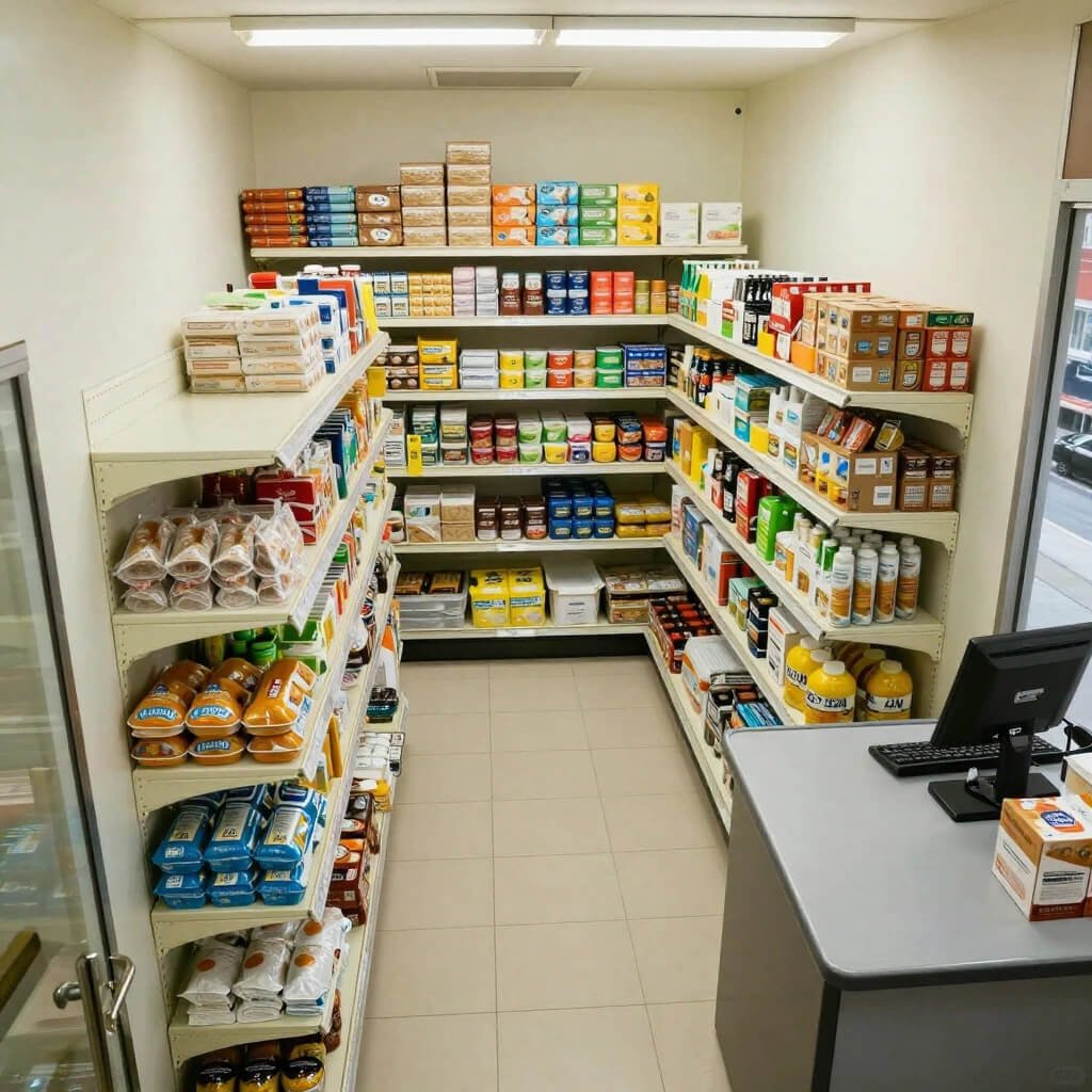
Grocery shops face unique challenges. You’re dealing with different product sizes, turnover rates, and customer shopping patterns. Optimization here means maximizing sales per square foot, not just making things look pretty.
I consulted for a small organic grocery once, and their layout was a nightmare. Customers couldn’t find anything, stock was inefficient, and sales showed it. We redesigned using retail psychology principles, and their revenue jumped 30% in two months.
Zone Your Space Strategically
Traffic Flow Optimization:
- Place high-demand items (milk, bread) at the back
- Create a logical shopping path with aisles
- Position impulse buys near the checkout
- Ensure easy access to entry and exit
Think about how your customers actually shop. They grab essentials, so make them walk past other tempting products to get there. Sounds manipulative? Maybe, but it’s also giving them exposure to products they might genuinely need and didn’t remember.
Vertical Space Is Your Best Friend
Small grocery shops that ignore vertical space are leaving money on the table. Floor to near-ceiling shelving doubles or triples your product capacity without expanding your footprint.
Vertical Display Tips:
- Eye-level = buy-level (premium products here)
- Bottom shelves for bulk items and heavy products
- Top shelves for lightweight or less popular items
- Use risers and stair-step displays for visibility
Organization and Accessibility
Nothing frustrates grocery shoppers more than not finding what they need. Clear signage, logical categorization, and easy accessibility are essential.
Use baskets for small items like snack bars or packets. Label everything clearly. Keep similar items together. Your customers are busy—make their shopping experience quick and intuitive, and they’ll come back.
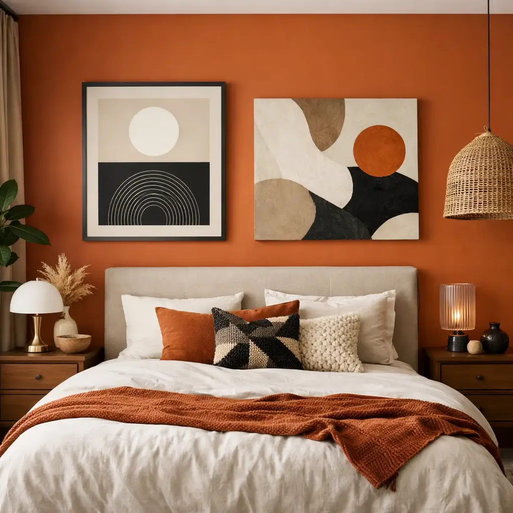
Wooden Rustic Small Shop Design Inspiration
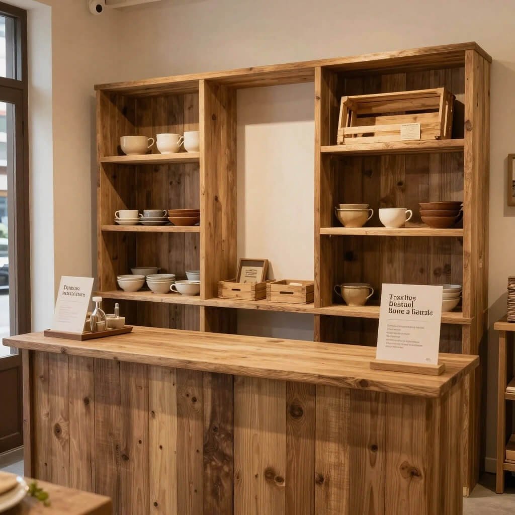
Can we appreciate the rustic trend for a second? It’s been going strong for years because people crave authenticity and warmth in their shopping experiences. Wooden rustic design delivers that in spades.
I’m personally obsessed with this style because it works for almost any product type—clothing, home goods, coffee shops, bookstores, even tech accessories. The key is balancing rustic elements with enough polish that it doesn’t look like a barn exploded in your shop.
Natural Wood Elements
Reclaimed Wood Features:
- Accent walls using pallet wood or barn wood
- Floating shelves from raw edge wood slabs
- Wooden crate displays for texture and depth
- Tree stump side tables or product risers
The beauty of wooden rustic design? Imperfections are features, not bugs. That knot in the wood? Character. The uneven staining? Charm. You’re celebrating natural materials, which takes pressure off achieving showroom perfection.
Complementary Design Elements
Rustic doesn’t mean exclusively wood. You need contrast and balance.
Pairing Elements:
- Metal accents (black iron, copper, or galvanized steel)
- Edison bulb lighting for warm industrial touch
- Neutral textiles like linen and burlap
- Green plants for organic life and color
- Chalkboard signs for handwritten charm
When my cousin opened her farm-to-table shop, she went full rustic with reclaimed barn wood walls, metal pipe shelving, and tons of plants. The vibe is so cozy and authentic that customers linger way longer than in typical retail spaces. Longer browsing time equals more sales, by the way.
Glass Front Modern Small Shop Display Ideas
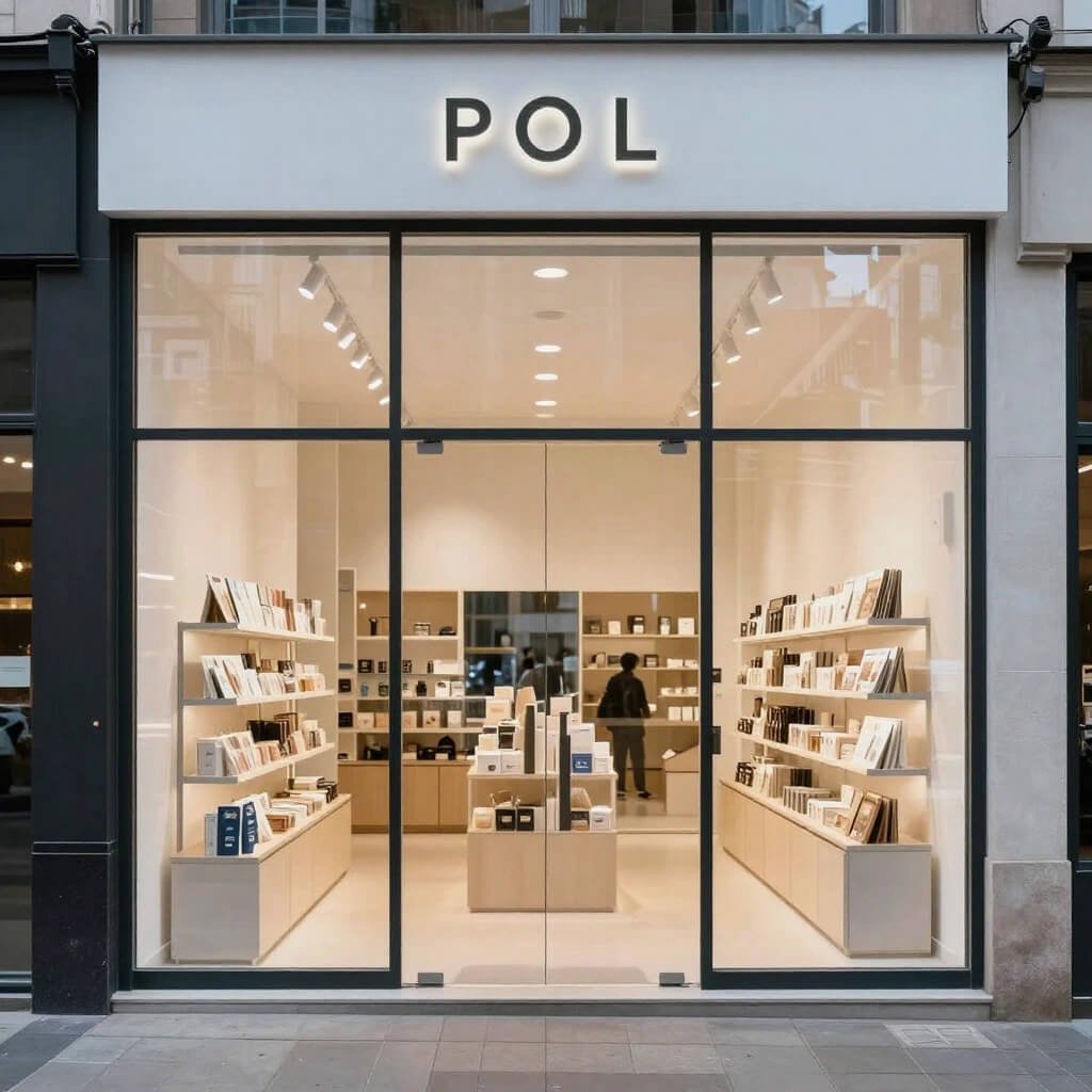
Glass fronts are criminally underutilized, IMO. You’ve got this prime real estate facing the street, and so many shop owners just slap up a poster or ignore it completely. Wild.
Your glass front is a 24/7 advertisement for your business. People walking by should be tempted to come in based solely on what they see through that window. Let’s make it count.
Window Display Psychology
I’ve spent way too much time studying window displays (occupational hazard), and the best ones share common traits:
Effective Window Displays Include:
- Clear focal point that catches the eye
- Seasonal or timely relevance
- Limited items to avoid overwhelm
- Strategic lighting for day and night impact
- Height variation for visual interest
Change your window display frequently—every 2-3 weeks minimum. Fresh displays signal to repeat customers that you have new inventory. They create urgency (that item I saw last week is gone—what’s new now?).
Maximizing Visibility and Openness
Here’s a mistake I see constantly: shop owners block their glass fronts with too much product or signage, making the interior invisible. Wrong move.
You want people to see inside your shop and feel invited to enter. That means:
- Keeping the window area relatively open
- Using transparent or minimal display fixtures
- Ensuring interior lighting showcases your space
- Strategic product placement that teases your inventory
Think of your window as a movie preview, not the whole film. Give them a taste that makes them want to come in for the full experience.
Glass Vinyl Decals and Branding
Your shop name and logo absolutely belong on your glass front—but please, for the love of good design, keep it simple. Minimal vinyl lettering looks professional and modern. Overdone graphics look cluttered and dated.
Consider frosted or etched glass effects for portions of your storefront if privacy or sun exposure is an issue. This adds visual interest while serving a practical function.
Also Read: 10 Ultimate Barber Shop Design Ideas Luxury Modern Setup
Smart Storage Small Shop Organization Layout Ideas
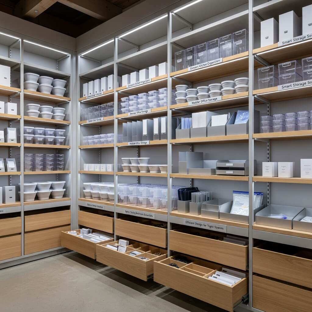
Storage. The unsexy topic that makes or breaks small shop functionality. You can have the prettiest shop design in the world, but if you can’t efficiently store and access inventory, you’re going to struggle.
I learned this the hard way working retail in college. Beautiful shop, zero functional back-stock storage. We wasted hours daily looking for products we knew we had “somewhere.” Organized storage directly impacts your efficiency and profitability.
Dual-Purpose Fixtures
Why have storage AND display taking up separate space? Combine them.
Multi-Functional Solutions:
- Display cabinets with closed storage below
- Bench seating with storage compartments
- Pegboard walls with storage bins
- Hollow display platforms for hidden stock
These solutions keep backup inventory accessible without dedicating precious floor space to storage rooms. Your shop feels bigger, your restocking is faster, and customers never see cluttered backstock areas.
Vertical Storage Maximization
We already talked about vertical display space, but vertical storage is equally crucial. Wall-mounted systems, overhead racks, and tall storage units use space that would otherwise go to waste.
Install hooks, hanging organizers, and wall-mounted bins in your storage areas. Label everything clearly. Create zones for different product categories. Future you will be so grateful when you need to find something quickly.
Behind-the-Counter Organization
Your checkout counter area tends to become a dumping ground for random stuff. Fight this with intentional organization.
Use drawer dividers, small bins, and clear containers. Everything should have a designated spot. Bags, receipt paper, business cards, tape, scissors—when these items have homes, your checkout process is smoother and your counter looks professional instead of chaotic.
Street Style Small Kiosk Shop Design Ideas
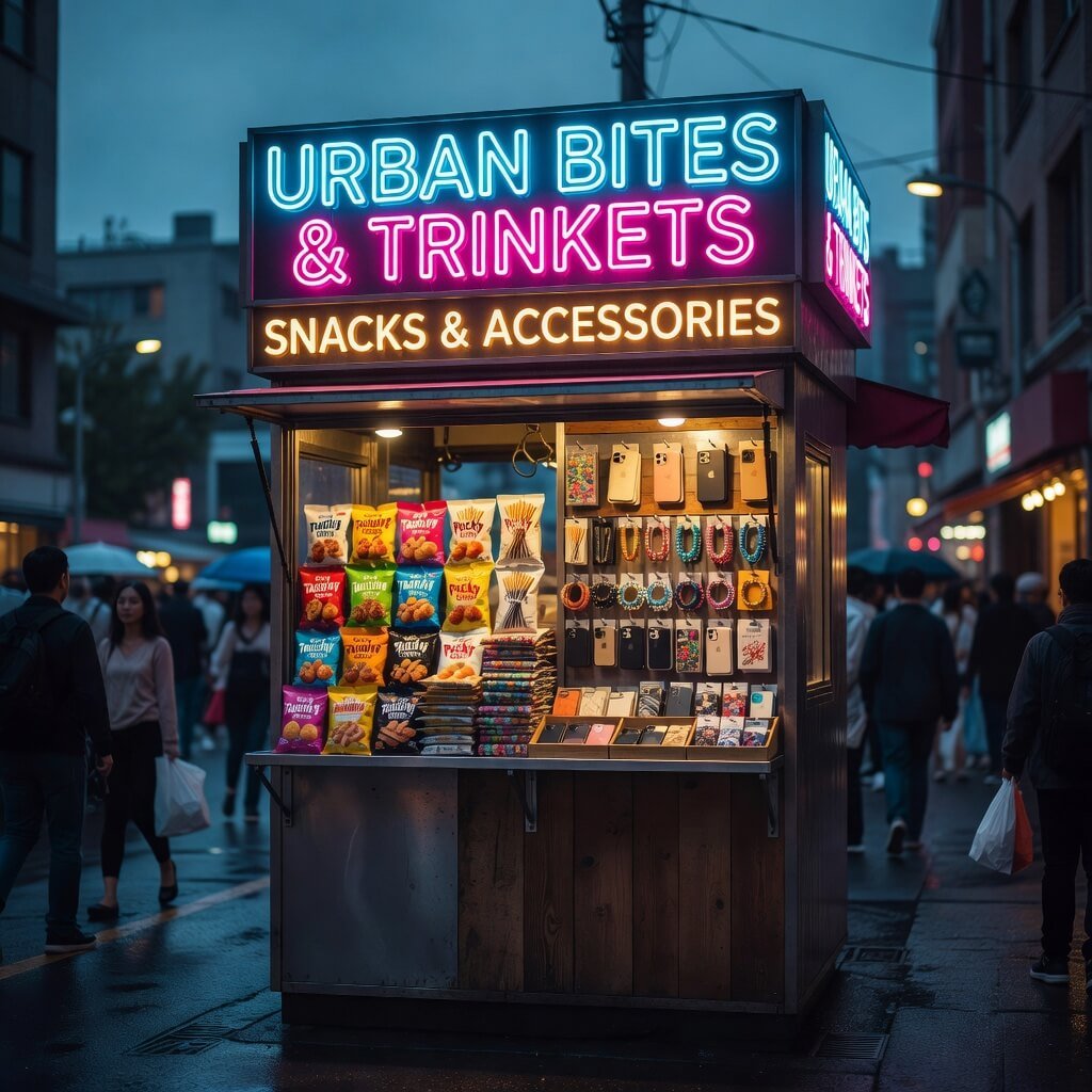
Kiosks are having a moment, and honestly, they solve so many problems for small business owners. Lower overhead, flexible locations, and that trendy pop-up vibe customers love.
But let’s be real—kiosk design is challenging. You’re working with extremely limited space, often in high-traffic areas where you’re competing for attention. Your design needs to be bold, functional, and mobile-friendly.
Attention-Grabbing Exteriors
You’ve got seconds to catch someone’s attention as they walk by. Your kiosk exterior needs to scream your brand identity.
Design Elements That Pop:
- Bold, contrasting colors that stand out
- Clear, large signage with readable fonts
- Unique shape or structural elements
- Eye-level product displays
- Interactive elements if possible
I saw a coffee kiosk once that was designed to look like a giant coffee cup. Gimmicky? Maybe. Memorable and Instagram-worthy? Absolutely. People took photos with it and posted them, giving the business free advertising. Clever.
Space Efficiency on Steroids
Every single inch matters in kiosk design. You need to store supplies, display products, process transactions, and sometimes prep products—all in a space smaller than most people’s bathrooms.
Kiosk Organization Essentials:
- Compact POS systems (tablets work great)
- Under-counter storage with organizers
- Vertical display systems
- Foldable or stackable elements for setup/breakdown
- Multi-use surfaces and equipment
The kiosks that thrive are ruthlessly efficient. There’s zero room for decorative fluff—everything visible must serve a purpose, either functionally or for branding.
Mobile and Modular Approaches
Many kiosks need to be movable or even fully mobile. Design with this in mind from the start.
Wheels, foldable components, and lightweight materials make relocation possible. Modular design means you can expand, shrink, or reconfigure based on location and needs. Flexibility is a competitive advantage in the kiosk world.
Bright Lighting Small Shop Interior Design Ideas
Let’s talk about lighting, because I’m convinced it’s the most underestimated element in small shop design. Lighting affects mood, visibility, sales, energy costs, and even how customers perceive your products.
Bad lighting can make a gorgeous shop feel depressing, cheap, or uninviting. Great lighting elevates everything.
Layered Lighting Approach
Professional designers use multiple lighting types to create depth and functionality. You should too.
Three Essential Lighting Layers:
- Ambient Lighting – Overall illumination for the space
- Recessed ceiling lights
- Track lighting systems
- Pendant lights
- Task Lighting – Focused light for specific functions
- Under-shelf lights for product visibility
- Checkout counter lighting
- Fitting room mirrors with side lighting
- Accent Lighting – Highlighting specific products or areas
- Spotlights on featured items
- LED strips for architectural features
- Display case interior lighting
When you combine these layers, you create a dynamic, well-lit space that feels intentional and professional. Single overhead lighting is so 1990s—we’ve evolved.
Color Temperature Matters
Here’s where people mess up: they install random bulbs without considering color temperature. This is measured in Kelvins, and it dramatically affects your shop’s vibe.
Color Temperature Guide:
- 2700K-3000K: Warm white (cozy, inviting, good for boutiques and cafes)
- 3500K-4100K: Neutral white (balanced, works for most retail)
- 5000K-6500K: Cool white (energizing, good for modern tech shops)
Keep your color temperature consistent throughout your shop. Mixing warm and cool lighting looks disjointed and unprofessional. I’ve walked into shops where different bulbs create weird color casts—it’s distracting and makes products look weird.
Energy Efficiency Without Sacrifice
Bright lighting doesn’t mean expensive electricity bills. LED technology has changed the game.
LEDs offer:
- 75% less energy than incandescent bulbs
- Last 25 times longer (way less maintenance)
- Available in any color temperature
- Dimmable options for mood control
- Much less heat output (important for small spaces)
The upfront cost is slightly higher, but LEDs pay for themselves quickly through energy savings and longevity. Plus, they’re better for the environment, which increasingly matters to customers.
Also Read: 10 Practical Mobile Shop Design Ideas for Better Sales
High-End Brand Feel Small Shop Makeover Ideas
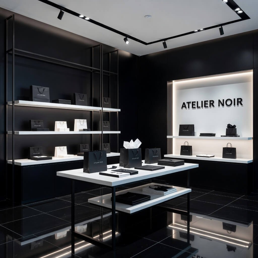
Alright, final design idea—let’s talk about creating that premium brand feel even when you’re not an actual luxury brand. Because here’s the truth: perceived value drives pricing power and customer trust.
Two shops selling identical products at identical prices will perform very differently based on their design and branding. The one that feels high-end will outsell the one that doesn’t. It’s psychology, baby.
Cohesive Branding Throughout
High-end brands are ridiculously consistent. Every touchpoint—from the shopping bag to the price tag to the wall color—reflects the same aesthetic and values.
Branding Consistency Checklist:
- Color palette used throughout (walls, fixtures, packaging, signage)
- Font choices limited to 2-3 maximum
- Logo prominently and tastefully displayed
- Packaging that matches your aesthetic
- Business cards, receipts, and marketing materials aligned
This consistency signals professionalism and attention to detail. When customers notice these cohesive touches, they unconsciously trust your brand more. You seem established, legitimate, and premium.
Premium Customer Experience
High-end isn’t just visual—it’s experiential. How do customers feel in your space?
Experience Elevation Tactics:
- Comfortable seating area (even one chair matters)
- Refreshments offered (water, coffee, tea)
- Personal attention and service
- Clean, clutter-free environment
- Soft background music at appropriate volume
- Pleasant ambient scent
I remember visiting a tiny indie bookshop that offered free coffee and had the coziest reading nook. The books weren’t discounted, but people happily paid full price because the experience felt valuable. They’d spend an hour browsing, chatting with the knowledgeable owner, and leave with several purchases.
Attention to Details
Premium brands sweat the small stuff. Details signal that you care about quality.
Pay attention to:
- Clean, smudge-free glass and mirrors
- Dust-free shelves and displays
- Well-maintained fixtures (no chipped paint or wobbly shelves)
- Quality hangers and display materials
- Professional signage with perfect spelling/grammar
- Fresh flowers or quality faux plants
- Pristine restroom if you have one
These might seem minor, but they accumulate. A dozen small details create an overall impression of excellence—or neglect. You choose which impression you’re giving.
The Psychology of Exclusivity
High-end brands often create perceived scarcity or exclusivity. You can do this too, even in a small shop.
Exclusivity Strategies:
- Limited edition or small-batch products
- “Curated selection” rather than exhaustive inventory
- Membership or loyalty programs with perks
- Private shopping appointments or events
- Selective product reveals or timed releases
You’re not trying to trick anyone—you’re creating legitimate value through curation and experience. Small shops can actually do this better than big-box stores because you can be selective, personal, and specialized.
Wrapping This Up
So there you have it—ten solid, trending design ideas for small shops that actually work in the real world. I’ve seen each of these implemented successfully, and I’ve also seen people mess them up by going too extreme or not committing fully.
The key takeaway? Your shop design should reflect your brand, serve your customers, and work within your constraints. Don’t chase trends that don’t make sense for your business. Don’t blow your budget on fixtures when you need inventory. And please, don’t create a beautiful space that’s dysfunctional to actually work in.
Mix and match these ideas based on your specific situation. Maybe you combine rustic wooden elements with bright modern lighting. Perhaps budget-friendly DIY meets luxury material accents. The best shop designs are authentic expressions of the brand behind them.
Start with one or two changes rather than overwhelming yourself with a complete overhaul. Test what resonates with your customers. Adjust. Refine. Your shop is a living space that should evolve with your business.
Now get out there and make that small space absolutely shine. Your dream shop aesthetic is totally achievable—you’ve got this! 🙂