10 Practical Mobile Shop Design Ideas for Better Sales
- Shop Design
 Ben
Ben- 0
- 43 minutes read
Look, I get it. You’re standing in your mobile shop right now, scratching your head, wondering why customers walk in, glance around, and walk right back out. Or maybe you’re planning to open one and you don’t want to make the same mistakes you’ve seen others make. Either way, you’re here because you know that design matters—like, really matters.
Here’s the thing: your shop’s design isn’t just about looking pretty (though that helps). It’s about creating an experience that makes people want to pull out their wallets. I’ve spent way too many hours analyzing mobile shops—both successful ones and those sad, empty stores that make you wonder how they’re still paying rent. And trust me, the difference almost always comes down to smart design choices.
So grab your coffee, and let’s talk about 10 design ideas that actually work. No fluff, no corporate nonsense—just real strategies that can transform your mobile shop from “meh” to “wow.”
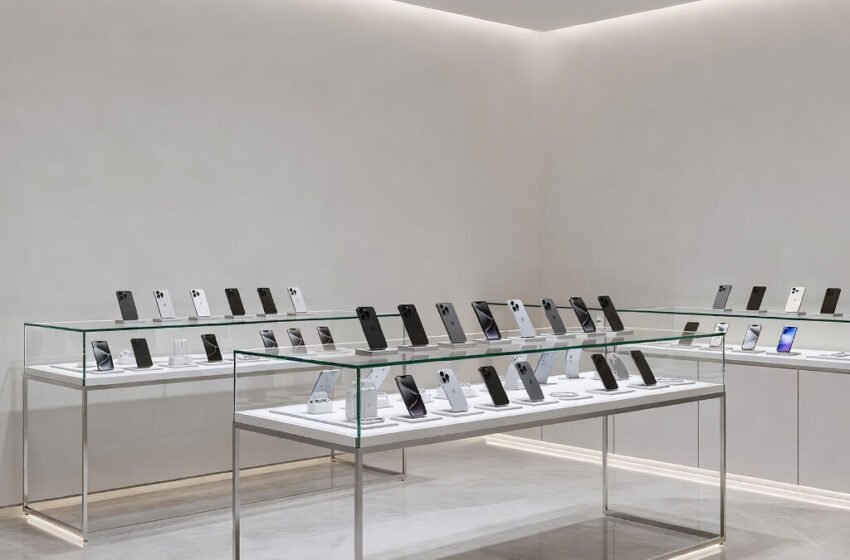
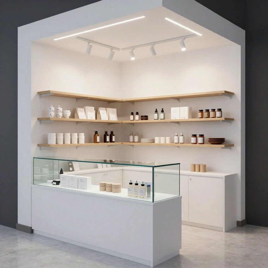
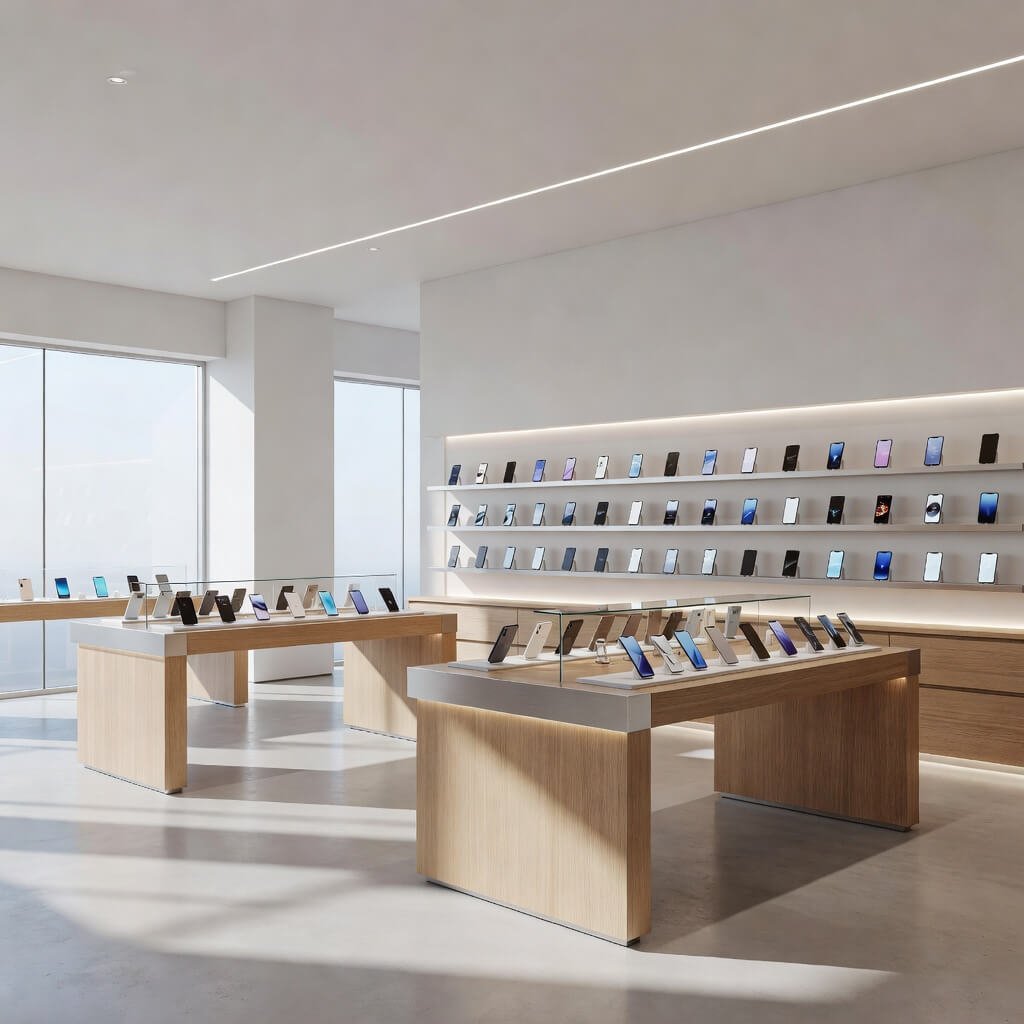
1. Minimal Glass Counter Mobile Shop Layout
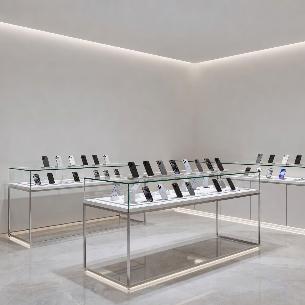
Clean. Transparent. Sophisticated.
Ever walked into an Apple Store and felt immediately relaxed? That’s the magic of minimalism. A minimal glass counter layout screams professionalism without shouting. The glass creates this psychological barrier that says “premium” while still letting customers see everything.
I absolutely love this approach for mobile shops because it solves multiple problems at once. Your expensive inventory stays protected behind glass, but customers don’t feel like they’re shopping in a fortress. The transparency builds trust—people can see what they’re getting, no smoke and mirrors.
Here’s what you need to make this work:
- Tempered glass displays with LED strip lighting underneath (makes phones look like jewelry, I swear)
- White or light gray walls to maximize that airy, spacious feeling
- Minimal signage—let your products do the talking
- Hidden storage for boxes and accessories to keep surfaces clutter-free
The beauty of this design? It works for literally any shop size. I’ve seen 200-square-foot shops look massive because they embraced the minimal glass concept. The trick is keeping everything visible but organized. Think museum, not warehouse.
One warning though: you’ve got to commit to keeping things pristine. Fingerprints on glass? They show everything. Budget for daily cleaning, or this look falls apart fast.
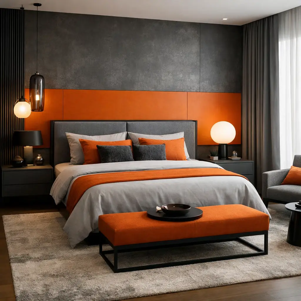
2. Luxury LED Mobile Store Interior Design
Want to know the quickest way to make budget phones look expensive? Lighting, my friend.
LED lighting isn’t just about visibility—it’s about creating an atmosphere that makes customers feel like they’re buying something special. I visited a mobile shop in Dubai once (yeah, humble brag 🙂 ) where they used color-changing LED panels behind their display units. The phones weren’t even high-end, but the lighting made them look like artifacts from the future.
Here’s how to nail the luxury LED approach:
Strategic LED Placement:
- Backlit wall panels behind phone displays
- Spotlight LEDs directly above premium models
- Under-shelf strip lighting for accessories
- Color-changing mood lighting for different zones
The Psychology Trick:
Warm white LEDs (3000K-3500K) make people feel comfortable and willing to browse longer. Cool white LEDs (5000K-6500K) make tech products look crisp and modern. Use warm lighting in your browsing areas and cool lighting on product displays. You’re welcome.
IMO, this is the best investment-to-impact ratio you’ll find. LEDs are cheap to run, last forever, and completely transform how your inventory looks. I’ve seen shops increase their average sale price by 15-20% just by upgrading their lighting. Customers genuinely perceive the same phones as more valuable when they’re properly lit.
Pro tip: Install dimmer switches. Seriously. Being able to adjust your lighting intensity throughout the day keeps things fresh and prevents that harsh, interrogation-room vibe.
3. Small Space Smart Mobile Shop Setup
Okay, so you’re not exactly working with a mansion here. Maybe you’ve got 150 square feet and a dream. Can you still make it work?
Absolutely.
Small spaces force you to get creative, and honestly? Some of the most profitable mobile shops I’ve seen are tiny. They just maximize every single inch. When you can’t expand outward, you expand upward and get strategic about what you display.
Vertical is Your Best Friend:
- Floor-to-ceiling shelving units (use that wall space!)
- Wall-mounted tablet displays at eye level
- Hanging accessory displays from the ceiling
- Multi-tier counters for different product categories
I remember helping my cousin set up his 120-square-foot shop. Everyone told him it was too small. Fast forward two years, and he’s outselling shops three times his size. His secret? He treated every square foot like prime real estate.
The Small Space Essentials:
- Corner displays that utilize dead space
- Foldable demo tables you can tuck away when not needed
- Mirror walls to create the illusion of double the space (this works, trust me)
- Limited display inventory with organized back-stock
Here’s the mental shift you need: don’t display everything you sell. Display your best sellers and your highest-margin items prominently. Everything else? Keep it organized in drawers or a small back area with clear labeling. Customers don’t need to see 47 phone case options simultaneously—they need to see your best options clearly.
Think boutique, not bazaar.
Also Read: 10 Brilliant Bakery Shop Design Ideas Modern Shopfront Glow
4. Modern Black & White Mobile Shop Theme
Some call it minimalist. Some call it contemporary. I call it the “can’t mess this up” design strategy.
Black and white themes work because they’re timeless, they make technology pop, and they photograph incredibly well (hello, Instagram marketing). But here’s what most people get wrong: they make it boring. All-white walls, black counters, done. Snooze fest.
The magic happens when you play with textures and patterns.
Making Black & White Actually Interesting:
- Matte black walls with glossy white counters (texture contrast)
- Black and white geometric floor tiles (adds visual movement)
- White walls with black accent wall behind the main display
- Monochrome product photography as wall art
I’ve seen shop owners afraid of using black because they think it’ll make spaces look smaller. Here’s the truth: strategic black actually adds depth and makes other elements stand out. Your colorful phone cases and devices become the stars of the show against a B&W backdrop.
The Formula:
60% white (walls, ceiling, main surfaces)
30% black (accent walls, shelving, furniture)
10% your pop of color (your logo color, seating, or one statement piece)
FYI, this theme also gives you flexibility. Want to switch things up seasonally? Add colored lighting or swap in colored accessories. Your foundation stays solid, but you can refresh the vibe without renovating.
And let’s be real—it looks expensive even when it’s not. Black and white materials are usually cheaper than fancy finishes, but the end result screams sophistication.
5. Wooden Premium Mobile Store Interior Style
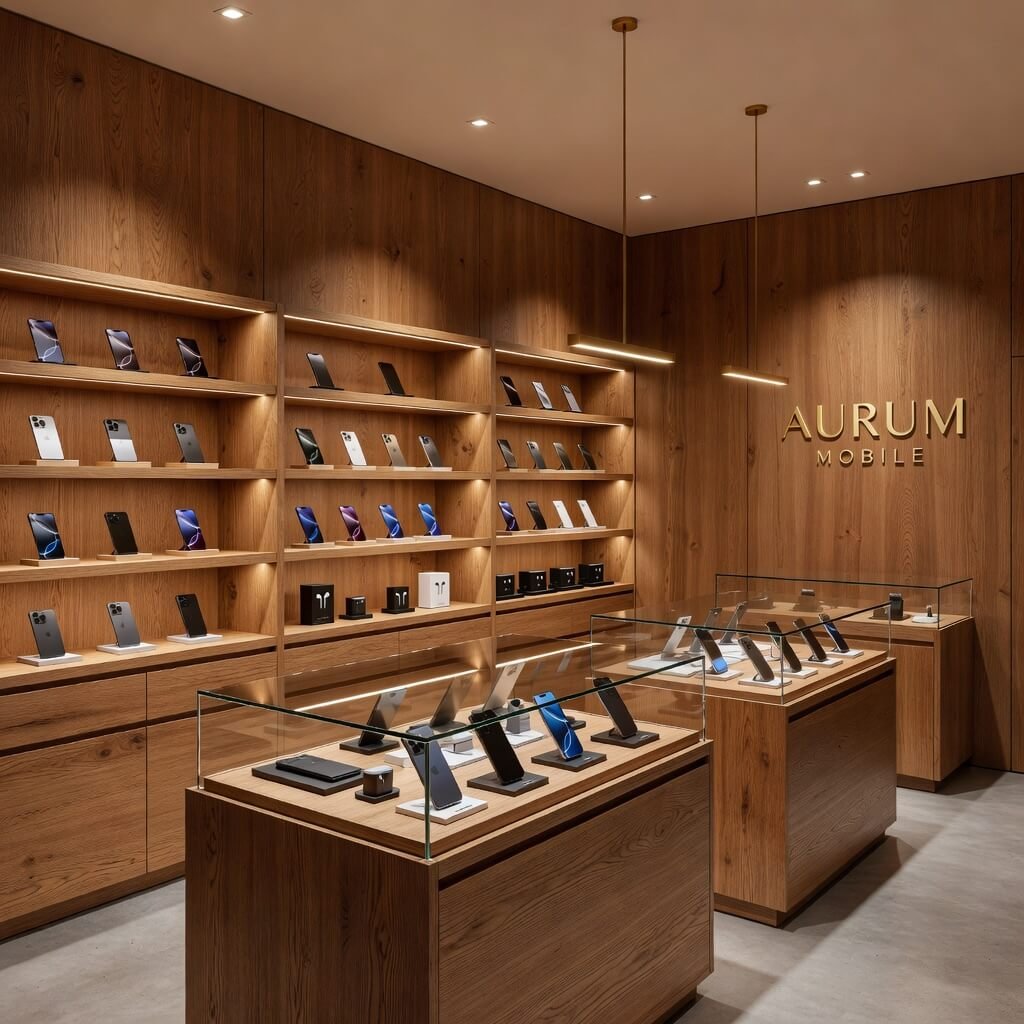
Want to stand out from every other sterile, tech-bro mobile shop? Bring in wood.
There’s something about natural wood that immediately makes spaces feel premium and trustworthy. It’s warm, it’s inviting, and it creates this interesting contrast with the cold technology you’re selling. Humans are wired to respond positively to natural materials—use that to your advantage.
I walked into a mobile shop in Scandinavia once (they know their design, those folks) that used light oak throughout their entire space. Combined with plants and soft lighting, it felt more like a lifestyle boutique than a tech store. And guess what? Their customer dwell time was almost double the average. People didn’t want to leave.
How to Do Wood Right:
For Premium Vibes:
- Walnut or oak display tables (the real stuff, not laminate)
- Wooden slatted accent walls behind displays
- Natural wood shelving with metal brackets
- Wooden checkout counter with built-in cable management
The Warm-Tech Combo:
Pair light-colored wood (maple, oak, ash) with white walls and black metal accents. This creates this incredible modern-meets-natural aesthetic that appeals to basically everyone. It says “we’re tech-forward but we haven’t lost our humanity.” Sounds dramatic? Maybe. Does it work? Absolutely.
One thing I’ve noticed: wooden interiors make customers browse more slowly and carefully. There’s less of that rushed, transactional energy. They settle in, ask questions, and actually think about their purchases. Higher consideration usually means higher-value sales.
Budget Reality Check:
Real wood costs more upfront, no sugarcoating that. But it lasts longer, ages better (those character marks actually add charm), and positions you as a premium retailer. If budget’s tight, use wood strategically on your main display area and checkout counter—the spaces customers interact with most.
6. Budget-Friendly Compact Mobile Shop Design
Let’s talk money. Not everyone has thousands to drop on interior design, and that’s completely fine.
Here’s what nobody tells you: expensive ≠ effective. Some of the smartest mobile shop designs I’ve seen cost less than a decent laptop. The owners just prioritized differently and got creative with their execution.
The Budget-Smart Approach:
DIY Where It Makes Sense:
- Paint is cheap and transformative (do it yourself)
- IKEA shelving hacked with custom paint or contact paper
- Printed vinyl decals instead of custom signage
- Thrifted furniture refinished for display use
I helped a friend launch his shop with literally $800 in design budget. Impossible? That’s what I thought too. But we hit up thrift stores for a solid wood table (refinished it ourselves), bought affordable LED strips online, used leftover paint from another project, and created phone displays from acrylic sheets we cut ourselves. Did it look like an Apple Store? No. Did it look professional and draw customers? Absolutely.
Where to Spend Your Limited Budget:
- Lighting (biggest bang for buck)
- One quality display piece (makes everything else look better)
- Clear signage (professional printed materials)
- Phone security cables (protects your inventory—essential)
Where to Save:
- Wall paint (DIY with quality paint)
- Shelving (affordable options everywhere)
- Decorative elements (get creative with free/cheap materials)
- Flooring (clean what you have; maybe add a nice rug)
The secret sauce? Consistency. Pick a color scheme and stick to it religiously. Pick a style (modern, industrial, minimal) and commit. Mismatched-but-intentional can work, but only if you’re really good at it. For most of us, consistent and simple beats eclectic and confused every single time.
And here’s a thought: your design can evolve. Start with the basics done well, then upgrade pieces gradually as profits allow. Nobody’s judging your opening day against year three.
Also Read: 10 Luxury Jewellery Shop Design Ideas Premium Style
7. High-End Brand Style Mobile Store Layout
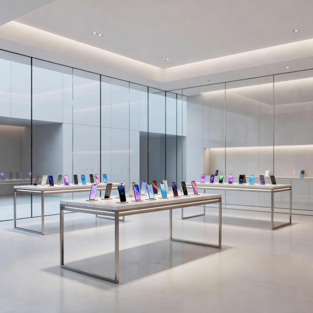
Alright, so you’re going premium. You want your shop to compete with the fancy carrier stores and authorized dealers. You want customers walking in and immediately knowing you’re the real deal.
This requires investment, but it also requires understanding luxury retail psychology.
High-end doesn’t mean cramming expensive stuff into your space. It means creating an experience of exclusivity, quality, and expertise. Think about the last time you walked into a premium boutique—what made it feel expensive?
The Premium Blueprint:
Spatial Psychology:
- More space, fewer products on display (scarcity signals value)
- Seating areas for customer consultations (shows you value their time)
- Dedicated demo stations with charging and testing setup
- Private zones for high-value transactions
I’ll never forget visiting a premium mobile retailer who had this gorgeous consultation area with leather chairs and a coffee table. They served actual coffee. Their average transaction was 3x their competitors. People weren’t buying phones; they were buying an experience. The phone was almost secondary.
Materials That Signal Quality:
- Marble or granite on key surfaces
- Brushed metal fixtures (brass, copper, or stainless steel)
- Leather or high-quality fabric seating
- Large format tiles or quality hardwood flooring
The Details That Matter:
Your high-end customers notice everything. Perfect corners on your paint job. Aligned shelving. Dust-free surfaces. Matching screw heads (yes, really). Quality packaging for their purchases. Branded shopping bags. These details separate premium from pretending-to-be-premium.
One controversial opinion: if you’re going high-end, you might need to carry less variety and more depth in premium products. Ten flagship phones displayed beautifully beats fifty mid-range phones crammed on shelves. Quality over quantity extends to your inventory strategy, not just your design.
8. Neon Light Mobile Accessories Shop Design
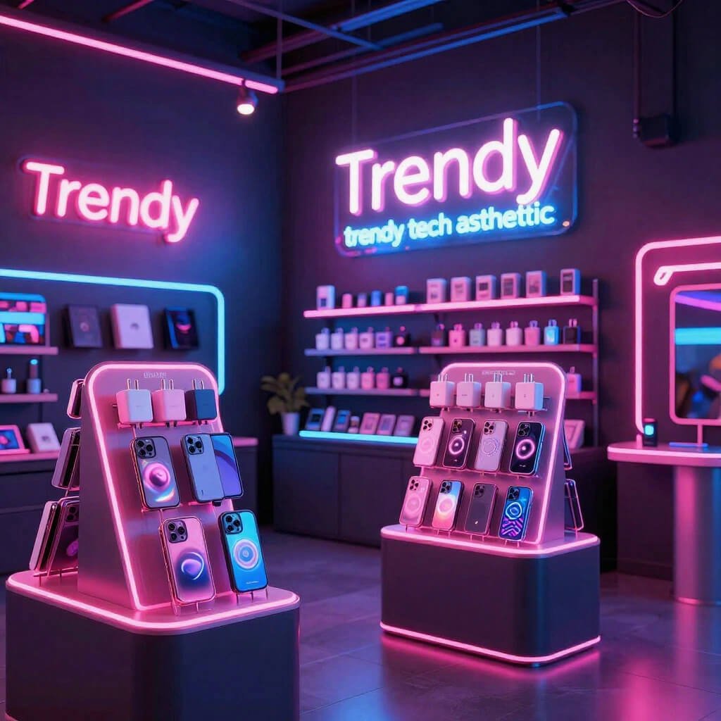
Want to attract younger customers and create serious Instagram appeal? Let’s talk neon.
Neon lighting has made this massive comeback, and for good reason—it’s fun, it’s photogenic, and it creates energy that traditional lighting just can’t match. But here’s where most people mess up: they think more neon = better. Wrong.
Strategic Neon Placement:
Think of neon as your accent color, not your primary light source. You still need good base lighting for customers to actually see products. Neon adds personality and draw, but it shouldn’t be doing the heavy lifting.
Ideas That Actually Work:
- Neon logo sign behind the checkout (Instagram gold)
- Neon accent lighting in display cases
- Neon “Tech Zone” or category markers
- Custom neon phrases that match your brand personality
I visited this accessories shop that had a neon sign saying “Charged Up” in blue. Simple, on-brand, and literally every customer under 30 took a photo with it. Free marketing every single day. The owner told me their social media engagement tripled after installing it.
Color Psychology for Neon:
- Blue = trust, tech, reliability (safe choice)
- Pink/Purple = creative, trendy, youthful
- Green = money-friendly, eco-conscious, fresh
- Multi-color = playful, diverse, energetic (but can overwhelm)
Real talk: neon works best for shops targeting younger demographics or focusing on accessories and fun tech. If you’re positioning as a premium, serious retailer for business customers, neon might undermine that message. Know your audience.
Budget Reality:
True neon is expensive. LED neon flex is affordable and looks nearly identical. Most people can’t tell the difference, and you save hundreds or thousands. Just saying 🙂
The key is integration. Your neon should feel intentional, not like you’re running a nightclub. Balance is everything.
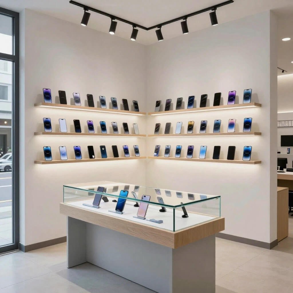
9. Open Display Modern Mobile Shop Concept
Here’s a spicy take: locked glass cases might be hurting your sales more than helping.
I know, I know—security concerns are real. But there’s a growing trend toward open displays where customers can actually touch and interact with phones without asking permission. And the shops doing this? They’re reporting better engagement and higher conversion rates.
The Open Display Philosophy:
Customers want to feel phones before buying. The weight, the size, the texture—these matter. When everything’s behind glass, you create this barrier that some customers won’t cross. They don’t want to bother you, or they feel intimidated, or they just can’t be bothered. So they leave.
Making Open Display Work Safely:
Security Measures:
- Individual phone security cables (non-invasive but effective)
- Magnetic alarm sensors on valuable items
- Strategic camera placement (visible but not creepy)
- Attentive staff positioning
- Display only certain models openly, keep flagships in consultation area
I’ve seen shops do this hybrid approach beautifully. Mid-range phones on open display with security cables. Flagship phones in a dedicated “Experience Zone” where staff handles demos. Accessories completely open. It balances security with accessibility.
The Layout Strategy:
- Central island displays for open browsing
- Wall displays for secured premium items
- Interactive demo tables with charging stations
- Clear sightlines throughout the shop (staff can see everything)
One shop owner I know was terrified to try this. He switched from all-glass cases to 60% open display. His initial concerns? Theft would skyrocket. What actually happened? One minor theft incident in six months (caught on camera, item recovered), but a 35% increase in sales. Customers browsed longer, asked more questions, and felt more comfortable making decisions.
Obviously, this depends on your location and local security considerations. But it’s worth considering if you’ve been struggling with customer engagement.
Also Read: 10 Affordable Shop Design Ideas for Budget Friendly Stores
10. Corner Space Mobile Shop Optimization Idea
Got stuck with a corner location? First of all, congratulations—you just got handed a gift and you might not even know it yet.
Corner shops have something precious: double the street visibility. Two sides of foot traffic. Two window displays. Two chances to pull people in. Most people see this as a layout challenge. Smart designers see it as double the opportunity.
Maximizing Corner Advantages:
The Window Strategy:
Use your two windows to tell different stories. One window showcases your premium phones and brand positioning. The other highlights accessories, deals, or seasonal promotions. This gives you twice the messaging opportunity.
I know a guy who used his main-street window for flagship phones and his side-street window for “Budget Warrior Picks.” He literally attracted two different customer segments through different entrances. Genius.
Interior Layout Optimization:
- Central checkout counter with visibility to both entrances
- Curved corner display utilizing the natural focal point
- Different zones along each wall (phones vs. accessories)
- Mirror placement to make the space feel larger and monitor both entrances
The Corner Focal Point:
That actual corner where your two walls meet? Prime real estate. This is where eyes naturally go when people enter. Use it for:
- Your most impressive display piece
- Your highest-margin products
- Seasonal feature items
- Your brand story or wall art
Here’s what’s wild: corner shops often rent for less than mid-block locations, but they can outperform them with smart design. Landlords sometimes see corners as awkward. Retailers see them as twice the visibility for less rent. Who’s winning that negotiation?
Practical Corner Tips:
- Ensure both entrances are clearly marked and welcoming
- Don’t create blind spots—staff should see both doors
- Use the extra windows for natural light (saves on electricity)
- Consider the flow—customers should naturally circuit through your space
One final thought on corners: embrace the geometry. Angular displays, curved cases, diagonal shelving—these work better in corner spaces than trying to force rectangular layouts into an angular space.
Bringing It All Together
Look, here’s the bottom line: your mobile shop design is working for you or against you every single hour you’re open. There’s no neutral.
Every design choice you make sends a message. Minimal glass says “premium and organized.” Neon says “energetic and youth-focused.” Wood says “trustworthy and established.” Open displays say “confident and customer-friendly.”
The Real Secret?
None of these ideas work in isolation. The best mobile shops I’ve seen blend multiple concepts. Maybe you do a budget-friendly setup with strategic LED lighting. Or a small space with open displays and neon accents. Or a corner location with a black-and-white theme and wooden elements.
Your Design Checklist:
- Does it reflect your target customer’s values?
- Can customers easily navigate and browse?
- Does it photograph well for social media?
- Is it maintainable within your cleaning capacity?
- Does it work within your actual budget (not fantasy budget)?
- Will it still look good in two years?
Start with one or two ideas from this list that genuinely excite you and fit your budget. Implement them properly rather than half-implementing everything. Your shop should feel intentional, not like a Pinterest board exploded.
And remember: you can always evolve. Your design isn’t permanent. Maybe you start budget-friendly and minimal, then add neon elements as you grow. Or you begin with a small space setup and expand into luxury LED when you move to a bigger location.
The Ultimate Question:
What experience do you want customers to remember? Because they’ll forget your prices and your product specs, but they’ll remember how your shop made them feel. Make it count.
Now stop reading and start planning. Your current shop isn’t going to redesign itself (though honestly, wouldn’t that be nice?). Pick one idea, sketch it out, price the materials, and take the first step.
Your future customers—and your bank account—will thank you. Trust me on this one.