10 Beautiful Office Corridor Design Ideas Minimal Luxury Spaces
- Corridor Design
 Ben
Ben- 0
- 38 minutes read
Look, I’ll be straight with you—office corridors get the worst treatment in most buildings. Everyone obsesses over the conference rooms, the lobby, maybe even the break room, but the hallways? People treat them like afterthoughts. Yet these spaces connect everything, and trust me, your employees notice when they’re walking through boring, soul-crushing tunnels every single day.
I’ve walked through enough bland corporate hallways to last a lifetime, which is exactly why I’m passionate about changing how we think about these spaces. Minimal luxury doesn’t mean cold and sterile—it means intentional, beautiful, and yes, totally achievable without emptying your company’s budget. Ready to see what’s possible? Let’s talk about ten corridor designs that’ll make people actually enjoy their walk from the elevator to their desk.
Minimalist Glass Wall Office Corridor
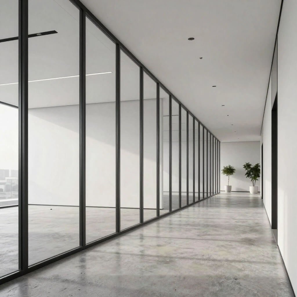
Transparency changes everything. I remember visiting a tech startup last year that installed floor-to-ceiling glass walls along their main corridor, and honestly, the transformation was mind-blowing. The space felt three times larger instantly, and the natural light? Chef’s kiss.
Glass walls create this beautiful openness that traditional corridors just can’t match. You eliminate that claustrophobic tunnel feeling while maintaining separation between spaces. The minimal approach works perfectly here because the glass itself becomes the design statement—you don’t need to clutter things up with excessive decoration.
Making Glass Work Without Going Broke
Here’s the thing about glass corridors: people assume they’re crazy expensive. Sure, if you’re installing some custom Italian imported glass system, yeah, you’ll spend a fortune. But standard commercial glass solutions? They’re more affordable than you’d think, especially when you consider the long-term benefits.
I suggest these key elements for pulling off this look:
- Frosted or fluted glass sections for privacy where needed
- Minimal black or brushed metal frames to keep lines clean
- Hidden door hardware that maintains the seamless aesthetic
- Strategic placement to maximize natural light flow
The beauty of this design lies in what you don’t see. No bulky walls, no heavy materials weighing down the space. Just clean lines and light. IMO, this works best for companies wanting to project transparency (literally and figuratively) in their culture.
Luxury Marble Corporate Hallway Design
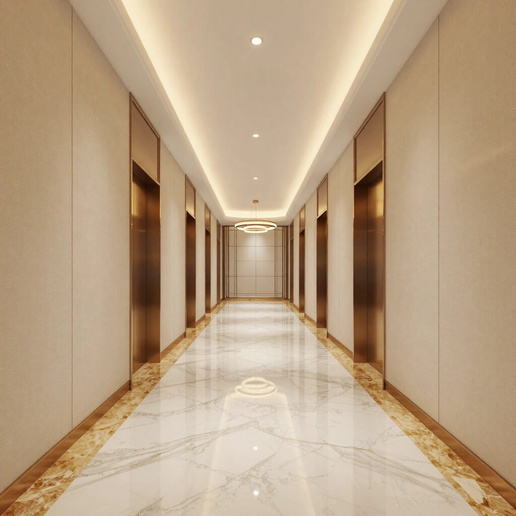
Okay, hear me out—marble gets a bad rap for being too fancy or too traditional. But when you use it right in a minimal luxury context, marble elevates a corridor from “nice” to “wow, are we in a five-star hotel?”
I’ve seen this done beautifully in law firms and financial companies where they want that established, sophisticated vibe. You’re not covering every surface in marble like some Roman palace. Instead, you’re using it strategically—maybe one feature wall, or as flooring with a subtle pattern.
The Right Marble Makes All the Difference
Not all marble looks the same, and picking the wrong type will absolutely ruin the minimal luxury vibe you’re going for. White Carrara marble gives you those gorgeous grey veins without overwhelming the space. Calacatta marble offers bolder veining for more drama. Black marble or dark grey options work incredibly well as accent walls.
Here’s my hot take: pair marble with warm lighting, or it’ll feel like a morgue. Seriously. I’ve walked through corridors that used marble with harsh fluorescent lighting, and I’ve never felt more unwelcome in my life :/
The minimal approach means:
- Large format tiles with minimal grout lines
- Book-matched slabs on feature walls for symmetrical veining
- Matte or honed finishes rather than super shiny polished surfaces
- Neutral color palettes that let the natural stone patterns shine
You want people to notice the quality and feel impressed, not distracted by busy patterns everywhere.
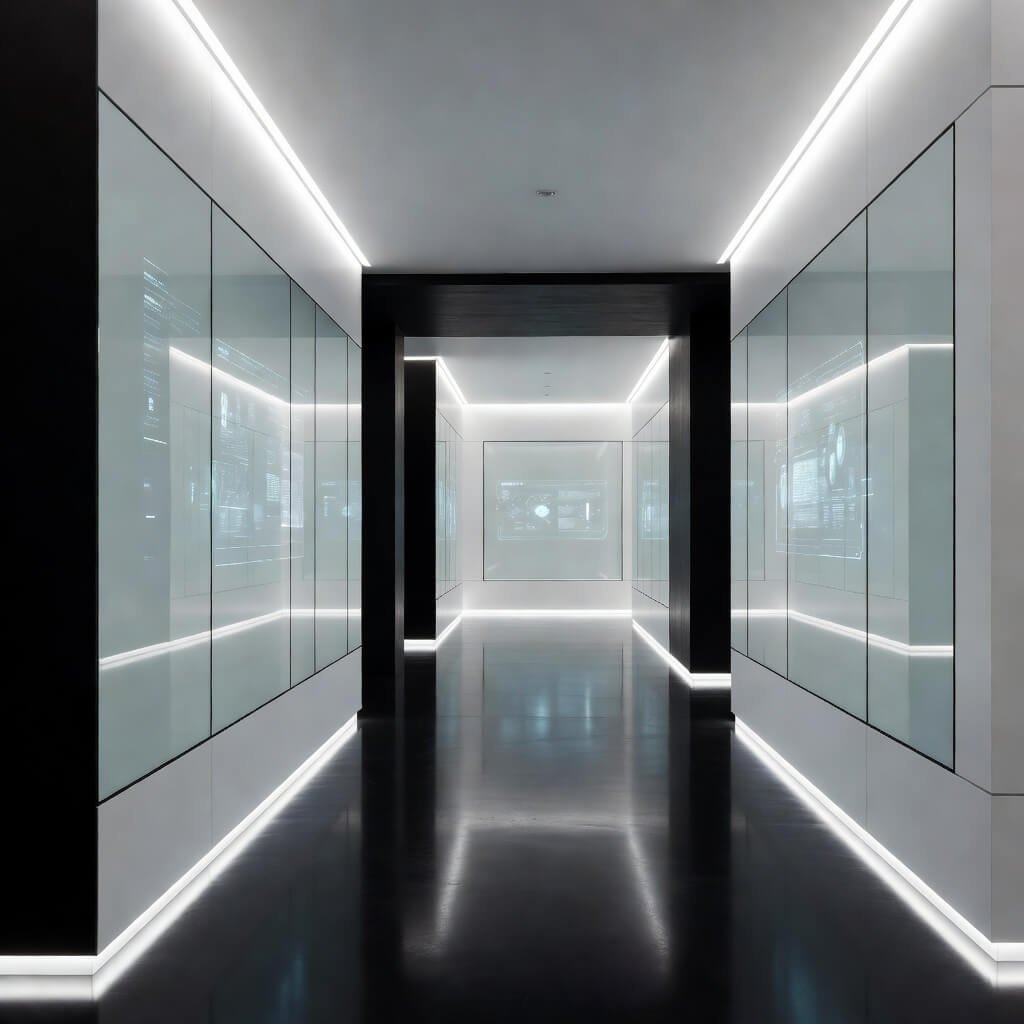
Modern LED Strip Lit Corridor Concept
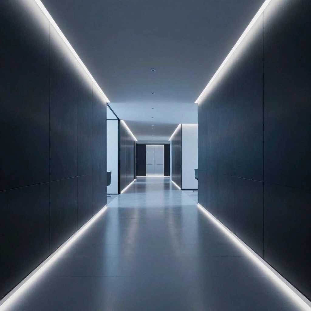
Ever walked down a hallway and felt like you were in a sci-fi movie? That’s the magic of well-executed LED strip lighting. This design approach transforms corridors from purely functional spaces into experiences, and honestly, it’s one of my favorite trends right now.
LED strips offer flexibility that traditional lighting just can’t match. You can install them in recessed ceiling channels, along wall panels, at floor level, or even behind translucent materials for a gorgeous glow effect. The minimal luxury aspect comes from using this technology subtly—not creating a nightclub, but rather enhancing architectural features.
Getting Creative with Linear Light
I consulted on a project last year where we installed LED strips in vertical recessed channels along both walls, spaced every six feet. The result? This incredible rhythm and flow that guided people naturally through the space. The lighting didn’t just illuminate—it created movement and interest.
Think about these applications:
- Cove lighting along the ceiling perimeter for indirect, soft illumination
- Wall washing to highlight textured surfaces or artwork
- Floor-level guide lights that look futuristic and help with wayfinding
- Color-changing options that adapt to different times of day or special events
FYI, the quality of LED strips varies wildly. Don’t cheap out here, or you’ll end up with uneven lighting and visible dots instead of continuous lines. You want high-density LED strips with proper diffusion channels.
The minimal luxury sweet spot? Use LED lighting to enhance architecture, not replace it. Let the light define spaces and create ambiance while keeping the actual fixtures invisible.
Also Read: 10 Premium Corridor Ceiling Design Ideas for Hotel Style Look
Green Biophilic Office Corridor with Plants
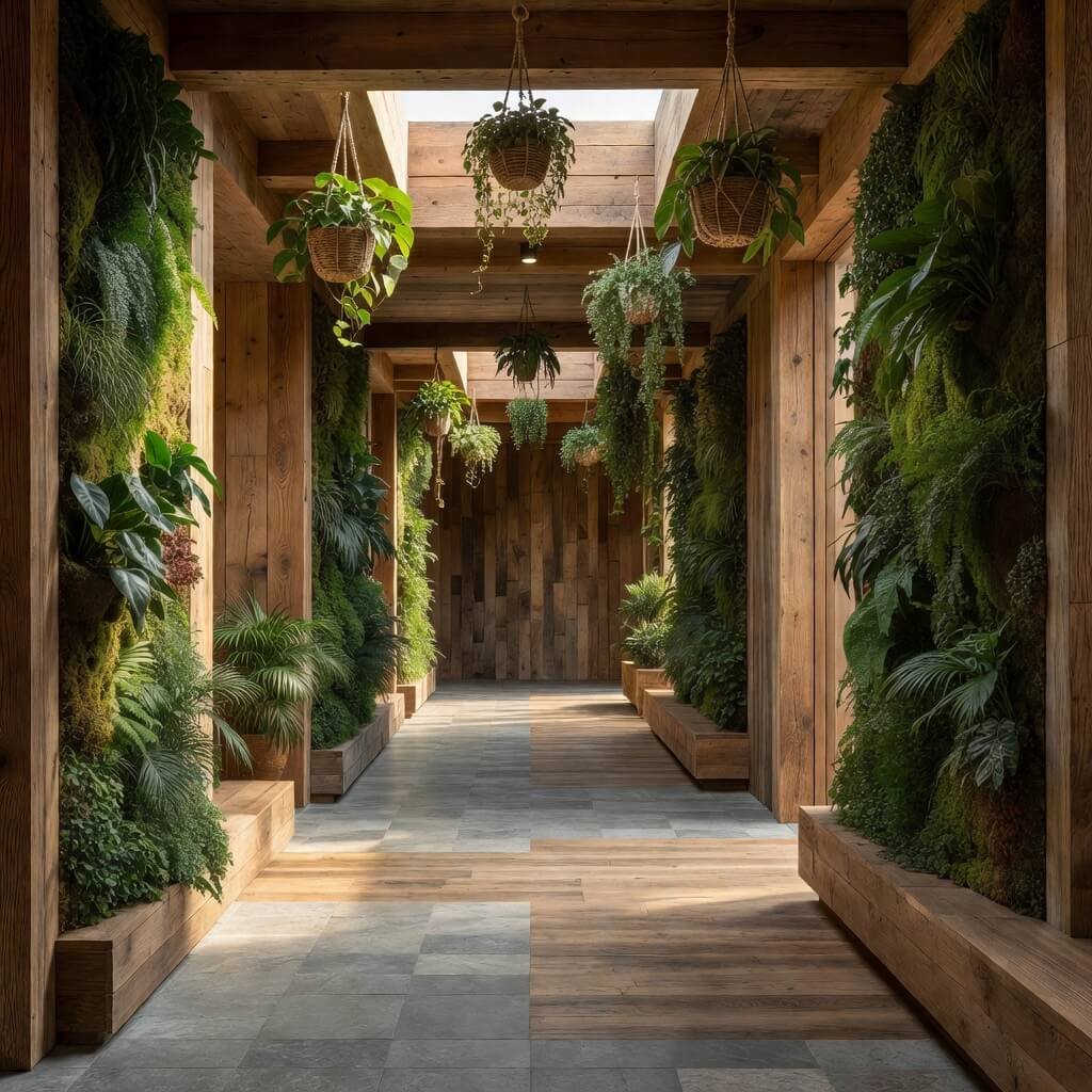
Plants in office corridors aren’t just trendy—they’re backed by actual science showing they reduce stress and improve air quality. But let’s be real, we’re not talking about a sad potted plant sitting in the corner collecting dust. We’re talking about intentional biophilic design that makes nature a core element of the corridor experience.
I’ve become a total convert to this approach after working in a building that installed living plant walls along their main hallway. Walking through that space genuinely improved my mood every single day. The air felt fresher, the space felt alive, and honestly, it gave everyone something to talk about by the coffee machine.
Plants That Actually Work in Corridors
Here’s where most people mess up: they choose plants based on looks alone, then wonder why everything’s dead in three months. Corridors typically have less natural light and varying temperatures, so you need hardy plants that can handle these conditions.
My go-to recommendations:
- Pothos and philodendrons for vertical gardens (basically indestructible)
- Snake plants for floor planters in darker areas
- Moss walls for zero-maintenance green impact
- Ferns if you have decent humidity and some natural light
The minimal luxury approach means choosing quality planters and presenting greenery in clean, organized ways. Think uniform planter boxes in natural wood or matte black metal, not random mismatched pots. Consider built-in irrigation systems so maintenance doesn’t become a nightmare.
You can go vertical with living walls, create a floor-level planter that runs along one side, or install floating planters at varying heights. The key? Make it look intentional, not like someone randomly scattered plants around.
Wooden Warm Tone Executive Hallway
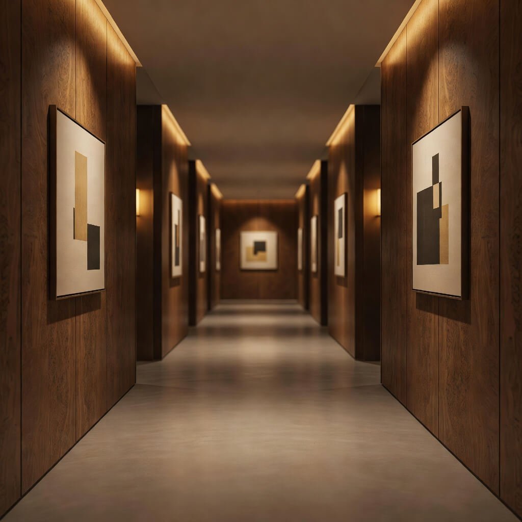
Nothing—and I mean nothing—beats natural wood for creating warmth in minimal spaces. While concrete and glass create drama and openness, wood creates comfort and sophistication. I love using wood in executive-level corridors where you want to communicate success without being cold or intimidating.
Wood brings texture and organic beauty that manufactured materials simply can’t replicate. Even in a minimal design, those natural grain patterns add visual interest without requiring additional decoration. You get depth and richness from the material itself.
Choosing Wood That Elevates the Space
The wood you select completely changes the vibe. Walnut reads sophisticated and rich. Oak feels established and timeless. Ash offers a lighter, more contemporary feel. Exotic woods like teak bring that luxury hotel aesthetic.
I’ve seen wooden corridors executed in several smart ways:
- Full wall paneling in a vertical or horizontal orientation
- Ceiling treatments with wood slats creating rhythm and texture
- Integrated bench seating that’s both functional and beautiful
- Door surrounds and frames in wood while walls stay neutral
Here’s a tip nobody talks about: the finish matters as much as the wood species. A heavy, glossy finish can make even beautiful wood look cheap and dated. You want matte or satin finishes that let the natural character shine through without looking plasticky.
Pair wood with the right lighting (warm white LEDs, please, not cool white), and you create corridors that feel expensive and inviting. The minimal approach means letting the wood be the star—you don’t need to add much else.
Industrial Style Concrete Office Passage
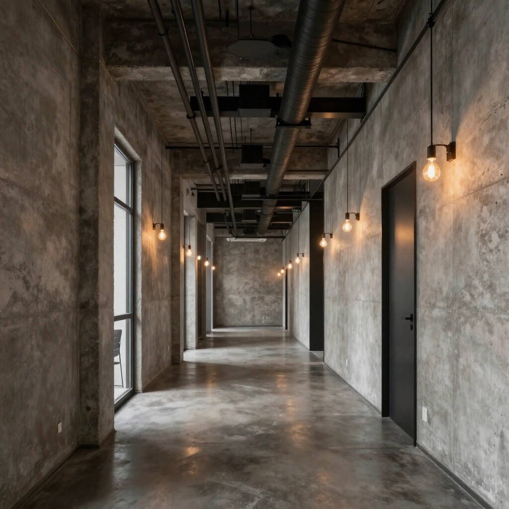
Polished concrete, exposed structural elements, metal accents—industrial design brings an edgy, honest aesthetic that resonates particularly well with creative companies and startups. But here’s the secret: minimal luxury industrial isn’t rough and unfinished, it’s refined and intentional.
I used to think industrial meant cold and harsh until I saw it executed properly in a design agency’s office. They combined polished concrete floors with exposed concrete walls, then warmed everything up with strategic lighting and a few carefully placed wood elements. The result felt urban, sophisticated, and totally unique.
Balancing Raw Materials with Luxury
The challenge with industrial corridors? You can easily tip into looking unfinished or cheap if you’re not careful. The minimal luxury approach means treating these raw materials with respect and precision.
Consider these essential elements:
- Polished or honed concrete rather than rough, unsealed surfaces
- Exposed ductwork and pipes painted in coordinated colors (usually black, white, or metallic)
- Metal-framed glass doors or partitions with black or gunmetal finishes
- Track lighting or industrial-style fixtures that complement the aesthetic
You want people to see the industrial elements and think “cool design choice” not “did they run out of budget?” Quality of execution separates sophisticated industrial from looking like a construction site.
I love adding unexpected soft elements too—maybe a plush runner rug down the center, or acoustic panels disguised as artwork. These additions make the space functional while maintaining the industrial edge.
Also Read: 10 Luxury Corridor Wall Design Ideas for Chic Interiors
Corporate Branding Wall Corridor Design
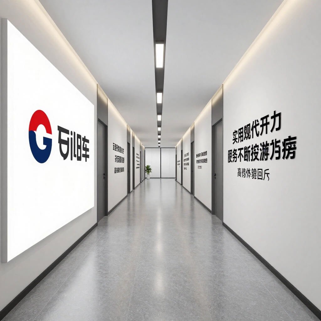
Why waste perfectly good wall space when you can use your corridor to tell your company’s story? I’ve seen this done brilliantly by companies that understand their hallways are prime real estate for communicating culture, values, and achievements.
Branding corridors work best when you commit fully to the concept. Half-hearted attempts with a few random logos scattered around just look tacky. But a thoughtfully designed branding experience? That’s powerful.
Creating Branding That Doesn’t Feel Like Advertising
Nobody wants to walk through a corridor that feels like a non-stop advertisement. The trick lies in making your branding feel like art and storytelling rather than corporate propaganda. Think museum exhibition, not billboard.
Here’s how to execute this with minimal luxury sensibility:
- Timeline walls showing company evolution with high-quality photography
- Values or mission statements in beautiful typography, not cheesy motivational posters
- Product displays in gallery-style shadow boxes or on minimal shelving
- Client logos or project highlights presented with design sophistication
I worked with a tech company that dedicated their main corridor to customer success stories, featuring large-format photography and minimalist text. They updated it quarterly, which kept it fresh and gave employees a reminder of their impact. People actually stopped to read it instead of rushing past.
The minimal approach means quality over quantity—fewer elements with higher impact. Use professional photography, invest in proper lighting for displays, and maintain plenty of white space so the branding breathes rather than overwhelms.
Smart Mirror Accent Office Corridor
Smart mirrors are having a moment, and for good reason. These aren’t your grandmother’s mirrors—we’re talking about technology-integrated surfaces that can display information, adjust to ambient lighting, or create fascinating visual effects.
I’ll be honest, when I first heard about smart mirrors in corridors, I thought it sounded gimmicky. Then I experienced one in a boutique hotel corridor that subtly displayed the time, weather, and inspiring quotes. It was genuinely cool without being overwhelming or distracting.
Practical Magic in Corridor Design
The beauty of smart mirrors in minimal luxury corridors? They serve multiple purposes while maintaining clean aesthetics. During the day, they function as regular mirrors that enhance light and create the illusion of more space. When activated, they provide functionality without adding physical clutter.
Smart applications for corridor mirrors include:
- Wayfinding displays that appear on the mirror surface when approached
- Ambient information like time, date, or weather
- Art displays that rotate through digital collections
- Lighting adjustments that complement natural light throughout the day
You can install smart mirrors as full-wall features or smaller accent pieces. Frame them in minimal black or brushed metal to maintain that luxury feel, or go frameless for an even cleaner look.
The key to keeping this minimal? The technology should enhance, not dominate. When the smart features aren’t active, people should see beautiful mirrors that make the corridor feel more spacious and light-filled. The tech becomes the bonus, not the entire point 🙂
Bright White Minimal Narrow Corridor
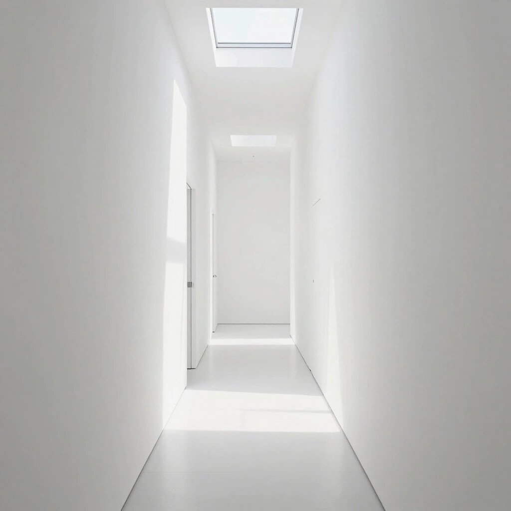
Got a narrow corridor that feels cramped and awkward? White minimal design might be your salvation. I know what you’re thinking—”won’t all white feel sterile and boring?” Only if you do it wrong.
An all-white corridor done right feels expansive, clean, and surprisingly warm. The secret lies in layering different white tones, textures, and finishes to create depth. Flat white walls with white flooring and white ceiling would indeed look like a dentist’s office, but that’s not what we’re doing here.
The Art of White-on-White Design
Successful white minimal corridors play with subtle variation. Maybe your walls are matte white, but your ceiling has a subtle texture. Your flooring might be white-washed wood or light grey stone. You add interest through materials and finishes, not color.
Essential elements for making white corridors work:
- Varying textures—smooth walls, textured ceiling panels, interesting flooring
- Different white tones—warm whites, cool whites, off-whites layered together
- Strategic lighting—warm LED strips or fixtures to prevent coldness
- Minimal black accents—door handles, light fixtures, or trim for definition
I’ve seen narrow white corridors that felt twice their actual width because the designer understood how to use white strategically. They installed white-washed wood slat walls on one side, kept the opposite wall smooth white, added recessed LED lighting, and finished with light grey polished concrete floors. The result? Stunning.
The narrow corridor actually becomes an advantage when you embrace minimal white design—it transforms into this interesting, gallery-like passage rather than a problem you’re trying to hide.
Also Read: 10 Fresh Corridor Design Home Ideas for Stylish Interiors
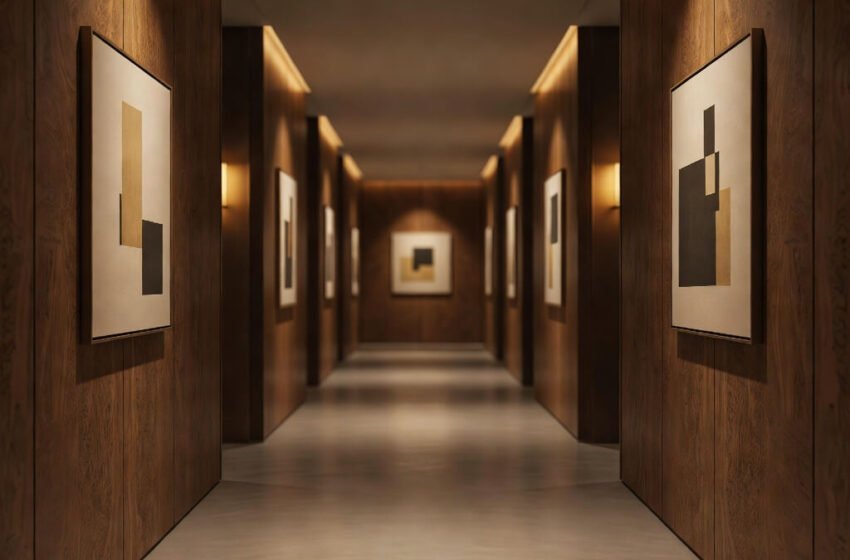
Artistic Gallery Style Office Hallway
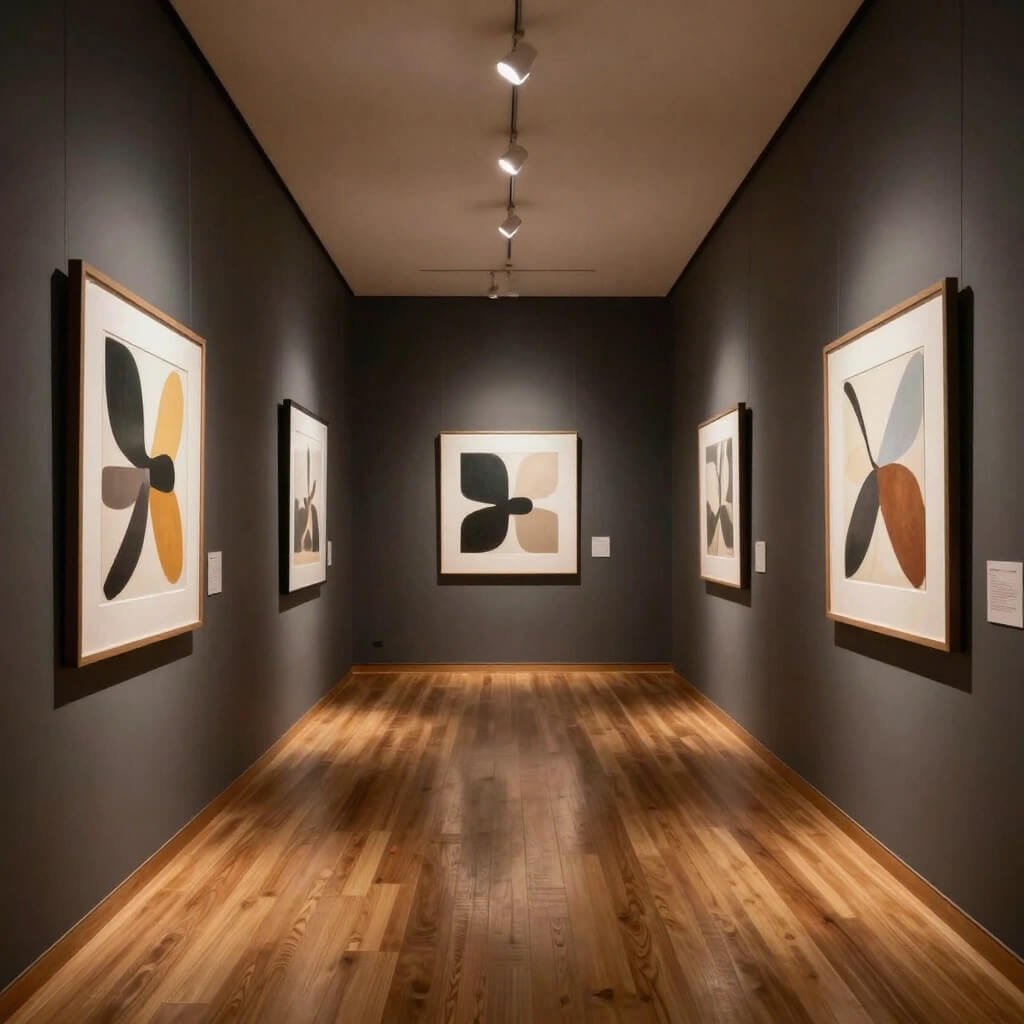
Why shouldn’t your office corridor feel like a curated art gallery? This approach elevates corridors into cultural experiences while maintaining that minimal luxury aesthetic. I’m talking about museum-quality presentation of artwork in a professional environment.
I love this approach because it demonstrates that your company values creativity and culture. Employees get to experience art daily, visitors get impressed, and the corridor becomes a conversation starter rather than dead space people rush through.
Curating Your Corridor Gallery
The gallery approach requires restraint—resist the urge to fill every inch of wall space. Professional galleries use plenty of white space around artwork, and you should too. This isn’t your aunt’s house where every wall surface has something hanging on it.
Keys to gallery-style corridors:
- Proper spacing—give each piece room to breathe, typically 6-10 feet between artworks
- Professional lighting—adjustable track lights or picture lights for each piece
- Consistent framing—uniform frame style or no frames for a cohesive look
- Regular rotation—change pieces quarterly to keep things fresh
You can feature work from local artists, employee creations, photography collections, or rotating exhibitions from galleries. Some companies partner with art schools or local artists for constantly refreshing displays.
The minimal luxury element comes from presentation quality. Invest in proper mounting, professional lighting, and museum-quality hanging systems. Don’t just stick poster prints in cheap frames with pushpins—that’s the opposite of what we’re going for here.
I’ve seen companies create digital displays showing artist information and piece details accessible via QR codes. It adds an interactive element while keeping the physical space clean and uncluttered.
Making It Happen: Practical Considerations
Let’s get real for a minute—these designs all sound great in theory, but you’re probably wondering about practical stuff like budget, maintenance, and actually implementing these ideas. Fair question.
You don’t need to renovate your entire office corridor overnight. I’ve seen companies successfully implement these designs in phases, starting with one hallway as a proof of concept. When leadership sees the impact (and trust me, people notice), expanding becomes easier to justify.
Budget-Friendly Approaches
Start with changes that deliver maximum impact for minimum investment:
- Paint and lighting can transform a space for relatively little money
- Vinyl wall graphics create branding or visual interest affordably
- Strategic accent walls give you luxury materials in manageable quantities
- Rearranged lighting often works better than replacing everything
Save your bigger budget for areas with the most traffic and visibility. The executive corridor might get the marble treatment while secondary hallways get the bright white minimal approach.
Maintenance Matters
Here’s something designers don’t always consider—whatever you install needs to stay beautiful with normal use. Glass walls show fingerprints. White surfaces show scuffs. Plants die without care.
Choose materials and finishes that match your maintenance reality. If you don’t have dedicated facilities staff who can clean glass walls daily, maybe opt for a different design approach. If nobody’s going to water plants, invest in those moss walls or high-quality artificial greenery (yes, I said it—good fake plants look better than dead real ones).
Final Thoughts: Corridors Deserve Better
I started this conversation by pointing out how neglected corridors typically are in office design, and I hope you’re now seeing the potential these spaces hold. Whether you’re drawn to the transparency of glass walls, the warmth of wood, the edge of industrial design, or the sophistication of marble, you’ve got options that can transform these overlooked spaces.
Minimal luxury doesn’t mean minimal effort—it means intentional choices that create maximum impact through quality and thoughtful design rather than clutter and excess. Your office corridors connect all the spaces your team uses daily. Making those journeys more beautiful, more inspiring, or more interesting? That’s worth the investment.
The corridor designs we’ve explored—from biophilic plant walls to smart mirror technology, from gallery-style art displays to LED-lit passages—all prove that “just a hallway” doesn’t have to be boring. These spaces can communicate your brand, enhance wellbeing, impress clients, and genuinely improve daily experiences for everyone in your building.
So take another look at those corridors in your office. See them with fresh eyes. What story could they tell? What experience could they create? Because I guarantee you, the potential is there—you just have to recognize it and make it happen.
Now if you’ll excuse me, I’ve got a corridor renovation to plan 🙂