10 Elegant School Corridor Design Ideas Clean Minimalist Halls That Actually Work
- Corridor Design
 Ben
Ben- 0
- 36 minutes read
You know what drives me absolutely nuts? Walking through a school and seeing those drab, beige corridors that look like they haven’t been updated since the 1970s. I mean, come on – we’re asking kids to spend 6+ hours a day in these spaces, and we give them the aesthetic equivalent of watching paint dry?
Here’s the thing: well-designed corridors aren’t just pretty to look at. They actually impact how students feel, learn, and interact with their environment. After spending years observing different school designs and talking to educators who’ve seen the transformation firsthand, I’ve put together these 10 corridor design ideas that balance elegance with functionality. These aren’t just Instagram-worthy concepts – they’re practical solutions that real schools can actually implement.
Ready to turn those boring hallways into spaces that inspire? Let’s dive in.
Interactive Learning Wall Corridor Design
Ever walked past a wall and wished it could teach you something? That’s exactly what interactive learning walls do, and honestly, they’re game-changers for school corridors.
Picture this: instead of blank walls or random motivational posters, you’ve got touch-sensitive displays, magnetic surfaces, and hands-on learning stations built right into the corridor design. I’ve seen schools install these setups where students can practice math problems on digital boards, explore interactive maps, or even conduct simple science experiments while transitioning between classes.
The beauty of this design lies in its minimalist framework with maximum educational impact. You’re not cluttering the space – you’re making every square inch work harder. The walls become extensions of the classroom, and suddenly those 5-minute breaks between periods turn into micro-learning opportunities.
Here’s what makes this concept particularly brilliant:
- Durability meets functionality: Modern interactive walls can handle hundreds of student interactions daily
- Customizable content: Teachers can update displays to match current curriculum
- Space efficiency: No need for extra furniture or floor space
- Engagement factor: Students actually want to interact with these walls
The key is keeping the overall aesthetic clean while incorporating these interactive elements seamlessly. Think sleek, flush-mounted displays with hidden wiring and intuitive interfaces that don’t require a computer science degree to operate.
Minimalist Modern School Hallway Concept
Sometimes less really is more, and nowhere is this truer than in school corridor design. The minimalist modern approach isn’t about creating sterile, hospital-like spaces – it’s about intentional simplicity that lets students breathe.
I’ve walked through schools that embraced this philosophy, and the difference is immediately noticeable. Clean lines, neutral color palettes, and strategic lighting create an environment that feels calm rather than chaotic. When you’re dealing with hundreds of students moving through these spaces daily, visual simplicity becomes a necessity, not a luxury.
The magic happens in the details. High-quality materials like polished concrete floors, sleek handrails, and minimalist lighting fixtures elevate the space without overwhelming it. You’re investing in fewer elements, but each one needs to be thoughtfully chosen and well-executed.
What I love about this approach:
- Easy maintenance: Fewer decorative elements mean less to clean and repair
- Timeless appeal: Won’t look dated in five years
- Stress reduction: Clean environments actually reduce anxiety
- Flexibility: Easy to adapt for different functions or events
The trick is avoiding the “boring” trap. Minimalist doesn’t mean colorless or personality-free. Strategic pops of color, interesting textures, or carefully chosen artwork can add warmth without cluttering the space. Think one stunning piece of student art rather than dozens of random posters.
Nature-Themed Green Corridor Makeover
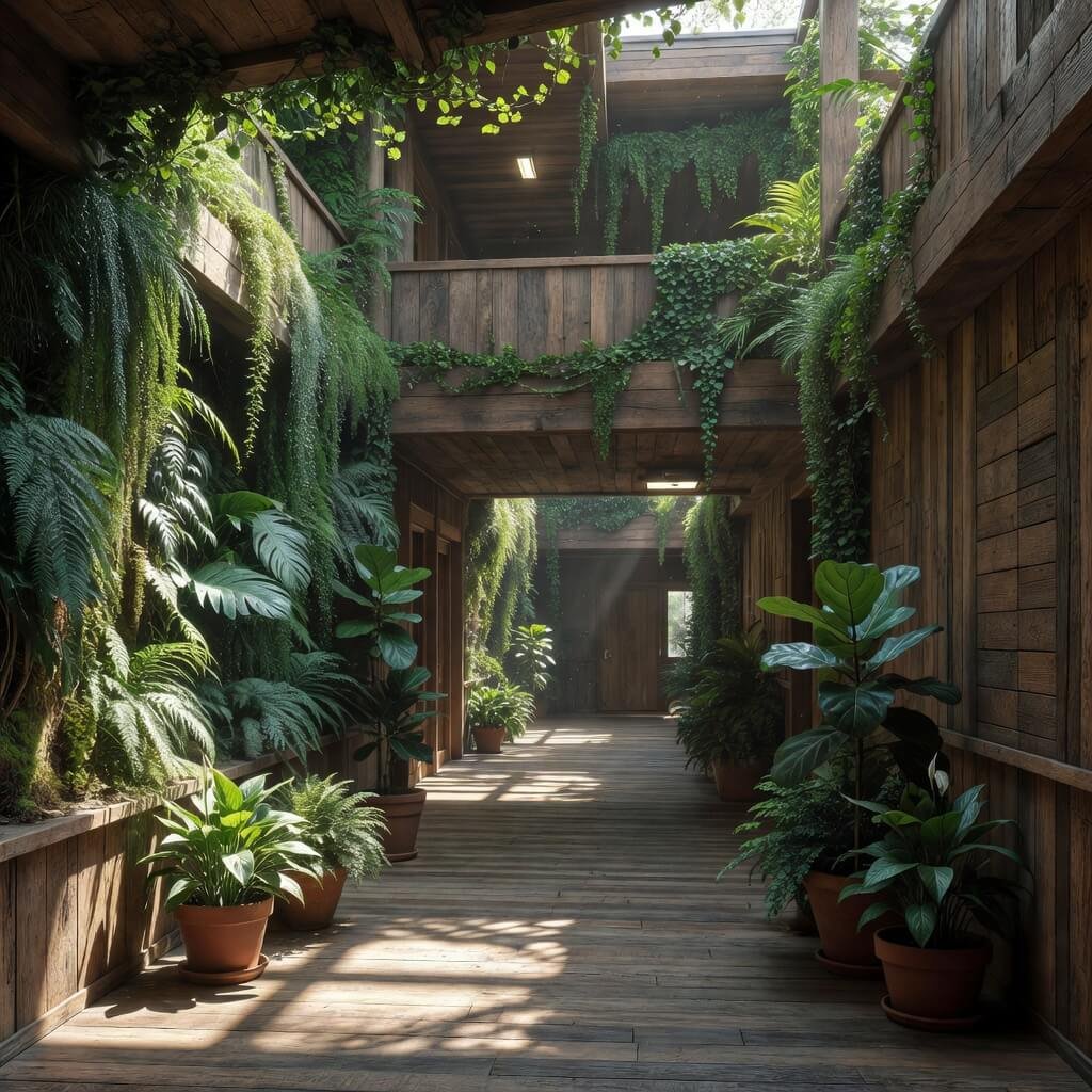
Who says schools have to feel like concrete bunkers? Bringing nature indoors through corridor design isn’t just trendy – it’s backed by solid research showing that natural elements improve concentration, reduce stress, and boost overall well-being.
I’m talking about more than just sticking a few fake plants in corners (please don’t do that :/ ). A proper nature-themed corridor incorporates living walls, natural lighting, organic shapes, and materials that connect students to the outdoors even when they’re stuck inside.
Living walls are my personal favorite element here. These vertical gardens don’t just look amazing – they actually improve air quality and create a sense of tranquility that traditional decorations can’t match. Plus, they give students hands-on learning opportunities about plant care and environmental responsibility.
The design elements that make this work:
- Natural light maximization: Skylights, larger windows, or light tubes where possible
- Organic color palettes: Think forest greens, warm browns, and soft blues
- Natural textures: Wood accents, stone features, or bamboo elements
- Plant integration: From living walls to hanging gardens to floor planters
Maintenance concerns? Sure, plants need care, but I’ve seen schools turn this into positive learning experiences. Student clubs take ownership of corridor gardens, creating responsibility and pride in their environment.
The key is balancing the natural elements with practical needs. You still need durable flooring that can handle heavy foot traffic, but that doesn’t mean you can’t choose materials that echo natural textures and colors.
Also Read: 10 Creative Small Corridor Design Ideas for Narrow Spaces
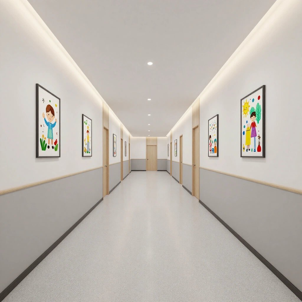
Student Art Display Gallery Corridor

Here’s a radical idea: what if school corridors celebrated the creativity of the people who actually use them? Student art display corridors transform these transitional spaces into dynamic galleries that showcase student talent while creating an ever-changing visual environment.
I’ve seen schools nail this concept by treating their corridors like professional gallery spaces rather than random bulletin board collections. The difference is night and day. Proper lighting, consistent framing systems, and curated displays give student work the respect it deserves while maintaining a clean, organized aesthetic.
The brilliant thing about this approach is its built-in rotation system. Unlike static decorative elements, student artwork naturally refreshes throughout the school year. New exhibitions, different grades showcasing their work, various artistic mediums – the corridor never gets stale or outdated.
Essential elements for success:
- Professional display systems: Adjustable hanging tracks or modular mounting systems
- Proper lighting: Track lighting or picture lights that actually illuminate the artwork
- Clear organization: Labeled exhibitions with artist information and project details
- Protection measures: Plexiglass covers or strategic positioning to prevent damage
But here’s the real magic: When students see their work displayed with the same care you’d find in a professional gallery, it changes how they view their own creativity and capabilities. The corridor becomes a source of pride rather than just a pathway.
FYI, this doesn’t mean accepting every crayon drawing. Curated displays with rotating themes maintain quality while ensuring broad participation. Think seasonal exhibitions, cross-curricular projects, or collaborative installations that involve multiple grades.
Motivational Quote Wall Corridor Design
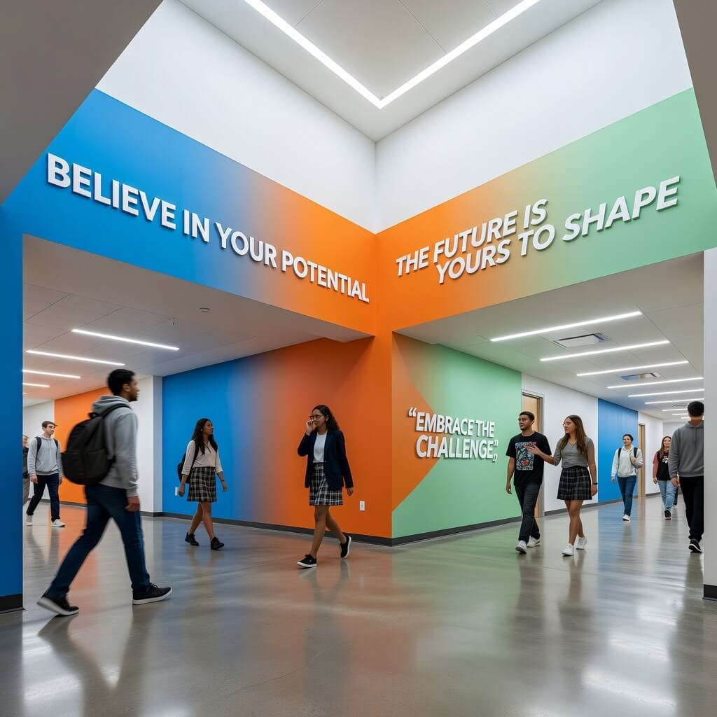
Okay, I know what you’re thinking – “Great, more cheesy inspirational posters.” But hold up! Done right, motivational quote walls can actually inspire rather than induce eye-rolls from students who’ve seen the same “Hang in There” cat poster for the millionth time.
The secret is in the execution and authenticity. Instead of generic platitudes, successful quote walls feature student-submitted quotes, words from local community leaders, or messages from graduates who’ve walked these same halls. The personal connection makes all the difference.
I’ve seen schools create interactive quote walls where students can contribute their own motivational messages or respond to existing ones. These become living documents of the school community’s values and aspirations, constantly evolving with new voices and perspectives.
Design elements that elevate this concept:
- Typography as art: Beautifully designed lettering rather than basic fonts
- Strategic placement: Quotes positioned where students naturally pause or gather
- Cultural diversity: Messages in multiple languages reflecting the school community
- Regular rotation: Fresh content keeps the walls relevant and engaging
The minimalist approach works particularly well here. One powerful quote in stunning typography has far more impact than a wall cluttered with dozens of messages. Think museum-quality presentation rather than bulletin board chaos.
What makes this work is relevance and authenticity. Quotes from students who’ve overcome real challenges, messages from local heroes, or wisdom from community elders create connections that generic motivational content simply can’t achieve.
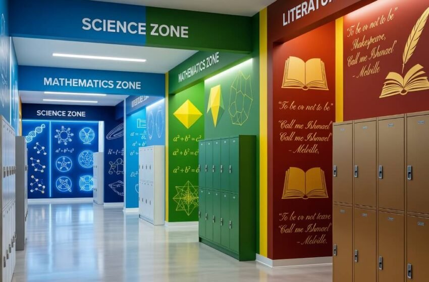
Color-Zoned Subject-Based Hallway Design
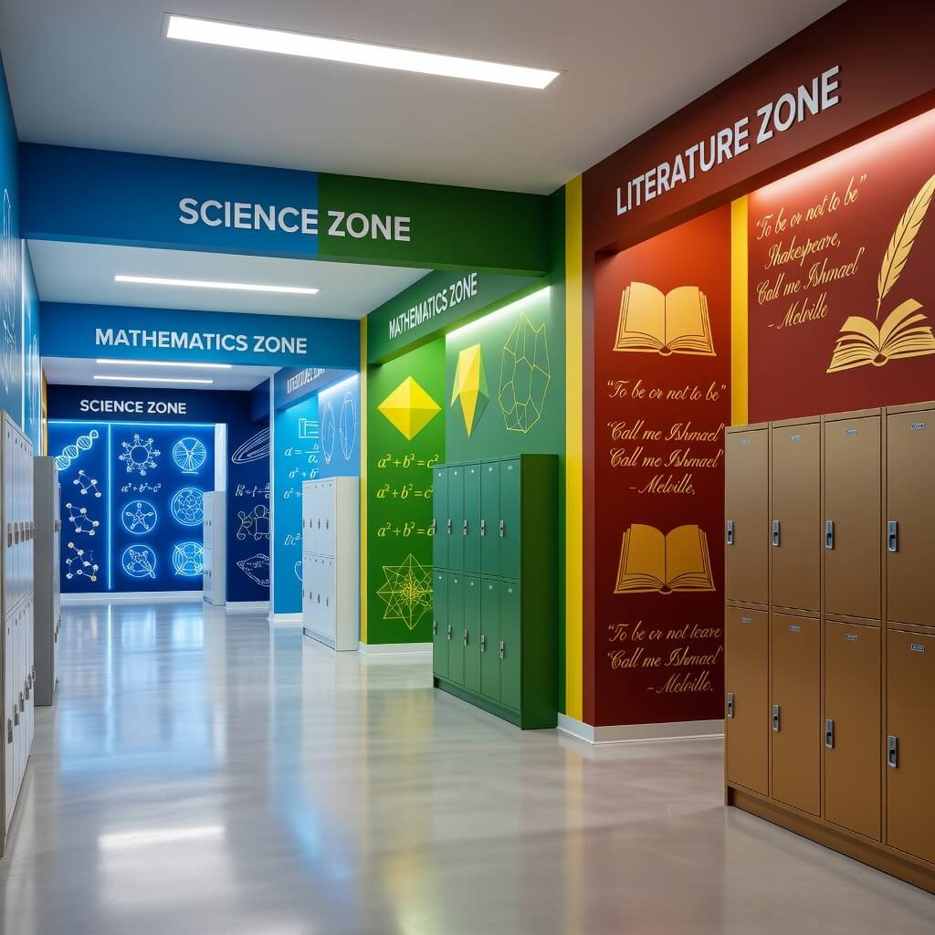
Ever gotten lost in a school because every corridor looks identical? Color-zoned design solves this problem while creating an intuitive navigation system that even first-day students can follow.
The concept is brilliantly simple: assign specific color palettes to different academic areas and carry these colors throughout the corridor design. Science wing gets cool blues and greens, arts corridor features warm oranges and reds, math areas use clean grays and whites with accent colors.
But this isn’t about painting entire walls in bright primary colors (please, no). Sophisticated color application through accent walls, flooring details, ceiling features, or integrated lighting creates visual zones without overwhelming the space.
Here’s what makes this system effective:
- Intuitive wayfinding: Students subconsciously learn the color associations
- Academic identity: Each department gets its own visual personality
- Cohesive flow: Consistent application creates unity throughout the school
- Practical benefits: Reduces confusion and improves traffic flow
I’ve walked through schools that implemented this system, and the psychological impact is real. Students feel more confident navigating the space, and there’s a subtle sense of arrival when entering different academic zones.
The key is subtlety. Accent colors rather than dominant hues maintain the clean, minimalist aesthetic while providing clear visual cues. Think colored tile inlays in neutral floors, colored lighting features, or strategically placed colored elements rather than full wall coverage.
This approach also makes maintenance easier – damaged or outdated elements in one zone can be updated without affecting the entire school’s aesthetic.
Also Read: 10 Beautiful Office Corridor Design Ideas Minimal Luxury Spaces
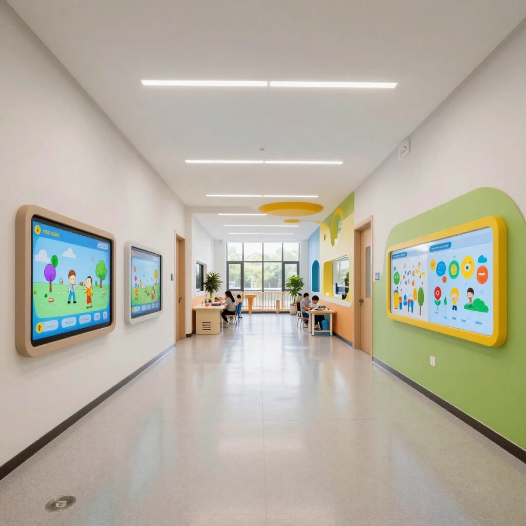
Smart Digital Display School Corridor
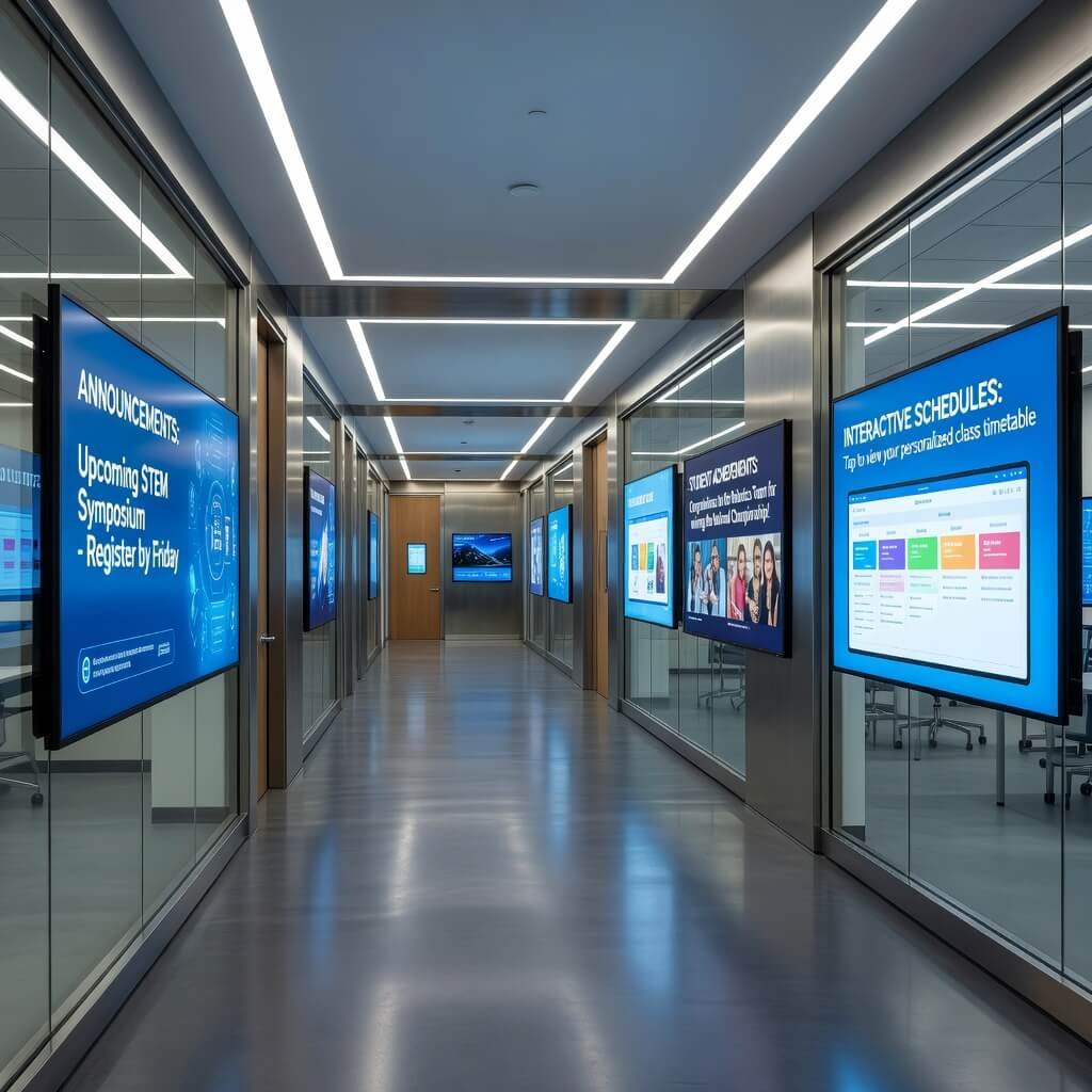
Welcome to the 21st century, where corridors can be as smart as the classrooms they connect. Smart digital display systems transform traditional hallways into dynamic information hubs that serve the entire school community.
But let’s be real – I’m not talking about those ancient, flickering TVs mounted randomly on walls showing endless PowerPoint slides. Modern smart corridor systems integrate seamlessly into the architecture, providing relevant, timely information while maintaining the clean aesthetic everyone wants.
Real-time scheduling displays, emergency alert systems, student achievement celebrations, and community announcements all flow through sleek, wall-mounted screens that blend into the overall design. The information is actually useful, and the presentation is clean and professional.
What makes smart displays work in corridors:
- Strategic placement: Positioned where students naturally pause or gather
- Content management: Easy-to-update systems that teachers and administrators can manage
- Integration potential: Connection to school information systems for automatic updates
- Energy efficiency: Modern displays that don’t drain the school budget
The minimalist approach is crucial here. Fewer, larger displays with clean mounting systems work better than multiple small screens scattered throughout the space. Think architectural integration rather than afterthought installation.
IMO, the best implementations I’ve seen treat these displays as architectural elements rather than technology add-ons. Recessed mounting, consistent sizing, and coordinated content create a professional appearance that enhances rather than clutters the corridor design.
The key is content curation. Random information overload defeats the purpose. Successful systems focus on relevant, timely, and visually appealing content that actually serves the school community.
Eco-Friendly Bamboo Style Corridor Concept
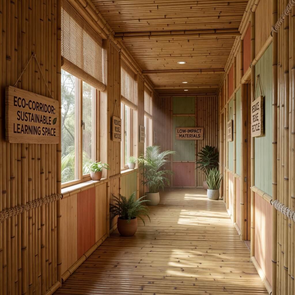
Sustainability meets style in eco-friendly bamboo corridor design. This isn’t about creating a tiki bar atmosphere – it’s about using sustainable materials and design principles to create spaces that are both environmentally responsible and visually stunning.
Bamboo works brilliantly in corridor applications because it’s incredibly durable, naturally antimicrobial, and grows faster than traditional hardwoods. Plus, the clean lines and natural texture fit perfectly with minimalist design principles.
I’ve seen schools incorporate bamboo flooring, wall panels, and ceiling features to create warm, inviting corridors that don’t sacrifice durability for sustainability. The natural variations in bamboo grain add visual interest without requiring additional decorative elements.
Eco-friendly design elements that work:
- Bamboo flooring: Harder than many traditional hardwoods, perfect for high-traffic areas
- Recycled materials: Glass tiles, reclaimed wood accents, or recycled plastic fixtures
- Energy-efficient lighting: LED systems with daylight sensors and occupancy controls
- Low-VOC finishes: Healthier indoor air quality for students and staff
The environmental benefits extend beyond material choices. Natural lighting maximization, improved ventilation systems, and energy-efficient mechanical systems create healthier learning environments while reducing operational costs.
What I love about this approach is how it teaches sustainability through example. Students learn about environmental responsibility not through lectures, but by experiencing thoughtfully designed spaces that demonstrate sustainable practices in action.
Maintenance considerations? Bamboo actually requires less maintenance than many traditional materials, and its natural antimicrobial properties make it ideal for high-use school environments. Plus, most bamboo products come with excellent warranty coverage.
3D Geometric Wall School Corridor Design
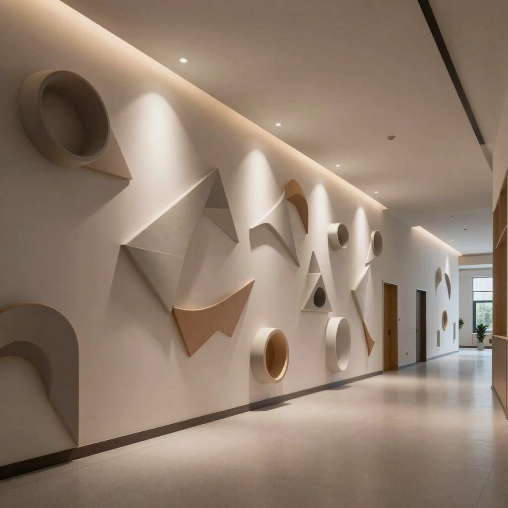
Sometimes you need to literally add dimension to transform a boring corridor, and 3D geometric wall treatments deliver visual impact while maintaining clean, modern aesthetics.
Think strategic geometric panels, dimensional wall tiles, or sculptural elements that create depth and interest without cluttering the space. These aren’t random decorative additions – they’re architectural features that serve both aesthetic and practical purposes.
I’ve walked through schools where 3D wall treatments transformed long, monotonous corridors into engaging pathways that students actually enjoy using. The key is strategic placement and consistent design language that complements rather than competes with the overall architectural vision.
Geometric design elements that work:
- Modular panel systems: Easy to install, repair, or reconfigure as needed
- Acoustic benefits: Many 3D treatments also improve corridor acoustics
- Material variety: Wood, metal, composite, or even acoustic foam options
- Lighting integration: Geometric patterns that work with integrated lighting systems
The minimalist principle applies here too. Fewer, larger geometric features create more impact than busy patterns that overwhelm the space. Think bold, simple shapes rather than complex, detailed designs.
What makes this concept particularly smart is its scalability. Schools can implement geometric features in phases, starting with high-traffic areas and expanding the design language throughout the building over time.
Practical benefits include improved acoustics (many geometric wall treatments absorb sound), easier maintenance (modular systems allow individual panel replacement), and psychological impact (dimensional walls feel more engaging than flat surfaces).
The key is consistency in scale and material choice. Random geometric features scattered throughout a corridor create visual chaos, but coordinated geometric elements with consistent proportions and materials enhance the overall design integrity.
Also Read: 10 Premium Corridor Ceiling Design Ideas for Hotel Style Look
Library-Inspired Reading Corner Corridor
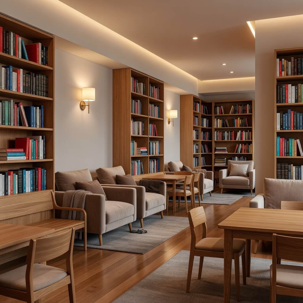
Who says learning only happens in designated classrooms? Library-inspired corridor design creates quiet zones and reading nooks that encourage academic engagement throughout the school day.
The concept transforms wider corridor areas, alcoves, or transitional spaces into comfortable reading environments that feel intentional rather than improvised. Built-in seating, integrated book storage, and thoughtful lighting create spaces where students can engage with books, complete homework, or simply take a quiet break.
I’ve seen schools nail this concept by treating corridor reading areas with the same design attention they’d give to a formal library space. Quality furniture, proper task lighting, and acoustic considerations make these spaces genuinely functional rather than just decorative.
Essential elements for success:
- Comfortable seating: Built-in benches with cushions or quality lounge chairs
- Book storage: Integrated shelving or mobile book carts with curated selections
- Task lighting: Focused lighting for reading without creating glare
- Acoustic treatment: Materials that reduce noise and create a calmer environment
The beauty of this approach is its flexibility. Reading corners can serve multiple functions – quiet study areas during the day, social gathering spots during events, or showcase spaces for book-related activities.
What makes this work is intentional design rather than afterthought furniture placement. Built-in elements, coordinated materials, and proper lighting signal that these spaces are valued parts of the educational environment, not just places to stick extra chairs.
The minimalist aesthetic works perfectly here. Clean lines, quality materials, and uncluttered spaces create calming environments that actually encourage quiet activities rather than social chaos.
Wrapping It All Up
After exploring these 10 corridor design approaches, here’s what I’ve learned: great school corridor design isn’t about choosing one perfect concept – it’s about understanding your specific needs and creating spaces that actually serve your school community.
The minimalist approach threads through all these ideas because it works. Clean, uncluttered spaces are easier to maintain, more flexible for different functions, and create calmer environments for learning. But minimalist doesn’t mean boring – it means intentional choices that serve multiple purposes.
Whether you’re drawn to the high-tech appeal of smart displays, the natural warmth of bamboo and plants, or the community focus of student art galleries, the key is consistent execution and authentic connection to your school’s values and needs.
Budget constraints? Start small. Pick one corridor and execute one concept beautifully rather than trying to transform everything at once with mediocre results. Quality implementation in a limited area often generates the enthusiasm and support needed for broader changes.
The best corridor designs I’ve seen grow organically from school communities that care about their environment and understand that physical spaces impact learning, behavior, and school culture. These aren’t just pretty hallways – they’re functional, inspiring spaces that make schools better places to learn and work.
Your corridors don’t have to stay boring. With thoughtful planning, community input, and quality execution, these transitional spaces can become some of the most loved areas in your school. Now go make it happen! 🙂