10 Unique Shop Front Design Ideas for Attractive Storefronts
- Shop Design
 Ben
Ben- 0
- 41 minutes read
So, you’re walking down the street, minding your own business, when BAM—a storefront catches your eye and literally stops you in your tracks. That’s the power of killer shop front design, my friend. I’ve seen businesses transform from “meh, I’ll pass” to “take my money!” just by nailing their exterior aesthetic. And honestly? Your storefront is basically your business card, billboard, and first date all rolled into one. No pressure, right?
Look, I’ve spent way too many weekends wandering around shopping districts (retail therapy is real, don’t judge me), and I’ve noticed something interesting. The shops that actually pull me inside aren’t necessarily the ones with the biggest budgets—they’re the ones with personality, creativity, and that certain “wow factor” that screams originality. Whether you’re opening a cozy boutique, a high-end jewelry store, or a quirky café, your shop front needs to tell your brand story before customers even touch the door handle.
Here’s the thing: most shop owners slap on a sign, paint the door, and call it a day. But you? You’re smarter than that. You want something that turns heads, generates Instagram posts, and makes people remember your store long after they’ve walked past. So grab your coffee (or wine, I won’t tell), and let me walk you through ten seriously unique shop front design ideas that’ll make your storefront absolutely irresistible.
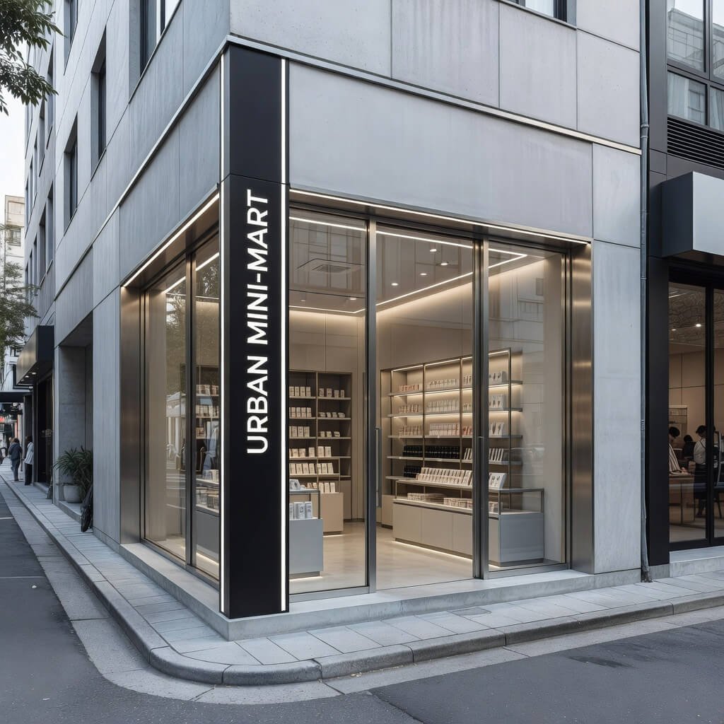
Modern Minimal Glass Shop Front Design
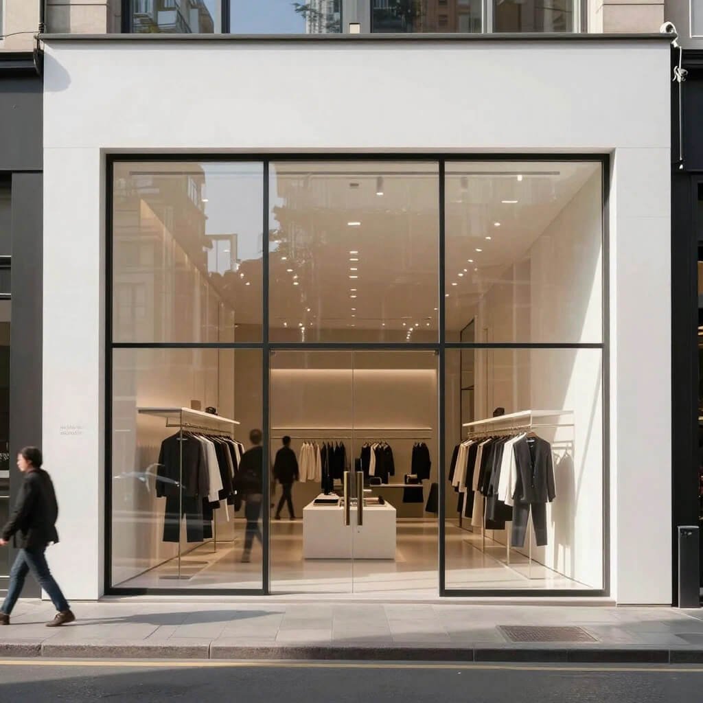
Ever notice how the most sophisticated stores make it look effortless? That’s the magic of modern minimalism. I’m talking floor-to-ceiling glass panels, clean lines, and barely-there framing that makes your products the absolute star of the show.
This design approach strips away all the noise and lets your merchandise do the talking. Think Apple Store vibes—simple, elegant, and ridiculously effective. The transparency creates this honest, “we’ve got nothing to hide” vibe that customers absolutely love. Plus, natural light floods your space, which makes everything inside look ten times better (and saves you money on electricity, FYI).
Why This Works Like Magic
The minimal glass approach works because it removes barriers—literally and psychologically. When potential customers can see straight into your store, they’re already mentally inside, browsing your displays. There’s zero intimidation factor, which is huge for attracting walk-in traffic.
I remember visiting this minimalist fashion boutique in Brooklyn where the entire front was seamless glass with just a sleek aluminum frame. No clutter, no excessive branding, just beautiful clothes displayed against white walls. Guess what? I walked in. The design made me feel like I was entering a gallery, not a pushy retail space.
Key Elements to Nail
Want to pull this off successfully? Here’s what you need:
- Frameless or ultra-thin aluminum frames that practically disappear
- High-quality tempered glass that’s crystal clear (no green tints, please)
- Strategic interior lighting that creates a glow effect at night
- Minimalist signage in modern fonts—think sans-serif elegance
- Impeccable window displays because everything shows with glass
The challenge? You can’t hide messy storage or unorganized stock. This design demands discipline and constant curation. But if you can maintain it, you’ll project premium quality without saying a word.
Luxury Marble And Gold Storefront Concept
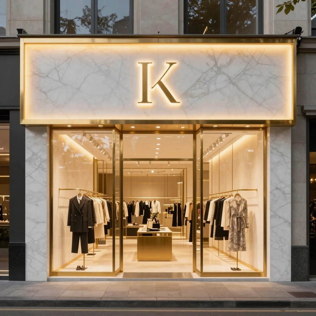
Okay, let’s talk about going full-on opulent. If your brand screams luxury and your target customers appreciate the finer things in life, marble and gold accents are basically your love language. This isn’t subtle—this is “I want people to know quality costs money” territory.
I’ve seen this done brilliantly with high-end jewelry stores and luxury fashion boutiques. Picture polished marble surrounds (white Carrara or dramatic black marble), gold-finished frames, and maybe some elegant brass fixtures. It’s the kind of storefront that makes people straighten their posture as they walk past. 🙂
Creating That Premium Feel
The marble-and-gold combo works because these materials have centuries of association with wealth and refinement. Your brain automatically categorizes stores with these finishes as high-end. It’s psychological positioning at its finest.
But here’s my honest take: you’ve got to commit fully. Half-hearted luxury looks worse than no luxury at all. Either use real marble (or incredibly convincing alternatives) and actual gold finishes, or choose a different direction entirely. Cheap imitations will backfire spectacularly.
Design Components That Elevate
Here’s what makes this concept shine:
- Marble cladding on columns, surrounds, or entire facades
- Gold or brass trim on door frames, handles, and signage
- Elegant typography with possibly gold-leafed lettering
- Subtle accent lighting that highlights the marble veining
- Symmetrical design because luxury loves balance
- High-gloss finishes that reflect light beautifully
One jewelry store I visited in Dubai had this design, and honestly, I felt underdressed just walking past it. The warm gold against cool white marble created this timeless elegance that perfectly matched their six-figure watches. The storefront promised luxury, and the interior delivered.
Neon Signage Night Glow Shop Front
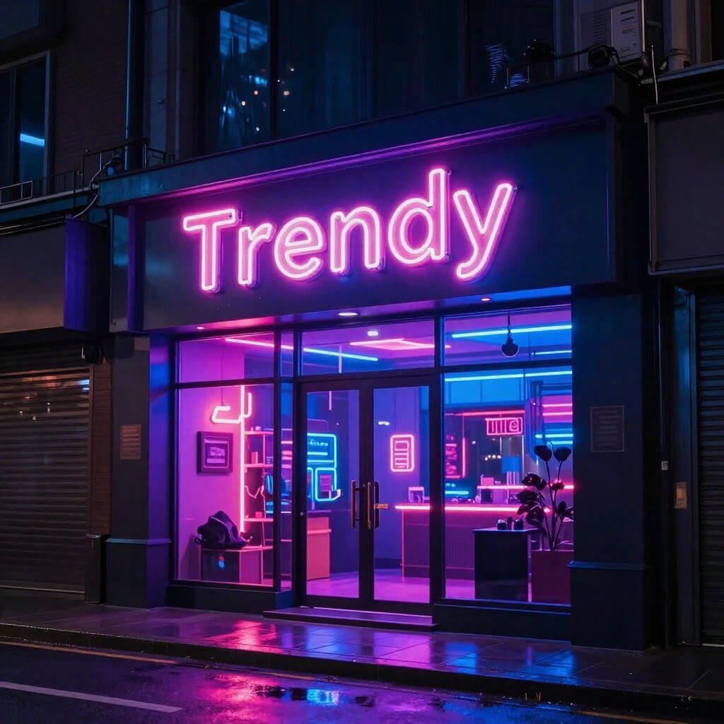
Want to own the nighttime economy? Neon signage might be your secret weapon. There’s something irresistibly retro-cool about glowing neon that attracts people like moths to a flame (but in a good way, obviously).
I’m not talking about tacky 1980s diner neon (unless that’s your vibe—no judgment). Modern neon design can be sophisticated, playful, or downright artistic. Custom neon signs in trendy script fonts, geometric shapes, or even abstract designs can transform your storefront into an Instagram magnet.
The Pull of the Glow
Neon creates atmosphere and emotion. Warm pink or orange neon feels inviting and friendly. Cool blue or purple reads as modern and edgy. You’re not just lighting up your store; you’re setting a mood before customers even enter.
I recently visited this craft cocktail bar with a custom neon installation that said “Good Vibes Only” in coral pink. The line to get in wrapped around the block, and I guarantee half those people discovered the place because they saw the glow from down the street. That’s the power we’re talking about.
Making Neon Work For You
Successfully incorporating neon requires some strategy:
- Choose colors that match your brand personality (not just what looks cool)
- Consider custom shapes or phrases that reinforce your identity
- Mix neon with other materials like exposed brick or black matte surfaces
- Think about visibility from different angles and distances
- Plan for the daytime look too—neon tubes have character even when off
- Budget for quality because cheap neon burns out fast and looks sad
The flexibility here is incredible. Coffee shops use neon coffee cup outlines. Bookstores create neon quote displays. Fashion boutiques spell out brand mottos in cursive neon. What story do you want your glow to tell?
Also Read: 10 Elegant Cash Counter Design Modern Ideas for Retail Upgrade
Wooden Warm Aesthetic Boutique Front Design
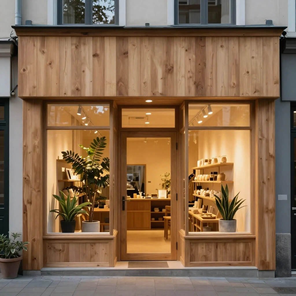
Let me tell you about the cozy-factor of wood. If you want your storefront to feel welcoming, artisanal, and genuinely warm, natural wood elements are absolute gold. This design approach works beautifully for boutiques, organic stores, cafés, and basically anywhere you want people to feel comfortable rather than intimidated.
I’m talking rich wood tones—walnut, oak, cedar—used for framing, cladding, or architectural details. Wood brings nature into urban environments and creates this instant sense of craftsmanship and authenticity that customers trust.
Why Wood Wins Hearts
There’s science behind why wood feels good. It’s a natural material that humans have positive psychological associations with. It reads as authentic, sustainable, and carefully crafted—all qualities that modern consumers actively seek out.
I visited this amazing boutique in Portland (of course it was Portland) where they used reclaimed barn wood for the entire storefront facade. The weathered texture told a story before you even saw the handmade goods inside. The wood varied slightly in color and grain, which made it feel genuine rather than manufactured. People constantly stopped to take photos.
Elements That Create Warmth
Want that cozy, approachable vibe? Include these:
- Reclaimed or sustainably-sourced wood for ethical appeal
- Natural finish that shows the grain and texture
- Warm-toned lighting that enhances the wood’s richness
- Mix wood with glass for an modern-rustic hybrid
- Wood-framed signage with carved or painted lettering
- Natural plants or greenery that complement the organic feel
Pro tip: Don’t go overboard. Too much wood can feel dated or overwhelming. I’ve seen designs that balanced wood framing with clean white walls or large glass sections, and that combination absolutely nailed the modern-yet-warm aesthetic.
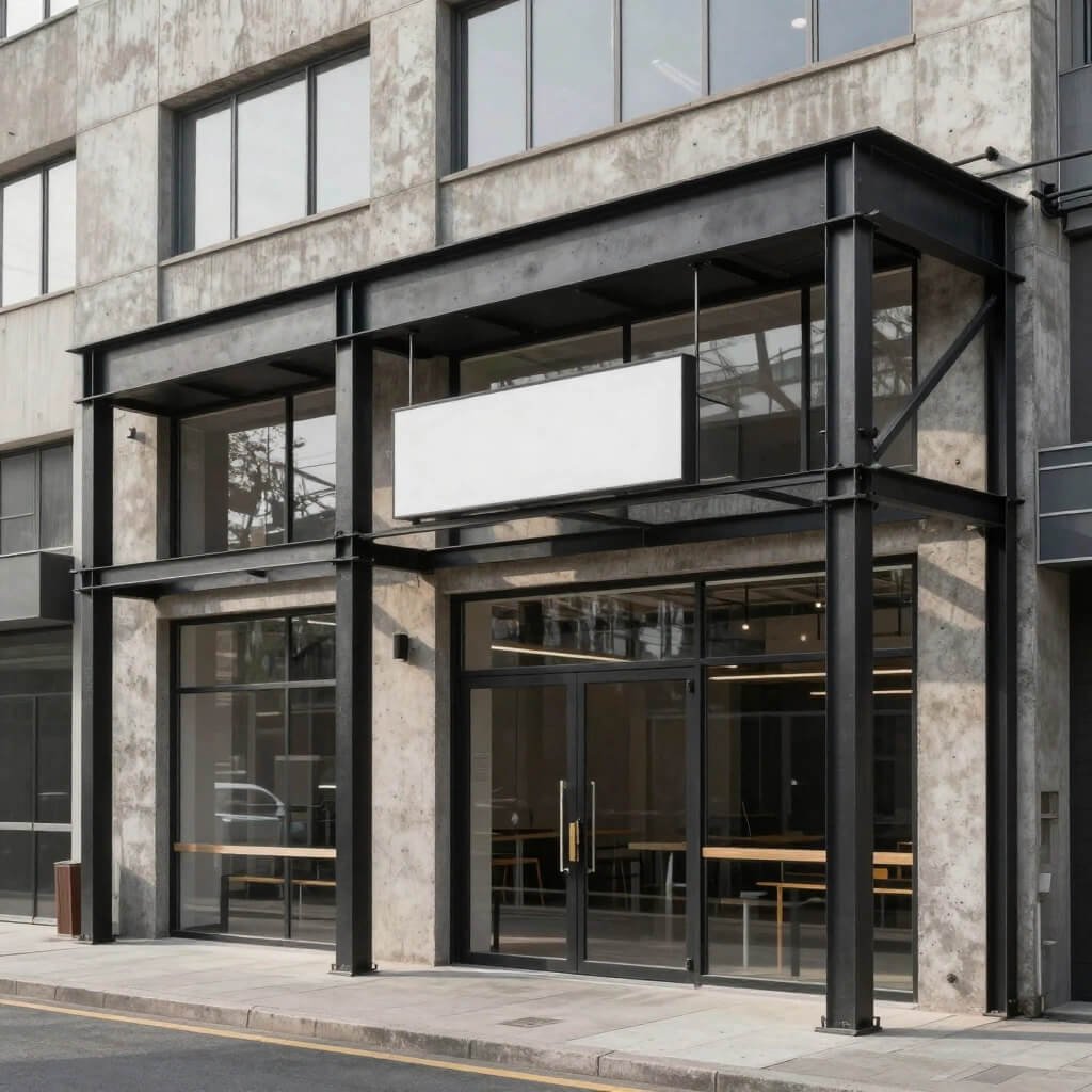
Industrial Style Metal Frame Storefront
Ready to channel some serious urban-cool energy? Industrial design isn’t going anywhere, and for good reason—it’s bold, honest, and unapologetically raw. We’re talking exposed metal frameworks, often in black steel or iron, with minimal fuss and maximum impact.
This style works incredibly well for fitness studios, design shops, barbershops, tech stores, and anywhere that wants to project strength and modernity. The industrial look says “we’re confident and we don’t need to hide behind decoration.”
The Strength of Steel
Metal frameworks create visual interest through geometry and structure rather than ornamentation. The honest exposure of beams and joints feels authentic in a world where everyone’s tired of fake facades (literally and figuratively).
I stumbled into this menswear shop in Brooklyn that had floor-to-ceiling black steel framing with large glass panes. The metal grid created a kind of architectural honesty that perfectly matched their brand—straightforward, quality-focused, no-nonsense style. The framework itself became the design feature.
Industrial Components Done Right
Here’s what makes industrial storefronts work:
- Black steel or iron framing with visible welds and joints
- Large glass sections contained within the metal grid
- Exposed rivets or bolts that celebrate the construction
- Concrete or brick surrounds that enhance the raw aesthetic
- Edison bulb lighting or metal cage fixtures
- Minimal color palette focusing on blacks, grays, and natural materials
The beauty of this approach? It’s incredibly versatile. You can go full warehouse-chic or soften it with wood accents and plants. The metal framework provides the backbone, and you can adjust the warmth from there.
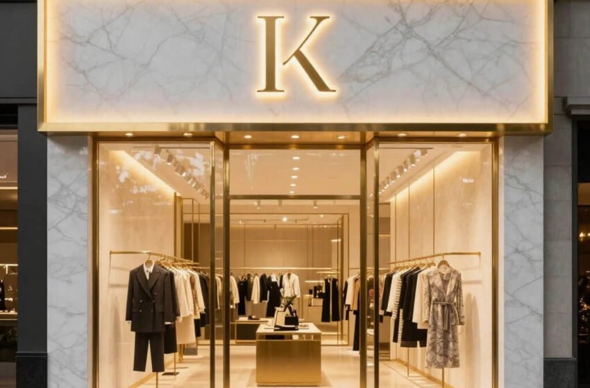
High-End Black Matte Premium Shop Front
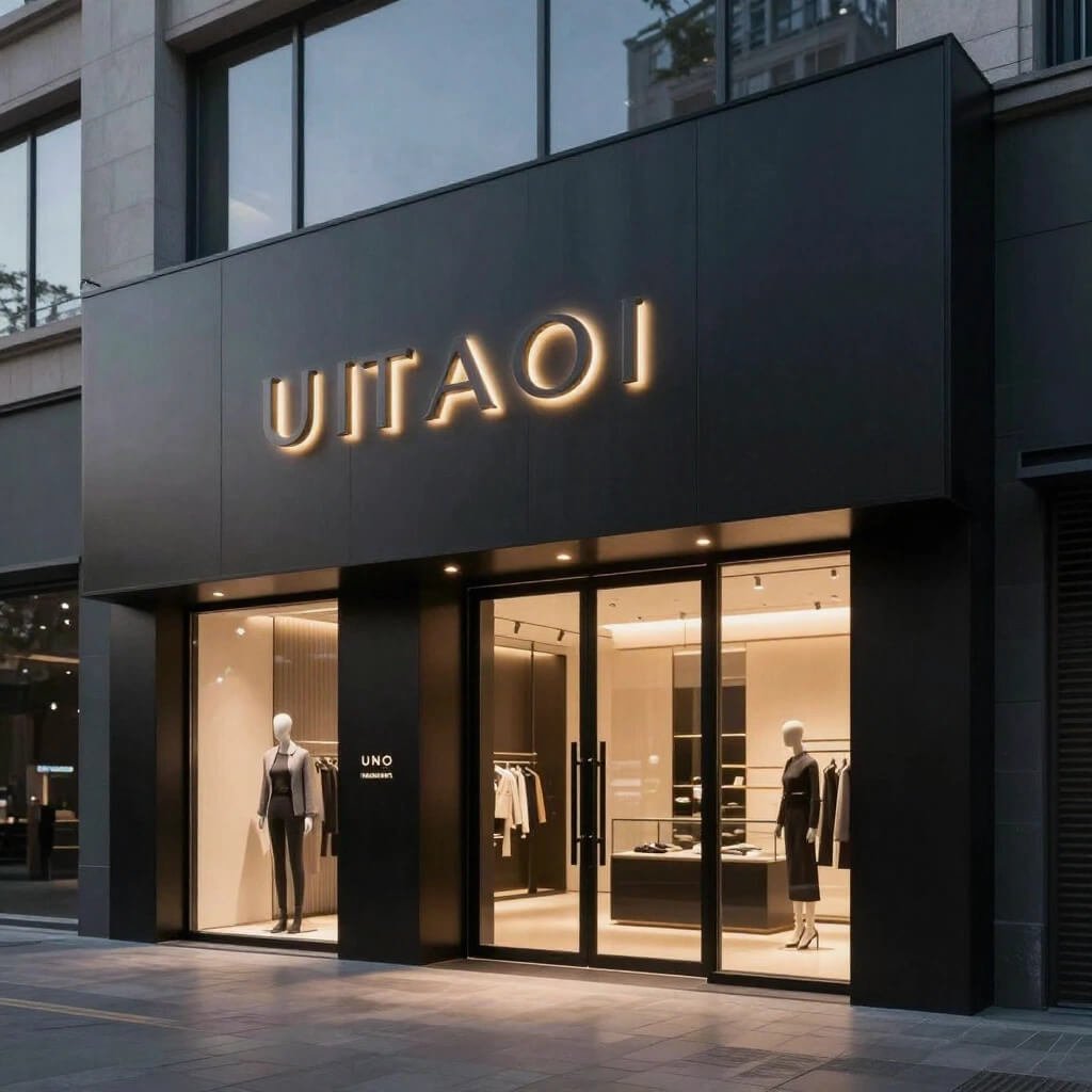
Want to know a secret? Black matte finishes make everything look more expensive. Period. There’s something about that deep, non-reflective black that screams sophistication and exclusivity. It’s the tuxedo of shop front designs.
I’m obsessed with this trend because it works across so many industries—from high-end salons to premium electronics stores to luxury fashion. The matte black creates a kind of visual silence that makes your signage and products pop dramatically.
The Psychology of Matte Black
Glossy says “look at me!” while matte says “I’m worth looking at.” See the difference? Matte finishes feel more refined and controlled. They absorb light rather than reflecting it, creating this sophisticated, almost mysterious quality.
There’s this premium watch boutique I pass regularly that has a completely matte black facade with only their brand name in subtle brushed gold lettering. No window displays. No clutter. Just black matte surfaces and a single glass door. The exclusivity factor is through the roof—you feel like you’re entering a members-only club.
Executing Matte Black Elegance
Getting this right requires attention to detail:
- High-quality matte paint or powder coating (cheap matte looks chalky and bad)
- Minimal but perfect signage in contrasting metals or white
- Strategic lighting to prevent the facade from disappearing at night
- Pristine maintenance because every fingerprint shows on matte black :/
- Contrast elements like brass handles or white marble accents
- Clean lines and geometric precision because matte reveals every flaw
Fair warning: matte black demands commitment to cleanliness. Dust, fingerprints, and smudges show up like crazy. But if you can maintain it, IMO, there’s no more powerful way to communicate premium positioning.
Also Read: 10 Trendy Shop Counter Design Modern Ideas for Smart Layouts
Open Wide Display Transparent Glass Storefront
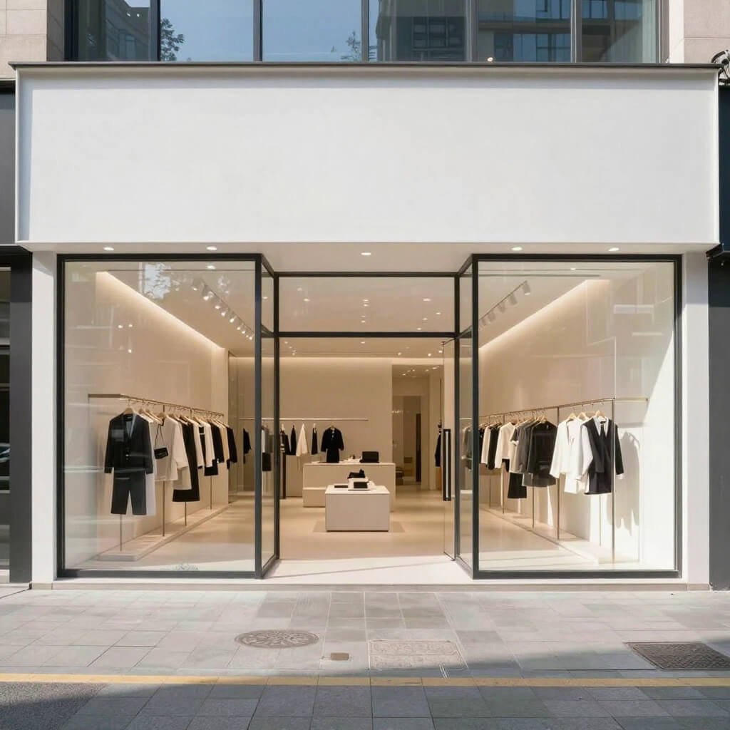
Let’s talk about breaking down barriers—literally. The open wide display concept maximizes transparency and creates a seamless transition between street and store. Think floor-to-ceiling glass with minimal framing, often featuring sliding or folding glass doors that can completely open the front.
This design creates an inviting, “come on in” feeling that lower foot traffic barriers significantly. I’ve watched stores with this setup absolutely dominate in high-traffic areas because there’s no psychological threshold to cross.
Transparency Builds Trust
When customers can see everything—the layout, the products, other happy customers browsing—it eliminates uncertainty. Visual accessibility reduces anxiety about entering an unfamiliar space. It’s welcoming without being pushy.
I visited this bookstore in Seattle with massive sliding glass panels that fully retracted during good weather. The store literally opened onto the sidewalk, creating this blurred boundary between public space and retail space. Customers wandered in almost accidentally, which I’m sure was exactly the point. Genius, really.
Components of Open Display Design
Make this work with:
- Retractable or folding glass systems for flexible opening
- Minimal visual barriers between interior and exterior
- Thoughtful interior design since everything’s visible
- Strong visual merchandising that draws eyes from the street
- Climate control planning for when you open completely
- Security systems that work with maximum transparency
The challenge? Your interior design game needs to be constantly on point. There’s no hiding mediocre displays or messy stock areas when everything’s visible. But if you’re confident in your merchandising skills, this approach can dramatically increase walk-in traffic.
Color Pop Creative Artistic Shop Front Design
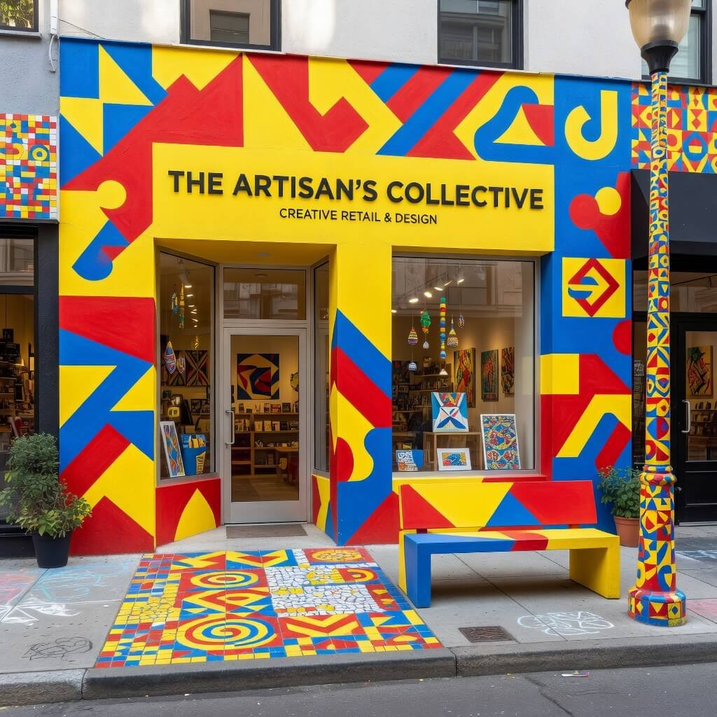
Time to get bold and playful. If your brand personality is energetic, creative, and not afraid to stand out, why should your storefront whisper when it could sing? Color pop designs use vibrant, unexpected color combinations to create memorable, joyful storefronts that people literally can’t ignore.
I’m talking bright yellows, electric blues, hot pinks—colors that make people smile and pull out their phones for photos. This approach works beautifully for ice cream shops, toy stores, creative agencies, art galleries, kids’ boutiques, and any business where fun and creativity are core values.
The Power of Color Psychology
Colors trigger emotional responses faster than words or shapes. Bright, saturated colors create feelings of happiness, energy, and optimism. Your storefront becomes an experience before customers even interact with your products.
There’s this amazing gelato shop near me with a facade painted in gradient stripes from hot pink to orange to yellow. It looks like a sunset exploded on the building, and honestly? There’s always a line. The color scheme promises fun and delivers it. The design does half the marketing work.
Creating Your Color Statement
Ready to go bold? Consider:
- Strategic color combinations that align with your brand (don’t just pick random bright colors)
- Quality paint and finishes that stay vibrant without fading
- Balance between statement and chaos (you want eye-catching, not overwhelming)
- Complementary interior colors that continue the color story
- Graphic elements or murals that incorporate the color palette
- Good signage contrast so your name remains readable
Pro tip: Test your colors in different lighting conditions. What looks perfect in afternoon sun might look weird under street lamps at night. I’ve seen color pop designs that absolutely glow beautifully in evening light because they planned the palette carefully.
Traditional Cultural Theme Shop Front Design
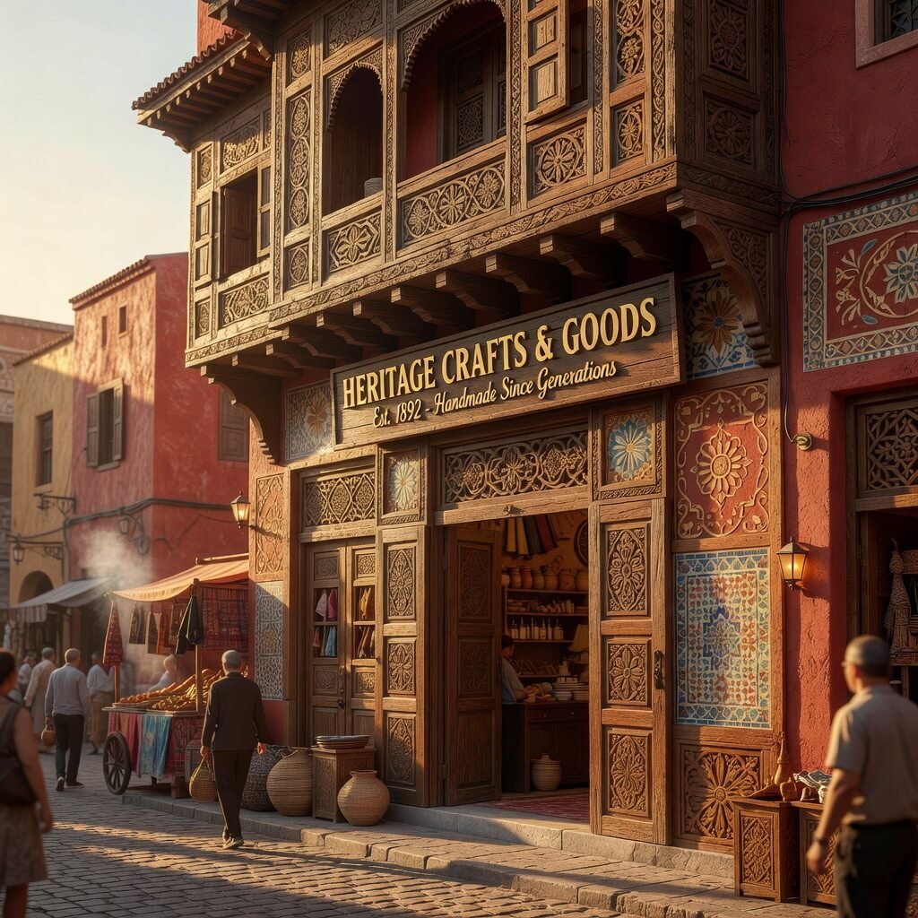
Here’s something beautiful: honoring cultural heritage through storefront design. If your business connects to specific cultural traditions—whether that’s a tea house, ethnic restaurant, cultural craft shop, or heritage brand—embracing traditional architectural elements creates authenticity and tells a powerful story.
This might mean incorporating architectural details from specific cultures: Chinese lattice work, Japanese shoji-inspired screens, Moroccan tile patterns, Indian carved wood details, or Middle Eastern archways. Authentic cultural design communicates respect, knowledge, and genuine connection to traditions.
Authenticity Over Appropriation
Let me be real here: this only works if there’s genuine connection. If you’re designing a Japanese tea house and you have deep knowledge of tea ceremony traditions, incorporating shoji screens and noren curtains makes sense. If you’re randomly slapping on cultural elements for aesthetic without understanding or connection, it feels (and is) disrespectful.
I visited this incredible Chinese apothecary in San Francisco’s Chinatown with a storefront featuring traditional carved wooden screens, red lacquered pillars, and gold calligraphy. The design choices reflected the family’s heritage and the traditional medicine practices inside. It felt authentic because it was.
Traditional Elements That Work
When done respectfully and authentically:
- Traditional architectural details specific to the culture
- Authentic materials like carved wood, specific tile work, or traditional metalwork
- Cultural color palettes that carry symbolic meaning
- Traditional typography or calligraphy for signage
- Craft techniques that honor traditional methods
- Consultants from the culture to ensure respectful representation
The key is intention and authenticity. Cultural design elements should reflect the truth of your business, not just aesthetic trends. When done right, this approach creates incredibly powerful, meaningful storefronts that attract customers seeking authentic cultural experiences.
Also Read: 10 Stylish Pharmacy Counter Design Ideas for Modern Pharmacies
Small Space Compact Smart Shop Front Design
Okay, not everyone has a massive street-level space with soaring ceilings. Some of you are working with tiny storefronts, narrow facades, or challenging dimensions. And you know what? That’s actually an opportunity to get incredibly creative with smart, compact design.
Small space storefronts need to work harder and smarter. Every element must earn its place. The challenge of limited space forces clarity and creativity that larger spaces can get lazy about.
Maximizing Minimal Frontage
I’ve seen narrow storefronts absolutely nail it by going vertical, creating depth with mirrors and lighting, and using bold design elements that make a big impact in a small footprint. There’s this tiny jewelry store I love that’s maybe six feet wide, but they painted the entire front in this gorgeous deep emerald green with perfect gold signage. You notice it immediately despite the size.
Small doesn’t mean invisible. Small means strategic, focused, and often more memorable than sprawling, unfocused designs.
Smart Design Strategies for Compact Spaces
Make small spaces work brilliantly:
- Vertical design elements that draw eyes upward
- Bold color or material choices that maximize impact
- Strategic lighting that creates depth and interest
- Minimal but perfect signage that doesn’t overwhelm the space
- Mirrors or reflective surfaces that create visual expansion
- Sliding or folding elements that maximize flexibility
- Clear sightlines into the interior to showcase depth
- One strong focal point rather than competing elements
I’m actually more impressed by brilliantly designed small storefronts than expensive large ones. They demonstrate creativity under constraints, which takes real skill. Your limited frontage forces you to distill your brand message to its absolute essence—and that clarity is powerful.
The tiny bookshop that painted quotes on every available surface. The narrow coffee shop with a fold-down counter that creates outdoor seating. The compact boutique with a rotating display window that changes weekly. These shops turn limitations into distinctive features.
Wrapping This Up (Because You’ve Got Plans to Make)
So there you have it—ten genuinely unique shop front design ideas that go way beyond “paint it and hang a sign.” Whether you’re drawn to the clean sophistication of minimal glass, the bold statement of color pop design, or the smart creativity of compact spaces, the right storefront design can absolutely transform your business.
Here’s the truth: your storefront is working 24/7, even when you’re closed. It’s marketing while you sleep, communicating your brand values to everyone who walks past, and making split-second impressions that determine whether potential customers even consider entering. That’s a lot of responsibility for a facade, right?
The best storefronts aren’t just pretty—they’re strategic. They align perfectly with brand identity, target customer preferences, and the actual products or services inside. A luxury marble-and-gold storefront promises (and better deliver) a premium experience. An industrial metal frame sets expectations for modern, no-nonsense quality. Your exterior makes a promise; your interior keeps it.
My honest advice? Don’t choose a design just because it looks cool in someone else’s Instagram post. Choose the approach that authentically represents who you are as a business. Think about your ideal customer—what attracts them, what makes them feel comfortable, what excites them? Design for those people, not for everyone.
And please, whatever you do, commit fully to your chosen design direction. A half-hearted industrial look is just messy. Cheap materials trying to fake luxury are worse than simple honesty. The execution quality matters just as much as the concept.
Your storefront is your handshake, your first impression, your visual elevator pitch. Make it count. Make it memorable. Make it so distinctly YOU that people recognize your brand from across the street. Because in a world of endless options and short attention spans, stopping someone in their tracks is basically a superpower.
Now go make your storefront absolutely irresistible. I’m rooting for you!