10 Trendy Shop Counter Design Modern Ideas for Smart Layouts
- Counter Design
 Ben
Ben- 0
- 35 minutes read
Look, I’ve walked into enough retail spaces to know that your shop counter can make or break the whole vibe. You know that awkward moment when you walk into a store and can’t figure out where to pay? Or worse, when the counter looks like it time-traveled from 1987 and not in a cool vintage way? Yeah, I’m talking about that counter.
Your shop counter isn’t just a place to slap a cash register and call it a day. It’s your store’s handshake, the final impression before customers walk out, and honestly, it needs to work as hard as you do. I’ve seen retailers pour money into gorgeous displays only to cheap out on the counter, and trust me, people notice. After spending way too much time analyzing retail spaces (occupational hazard, don’t judge), I’ve rounded up ten modern counter designs that actually make sense for today’s shops. These aren’t just pretty faces—they’re smart, functional, and they’ll make your customers think you’ve got your act together.
Minimal Glass Front Modern Shop Counter Design
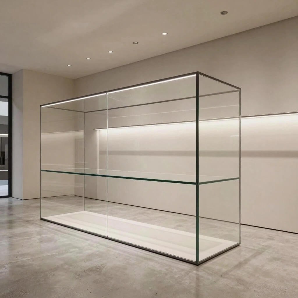
Glass counters have this magical ability to look expensive without screaming “I spent my entire budget on this thing!” I absolutely love how a minimal glass front counter creates an open, transparent vibe that modern shoppers actually appreciate.
The beauty here is in the simplicity. You’re working with clean lines, tempered glass panels, and usually a sleek metal or wooden base that keeps everything grounded. The transparent front lets customers see your packaging, shopping bags, or even some subtle product displays you’ve tucked underneath. Ever noticed how luxury boutiques pull this off? They’re not hiding anything because they don’t need to.
Here’s what makes this design work:
- Visual spaciousness: Glass doesn’t create visual barriers, making your shop feel bigger than it actually is
- Easy maintenance: Modern glass treatments resist fingerprints way better than you’d think
- Versatility: Works beautifully whether you’re selling artisan coffee or designer handbags
- Light reflection: Bounces natural and artificial light around your space like a champ
One thing I learned the hard way—you need quality tempered glass for this. I once visited a shop that went cheap on the glass, and it had more scratches than my old iPhone screen. Not cute. Budget for the good stuff, and your counter will look sharp for years.
The minimal glass counter particularly shines in smaller retail spaces. You don’t want a chunky wooden fortress eating up visual real estate when you’re working with limited square footage. This design keeps things airy while still providing all the functionality you need for transactions, product displays, and that inevitable pile of receipts we all accumulate.
Luxury Marble Finish Retail Billing Counter Concept
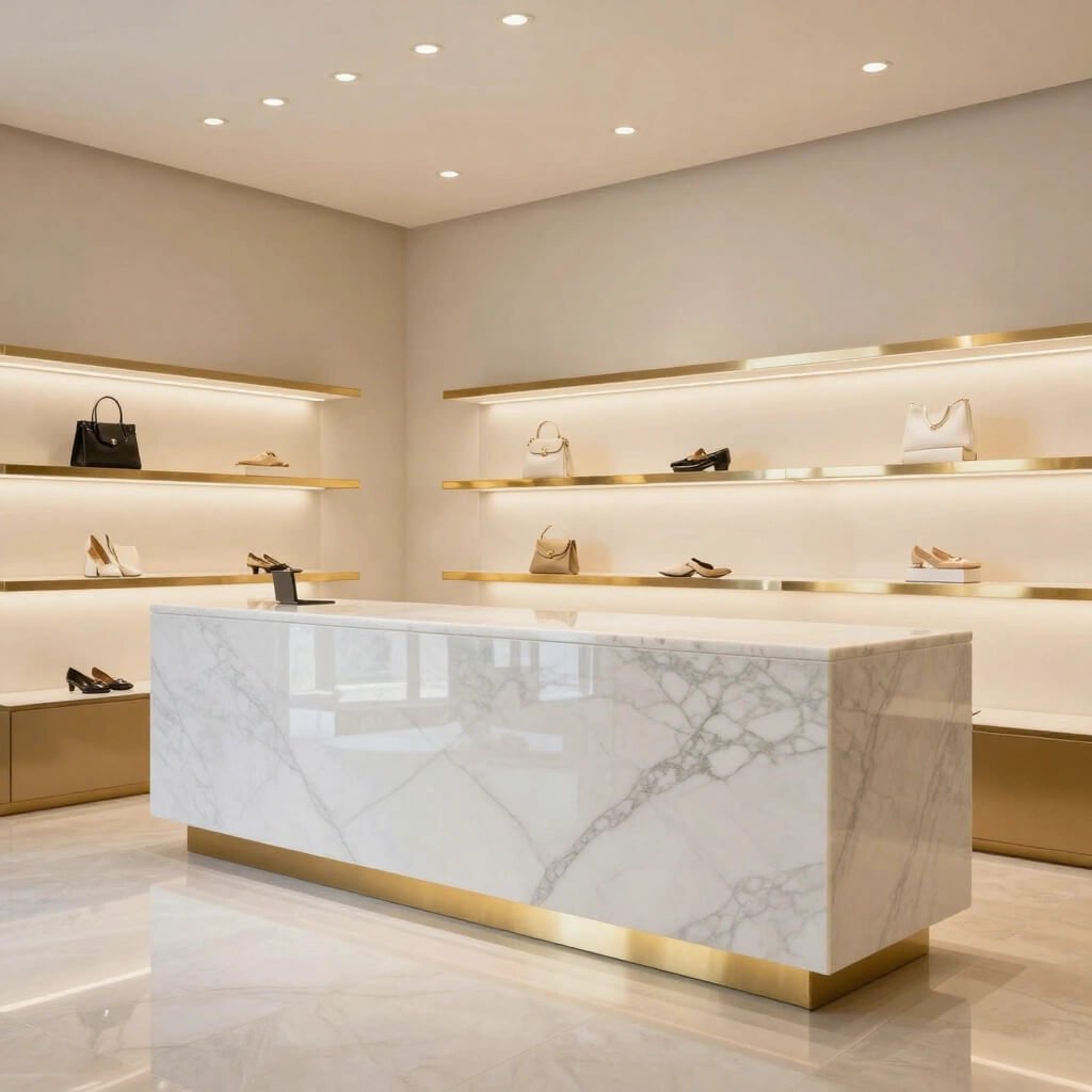
Let’s talk about making a statement, shall we? Nothing—and I mean nothing—says “we mean business” quite like a marble finish counter. Real marble costs a small fortune, but here’s the secret: quality marble-finish materials look nearly identical at a fraction of the price.
I remember walking into this high-end cosmetics shop where they’d installed a genuine Carrara marble counter. Gorgeous? Absolutely. Practical? Well, that’s debatable when you’re dropping makeup testers on it daily. The smart move is engineered marble or quality laminate with marble patterns. You get the luxury aesthetic without the heart attack every time someone sets down a coffee cup.
Why the marble finish works so well:
- Instant sophistication: Your shop immediately feels more upscale
- Timeless appeal: Marble never goes out of style (unlike that geometric wallpaper trend, oof)
- Versatile color options: White marble for clean elegance, black for drama, or green for something unique
- Durability: Engineered marble finishes resist staining and damage better than the real deal
The key to pulling off a marble counter is keeping everything else relatively simple. You don’t want to compete with those beautiful natural patterns. Pair it with brushed brass or matte black hardware, keep your counter surface organized, and let the marble do the talking. Trust me, customers will run their hands over it admiringly—it’s just human nature.
This design works particularly well for jewelry stores, high-end boutiques, beauty salons, and anywhere you want to communicate quality before customers even see your products. The psychological impact is real. People subconsciously associate marble with luxury, and that association transfers to your brand.
Wooden Slat Modern Boutique Counter Idea
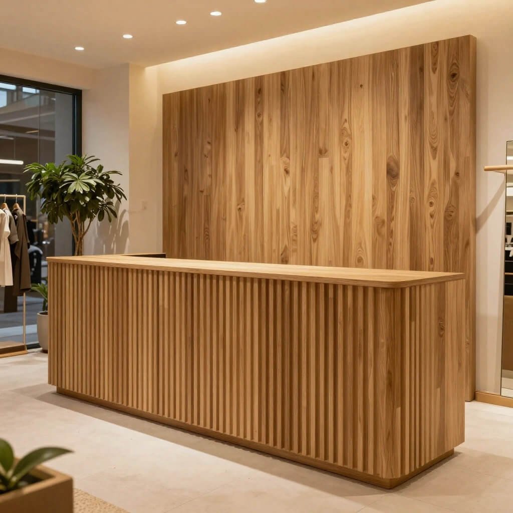
Okay, can we take a moment to appreciate how warm and inviting wood makes a space feel? The wooden slat counter design brings serious cozy vibes without looking like a rustic farmhouse threw up in your shop.
I’m talking about vertical or horizontal wooden slats, usually with some spacing between them, creating this cool textured effect. You can go light wood for a Scandinavian feel, rich walnut for sophisticated warmth, or even painted slats if you want to inject your brand colors. The slat design adds dimension and interest that flat panels just can’t match.
What makes wooden slats special:
- Texture and depth: Creates visual interest from every angle
- Acoustic benefits: The slats actually help absorb sound in busy retail environments
- Customization options: Spacing, width, and wood type let you create something unique
- Touch appeal: People genuinely enjoy the tactile experience (yes, customers will touch it)
One boutique I visited used reclaimed wood slats with varying widths, and honestly? It was chef’s kiss. The irregular spacing gave it character without looking messy, and the sustainability angle gave them a great story to tell customers. FYI, customers increasingly care about this stuff, so it’s worth mentioning if you go the eco-friendly route.
The wooden slat counter works brilliantly for fashion boutiques, artisan shops, organic product stores, and anywhere you want to create a connection to natural materials. It pairs beautifully with plants, natural lighting, and minimalist product displays. Just make sure you seal the wood properly—retail environments are tougher on materials than you’d think.
Also Read: 10 Smart Washbasin Counter Design Ideas for Compact Spaces
LED Backlit Floating Counter Design for Shops
Want to know what makes customers stop and stare? A floating counter with LED backlighting. Sounds fancy, right? It’s actually more achievable than you’d think, and the impact is absolutely worth it.
The “floating” effect comes from mounting your counter to a wall or support structure in a way that hides the connection points, usually with a recessed base. Add LED strip lighting underneath, and boom—your counter appears to levitate while casting this gorgeous ambient glow. I’ve seen this done in vape shops, tech stores, and trendy cafes, and it never fails to impress.
Why LED backlit floating counters rock:
- Modern aesthetic: Screams contemporary without trying too hard
- Customizable lighting: Change colors for different moods, seasons, or events
- Space perception: Makes your floor space look larger and less cluttered
- Energy efficiency: LED strips use minimal electricity and last forever
Here’s a pro tip: go for warm white or your brand color for the LED backlighting. I’ve seen shops use rainbow cycling lights, and it looks like a nightclub threw up. Unless you’re actually running a nightclub, show some restraint 🙂
The floating counter works best when you keep the counter surface itself fairly simple. You want the lighting effect to be the star, not compete with busy patterns or excessive decoration. Pair it with a clean white, black, or light wood surface, and you’ve got yourself a genuinely modern setup that photographs beautifully for Instagram. Speaking of which, customers will photograph this counter, so consider it free marketing.
Compact Space-Saving Corner Shop Counter Setup
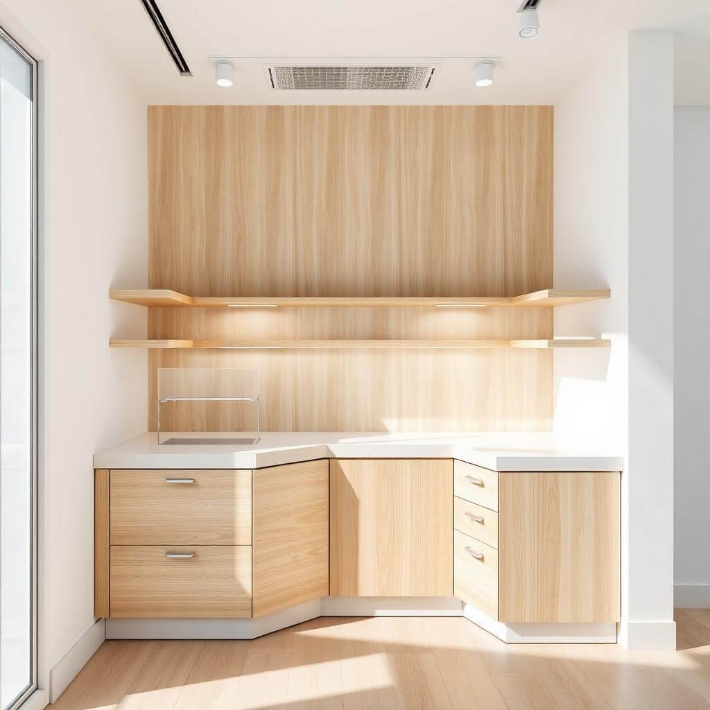
Small shop? Join the club. Most retailers aren’t working with massive floor plans, which is exactly why corner counter setups deserve way more love than they get.
I once helped a friend set up a tiny boutique where every square foot mattered. We installed an L-shaped corner counter, and suddenly she had ample transaction space, storage underneath, and room for product displays on top—all without sacrificing precious customer browsing area. Corner counters are the unsung heroes of smart retail design.
Benefits of corner counter configurations:
- Maximizes awkward spaces: Corners often go unused, so why not put them to work?
- Creates natural traffic flow: Customers know exactly where to go for checkout
- Extra counter surface: L-shapes give you more usable space than straight counters
- Storage potential: Corner bases can hide surprising amounts of inventory and supplies
The trick with corner counters is making them feel intentional, not cramped. You need adequate working space for your POS system, room for customers to set down items, and ideally a little breathing room so your staff doesn’t feel boxed in. I recommend at least 24 inches depth on each wing of the L-shape.
Corner setups work brilliantly for kiosks, small boutiques, pop-up shops, and anywhere you’re fighting for space. Add some vertical storage solutions behind the counter—shelving, pegboards, or wall-mounted organizers—and you’ve created a surprisingly functional retail command center. IMO, this is the smartest option for anyone working with under 500 square feet.
Industrial Metal Frame Modern Retail Counter Idea
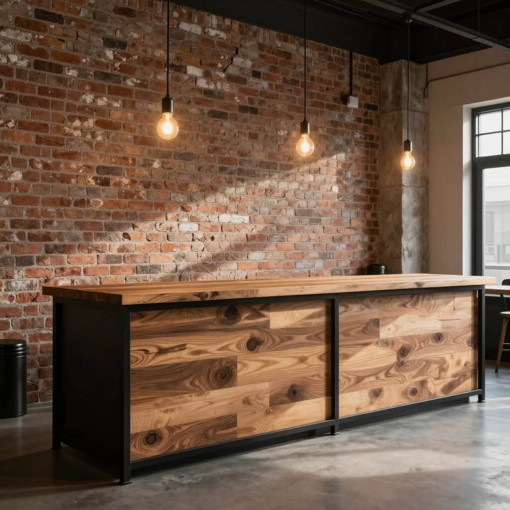
Let’s get a bit edgy, shall we? Industrial design isn’t going anywhere, and a metal frame counter brings that raw, urban aesthetic that certain brands absolutely nail.
Think black powder-coated steel frames, visible welds or rivets, and either a wood plank top or a concrete-effect surface. This counter style has serious attitude. I’ve seen it work beautifully in streetwear shops, barbershops, bike stores, and craft breweries. It says “we don’t do boring” without being obnoxious about it.
What industrial metal frames bring to your shop:
- Durability: Metal frames can withstand apocalyptic levels of daily abuse
- Masculine aesthetic: Works great for brands targeting male customers
- Budget-friendly options: Steel is often cheaper than custom woodwork
- DIY potential: If you’re handy, you can actually build this yourself
One warning though—metal can feel cold and uninviting if you overdo it. You want to balance the industrial elements with warmer touches. Add a wood top, incorporate some plants nearby, or warm up the lighting. I visited a shop that went full industrial—metal everywhere, concrete floors, harsh lighting—and honestly, it felt like shopping in a parking garage. Not the vibe.
The metal frame counter pairs perfectly with exposed brick, concrete floors, Edison bulb lighting, and minimalist signage. If your brand has an urban, no-nonsense personality, this design reinforces that message every time customers approach the counter. Just make sure your staff actually likes the aesthetic too—they’re the ones spending eight hours a day back there.
Also Read: 10 Brilliant Restaurant Counter Design Ideas for Smart Layouts
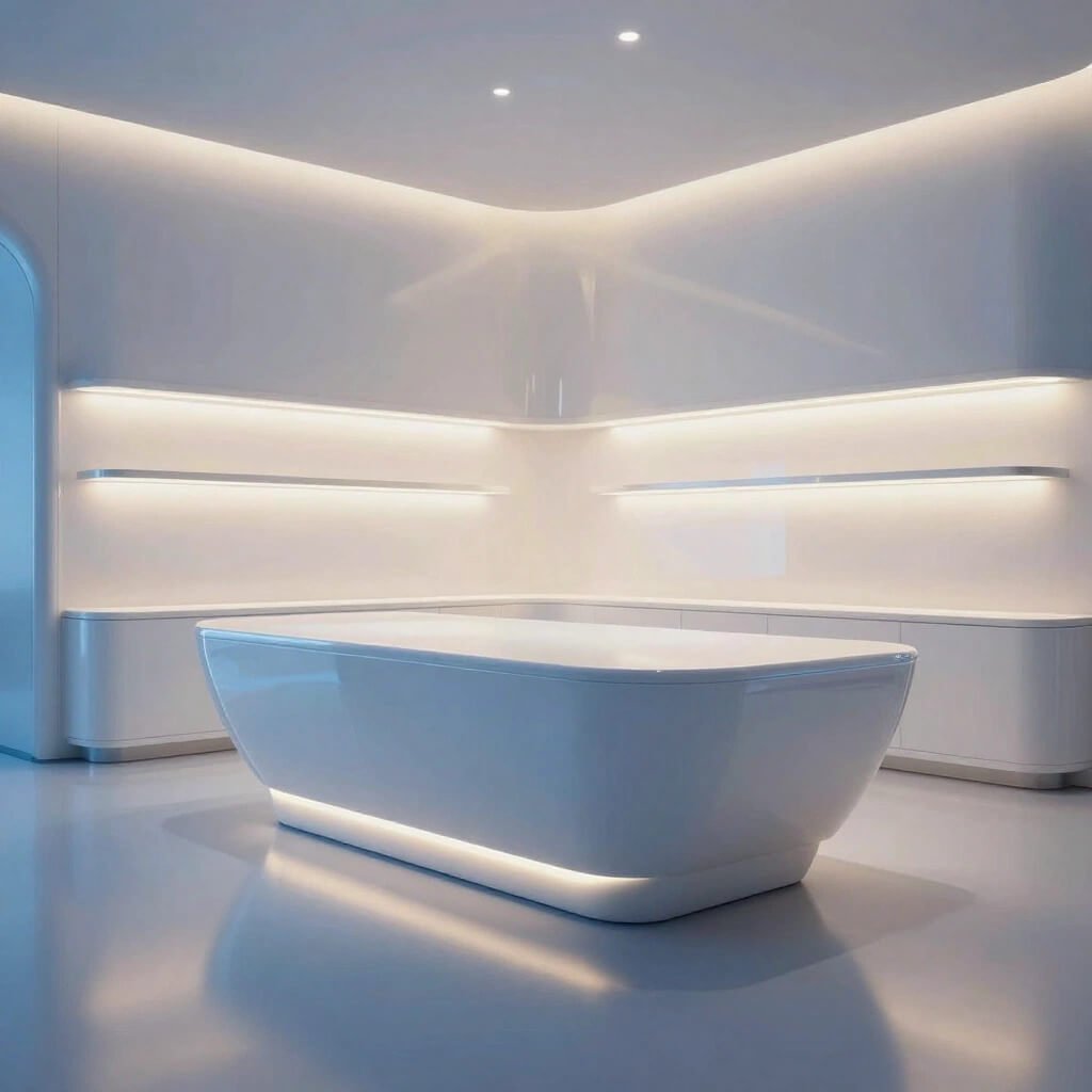
High-End Glossy White Acrylic Shop Counter Design
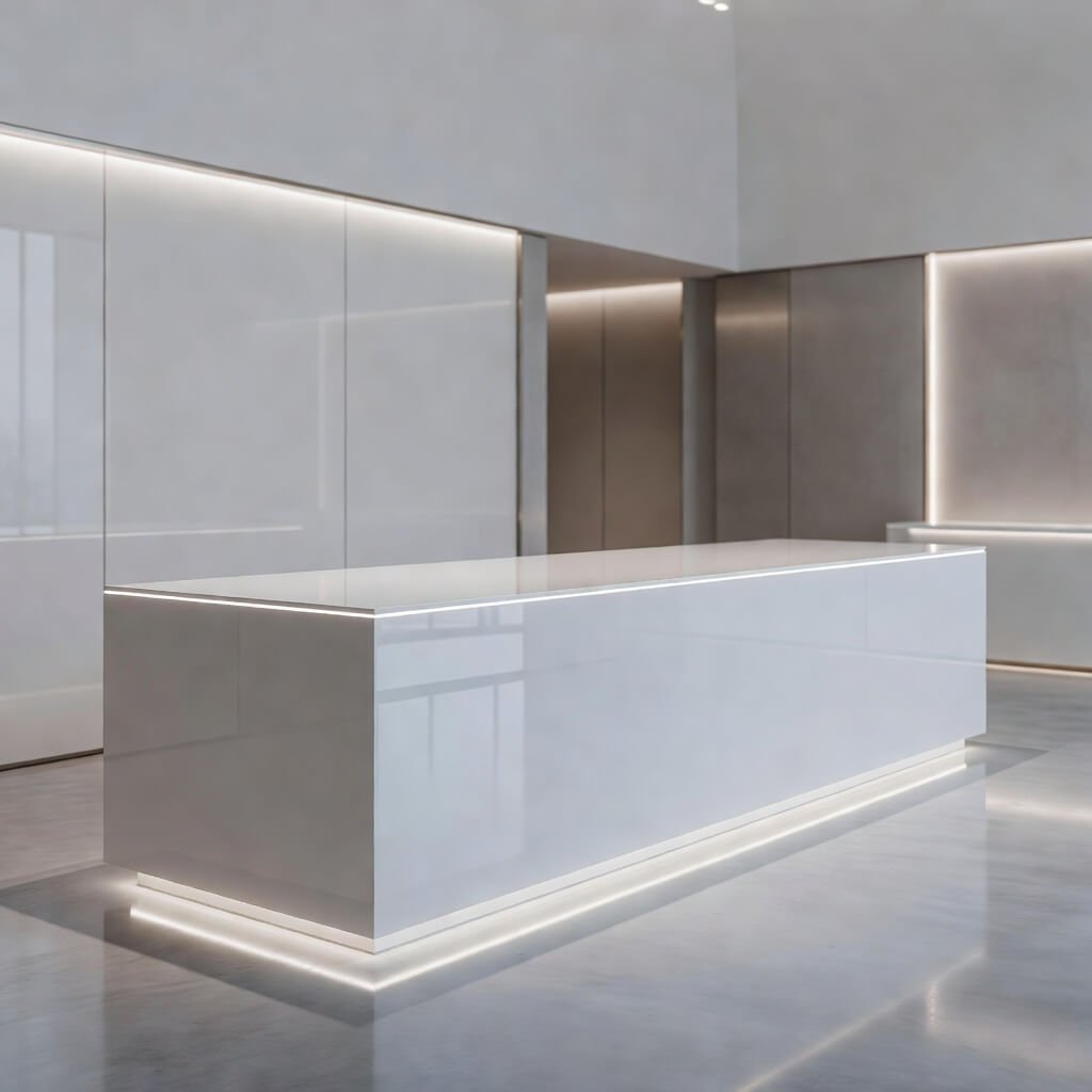
White. Glossy. Seamless. If Apple designed shop counters, they’d probably look like this. The high-gloss white acrylic counter is the definition of clean, modern retail design.
Acrylic is this wonderful material that looks like it costs way more than it does. When properly finished in glossy white, it creates this almost futuristic appearance that makes everything around it look more premium. I’ve seen this design absolutely crush it in phone stores, cosmetic shops, and modern eyewear boutiques.
Why glossy white acrylic counters work:
- Clean aesthetic: Nothing looks fresher or more modern
- Light reflection: Bounces light around your space, making it brighter
- Easy to clean: Seriously, a quick wipe and it looks brand new
- Seamless construction: No visible joints means sophisticated appearance
The downside? Fingerprints. Oh boy, the fingerprints. If you go this route, keep cleaning supplies handy and make peace with the fact that you’ll wipe this counter down approximately 47 times per day. Small price to pay for looking this sharp though.
One smart move I’ve seen is incorporating subtle LED lighting under the countertop edge or within the body of the counter. The white acrylic diffuses the light beautifully, creating this soft glow that elevates the entire design. You’re basically creating a piece of functional art that also happens to handle transactions.
This design particularly suits tech stores, medical aesthetic clinics, modern opticians, and any brand positioning itself as cutting-edge and premium. The white backdrop also makes your products pop—whether you’re displaying phone cases or skincare, they’ll look better against that pristine white surface.
Dual-Level Customer Friendly Billing Counter Concept
Ever stood at a counter that felt like a fortress wall between you and the staff? Yeah, me too. That’s why dual-level counters deserve your attention—they’re designed with actual human interaction in mind.
The concept is simple but brilliant: you have a standard height counter (around 42 inches) for your POS system and working area, plus a lower section (around 30 inches) where customers can comfortably interact, sign receipts, examine products, or just rest their bags. This setup creates a more welcoming, accessible environment.
Dual-level counter advantages:
- Accessibility: Lower sections accommodate wheelchair users and children
- Better customer interaction: Reduces the barrier feeling between staff and shoppers
- Functional zones: Separate areas for transactions and customer service
- Professional appearance: Shows you’ve thought about user experience
I visited a bookstore that implemented this beautifully. The lower counter section had adequate lighting and space for customers to flip through books before purchasing, while staff worked efficiently at the higher level. The owner told me customer feedback improved significantly after the redesign—people felt more welcome and spent more time at the counter.
This design works particularly well for service-oriented retail environments where consultation happens at the counter. Think opticians helping customers try frames, electronics stores explaining products, or jewelers showing pieces. The lower level creates a natural consultation space that feels collaborative rather than transactional.
Make sure the transition between levels is smooth and intentional. You don’t want it looking like you couldn’t decide on a height and just did both. Integrate it into the overall design with matching materials, and consider using the level difference to create visual interest or additional display space.
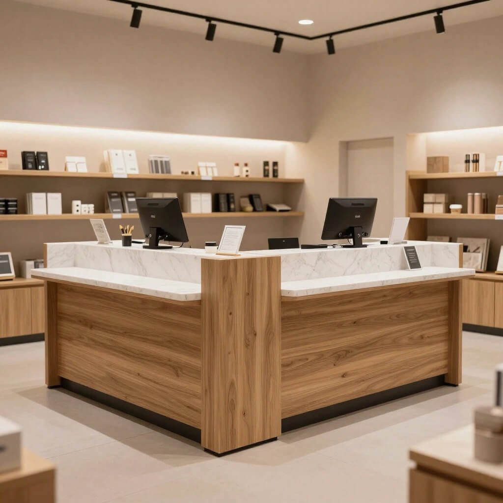
Smart Storage Integrated Modern Shop Counter Design
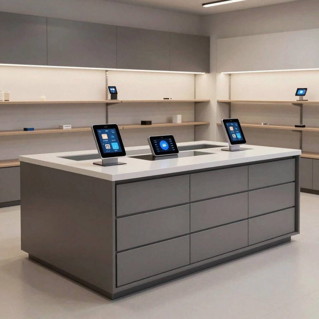
Let’s be honest—retail involves a lot of stuff. Receipt paper, bags, packaging materials, extra inventory, chargers, staplers, tape, and whatever else accumulates throughout the day. A counter without adequate storage becomes a cluttered mess faster than you can say “inventory management.”
Smart storage-integrated counters build organization right into the design. You’re looking at pull-out drawers, open shelving facing the staff side, hidden compartments, cable management systems, and dedicated spaces for everything. This isn’t just about looking tidy—it’s about operational efficiency.
Features of storage-smart counter designs:
- Pull-out drawers: Different sizes for different needs (shallow for pens, deep for inventory)
- Cable management: Built-in channels keep cords organized and hidden
- Open shelving: Quick access to frequently used items
- Locking compartments: Secure storage for cash, valuables, or sensitive items
- Vertical organizers: Maximize space with wall-mounted storage above the counter
I worked with a retailer who complained about constant counter clutter. We redesigned with storage integration—drawers with dividers, a dedicated POS drawer, cable routing, wall-mounted organizers—and the difference was night and day. Not only did the counter look professional, but checkout became faster because staff could find everything immediately.
The key is really thinking through your daily operations. What do you reach for twenty times a day? Where does stuff tend to pile up? Design your storage around your actual workflow, not some idealized version. If you go through a million shopping bags daily, you need dedicated bag storage that’s easy to access, not tucked in some awkward bottom drawer.
This design approach works for literally every retail environment because everyone needs storage. The difference is how thoughtfully you integrate it. A well-designed storage-integrated counter looks clean and professional from the customer side while functioning like a well-oiled machine from the staff side.
Also Read: 10 Modern Clothing Store Counter Design Ideas for Trendy Stores
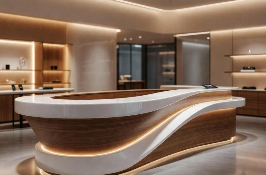
Curved Contemporary Reception Style Shop Counter Idea
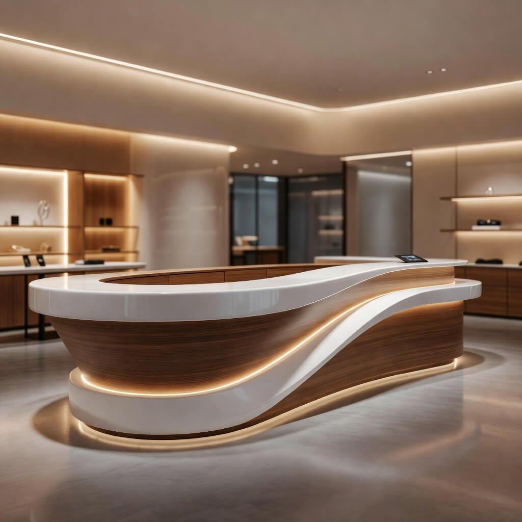
Straight lines are fine and all, but curves? Curves add personality and softness that can completely change how your shop feels. A curved counter brings that high-end reception desk aesthetic into retail, and honestly, it’s a power move.
Curved counters are inherently more welcoming than sharp-cornered rectangles. They invite customers to approach from multiple angles, create better traffic flow, and just look more sophisticated. I’ve seen this design absolutely nail it in salons, spas, upscale boutiques, and hotel retail spaces.
Why curved counters stand out:
- Softer aesthetic: Curves feel more approachable than harsh angles
- Traffic flow: Guides customer movement naturally around your space
- Unique appearance: Sets you apart from the standard rectangular counter crowd
- Conversation piece: Customers genuinely comment on well-executed curves
Building curved counters requires more skill and materials than straight designs, so budget accordingly. You’re looking at custom fabrication, which means higher costs but also a truly unique piece. I’ve seen shops use curved laminate, molded acrylic, bent wood, and even custom metal work. The material you choose depends on your budget and overall aesthetic.
One salon I visited had this gorgeous gently curved counter in a warm wood finish that mirrored the curved wall behind it. The flow was absolutely beautiful and made the entire space feel more cohesive and intentional. They told me it was the most photographed spot in their shop, which translates to free social media marketing every time someone posts.
The curved counter works particularly well when you want to create a destination feel rather than just a transaction point. It becomes a focal point, an architectural element that elevates your entire retail environment. Pair it with complementary curved elements—rounded shelving, arched doorways, circular displays—and you’ve got a genuinely cohesive design language.
Bringing It All Together
Look, your shop counter is way more important than most retailers give it credit for. It’s not just furniture—it’s your brand’s handshake, your operational hub, and often the last thing customers see before they leave. Getting it right matters.
The designs I’ve shared aren’t just pretty Pinterest boards. Each one solves specific challenges while bringing distinct aesthetic value. Maybe you need the space efficiency of a corner setup, or perhaps the upscale vibe of marble speaks to your brand. Maybe you’re all about that industrial edge, or you want the futuristic feel of LED-backlit acrylic. The point is matching your counter design to your actual needs, not just following trends blindly.
Quick decision guide:
- Small space? Go for corner setups or minimal glass fronts
- Luxury positioning? Marble, glossy acrylic, or curved designs deliver
- Urban/edgy brand? Industrial metal frames or wooden slats work brilliantly
- Maximum functionality? Smart storage integration is non-negotiable
- Customer experience focus? Dual-level or curved designs show you care
Here’s my honest take: don’t cheap out on your counter. It’s one of the hardest-working pieces in your entire shop, and a well-designed counter pays for itself in efficiency, customer perception, and straight-up not driving your staff crazy. I’ve seen too many retailers skimp here and regret it six months in when their cheap counter is literally falling apart.
Whatever design direction you choose, commit to it fully. A half-executed vision looks worse than a simple design done well. Get quality materials, think through the practical details, and create something that serves both your operational needs and your aesthetic goals. Your future self (and your staff) will thank you every single day.
Now go forth and create a counter that makes your retail space genuinely special. You’ve got this! 🙂