10 Brilliant Restaurant Counter Design Ideas for Smart Layouts
- Counter Design
 Ben
Ben- 0
- 34 minutes read
Look, I’ll be honest with you—most restaurant counters I’ve seen are about as inspiring as watching paint dry. You walk into these places and the counter is just… there. Taking up space. Doing the bare minimum. But here’s the thing: your restaurant counter isn’t just a transactional zone where money changes hands. It’s the first real interaction point between your staff and customers, and if you nail the design, it can completely transform the vibe of your space.
I’ve spent way too much time (some might say an unhealthy amount) obsessing over restaurant layouts, and I want to share what actually works. Not the cookie-cutter stuff you see everywhere, but designs that make people stop and think, “Okay, these folks get it.” Ready? Let’s get into it.
Modern Minimalist Wooden Restaurant Counter Design
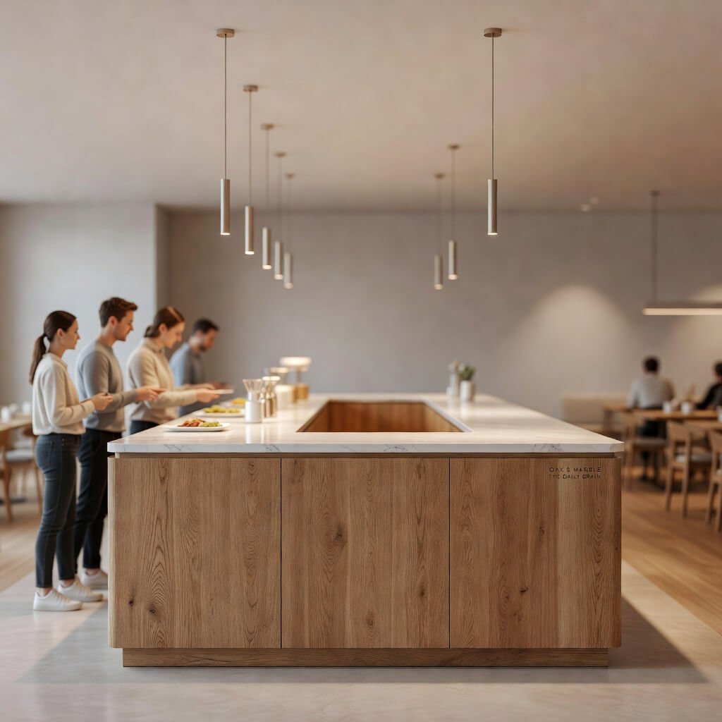
You know what never goes out of style? Clean lines and natural wood. I’m talking about that Scandinavian-inspired minimalism that somehow feels both elevated and approachable at the same time.
The modern minimalist wooden counter strips away all the unnecessary BS and focuses on what matters: beautiful grain patterns, smooth surfaces, and smart functionality. This design works because it creates breathing room in your space—something customers desperately need when they’re making decisions about what to order.
Think light oak or ash wood with a matte finish. No high-gloss nonsense that shows every fingerprint. The counter height should sit around 42 inches, giving your staff a comfortable working position while creating just enough separation from the customer area. I’ve noticed that when counters are too low, the whole interaction feels awkward, like you’re both leaning over an invisible barrier.
Key Features That Make It Work
- Integrated storage beneath the counter: Hidden compartments keep your workspace clutter-free
- Minimal hardware: Push-to-open drawers instead of visible handles
- Cable management systems: Because nothing ruins minimalism faster than tangled cords
- Waterfall edges: Where the countertop material flows down the sides—it’s subtle but adds serious visual appeal
What I love most about this design is its chameleon-like quality. You can dress it up with brass accents for a more upscale feel, or keep it bare and pair it with industrial elements for that modern café vibe. The versatility is unmatched, IMO.
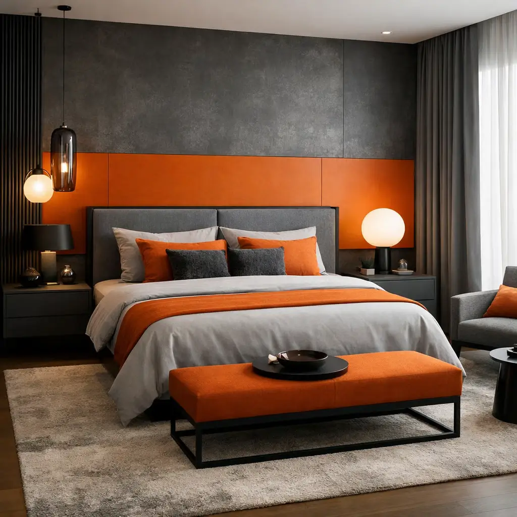
Luxury Marble Front Café Counter Design Ideas
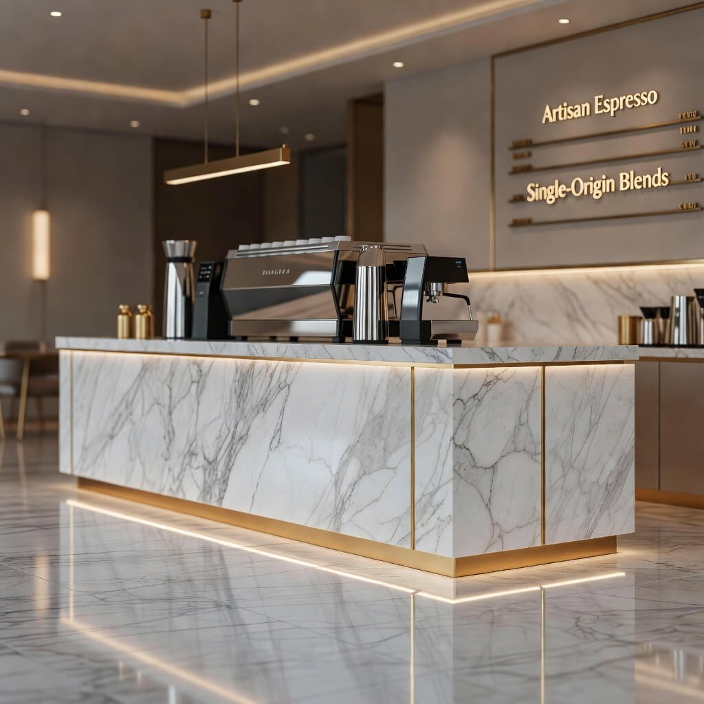
Okay, let’s talk about making a statement. Nothing—and I mean nothing—says “we’re serious about this” quite like marble.
I remember walking into this café in my neighborhood that had just renovated, and the Calacatta marble counter literally stopped me in my tracks. The veining was insane, each slab telling its own geological story. Marble brings instant sophistication that cheaper materials simply can’t replicate, no matter how hard they try.
But here’s where people mess up: they think slapping marble on everything automatically equals luxury. Wrong. The magic happens when you pair that gorgeous stone with the right supporting elements. Think polished brass fixtures, subtle LED underlighting, and maybe some darker wood accents to ground all that white marble.
Making Marble Work Without Breaking the Bank
You don’t need to cover every surface in marble to get the effect. Smart designers use it strategically:
- Front-facing panels only: Save money by using marble where customers see it
- Engineered stone alternatives: Quartz can give you the marble look with better durability
- Waterfall edges on one side: Creates impact without doubling your material costs
- Mix with complementary materials: Pair a marble front with wooden sides
The maintenance factor is real, though. Marble stains if you look at it wrong. I’ve seen too many beautiful counters ruined by coffee rings and acidic spills. You’ll need to seal it properly and stay on top of cleaning, or that luxury vibe turns into shabby pretty quick.
Industrial Style Brick & Metal Restaurant Counter Setup
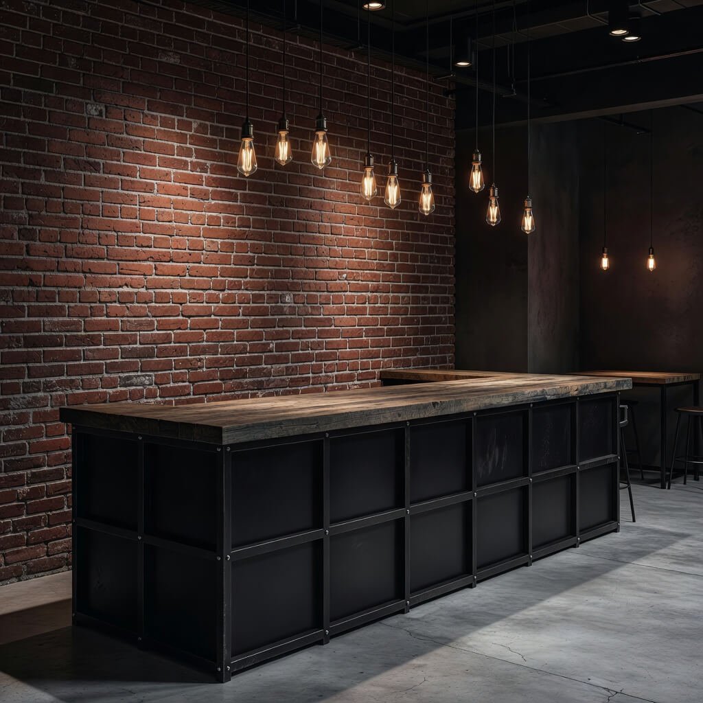
Ever wonder why industrial design refuses to die? Because it’s honest. Raw. It doesn’t pretend to be something it isn’t.
The brick-and-metal combo brings serious edge to your restaurant. We’re talking exposed red brick (or that cool weathered look), paired with steel or wrought iron frames. This setup screams urban cool without trying too hard, which is exactly the point.
I helped a friend design his burger joint’s counter using this style, and the transformation was ridiculous. We sourced reclaimed brick that had this incredible patina—you can’t fake that aged character. The metal framework came from a local fabricator who welded together a custom frame with visible welds and all. Some designers would hide those imperfections, but that’s what makes industrial style authentic.
Elements That Nail the Industrial Aesthetic
- Exposed brick backsplash: Extends the look vertically and creates depth
- Metal bar stools with wooden seats: Comfort meets industrial edge
- Edison bulb pendant lights: Yeah, it’s been done, but it works
- Open shelving with steel brackets: Display bottles or glassware against that brick
- Concrete countertops: Alternative to traditional surfaces that fits the vibe perfectly
The beauty of this design is how forgiving it is. Scratches and dings? They add character. A pristine industrial counter somehow feels wrong anyway. Just make sure your brick is properly sealed—brick dust is not the garnish anyone ordered.
Also Read: 10 Modern Clothing Store Counter Design Ideas for Trendy Stores
Small Space Smart Compact Restaurant Counter Design
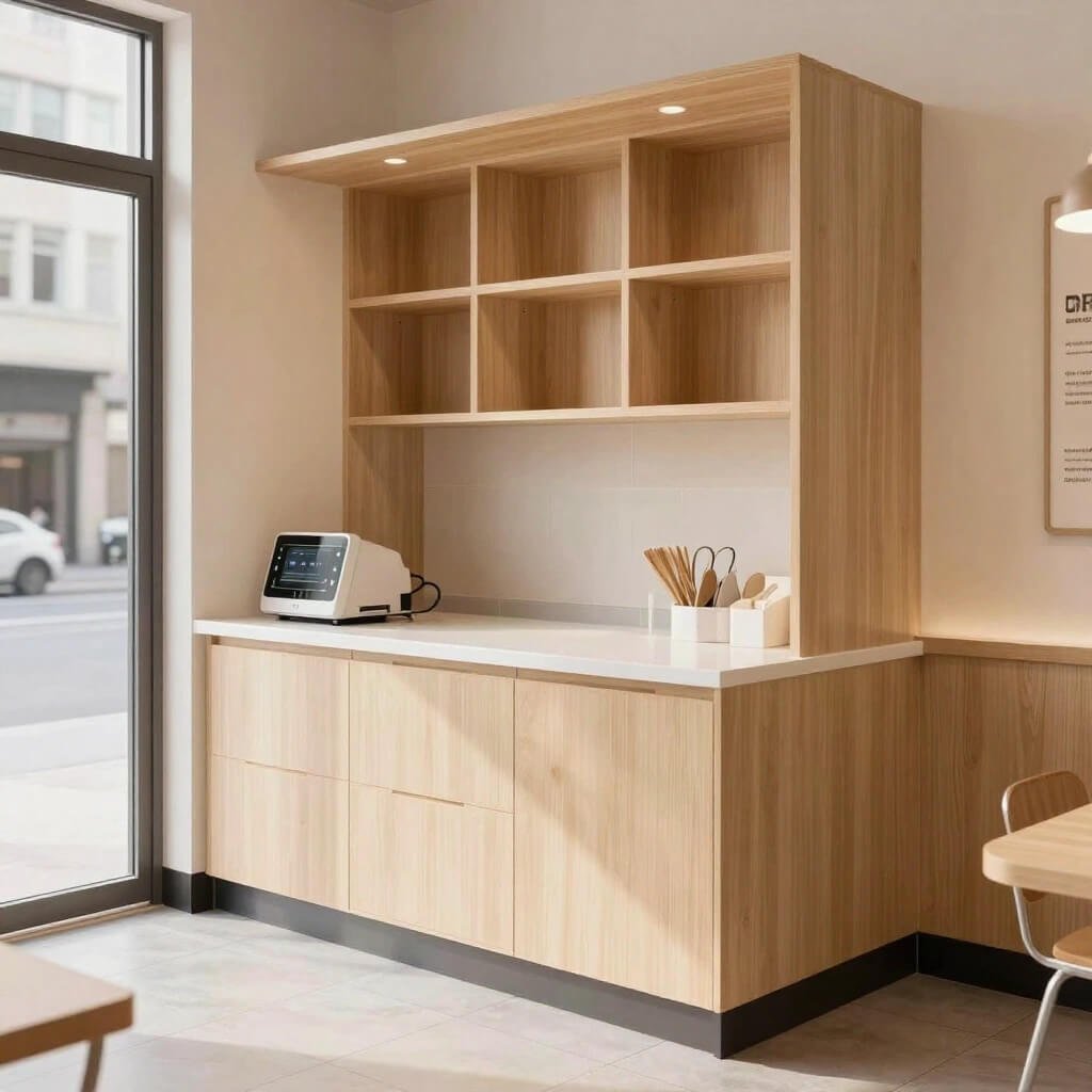
Small spaces are where design gets interesting. Anyone can make a massive space work, but creating a functional, beautiful counter in limited square footage? That takes actual skill.
Compact doesn’t mean compromising—it means being smarter about every single inch. I’ve seen 6-foot counters that work harder than 15-foot monsters because the designer actually thought through the workflow and customer experience.
The secret sauce here is vertical thinking. When you can’t go wide, go up. Add shelving above the counter for menu boards or decorative elements. Install hooks underneath for bags. Create a fold-down extension for busy periods that tucks away when you don’t need it.
Space-Maximizing Features
- Corner placement: Utilize dead space that would otherwise go to waste
- Multi-level surfaces: Lower section for ordering, raised shelf for pickup
- Slim profile design: 18-20 inches deep instead of standard 24 inches
- Built-in point-of-sale integration: Tablet mounts keep your counter clear
- Magnetic strips: Hold knives, tools, or even menu cards vertically
I saw this coffee shop once that had maybe 200 square feet total, and they built this L-shaped counter that handled ordering, payment, and pickup all in one continuous flow. The barista could pivot between espresso machine and register without taking more than two steps. FYI, that kind of efficiency is what keeps lines moving and customers happy 🙂
LED Backlit Modern Fast Food Counter Design Concept
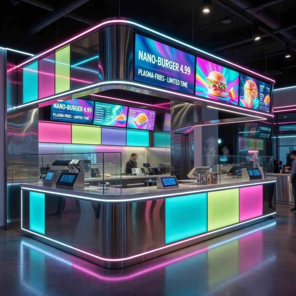
Let’s be real—fast food counters usually have all the personality of a DMV waiting room. But throw in some strategic LED backlighting, and suddenly you’re creating an experience.
Backlighting transforms ordinary materials into something that feels premium. I’m talking about that soft glow behind translucent panels that makes your counter look like it belongs in a sci-fi movie (the good kind, not the cheesy ones).
The practical benefits go beyond aesthetics too. Proper lighting illuminates menu boards, highlights your branding, and creates ambiance that can actually influence purchasing decisions. Studies show that warmer lighting encourages longer stays and higher spending, while cooler tones create efficiency and quick turnover. Choose based on your business model.
LED Integration Ideas
- Backlit acrylic panels: Frosted or colored acrylic with LED strips behind
- Under-counter lighting: Creates a floating effect and illuminates the floor area
- RGB programmable systems: Change colors for different times of day or special events
- Menu board backlighting: Makes your offerings visible from across the room
- Logo illumination: LED-lit brand elements in the counter design
The tech has gotten so much cheaper too. A few years back, this kind of installation would’ve cost a fortune. Now you can grab quality LED strips for a fraction of the price and get creative with installation. Just don’t go overboard—you want ambiance, not a nightclub.
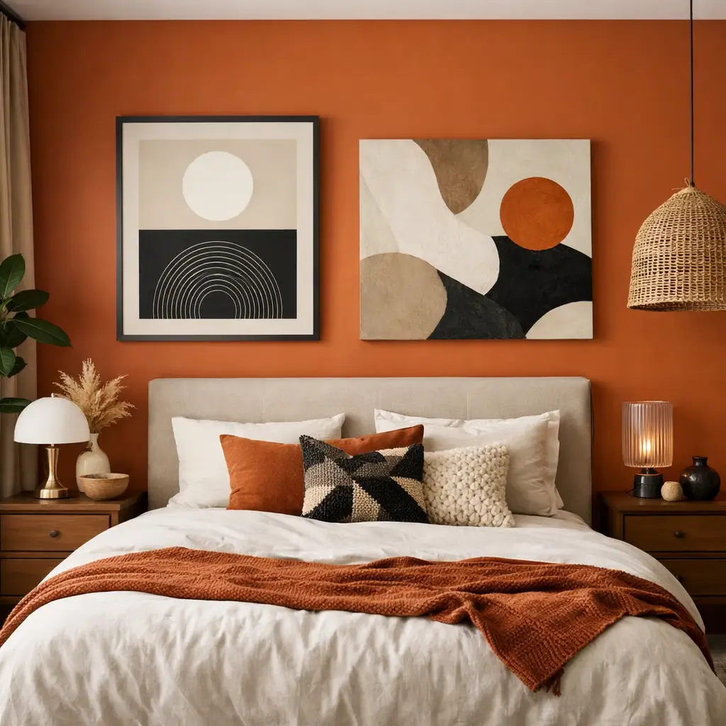
Rustic Farmhouse Style Wooden Counter for Restaurants
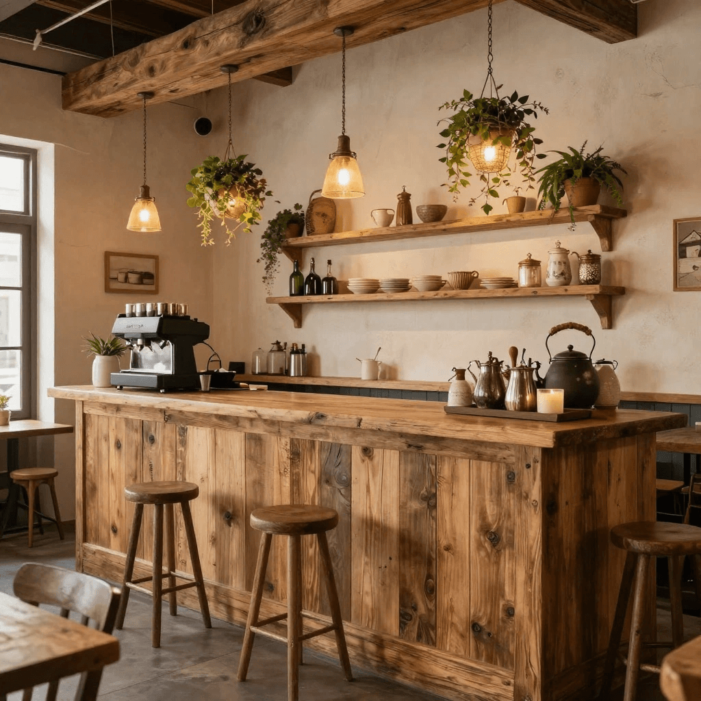
There’s something deeply comforting about farmhouse style. Maybe it’s the chunky wood beams, or the lived-in feel, or the fact that it reminds people of Sunday dinners at grandma’s house. Whatever it is, rustic farmhouse counters create instant warmth that makes customers want to stick around.
This style works killer for farm-to-table restaurants, breakfast spots, or anywhere you want to emphasize comfort and authenticity. I’m talking about reclaimed barn wood with all its knots and imperfections, thick butcher-block countertops, and those sliding barn door-style panels for storage.
The vibe here is intentionally imperfect. Machine-cut precision? Nah. We want hand-hewn beams, visible joinery, and surfaces that show their age. One restaurant I visited used an actual antique farmhouse counter they’d restored—the thing had been a working counter for like 80 years. You can’t manufacture that kind of story.
Farmhouse Counter Essentials
- Thick wood construction: Minimum 2-3 inches for that substantial feel
- X-brace supports: Visible structural elements that add character
- Distressed finishes: Wire brushing or hand-scraping creates texture
- Open lower shelving: Display baskets, crates, or fresh produce
- Vintage hardware: Iron hooks, aged brass fixtures, ceramic knobs
Mix in some modern conveniences though. Your farmhouse counter can have integrated POS systems and proper electrical—you’re creating a vibe, not actually running a 19th-century establishment. The best designs blend that rustic charm with functionality that makes sense for actual restaurant operations.
Also Read: 10 Inspiring Showroom Counter Design Ideas for Shop Upgrade
High-End Black & Gold Luxury Reception Counter Design
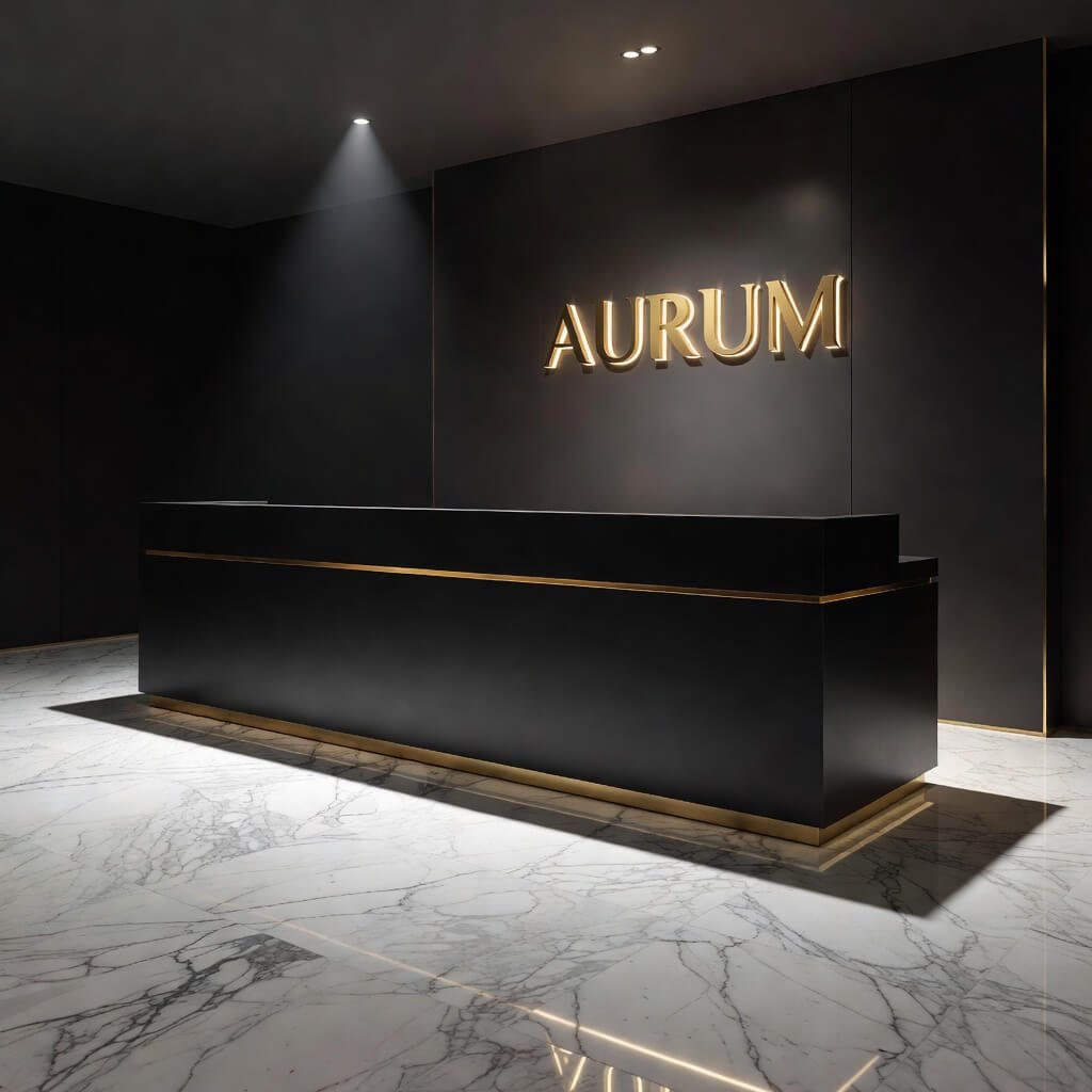
Want to know the fastest way to communicate “upscale”? Black and gold, baby. This combo has been signaling luxury since ancient Egypt, and it still works today.
The black-and-gold counter makes an immediate impression that tells customers they’re somewhere special before anyone says a word. But here’s the catch—you’ve got to commit fully. Half-hearted black-and-gold looks cheap and tacky. Go all in or go home.
I’m talking about deep matte black surfaces—maybe painted wood, maybe black granite—paired with brushed gold or brass accents. Not shiny gold that looks like costume jewelry, but that rich, warm tone that feels substantial. The counter front might feature geometric gold inlay patterns, or vertical gold slats, or even a full gold leaf treatment if you’re feeling fancy.
Luxury Design Elements
- Matte black base material: Painted MDF, stained wood, or black stone
- Brushed brass trim: Edge banding, toe kicks, or decorative panels
- Integrated lighting: Warm LED that highlights the gold tones
- High-gloss black countertop: Creates contrast with matte base
- Gold hardware: Drawer pulls, display hooks, decorative elements
The lighting matters enormously here. I’ve seen black-and-gold counters that looked incredible in renderings but fell flat in person because the restaurant didn’t invest in proper lighting. You need focused spots that make those gold elements pop without creating harsh shadows on the black surfaces.
Open Kitchen Integrated Service Counter Layout Idea
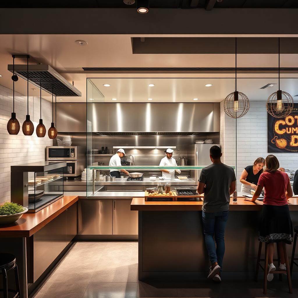
Open kitchens aren’t just trendy—they’re smart business. When customers watch their food being prepared, trust goes up. When trust goes up, spending follows :/
The integrated service counter breaks down the barrier between kitchen and dining space, turning meal prep into entertainment. Your counter becomes part theater, part service station, part culinary showcase.
The design challenge here is creating a counter that works from both sides. The customer-facing side needs to look polished and inviting, while the kitchen side needs to be hardcore functional with all the durability and workspace your team requires.
I visited this ramen shop where the entire counter wrapped around the kitchen in a U-shape. Customers sat at the counter, watching chefs work literally three feet away. The interaction was incredible—chefs explaining dishes, customers asking questions, everyone engaged. That’s the magic of open integration done right.
Making Open Integration Work
- Raised pass-through section: Kitchen staff can slide plates across at proper height
- Heat-resistant materials: The counter gets hot; plan accordingly
- Sneeze guards: Required by health codes, but can be designed elegantly with tempered glass
- Storage facing kitchen side: Drawers and cabinets accessible to staff only
- Easy-clean surfaces: Stainless steel or sealed stone that handles kitchen chaos
The workflow planning is critical. Your counter layout needs to support the kitchen’s operational flow while creating logical customer interaction points. Map it out, test it, adjust it. This isn’t a design you want to get wrong and discover the hard way.
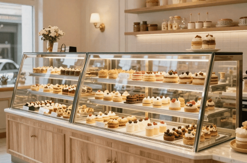
Glass Display Food Counter Design for Cafés & Bakeries
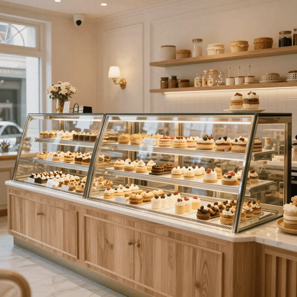
You know what sells food better than any menu description? Actually seeing the food. This is bakery and café 101, but you’d be surprised how many places mess it up.
A well-designed glass display counter turns your products into marketing. Those croissants, tarts, sandwiches, and pastries become irresistible when they’re properly lit and displayed at eye level.
The counter needs refrigeration for items that require it, ambient temperature sections for baked goods, and proper lighting that makes everything look delicious (not that harsh fluorescent vibe that makes everything look like it’s been sitting there since Tuesday). The glass should be spotless—I’m talking obsessively clean—because smudges and fingerprints kill the whole effect.
Display Counter Must-Haves
- Multi-temperature zones: Refrigerated and ambient sections
- LED lighting from multiple angles: Eliminate shadows, highlight textures
- Tiered display levels: Maximize visibility of all products
- Removable trays: Easy restocking and cleaning
- Customer-side viewing: Glass panels at slight angle for optimal viewing
- Staff-access from behind: Smooth workflow for service
I’ve noticed the best bakery counters create this gentle slope in their display, like products are being presented on a stage. Everything visible, nothing hidden in back corners. And please, for the love of good design, label your products clearly. Amazing display + mystery contents = frustrated customers.
Also Read: 10 Elegant Breakfast Counter Design Ideas for Modern Living
Curved Modern Reception Counter for Restaurants
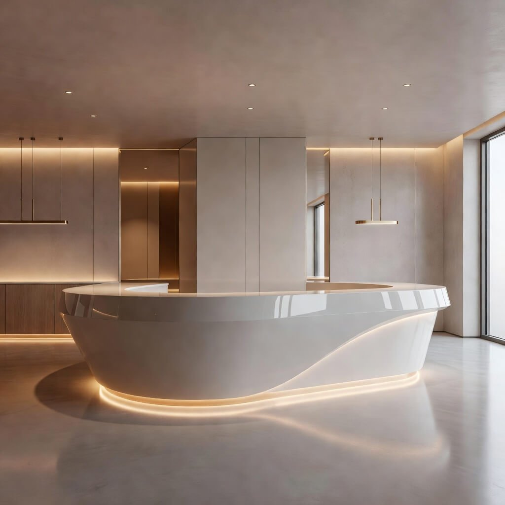
Straight lines are fine, but curves? Curves create flow. They invite movement. They feel organic and welcoming in ways that hard angles simply don’t.
The curved counter softens your entire space and naturally guides customer traffic in the direction you want. No awkward “where do I stand?” moments. The curve creates an intuitive path that feels effortless.
From a design perspective, curves are harder to execute. You need skilled fabricators who can bend materials properly or create segments that flow together seamlessly. But that difficulty is exactly what makes curved counters special—they show customers you invested in creating something beyond the ordinary.
I remember this high-end sushi restaurant with a counter that curved through the space like a river. The shape created intimate dining nooks along the inside curve while maintaining that flowing circulation on the outside. Brilliant use of geometry.
Curved Counter Design Considerations
- Radius planning: Gentle curves (larger radius) feel elegant; tight curves feel dynamic
- Material selection: Some materials bend easier than others—solid surface materials work great
- Seamless joints: Visible seams kill the flowing effect
- Custom cabinetry: Standard rectangular cabinets won’t fit; budget for custom
- Lighting follows the curve: Linear LEDs can trace your counter’s path
- Enough depth: Maintain functional depth throughout the curve
The cost factor is real. Curved counters run 30-50% more than straight equivalents because of the fabrication complexity. But if you want your restaurant to stand out and create a memorable spatial experience, that investment pays dividends in customer perception and Instagram moments (which, let’s face it, matter for restaurants these days).
Bringing It All Together
Here’s what I’ve learned after obsessing over restaurant counters for way too long: the best design serves both form and function equally. A gorgeous counter that kills your workflow is a expensive mistake. A functional counter with zero personality is a missed opportunity.
Think about your brand first. What experience are you creating? A minimalist wooden counter sets completely different expectations than black-and-gold luxury. Make sure your counter design aligns with everything else—your menu, your service style, your price point, your neighborhood.
Consider your operational needs ruthlessly. How many staff members work the counter during rush periods? Where does the POS system go? Do you need space for a coffee machine, blender, or other equipment? What about storage for bags, receipts, and all those operational necessities?
And please, don’t forget about the customer experience. Counter height matters. Visibility matters. The ability to actually see menu boards and make eye contact with staff matters. I’ve stood at too many counters where I’m straining to see over barriers or awkwardly hunching down to communicate. Get the ergonomics right.
The counters I’ve shared here aren’t just pretty pictures—they’re proven concepts that work in real restaurants serving real customers every day. Whether you go minimalist wood, industrial brick, or curved modern, make the choice deliberately. Your counter is quite literally where the money changes hands. It deserves serious thought.
Now get out there and create something that makes people stop scrolling through their phones and actually look up. Your counter should be that good. And if it’s not? Well, at least you’ve got ten solid directions to explore. You’re welcome 🙂